Get Indexology® Blog updates via email.

In This List

Gold & Silver: Fed Rate Hike Vs Mine Supply

Rising Rates Revisited...

Gaining Insight Into New Zealand's Dividends

The Fed: No Change In Rates Amidst Puzzling Policies

Fallen Oil Might Now Be Spilling Into Every Stock Sector

Gold & Silver: Fed Rate Hike Vs Mine Supply

Contributor Image
Erik Norland

Executive Director and Senior Economist

CME Group

Two factors tend to consistently influence gold and silver — interest rate expectations and mining supply.  Changes in interest rate expectations typically exert a short-term, day-to-day influence that is exogenous to the metals market while mining supply has a long-term, year-to-year influence that is endogenous.

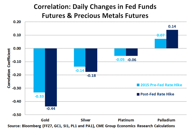
Precious metals prices seem to exert little to no influence on the U.S. Federal Reserve’s (Fed) monetary policy, but changes in market expectations for Fed rates often have a strong impact on gold and silver. If one compares the day-to-day correlation of the changes in the Fed Fund futures rate (100 minus the Fed Fund futures price) with the changes in precious metals prices, one finds a strong and persistently negative correlation for gold and silver.  Since the Fed hiked rates in December 2015, those correlations have grown stronger.

Gold appears to be more sensitive to changes in interest rate policy than silver.  This is probably because gold is the more truly precious of the two — it is widely used in investment and in jewelry, which can also be seen as an investment.  While silver is also used in investment and in jewelry, it is more widely used in industrial and other applications.  The reason why gold and silver prices react negatively to higher interest rates may be simple.  The metals do not pay interest.  As such, higher interest rates tend to make fiat currencies like the U.S. dollar appear more attractive to investors than gold or silver.

Growing expectations earlier in the year for an interest rate hike appear to have halted the rally in the gold and silver for the time being.  Gold peaked in early July, and silver in early August, but the subsequent declines have been modest.  One factor that might be limiting the declines and is also one of the most overlooked is — supply.  According to the GFMS Gold Survey Q2 report, gold mining supply fell by 2.2% in the second quarter of 2016 from a year earlier after having barely grown during the first quarter.

The U.S. economy is doing reasonably well.  Despite low productivity growth and declining corporate profit growth, the labor market appears to be strong.  According to the Bureau of Labor Statistics, the total number of people working has risen by 1.9% during the past year and average hourly earnings have increased by 2.6%.  All told, this equates to a 4.5% growth in total labor income.  GDP growth has been stagnant perhaps mainly due to a decline in corporate profits (from very high levels), falling inventories (a good sign going forward) and deterioration in the U.S. trade balance.  Inflation has been subdued in part as a result of falling energy prices but this won’t last forever, and the core rate of inflation has been perking up.  As such, our view is that the Fed will gradually adjust interest rates higher, and that the boost gold and silver prices got from diminished expectations for a rate hike is mainly behind them.

From our point of view, neither the interest rate picture nor mining production trends are likely to be supportive for gold and silver prices in late 2016 or in 2017.  Of course, events could prove us wrong, especially if the Fed decides to further delay its next rate increase or if mining supply contracts further.

capture

The posts on this blog are opinions, not advice. Please read our Disclaimers.

Rising Rates Revisited...

Contributor Image
Fei Mei Chan

Former Director, Core Product Management

S&P Dow Jones Indices

The prospect for and ramifications of rising interest rates have surfaced time and again in recent years. Whether and when the Fed will raise rates next is anyone’s guess. But as we’ve noted before, the correlation between higher interest rates and equity declines has grown tenuous in recent history.  Since 1991, the S&P 500 has risen roughly twice as often as it declined.  In 124 (of a total 307) months the 10-Year Treasury Yield increased; in those months, the S&P 500 declined only 27% of the time.   Though conventional wisdom is that stocks decline when rates rise, for the last 25 years, things haven’t been very conventional.

This is critical in understanding the prospects for defensive strategy indices.  These indices, as the name suggests, are designed to attenuate the market’s volatility. When times are good, they won’t participate fully in the market’s performance, but they provide some protection in falling markets. They’ve also been very popular since the financial crisis in 2008.

What would be the impact of a rate rise on these strategies?  The yield/performance matrix below shows the performance of the S&P 500 and the differential returns of several defensive strategies in various combinations of interest rate and market environments. Consistently, defensive strategies outperformed in down markets and underperformed in up markets. This relationship holds regardless of whether interest rates were up, down or static. Defensive equity strategies are much more dependent on the direction of the equity market than the direction of the bond market.

rising-rates-revisited

The posts on this blog are opinions, not advice. Please read our Disclaimers.

Gaining Insight Into New Zealand's Dividends

Contributor Image
Tianyin Cheng

Former Senior Director, ESG Indices

S&P Dow Jones Indices

Why a New Zealand Dividend Strategy Now?
New Zealand companies pay out more profits as dividends than many other countries in the world, with an aggregate distribution of 84% of earnings in 2015, much higher than the 48% in the U.S. and 54% globally (see Exhibit 1).

capture

One primary reason for this high payout ratio may be New Zealand’s dividend imputation regime, a rarity among countries around the world.  The imputation policy boosts total return by promoting a good corporate dividend payout policy.  More than 80% of New Zealand corporations surveyed by Ernst & Young in 2014[1] listed “meeting dividend payout target” as a leading driver of dividend policy.

As a result, New Zealand’s dividend strategy may provide market participants with robust income.  Exhibit 2 shows the significant role of dividends in total long-term equity returns.  Between Jan. 3, 2001, and Aug. 31, 2016, approximately 60% of the S&P/NZX 50 Index’s total return was due to reinvestment of dividends, and 18% was due to reinvestment of imputation.

capture

Why the S&P/NZX 50 High Dividend Index?
The S&P/NZX 50 High Dividend Index seeks to provide insight into the New Zealand equity market with a focus on dividends.  It is constructed from the S&P/NZX 50 Index universe.  The 25 companies in the S&P/NZX 50 Index with the highest dividend yields and liquidity are selected and form the S&P/NZX 50 High Dividend Index.  Constituents are weighted by the product of float-adjusted market cap and trailing 12-month gross dividend yield (including imputation).  The index is rebalanced semiannually, effective after the close on the third Friday of January and July.

How Does This Index Relate to Market Participants’ Portfolios?
Income generation and the potential for higher total return are two reasons why market participants might consider the S&P/NZX 50 High Dividend Index for their portfolios.

The historical yield of the S&P/NZX 50 High Dividend Index ranged from 5% to 9% between Dec. 31, 2010, and Aug. 31, 2016, while the yield of the S&P/NZX 50 Index fluctuated around 5%.  Note that imputation is not taken into account in the yield computation.  The income effect may be even more prominent for domestic market participants who could benefit from the imputation system.

capture

Given the strong income effect, the S&P/NZX 50 High Dividend Index managed to outperform the S&P/NZX 50 Index in terms of total return over the 3-, 5-, and 10-year periods ending Aug. 31, 2016, although there was slight underperformance in the price return version.  Exhibit 4 shows the detailed risk/return profile of the index.

capture

Ticker and More Information

capture

For more information, check out the S&P/NZX 50 High Dividend Index.


[1]   Imputation and the New Zealand Dividend Psyche, Ernst & Young, September 2015, http://www.ey.com/Publication/vwLUAssets/ey-imputation-and-the-new-zealand-dividend-psyche-highlights/$FILE/ey-imputation-and-the-new-zealand-dividend-psyche-highlights.pdf.

The posts on this blog are opinions, not advice. Please read our Disclaimers.

The Fed: No Change In Rates Amidst Puzzling Policies

Contributor Image
David Blitzer

Former Managing Director and Chairman of the Index Committee

S&P Dow Jones Indices

Questions and some answers on issues facing, or created at, the Fed

Raise Rates?

Not very likely next week at the September 21st FOMC meeting.  Recent data including August jobs report, declines in Industrial Production and Retail Sales and comments from FOMC members argue against a move now.  The November 2nd meeting is just days before the election so attention will be the December 14th FOMC session.  As of now the probability appear to be close to, but a bit below, 50%.

Policy Puzzles – The last eight years have seen more changes in the Fed’s policy making and operations than any time since 1979.  Some comments on the innovations:

Quantitative Easing (QE) raised the price and lowered the yields on intermediate and long term bonds in an effort to spur business investment and encourage consumer spending on big ticket items. Lower long term interest rates increased the prices of houses and stocks, adding to household net worth.  The same low interest rates raised havoc for pensions and insurance companies facing long term liabilities. Business investment gains were harder to identify.

Negative Interest Rates were the next step when the combination of QE and near-zero central bank policy rates didn’t provide sufficient stimulus. In Switzerland, but not in Japan, negative interest rates weakened the currency.  They did manage to push real interest rates farther into negative territory despite extremely low inflation. However, negative interest rates damage consumer confidence and encourage saving more than spending. They also distort normal relations among different debt instruments and the yield curve.

Raising the Fed’s inflation target maybe one way to raise interest rates and give the Fed more room to lower rates when the next recession appears.  The arithmetic works but pushing the inflation target to 4% would add to fears that past QE is setting us up for much higher inflation.  Given the difficulty the Fed and other central banks have in even getting inflation up to 2%, everyone may doubt that a 4% inflation target could be achieved.

The Phillips curve seems to have disappeared. A building block of monetary policy is the inverse relation and trade-off between inflation and unemployment usually referred as the Phillips curve. A basic tenet of monetary theory is that raising the policy interest rate – the Fed funds rate in the US – will raise unemployment and lead to lower inflation.  This worked until recently. Then after the 2007-9 recession ended, unemployment came down from 10% to 5% but inflation remained a bit under 2%.  Although current data suggest this theory isn’t valid now, it is still being cited in arguments for and against higher interest rates.

One counter to policy built on the Phillips curve is called Neo-Fisherism, named after economist Irving Fisher.  Fisher is known for two things: predicting that stocks had reached a permanently higher valuation level just before the 1929 crash and explaining that the nominal interest rate is the sum of inflation and the real interest rate. (Most economists prefer to remember Fisher for the second item.) Traditionally Fisher’s interest rate rule is understood to mean that causation runs from inflation to the nominal rate. Borrowers and lenders focus on the real rate and nominal rates adjust to compensate for inflation. Neo-Fisherism turns this upside-down: The central bank sets the nominal interest rate. The real (or natural) rate of interest is determined by economic conditions – it may vary in the short term but not in the long term. Inflation then adjusts to re-establish the proper relation between the nominal and real interest rates. In this world, the Fed would raise interest rates if it wanted to raise inflation. Moreover, the same logic argues that if the Fed keeps interest rates low, it will not be able to raise inflation.

Another alternative to traditional monetary thinking is the Fiscal Theory of the Price Level (FTLP) which also attempts to explain why QE and low interest rates haven’t succeeded in raising inflation.  Under QE, the central bank buys bonds and increases the money supply by raising the cash banks have on hand or on deposit at the Fed.  Traditionally this increase in the money supply should have raised inflation – more money chasing fewer goods means higher prices.  A simplified version of FLTP says all QE did was swap bonds and money – in a modern market economy with rock bottom interest rates bonds and money are both liquid ways to hold cash. Since they are almost equivalent, QE doesn’t affect the supply of liquidity and can’t effect inflation. If the central bank really wants to increase liquidity, it must turn to the fiscal authority – the Treasury – for expanded fiscal spending. Without the credibility of increased debt-financed government spending, liquidity won’t increase and inflation won’t move.

As the Fed and others debate all these theories, interest rates are likely to stay low for a while longer. If the economy picks up in the third quarter, the Fed may deliver a rate hike as an early Christmas present.

The posts on this blog are opinions, not advice. Please read our Disclaimers.

Fallen Oil Might Now Be Spilling Into Every Stock Sector

Contributor Image
Jodie Gunzberg

Former Managing Director, Head of U.S. Equities

S&P Dow Jones Indices

Something unusual happened in August in commodities where energy was the only sector that rose.  Despite the negative non-energy performance, supply shocks created pockets of opportunity for some individual commodities within industrial metals and agriculture.

Now, oil has turned negative again from record high inventories despite U.S. production cuts, because OPEC producers have more than filled the gap and demand growth is faltering.  Not only is emerging demand from China and India more unstable from slowed expansion and weak infrastructure demand, but developed market demand is also slowing as the stimulus from low oil prices is running out of fuel.  As oil has become a major macro economic factor in GDP growth estimates, its low price seems like more of a liability than an asset as the horizon for a balanced market seems further away.

Upon inspection of the equity sectors, there is equally as rare and gloomy of a picture as in the commodities market. History shows that like with all commodities that rise with oil, rising oil supports the majority of equity sectors most of the time. In 120 positive oil months, 6 or more sectors were positive in 74 of those months or 62% of the time. In fact, there were 17 months where all ten sectors were positive with rising oil, which was the most common scenario with rising oil. On the other hand, when oil fell, the impacts on sectors were mixed with all 10 only simultaneously falling with oil in 8 months of 93 negative oil months and a total of 213 month in the time period since Jan. 1999.

Source. S&P Dow Jones Indices. Monthly Data from Jan. 1999. S&P GSCI Crude Oil is used to represent oil.

Month-to-date as of Sep. 14, 2016, oil is down and all the equity sectors are down with it. The last time this happened was over five years ago in Jun. 2011. Back then, the S&P 500 lost 14.0% in the following three months. However, the last time the unusual lonely rise of energy in the commodity spectrum happened in Mar. 2008, it took place near the same time as the as the unusual simultaneous equity sector drop back in Jan. 2008, right after the peak before the global financial crisis.

Source. S&P Dow Jones Indices. Monthly Data from Jan. 1999. S&P GSCI Crude Oil only positive commodity sector represented by red square data markers.
Source. S&P Dow Jones Indices. Monthly Data from Jan. 1999. S&P GSCI Energy only positive commodity sector represented by red square data markers.

It may be coincidental timing or it may be related to the demand crisis in oil that might be hurting the economy enough for negative sector performance across the board, even if there is a rogue month of a bear market rally in oil alone.

Additionally, the sector risk premiums, a measure of the sentiment showing where investors are excited to participate in the upside of the stocks versus hide in the safety of the bonds, show 8 of 10 sectors with discounts. This is the most since Sep. 2015, when the Chinese stock volatility was rippling through the market.  Now just technology and utilities are still positive but the technology risk premium has fallen to just 1.3% from 6.6% just two months ago.

One last possible reflection that market participants are feeling the fear is evidenced by a spike in VIX, at its highest levels since the end of June.

Source: http://www.bloomberg.com/quote/VIX:IND


The posts on this blog are opinions, not advice. Please read our Disclaimers.