What is the essence of VIX? This may seem like an abstract, philosophical question, but I can assure you it is not. It is a practical one, and if you can understand what makes VIX unique, you will know why this index matters so much.
Informed investors know that VIX:
- Employs a wide range of options in its calculation, both calls and puts;
- Maintains a constant 30-day maturity;
- Is not based on an options pricing model such as Black-Scholes; and
- Does not incorporate the S&P 500 price level in its calculation (VIX is negatively correlated to the S&P 500, but correlation does not translate to direct causation).
For most people, VIX is largely associated with the first two bullet points. But many indices use options prices and target certain maturities. The key attribute of VIX – the knowledge you need to take away from this post – comes from the final two bullet points. It has to do with how VIX measures implied volatility, and nothing else.
How is it that we can arrive at an implied volatility value without using an options pricing model like Black-Scholes? And how can it be that the VIX and the S&P 500 price levels are not directly related?
VIX and Variance Swaps
When institutional investors want to trade volatility, they often trade variance swaps. The magic of a variance swap is that by using a portfolio of options weighted in a certain way, the impact of other factors, such as the changing underlying index level, can be neutralized. The trader is left with exposure to volatility alone.
VIX uses the same processes employed in variance swaps to arrive at the same result: exposure to pure volatility. Though the math behind variance swaps is complicated, one simple technique, explained below, liberates VIX from the influence of other factors.
How Volatility is Isolated
A challenge in calculating a volatility index is that, as a general rule, options have higher sensitivities to changes in implied volatility (“vega values”) as their strike prices increase, as shown in Figure 1. The bell curves in this graphic represent the sensitivities of options to implied volatility at different strike prices.
Figure 1
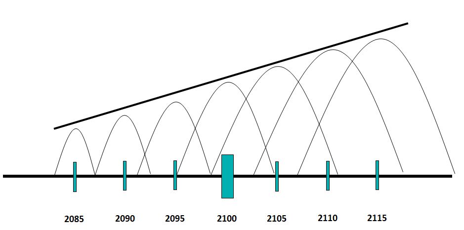
This upward sloping effect links the price of the underlying index with the volatility exposure of the full portfolio. If the underlying index price is high, then the sensitivity of the options to changes in implied volatility will be high as well.
To offset this effect, the options need to be reweighted. The result of this reweighting is illustrated in Figure 2. The options demonstrate the same relative sensitivity to implied volatility in the portfolio regardless of the underlying index price.
Figure 2
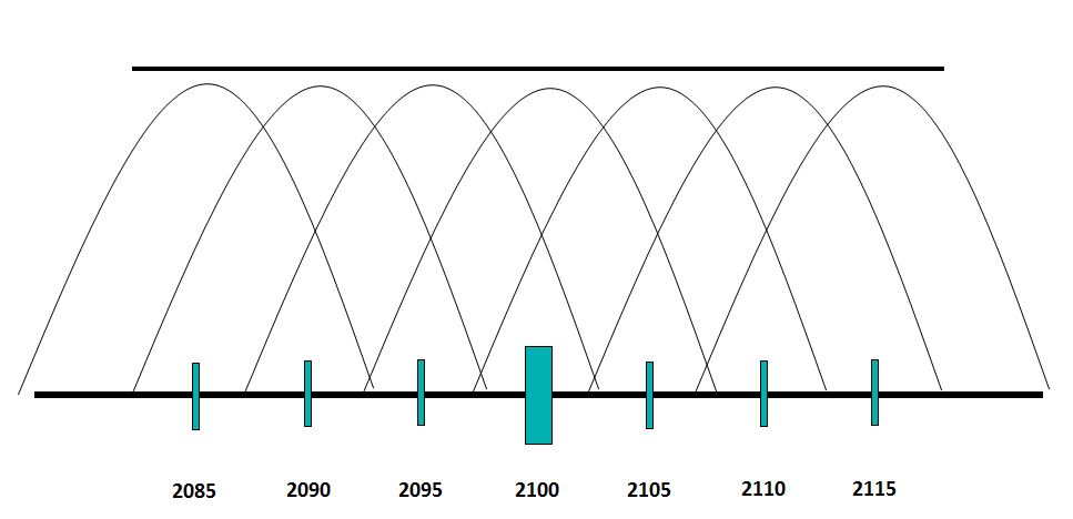
This is achieved through weighting the options by the inverse of their strike prices, squared. So, options with lower strike prices are given a higher weight to make up for the fact that they naturally have less sensitivity to changes in implied volatility.
This is the essence of the VIX calculation: a reweighting of the options so that exposure to implied volatility rises and falls independently of the underlying index price level. This is what allows VIX to be VIX, a pure measure of volatility, uncontaminated by other effects and factors.
For a deeper dive into this concept – and better charts! – I recommend reading a renowned paper published by Goldman Sachs in 1999. The ideas in this piece served as the foundation for the modernization of the VIX methodology, which took place in 2003.
The posts on this blog are opinions, not advice. Please read our Disclaimers.


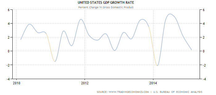
![Source:http://www.worldeconomics.com/papers/Global%20Growth%20Monitor_7c66ffca-ff86-4e4c-979d-7c5d7a22ef21.paper Real GDP data was taken from the World Economics Global GDP database Population data was obtained from the Maddison and the United Nations tables 2012/14 data was calculated from the year on year estimated % increase in real GDP from the IMF tables[1] (Gross domestic product, constant prices, % change)](https://www.indexologyblog.com/wp-content/uploads/2015/05/GDPyoyAmericas.png)