Get Indexology® Blog updates via email.

In This List

Here's How A Rising Dollar Impacts Stocks

Reweighting ESG: Does Changing the Component Weighting Matter?

Energy Stays on Top in April

As U.S. Investment-Grade Corporate Bonds Push Toward Yields of 4%, Will Eurozone Corporate Bonds Ever Make it to Even 1%?

Energy Powers Small Cap And Value In April

Here's How A Rising Dollar Impacts Stocks

Contributor Image
Jodie Gunzberg

Former Managing Director, Head of U.S. Equities

S&P Dow Jones Indices

The U.S. dollar hit a 4 month high last week from concern over potentially faster interest rate hikes to control inflation as oil exceeded $70 per barrel and the lowest unemployment since 2000 was reported.  If the U.S. dollar continues to strengthen, it may be useful to know how U.S. equities moved historically in times when the dollar rose.  Given each size, style and sector has different exposures to the U.S. dollar, there have been differences in the performance of each.

Naturally the largest companies do most international business so have a greater portion of revenues coming from outside of the U.S.  Notice in the table below from S&P Dow Jones Indices research that the S&P 500 has 70.9% of revenue from the U.S.  That is less than the 73.3% of U.S. revenue in the S&P MidCap 400 but is much less than the 78.8% of U.S. revenue generated in the S&P SmallCap 600.  

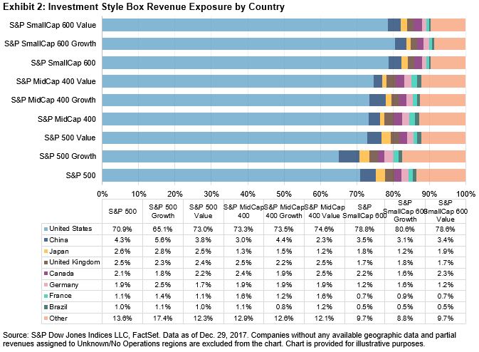
Also, in a recent S&P Dow Jones Indices research paper, an analysis showed the percentage of revenues from the U.S. by sector.  For illustrative purposes, two methods were used to measure the percentage of U.S. revenues, and the results were relatively in line for each method.  Energy showed the most difference between the methods since the three biggest companies in that sector contributed heavily to the overall revenues.  Notice the real estate, telecom and utilities sectors have the highest percentage of revenues domestically. 

Therefore these sectors underperformed in the period measured in the aforementioned paper that was from Nov. 8, 2016 – Dec. 29, 2017, when the U.S. dollar fell roughly 7%.  Likewise, during this period, the technology and materials sectors that have the greatest percentage of revenues coming from overseas, outperformed significantly.  

While the percentage of revenues breakdown by the U.S. and international matters for performance as the dollar fluctuates, in some cases, the companies hedge or partially hedge currency moves, so the currency impact is muted.  Further, there are other factors that may drive outperformance more than the dollar moves. For example, the energy sector underperformed with a falling dollar and rising oil prices, despite having relatively low revenues from the U.S., since many companies hedge against oil price moves to reduce volatility of revenues.

An interesting finding when comparing the impact on U.S. equities from a falling dollar versus a rising dollar is that the sensitivity to the falling dollar is much greater, though the U.S. equities rise on average in either case.  This is much in-line with findings that U.S. equities have historically risen more with interest rate cuts than with hikes, but that with growth, equities can still rise with rates.

On average, the S&P 500 rises 3.7 times more from a falling dollar than a rising one, perhaps since a falling dollar helps the international business, and companies can hedge portions of their international revenues if the dollar rises.  The S&P MidCap 400 is 3.9 times more sensitive to a falling dollar than rising one since a falling dollar gives the mid-size companies a chance to grow international business when the dollar falls.  The mid caps also performed best with the falling dollar. The S&P SmallCap 600 is 3.1 times more sensitive to the falling dollar than a rising one but does better than large- or mid-size companies when the dollar rises.  

On a sector level, materials, financials and energy are all driven more by a falling dollar than a rising one, though energy and materials actually fall with a rising dollar.  This is since the underlying commodities are priced in dollars so the dollar is a powerful driver of these sectors; however, the downside capture ratio when the dollar falls is much greater than the (small negative) upside capture when the dollar rises, so the companies may be skillful at hedging their downside from falling prices of raw materials.  Also, the falling dollar helps the mid-size tech companies significantly more than a rising dollar.  This is since technology has a relatively large portion of revenues coming from outside the U.S. and the mid-size companies have extra room to expand before they mature.

Overall, the S&P SmallCap 600 benefits most from a rising dollar from its heavier U.S. revenue concentration.  On average, historically in the past ten years, for every 1% the dollar rose, small caps gained 95 basis points, mid-caps gained 82 basis points and large caps 71 basis points.  Small-caps in financials have outperformed their bigger counterparts with rising rates.  The financial large-caps have about 20% of their revenues internationally whereas the smaller banks are likely more local so do better (though aren’t that sensitive, rising just 26 basis points per 1% dollar increase) with a rising dollar and with rising rates, but when rates don’t rise, utilities have fared better.  The bottom line is that a rising dollar is not harmful for most stocks, especially small-caps; however, all else equal – energy is too sensitive to the downward pressure on oil with a strengthening dollar.

Source: S&P Dow Jones Indices

Endnote: Exhibits, 2, 10, and 11 were prepared by my colleague, Phillip Brzenk.  Exhibit 2 appeared in Brzenk, P. “How Global Are the S&P 500®, the S&P MidCap 400®, and the S&P SmallCap 600® Style Indices?”, S&P Dow Jones Indices, February 2018. Exhibits 10 and 11 are from Brzenk, P. “The Impact of the Global Economy on the S&P 500®”, S&P Dow Jones Indices, March 2018.

The posts on this blog are opinions, not advice. Please read our Disclaimers.

Reweighting ESG: Does Changing the Component Weighting Matter?

Contributor Image
Kelly Tang

Former Director

Global Research & Design

In a prior blog series,[1] we explored the relationship between environmental (E), social (S), and governance (G) scores and future stock performance. In all three cases, the results showed that top quintile portfolios outperformed the bottom quintile portfolios. However, a deeper analysis revealed that the spread between Q1 and Q5 portfolios was the highest for the G-ranked portfolio (1.68%) and the lowest for the S-ranked portfolio (1.34%) over a long-term investment horizon (January 2001-December 2017). In medium-term periods, such as five-years, the spread returns for the E-ranked portfolio was the highest (2.70%), while the S-ranked portfolio performed the worst (-0.63%).

Therefore, ESG-minded market participants should be aware of their investment time horizon and the return expectations associated with that time horizon.

According to the RobecoSAM scoring process, the relative weights of the ESG score components vary by industry due to materiality. For example, as shown in Exhibit 1, the E dimension warranted a higher weighting in the electric utilities industry compared to the banking or pharmaceutical industries, while the G dimension carried the highest weighting in pharmaceuticals. The total ESG score was then calculated after applying these component industry-specific weights for E, S, and G.

Given the return information derived from component scores and future stock performance analysis, investors may wish to alter the weights of ESG components. To illustrate whether reweighting matters, we calculated two hypothetical ESG portfolios by reweighting the E, S, and G scores for each security and re-ranking the universe (see Exhibit 2). For example, we constructed an ESG – S Light portfolio in which each security in the universe received a weighting of 40% in E, 20% in S, and 40% in G. We also constructed a 50% E and 50% G portfolio in which S was eliminated altogether.

By reweighting, market participants can incorporate the return expectations of ESG components into portfolio construction and overweight the component that is the most economically meaningful to them. Exhibit 3 shows the annualized returns for the three hypothetical portfolios formed using different component weighting combinations. Consistent with previous findings, the bottom Q5 portfolios for all three scenarios performed the worst. It is worth noting that the spread between the top Q1 portfolio and the bottom Q5 portfolio was the highest for the E&G portfolio.

In Exhibit 4, we display all three scenarios and their performance across different investment horizons. Up to this point in our analysis, one of the consistent takeaways was that avoiding the worst quintile and instead opting for the top three quintiles had economic benefits, ranging approximately 200 bps.

Our prior analysis indicated that, while ranking by overall RobecoSAM ESG score could lead to positive returns, the three underlying components had different relationships with future stock performance. Therefore, investors may wish to alter the weight of each component in the overall ESG score.

We found that integrating ESG into the investing process can be a bespoke, highly customized effort because different investors have different views of which subcomponent is material to them.

[1]   Exploring the G in ESG – Part I
Exploring the G in ESG – Part 2
Exploring the G in ESG – Part 3

The posts on this blog are opinions, not advice. Please read our Disclaimers.

Energy Stays on Top in April

Contributor Image
Marya Alsati

Former Product Manager, Commodities, Home Prices, and Real Assets

S&P Dow Jones Indices

The Dow Jones Commodity Index (DJCI) was up 2.9% for April 2018 and up 3.7% YTD, while the S&P GSCI was up 5.0% for the month and 7.3% YTD. Precious metals was the worst-performing sector in the indices and energy was the best.

Exhibit 1 depicts the month-to-date and YTD performance of the sector indices in the S&P GSCI.

Precious metals was down 0.4% for the month and flat for the year, weighed down by a strengthening U.S. dollar. Livestock’s decline of 8.9% YTD erased the gains it earned in 2016, when it finished the year up 8.4%. The loss was driven by price declines in lean hogs, which make up about 32% of the sector and were down 15.1% YTD because of ample global supplies.

The S&P GSCI Energy was up 6.5% for the month, and all the energy commodities were positive for a second consecutive month. Petroleum prices increased as U.S. drilling declined, a decline was seen in global oil stocks, and Saudi Arabia’s Crown Prince, Mohammad Bin Salman, announced to the press in March that Saudi Arabia will be working with Russia on a deal to extend control over major exporters over a period of one to two decades. In April, Brent crude was the best performer, up 8.7%, followed by heating oil, up 6.9%. Natural gas was down 0.1%, due to warming weather conditions.

Of the 24 commodities tracked by the S&P GSCI, 17 were positive in April. Exhibit 2 depicts the April performance of the single commodity indices.

Aluminum was the best-performing commodity in the indices, up 14.9% in April, after proposed sanctions on Russian aluminum producer Rusal were announced. Sugar was the worst-performing commodity in the indices, down 5.2% for the month and off 22.1% YTD, due to a global surplus.

Exhibit 3 depicts the performance for sugar and aluminum since index levels were rebased to 100 on April 30, 2008.

It can be seen in Exhibit 3 that the S&P GSCI Aluminum has reverted back to its late-2014 levels, when demand exceeded supply, while the S&P GSCI Sugar has reverted to its 1999 levels. To understand the concept of index levels, a hypothetical portfolio of USD 100 tracking an index based at 100 would increase by USD 20 if the index levels increased to 120 and decrease by USD 20 if the index level declines to 80.

The posts on this blog are opinions, not advice. Please read our Disclaimers.

As U.S. Investment-Grade Corporate Bonds Push Toward Yields of 4%, Will Eurozone Corporate Bonds Ever Make it to Even 1%?

Contributor Image
Heather Mcardle

Director, Fixed Income Indices

S&P Dow Jones Indices

The European Central Bank (ECB) announced last Thursday, April 26, 2018, that it would maintain its monetary policy and bond-buying program, as growth in the eurozone slowed in the first quarter. The ECB corporate bond purchases have pushed yields in the region to their lowest since the financial crisis. Inflation targets in the region are not expected to be reached and monetary stimulation could continue for longer than expected. Corporate bond yields are dramatically lower than comparable U.S. and UK markets. Investors in the region have speculated on the effect a cut in monetary stimulus would have on the asset class. Today’s announcement continued the uncertainty and the likelihood that eurozone corporate bond yields are not poised to rise anytime soon.

The U.S. investment-grade corporate bond market has seen yields getting progressively higher with the U.S. Fed Rate hikes over the past year. The S&P 500® Investment Grade Corporate Bond Index, which is designed to measure the performance of U.S. corporate debt issued by constituents in the S&P 500 with an investment-grade rating, yielded 3.85% as of April 25, 2018—rising 74 bps year-over-year. Meanwhile, the S&P Eurozone Investment Grade Corporate Bond Index has seen its yield rise only 1 bps in the past year, going from a yield of 0.77% to 0.78%. The eurozone index yield sank to lows of 0.50% back in November 2017. The option-adjusted spread (OAS), which measures the spread over a risk-free rate (usually a treasury/government bond), for both indices has tightened in the past year between 8 bps and 16 bps, showing the effect the ECB’s bond purchasing program has had on eurozone corporates. German bunds have largely been range-bound in the sub 0.10% level, while U.S. Treasury yields have risen nearly 100 bps in the past year. Despite concerns that the asset class could be subject to a correction once the ECB switches monetary policy, and despite the attractiveness of higher rates in the U.S., a weaker-than-hoped-for European economy may keep corporates below the 1% level for longer than expected.

The posts on this blog are opinions, not advice. Please read our Disclaimers.

Energy Powers Small Cap And Value In April

Contributor Image
Jodie Gunzberg

Former Managing Director, Head of U.S. Equities

S&P Dow Jones Indices

In April, the S&P 500 (TR) gained 0.4%, ending its first consecutive monthly loss in almost two years, but the index is still down 0.4% year-to-date (ending April 30, 2018.)  Mid caps are also down for the year, -1.0%, after the S&P 400 (TR) lost 0.3% in April.  However, Small caps pushed into positive territory, up now 1.6% year-to-date, from the S&P 600 (TR) gain of 1.0% in April.

Source: S&P Dow Jones Indices

Overall, 6 of 11 sectors gained in large and mid caps while 8 of 11 gained in small caps.  Energy led the gains across the size spectrum with total returns of 9.4%, 13.4% and 16.6%, respectively in large, mid and small caps that more than tripled the next best sector’s returns (S&P 500 Consumer Discretionary gained 2.4%, S&P 400 Utilities gained 3.9%, and S&P 600 Telecommunications gained 5.9%.) It  was the S&P 500 Energy’s 17th best month on record since October 1989, and it gained most since Sep. 2017.  Consumer Staples posted its 28th worst month in history, losing 4.3%, making it the 3rd consecutive monthly loss and worst 3-month loss (-12.5%) since the 3 months ending in Feb. 2009.

Source: S&P Dow Jones Indices

Energy’s outperformance not only propelled small caps to outperform large caps (since smaller energy companies rise more with oil) but drove value to outperform growth.  The S&P 500 Value has 12.5% more energy than the S&P 500 Growth, which has nearly none. While the value outperformed growth across all sizes for the first time in 2018, the mid and small caps had a much greater premium (respective 1.8% and 1.3%) than the large cap premium at 0.2%.  The mid cap premium was the most since Nov. 2016 and the small cap was most since Sep. 2017.  It is also the first time large cap value outperformed growth for 4 of 6 months since the second half of 2016.

Source: S&P Dow Jones Indices

As shown at the end of 2017, when growth and large caps outperform as much as they did in 2017 (that was the most since 1999,) the trend reverses.  That’s what seems to be happening now.


The posts on this blog are opinions, not advice. Please read our Disclaimers.