Get Indexology® Blog updates via email.

In This List

Energy Stocks Beat Oil Futures In Rising Inflation

Can Realized Volatility Predict Future Volatility for Preferred Securities?

India ETFs Wrap-up: 2017

What a Portfolio Might Look Like After Adding a Pinch of Real Assets

Vectors of Volatility

Energy Stocks Beat Oil Futures In Rising Inflation

Contributor Image
Jodie Gunzberg

Former Managing Director, Head of U.S. Equities

S&P Dow Jones Indices

There may be a legitimate concern about rising inflation since inflation has been under the Fed’s target for years and there is now very low unemployment with signs of accelerating economic growth.  The low unemployment rate and strong growth are probably positive for the stock market and the tax cuts may provide even more upside.  However, if inflation upticks and the Fed raises rates to slow it, the increased cost of capital and likely drop in consumer spending may put pressure on stocks.

Understanding more about how to position equities in the event of rising inflation may be useful in this uncertain time.  In conjunction with the impacts on stocks from accelerating growth and the falling dollar, a more complete picture of investment strategy inside an equity allocation can be formed.  Small-caps benefit most from accelerating growth, mid-caps do best from a falling dollar, and what will be shown in this analysis is that mid-caps are most sensitive to inflation, and energy is by far the most sensitive sector.  Also what is interesting is that though crude oil itself is more sensitive to inflation than the energy equities, once the roll yield of the futures contracts is considered, all the benefit is lost.

Let’s start with the 10 year correlation using monthly year-over-year data of index levels and CPI (Consumer Price Index.)  Overall, equities are not that correlated with inflation at just over 0.2.  However, the energy sector correlation to inflation of 0.6 is triple the correlation of the broad equities to inflation.  The crude oil futures are even more correlated to inflation, measuring over 0.8, that is considered highly correlated.  This is because energy is the most volatile component of CPI, essentially driving it.

Source: S&P Dow Jones Indices. https://www.bls.gov/cpi/

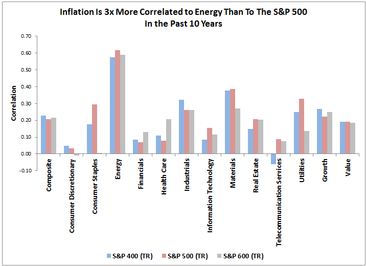
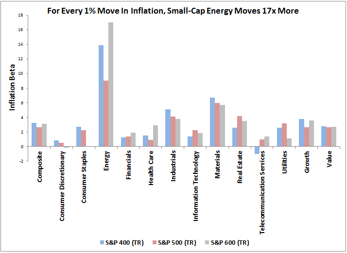
Another common measure used to evaluate the sensitivity of assets to inflation is called inflation beta.  It means, “if there was a 1% change in CPI, then there was an x% change in the index.”  For example, in the chart below, for every 1% rise in inflation there was a 17% increase on average for small-cap energy stocks.  The S&P MidCap 400 is the most sensitive broad-based index, with an inflation beta of 3.3, only slightly higher than the 3.1 inflation beta of the S&P 600, but markedly higher than the 2.6 inflation beta of the S&P 500.  Again, the crude oil futures have an even higher inflation beta than the equities at about 20.  Since the small-caps are least likely to hedge, they may benefit most with rising oil and inflation.

Source: S&P Dow Jones Indices. https://www.bls.gov/cpi/

One might conclude that for inflation protection, crude oil is the best bet.  Though the problem with getting inflation protection with crude oil futures is that market participants need to pay storage costs, reflected through the roll yield when there is excess inventory.  In a decade plagued with high inventory, this has cost crude oil futures investors an additional 48% beyond the -37% lost in the spot market.  The result has been a negative up market capture ratio of -109.7, meaning for every 1% rise in inflation, the S&P GSCI Crude Oil Excess Return actually fell by 1.1% on average in the past 10 years.

Given equities are better than futures for inflation protection, after the roll yield is included, and that small-caps and mid-caps have done best with accelerating growth, the falling dollar and rising inflation, perhaps the strategy might be to underweight large caps.

The posts on this blog are opinions, not advice. Please read our Disclaimers.

Can Realized Volatility Predict Future Volatility for Preferred Securities?

Contributor Image
Hong Xie

Former Senior Director, Global Research & Design

S&P Dow Jones Indices

The investment community routinely uses historical realized volatility as an indicator of future volatility. One prominent example of this is the construction of ranking-based, low volatility equity strategies where realized volatility is used to form low volatility portfolios. Can the realized volatility of an asset indicate its future volatility? We extend the low volatility analysis to U.S. preferred stocks to see if the low volatility effect is present in other asset classes. For our analysis, the S&P U.S. Preferred Stock Index is used to represent the investment universe of U.S. preferred stocks.

To construct a low volatility factor portfolio, it is common to select securities that had low realized volatility over a pre-specified period and hold the portfolio for the subsequent n months. Accordingly, in our analysis, we measure the relationship between the realized volatility over the previous one-year period and that of the subsequent three months across all preferred securities in the universe for each quarterly rebalance date.

Exhibit 1 shows the volatility for the next three months versus the realized volatility for the past year in scatter plots. The top plot shows a positive relationship between these two sets of realized volatility. Moreover, the relationship seems to be exponentially related, rather than linearly. The bottom graph plots the two sets of volatility in natural logarithm terms and shows a more linear relationship than the top plot.

In Exhibit 2, we show the rolling correlation, where at each time point the correlation is calculated between the realized volatility over the past year and the realized volatility over the next three months for all the preferred stocks in the universe as of each quarterly rebalance date. Since low volatility factor portfolios typically select securities using volatility rank, we also calculated the correlation of volatility ranks based on these two sets of realized volatility.

The top panel shows that the correlation of the logarithmic volatilities seems to be more stable than that of the volatilities themselves for each point in time. The bottom panel shows that the correlation of volatility rank and the logarithmic volatility rank are identical. Since October 2003, the average correlation of the rank of the two sets of volatility is 0.66.

The analysis shows that, on average, a preferred stock that ranks low or high based on its realized volatility over the past year is likely to continue to rank low or high for the volatility exhibited in the next three months. This lends support to arguments for using realized volatility to construct a low volatility factor portfolio for preferred stocks.

The posts on this blog are opinions, not advice. Please read our Disclaimers.

India ETFs Wrap-up: 2017

Contributor Image
Mahavir Kaswa

Former Associate Director, Product Management

S&P BSE Indices

Until 2013, the exchange-traded fund (ETF) industry in India was in a nascent stage, with negligible assets under manager (AUM). As of Dec. 31, 2013, the total AUM for ETFs was INR 8,000 crores (or USD 1.2 billion), out of which commodities-based ETFs tracking gold noted the largest share, with total AUM of INR 6,500 crores (USD 1 billion). Starting with such a small base, the ETF industry noted exponential growth over the past four years, primarily driven by a decision from the Employee Provident Fund Organization (EPFO, one of the largest pension houses in India) to start investing in equities-based ETFs, including those tracking the S&P BSE SENSEX, as well as the Government of India’s decision to disinvest its holdings via ETFs.

As of Dec 31, 2017, the total AUM of the ETF industry stood at INR 78,000 crores (USD 12 billion), with an annualized growth rate of 76.6% during the past four years. The industry saw four new product launches in 2017, including the Bharat 22 ETF, which tracks the S&P BSE Bharat 22 Index and had the largest (by AUM) single ETF launch ever worldwide. This ETF was part of the disinvestment of listed government-owned companies in India.

Exhibit 1: Growth of ETF AUM – India 


Among the three asset classes, equities noted the highest increase, with an annualized growth of 213% over the past four years. The exponential growth was also supported by a sustained bull run in Indian and global markets, with the S&P BSE SENSEX, S&P BSE MidCap Select, and S&P BSE SmallCap Select increasing 29.56%, 53.23%, and 51.13%, respectively over calendar year 2017.

The posts on this blog are opinions, not advice. Please read our Disclaimers.

What a Portfolio Might Look Like After Adding a Pinch of Real Assets

Contributor Image
Marya Alsati

Former Product Manager, Commodities, Home Prices, and Real Assets

S&P Dow Jones Indices

In December 2015, S&P Dow Jones Indices launched the S&P Real Assets Index, the first index of its kind, which is designed to measure global property, infrastructure, commodities, and inflation-linked bonds, using liquid and investable component indices that track public equities, fixed income, and futures.

The S&P Real Assets Index includes global infrastructure (35%), property (25%), natural resources (35%), and inflation-linked bonds (5%), using stocks (50%), bonds (40%), and futures (10%). It is constructed as an index of indices, using the components and weights shown in Exhibit 1.

Why Use Real Assets?

The two main reasons market participants might consider using real assets are diversification and inflation protection. The S&P Real Assets Index design incorporates both equities and fixed income to more fully represent companies, and it adds commodity futures for more direct exposure to natural resources. The result is that market participants may achieve more diversification and inflation protection than with just equities or with any single asset inside the index.

As shown in Exhibit 2, the S&P Real Assets Index has provided relatively strong inflation protection, with an inflation beta of 4.46, as measured by monthly and year-over-year returns of the index and the CPI, compared with 2.4 for the S&P 500® and the negligible inflation protection of the S&P U.S. Aggregate Bond Index. Inflation beta can be interpreted as a 1% increase in inflation resulting in a 4.46% increase in the return of the S&P Real Assets Index.

Real assets are moderately correlated to each other, since their underlying characteristics are alike in many ways, and, while they have a strong correlation to the S&P 500 (83.0%), they have a more modest correlation to the S&P U.S. Aggregate Bond Index (28.1%). In addition, including real assets in a portfolio offers access to a larger spectrum of assets.

Exhibit 3 depicts two hypothetical portfolios—one with an allocation of 60% to equity and 40% to bonds, and the second with a 50/40/10 allocation to stocks, bonds, and real assets, respectively.

While the annualized return for the one-year period dropped slightly from 14.0% for the equity/bond portfolio to 12.9% for the portfolio that includes real assets, the annualized risk declined as well. The numbers are not mediocre, considering the historical drawdown natural resources have suffered over the past 10 years and the rally of U.S. equities in 2017. It is important to note that analysis up until the end of 2015 showed that the Sharpe ratio increased from 0.47 for the equities benchmark to 0.68 for the equity/bond portfolio and to 0.7 for the portfolio that included real assets.

The posts on this blog are opinions, not advice. Please read our Disclaimers.

Vectors of Volatility

Contributor Image
Fei Mei Chan

Former Director, Core Product Management

S&P Dow Jones Indices

Risk is once again part of investors’ vocabulary. Through yesterday’s close, the S&P 500 lost a total of 6%, made all the more jarring by the practically straight line rise in most of 2018 prior to the losses. Volatility has, of course, ticked up, but in the context of the broader 27 year history, not dramatically so.

ROLLING 21-DAY VOLATILITY FOR S&P 500

While the stock market’s recent declines seem quite traumatic (in point terms, the Dow Jones Industrial Average’s decline was a record), insight into the factors that contribute to volatility may alleviate some worries.  The dispersion-correlation map below gives us a way to put the recent jump in market volatility into context.  A rolling 21-day look at the dispersion and correlation levels so far this year shows a general trend of increasing dispersion.  As of the market’s close on February 5th, dispersion had increased to slightly higher than median levels, and correlation made a significant jump.

ROLLING 21-DAY DISPERSION-CORRELATION YEAR-TO-DATE

The longer-term dispersion-correlation map below shows that 2017 was among the sleepiest of years and, in the context of stock dispersion and correlation, was similar to the boom years of the mid 1990s when volatility was also subdued.  Current conditions are at approximately the same levels as in 2011 (a year that experienced significant volatility mid-year but ended more or less flat).

Years of extreme market distress such as 2000 and 2008 witnessed dispersion levels that were much higher than the current environment.  If the past is any gauge, therefore, what has happened in the last week hasn’t propelled us to crisis levels.

DISPERSION-CORRELATION MAP

The posts on this blog are opinions, not advice. Please read our Disclaimers.