Get Indexology® Blog updates via email.

In This List

Exploring the G in ESG: Governance in Greater Detail – Part I

How Did Australian Active Funds Perform in 2017?

There's Nothing Equal About Equal Weight Returns

Green Bond Issuance Doubled in 2017

A new volatility regime? VIX® don't think so!

Exploring the G in ESG: Governance in Greater Detail – Part I

Contributor Image
Kelly Tang

Former Director

Global Research & Design

There is increasing evidence of the link between ESG and financial outperformance as better data quality, standardized data, longer data history, and heightened interest in assessing the materiality of ESG drives continued research. However, there is already substantial empirical evidence to suggest that the “G” aspect of ESG ultimately yields better corporate returns.

Governance data, unlike environmental or social data, has been compiled for a longer period of time and the criteria for what comprises good governance and its classification has been more widely discussed and accepted. Harvard researchers Gompers, Ishii, and Metrick (2003)[1] constructed a Governance Index (G-Index) consisting of 24 governance provisions that weaken shareholder rights and ranked companies based on their scores.

Subsequent research from Bebchuk, Cohen, and Ferrell (2009)[2] identified six corporate governance provisions that are associated with what is considered poor governance and that negatively affect valuation. These six provisions are called the “E-Index” (E for entrenchment), and while they (Bebchuk, Cohen, and Wang, 2012)[3] found that both the G-Index and E-Index would have resulted in abnormal returns in the 1990s, the premium dissipated in the 2000s as the markets learned to distinguish between firms with good governance and those with poor governance and price these discrepancies accordingly.

Through a blog series on governance, we will be detailing what the categories and criteria are that define good governance. For sustainability research, S&P Dow Jones Indices partners with RobecoSAM, an asset manager known for its Corporate Sustainability Assessment (CSA), resulting in an overall sustainability score for companies in addition to the three underlying dimension scores that measure their environmental, social, and governance performance.

Economic Dimension Score

Based on RobecoSAM’s definition, the governance score is referred to as the economic dimension score (EDS), as it evaluates the corporate governance performance of companies but includes additional key measurements that evaluate the quality of a company’s management systems as well as its ability to manage long-term risks and opportunities. In order to understand the G component of ESG and how it affects stock performance, it is helpful to delve deeper into what constitutes good governance.

There are eight specific EDS criteria as outlined in Exhibit 1. The first is corporate governance, which evaluates the systems that ensure a company is managed in the interests of its shareholders (including minority shareholders).

Codes of business conduct addresses business ethics and whether the company’s code of conduct and compliance practices are designed to prevent bribery and corruption in the organization. Companies active in countries with weak anti-corruption laws are exposed to additional reputational and legal risks.

Risk and crisis management examines the effectiveness of the company’s risk management organization and practices, including the independence of risk management from business lines as well as the identification of long-term risks, their potential impact, and the company’s mitigation efforts.

Supply chain management is becoming increasingly important as companies expand to operate on a global level. When a company outsources its production, services, or business processes, it also outsources its own corporate responsibilities and its reputation. Companies need to have strategies in place to manage the associated risks and opportunities posed by their supply chain.

The tax strategy criteria examines the degree to which the company has a clear policy on its approach to taxation issues and an awareness of the extra-financial risks associated with the company’s tax practices.

The materiality score aims to assess the company’s ability to identify the sources of long-term value creation, understand the link between long-term issues and the business case, develop long-term metrics, and transparently report these items publicly.

In the policy influence criteria, RobecoSAM evaluates the amount of money companies are allocating to organizations whose primary role is to create or influence public policy, legislation, and regulations. Companies are also asked to disclose the largest contributions to such groups.

Impact measurement and valuation strives to assess whether companies have business programs for social needs, such as strategic social investments, and if they are measuring and valuing their broader societal impacts with metrics. Companies need to analyze the impacts of externalities that are not currently reflected in financial accounting, but which, over time, may have the potential of becoming priced in.

As discussed and laid out in this blog, the EDS comprises more than a traditional governance score. The inclusion of risk and crisis management, supply chain management, and tax strategy criteria differentiates the RobecoSAM EDS from a traditional governance score that relies heavily on more standard corporate governance metrics. In the next blog in this series, we will examine whether the EDS contains risk/return information and how it may impact future stock performance.

[1]   https://papers.ssrn.com/sol3/papers.cfm?abstract_id=278920

[2]   https://papers.ssrn.com/sol3/papers.cfm?abstract_id=593423

[3]   https://papers.ssrn.com/sol3/papers.cfm?abstract_id=1589731

If you enjoyed this content, join us for our Seminar Discover the ESG Advantage in
London on May 17, 2018.

The posts on this blog are opinions, not advice. Please read our Disclaimers.

How Did Australian Active Funds Perform in 2017?

Contributor Image
Priscilla Luk

Managing Director, Global Research & Design, APAC

S&P Dow Jones Indices

The SPIVA® Australia Scorecard reports on the performance of actively managed Australian mutual funds against their respective benchmark indices over various investment horizons. In the year-end 2017 report, we extended the analysis to 15 years.

In 2017, the majority of Australian funds in most categories underperformed their respective benchmarks, apart from the Australian A-REIT category. There were 74%, 69%, and 59% of funds in the Australian Equity Mid- and Small-Cap, Australian Bonds, and Australian Equity General categories, respectively, that underperformed their respective benchmarks. Over the 10- and 15-year periods ending Dec. 31, 2017, a minority of funds in most categories delivered higher returns than their respective benchmarks. Less than 15% of International Equity General and Australian Bonds funds and less than 30% of Australian Equity General and Australian Equity A-REIT funds managed to outperform their respective benchmarks on an absolute basis.

Apart from comparing active funds against their respective benchmarks to evaluate their performance, persistence is an additional test that reveals fund managers’ skills in different market environments. Results from the latest Persistence of Australian Active Funds report show that a minority of high-performing funds in Australia persisted in outperforming their respective benchmarks or consistently stayed in their respective top quartiles for three consecutive years, and even fewer maintained these traits consistently for five consecutive years.

Out of the 177 top-quartile Australian active funds in 2013, only two of them (1.1%) remained in the same quartile for the next four consecutive years (2014-2017). Among the 382 Australian active funds that beat their respective benchmark in 2013, only four of them (1.0%) managed to continue their outperformance over the following four consecutive years (2014-2017).

Overall, identifying outperforming active funds is challenging, because the majority of funds delivered lower returns than their respective benchmarks in most categories, as shown in the SPIVA Australia Scorecard. Considered together with the observed weak performance persistence for top-performing funds in Australia across three- and five-year periods, finding funds that beat the benchmark for several consecutive years may appear an inconceivable mission.

The posts on this blog are opinions, not advice. Please read our Disclaimers.

There's Nothing Equal About Equal Weight Returns

Contributor Image
Jodie Gunzberg

Former Managing Director, Head of U.S. Equities

S&P Dow Jones Indices

Let’s use the S&P 500 as a starting point since it is the most basic beta, or representation of the U.S. stock market.  Since its launch in 1957, it has grown with the stock market and has become the most widely used benchmark of the U.S. stock market with numerous products tracking it.  Although in the beginning of its history, it tracked basically the entire stock market, it still captures about 80-85% of the total market today.

In order to be included in the S&P 500, a stock must be a common stock of a U.S. company, there should be a minimum market cap of $6.1 billion with at least half of outstanding shares available for trading, and there should be a positive sum of the most recent 4 quarters of earnings with the last quarter positive.  However, once the stocks are in the index, they don’t necessarily need to meet these criteria to remain in the index.  The index is reviewed at least monthly to determine any changes, and there have been about 20-25 changes per year based on events that happen to the companies such as mergers and acquisitions.

There are currently 505 constituents with a median market cap of $21.6 billion and average market cap of $48.4 billion.  In the index, the stocks are weighted by float adjusted market capitalization.  The results is the top ten constituents make up just over 20% of the S&P 500, and information technology is the biggest sector, making up over 25% of the index.  Together with the financial sector, they comprise about 40% of the index.

Source: S&P Dow Jones Indices, LLC. As of close of business March 7, 2018.

While the S&P 500 represents the U.S. stock market and can be considered the purest beta, the return profile may not be for everyone.  So, many managers have entered the industry through the past several decades trying to beat the index.  With that has come much great research, in particular, showing a small cap premium.  In 1984, on the back of research by Rolf Banz, Russell launched the Russell 2000 to measure their small cap managers in their consulting business, and most of the time, the managers were able to beat the benchmark.

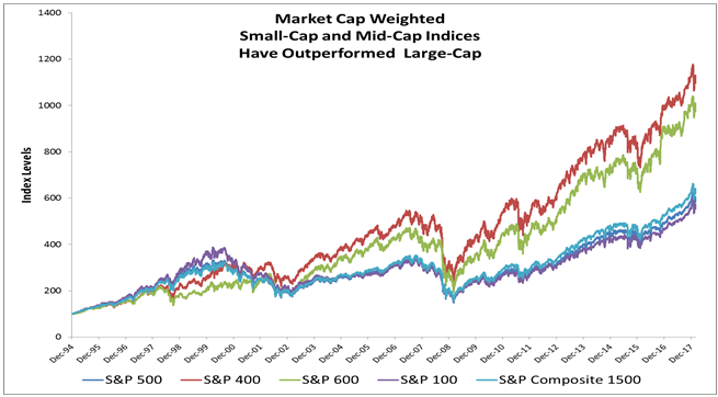
However, a decade later, the better known Nobel prize winner Eugene Fama and his co-author Kenneth French introduced the 3-factor model using market risk and value in addition to small cap, and it has since been shown by many, including Assness, the small cap premium is stable and significant when quality is a factor.  This research led to the development of the S&P MidCap 400 and S&P SmallCap 600 by 1994, which are much harder for managers to beat, and it is important for the exposure and performance in equally weighted and pure style indices.

Source: S&P Dow Jones Indices, LLC. Index levels from Dec 31, 1994 as of close of business March 6, 2018

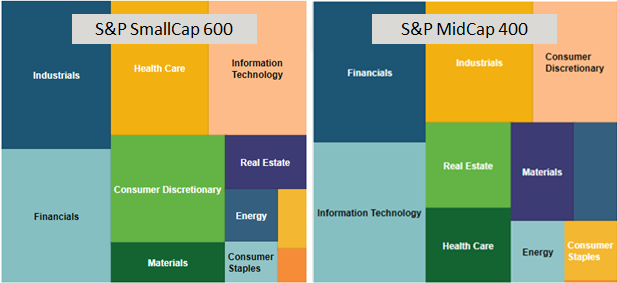
The S&P MidCap 400 and the S&P SmallCap 600 are constructed similarly to the S&P 500 with market capitalization ranges between $1.6 and $6.8 billion for mid-cap and between $450 million and $2.1 billion for small-caps.  While there is still representation across the 11 sectors, and the financials and technology still add up to around 40% in the midcap index, the weights in the two sectors are much more evenly split.  Also, the top ten holdings only make up about 7% of the S&P MidCap 400 that is much less than the 20% of the S&P 500 constituted by its top ten.  The S&P Smallcap 600 concentration is similar to the mid-cap but the technology sector continues to shrink, replaced by industrials.  Together the industrials and financials make up about 35% of the small-caps and the top ten are still about 7% of the index.

Source: S&P Dow Jones Indices, LLC. As of close of business March 8, 2018

These indices are both more well diversified than the S&P 500, and contribute to the S&P 500 Equally Weighted Index returns versus the 500 itself.  Equally weighted indices have a smaller market capitalization mathematically so have outperformed the market cap weighted indices over the long-term.  Simply, the S&P equally weighted indices for their respective sizes use the universe from relevant the market cap universe and allocate 100%/(n stocks) weight to each stock, then rebalances quarterly.  For example, the S&P 500 Equal Weight Index rebalances quarterly to equal weight each stock in the S&P 500 at the company level of 1/500 = 0.02%.

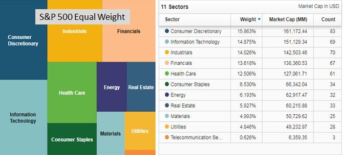
This results in an index with a concentration as a result of the number of stocks rather than by market capitalization.  The top ten amount to about 2.5% of the index while the consumer discretionary sector rises to the top of weights but with technology, industrials, financials and health care not far behind.  The largest holding as of March 7, 2018 was Netflix at 0.34%, which is a function of performance since the last quarterly rebalance. This is far more diversified than the top ten of the S&P 500 that make up over 20% with nearly 4% in Apple.

Source: S&P Dow Jones Indices, LLC. As of close of business March 07, 2018

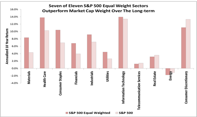
The equally weighted indices across the sizes have outperformed their market cap weight counterparts in the long run, annualized over ten years.  This is since the equally weighted indices have smaller market capitalization by the simple math of construction.  This biggest impact naturally is from the large caps in the move from market cap weighted 500 to equally weighted 500 with a gain of 1.6% annualized.

Source: S&P Dow Jones Indices, LLC. As of close of business March 7, 2018

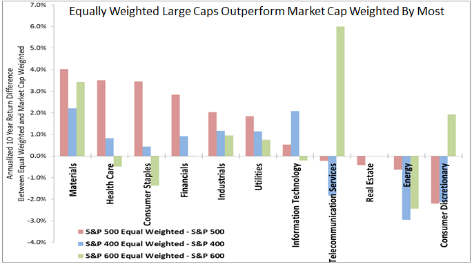
Also, on average for most sectors the equally weighted outperformance is greatest for large caps.  However, equally weighted technology midcaps have had a greater premium than the other sizes, while small-cap equally weighted had the highest premium for consumer discretionary and telecom. Telecom is harder to measure since there are barely any companies in the large and midcaps with only 3 large and 1 mid– as opposed to 9 in small cap. Also, the technology mid caps may have a bigger premium from the increased international business growth opportunities in that segment of the market.  Technology has more international revenues than any other sector and the midcaps are big enough to go global but small enough to get new business growth.

Source: S&P Dow Jones Indices, LLC. As of close of business March 7, 2018.

While on the whole the S&P 500 Equal weighted Index is more diversified and has provided a small cap risk premium, and this premium also holds for the majority of the sectors, it doesn’t hold for all.  Sometimes larger size helps, depending on sector or market environment.  For example, in energy, many of the larger energy companies hedge against falling oil prices, so in the past decade of fallen oil, the large companies may not have fallen as much with the price of oil.  On the flip side, when oil rises, the same unhedged companies that are smaller (if they survived the downturn) will probably rise more than their bigger and better hedged counterparts. Though smaller companies can be more nimble, there are instances where larger size is useful for purchasing power or distribution.

Source: S&P Dow Jones Indices, LLC. As of close of business March 7, 2018.

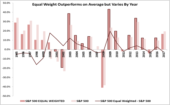
Lastly, when looking at the performance annually, there are specific periods where the S&P 500 equal weight outperforms the S&P 500.  This generally happens in cycles and has fundamental underpinnings that support smaller stocks. Interesting times when equal weights underperformed have been in the financial crisis when smaller companies were beaten down by the credit environment, and recently last year when the market was anticipating Trump’s tax cuts but were delayed so the excitement over small caps diminished.  In 2017, large caps have outperformed small caps by the most since 1999, which historically does not hold.

Source: S&P Dow Jones Indices, LLC. As of close of business Dec. 29, 2017.

In an environment where rising interest rates, accelerating growth, possibly rising inflation and a falling dollar are in place, it may help small and mid caps, especially in energy, financials, materials and information technology.  The equally weighted indices may be a good choice for smaller cap exposure without making a separate small-cap allocation.


The posts on this blog are opinions, not advice. Please read our Disclaimers.

Green Bond Issuance Doubled in 2017

Contributor Image
Dennis Badlyans

Former Associate Director, Global Research & Design

S&P Dow Jones Indices

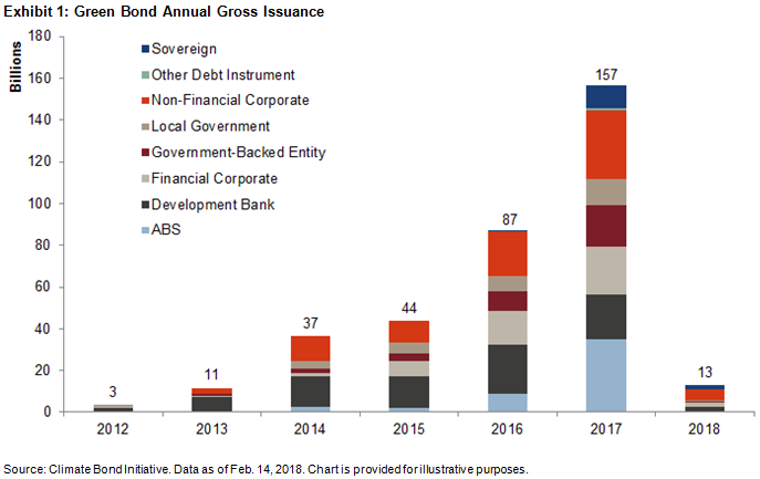
Gross issuance of green bonds reached USD 157 billion in 2017, nearly double that of the previous year. Fourth quarter issuance was the fastest quarterly pace on record, adding USD 48 billion, 30% more than seen in each of the previous three quarters.

Issuers and issuance types continue to diversify. Asset-backed security (ABS) issuance had the largest year-over-year increase, accounting for USD 36 billion (23% of gross 2017) of total issuance, up from USD 8.6 billion (8.6% of gross 2016). Development Banks, which historically have been the dominant issuers, issued USD 21 billion (14% of gross 2017), down from USD 24 billion (28% of gross 2016) the previous year. Sovereign issuance, which began with Poland in December 2016, has grown to USD 14 billion as of March 2018, with French Treasury, Fijian, Nigerian, Belgium, and Indonesian sovereign bonds. Hong Kong outlined a grant for first-time green corporate bond issuers and plans to issue the largest amount of green sovereign bonds this year.

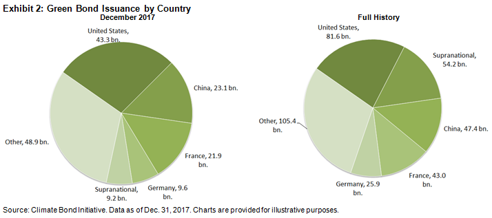
Despite steady persistence of issuance from China, the U.S. took the top spot in 2017, driven by the increase in ABS issuance. China, a latecomer to the green bond market, took second place, despite the outsized sovereign issuance by the French government, and held on to its third place spot in total issuance.

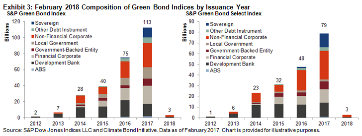
USD 113 billion of the primary issuance in 2017 qualified for the S&P Green Bond Index, which is designed to track the global green bond market. The primary inclusion rule for the broad index is price availability—currently, the USD 26.3 billion of Fannie Mae ABS issuance is not being included. Of the bonds included in the broad index, 70% by market value qualified for the S&P Green Bond Select Index. This narrower index further limits inclusion with more stringent financial and extra-financial eligibility criteria (see Exhibit 3).

The S&P Green Bond Select Index can help diversify core fixed income exposure away from treasuries. Despite the ramp up in sovereign issuance, agencies, supras, and local authorities account for the lion’s share of the S&P Green Bond Select Index, representing 60% of the index, while treasury bonds constitute less than 6%. In comparison, core fixed income markets are primarily made up of treasuries. For example, in the Bloomberg Barclays Global Aggregate Bond Index, treasuries make up about 60% of the index.

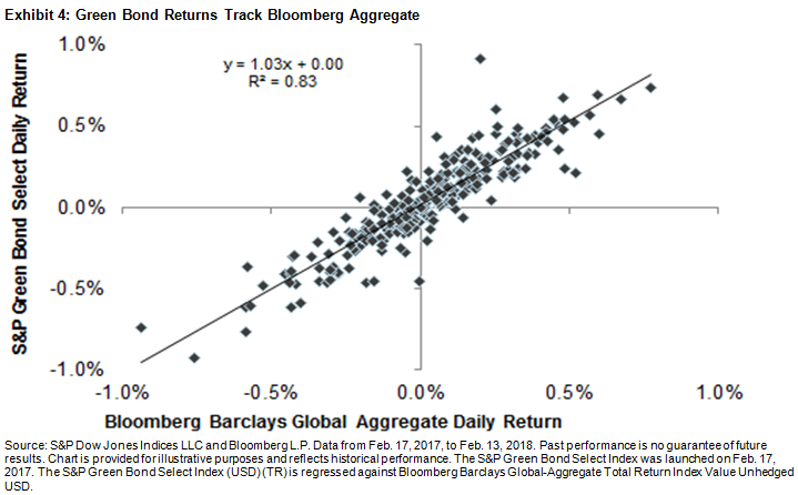
Investors looking to add an element of green exposure to their core portfolio may be able to replace a portion of their global aggregate bonds with green bonds without sacrificing performance. Despite the differences in composition, historical performance of green bonds has been much like the aggregate index. Over the past year, when regressing the daily returns of the S&P Green Bond Select Index against the Bloomberg Barclays Global Aggregate, there was a 0.91 correlation, with a statistically significant (at 95%) slope of 1.03, and a small positive alpha (see Exhibit 4). That means that market participants looking to green up their portfolio may not need to sacrifice performance to do so.

The posts on this blog are opinions, not advice. Please read our Disclaimers.

A new volatility regime? VIX® don't think so!

Contributor Image
Hamish Preston

Head of U.S. Equities

S&P Dow Jones Indices

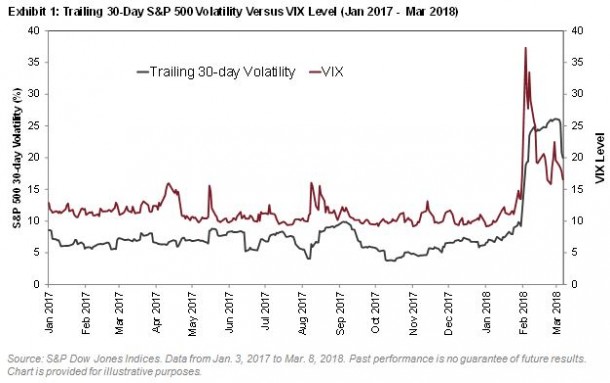
Global equity markets experienced a challenging February.  A U.S.-led selloff triggered a spike in volatility; the Cboe Volatility Index (VIX) recorded its largest ever daily increase on February 5 to reach its highest level since August 2015.

But is higher volatility here to stay?

Towards the end of last year, we published a paper – and a practitioner’s guide – offering a way to convert a VIX level into an estimate for future S&P 500® volatility.  Using the steps outlined in these papers (and a previous blog post), we calculate that given the recent market environment, we might expect the VIX to be around 24.061.  Instead, it closed last night at around two-thirds of that: ending the day at 16.54.

The significant difference between the actual and expected level of VIX suggests that realized volatility may decline at a faster-than-usual rate from its present highs.  In numerical terms, the details of our paper – applied to the present circumstances – tell us that we might anticipate S&P 500 volatility of around 11% (annualized) over the next 30 days2.  Of course, this is a far from perfect prediction; the actual realized volatility of the S&P 500 is extremely unlikely to be exactly as predicted.

Nonetheless, once suitably interpreted, the information encoded in VIX has a moderately impressive record in predicting future changes in volatility.  Despite the recent uptick in volatility, VIX is telling us that market participants are expecting a return to calmer waters.

(1,2) Realized volatility in the S&P 500 over the last 30 days was 19.97% annualized, giving an expected “mean reverted” (MR) volatility of 18.52%.  Adding the expected premium of 5.54 for this level of MR volatility provides an Expected VIX of 24.06.  Subtracting the 7.52% difference between VIX and Expected VIX from the MR volatility of 18.52% provides the expected volatility of 11.00%.  See “Reading VIX: Does VIX Predict Future Volatility?” for more details of both calculations.

The posts on this blog are opinions, not advice. Please read our Disclaimers.