Get Indexology® Blog updates via email.

In This List

Exploring the G in ESG: E & S and Performance – Part 3

Indexing Canadian REITs: A Look at the S&P/TSX Capped REIT Income Index

Standard Benchmarks Extend Standard of Living Through Retirement

Innovation in Indexing: Incorporating Options in Indexes to Help Achieve Defined Investment Outcome as a Packaged Solution

Index Investing – The Growing Mantra

Exploring the G in ESG: E & S and Performance – Part 3

Contributor Image
Kelly Tang

Former Director

Global Research & Design

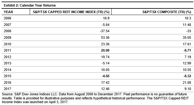
In a previous blog, we explored the relationship between corporate governance and stock performance. The results show a wide variance between the top quintile and the bottom quintile, particularly over a long-term horizon (17 years). We applied the same analysis to the RobecoSAM environment (E) and social (S) scores. To do so, we formed hypothetical, annually rebalanced quintile portfolios, ranked by E and S scores, and tracked their forward 12-month performance.i The quintile portfolios were formed on an annual basis as of December 31 of every year.

Looking at the analysis from 2001 through 2017, both E and S scores showed a clear bifurcation in returns, with the bottom quintile performing the worst (see Exhibit 1).

Environment Results

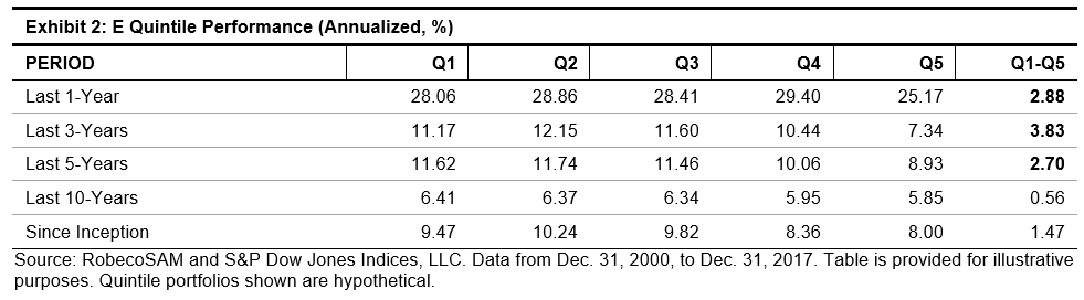
For the portfolios ranked by E score, the fourth quintile (8.36%) and fifth quintile (8.00%) returns were markedly lower than those of the top three quintiles. Over near- to medium-term time horizons, E-ranked portfolios displayed the highest performance spread between the top and bottom quintiles (see Exhibit 2). Perhaps this is because environmental concerns have increasingly moved to the forefront of investor concerns in recent years.

Average rolling returns over the one-, three-, and five-year periods show that, on average, the Q5 portfolio underperformed the Q1 portfolio by about 1.20% (see Exhibit 3).

The results for the governance (G) portfolios showed a greater variance between the top and bottom quintiles compared to the E portfolios. This is expected, as corporate governance reflects management strategy and ability to execute the strategy. On the other hand, E performance reflects risk management of a growing issue that attracts heightened awareness from institutional investors. It appears that for portfolios ranked by E score, market participants may be economically better served by shying away from not only the bottom 20%, but also the fourth-worst quintile, which accounted for the bottom 40% of the ranking universe.

Social Results

The S dimension score measures a corporation’s relationship with its stakeholders, especially its employees, but also the local and wider community in which it operates. The categories analyzed are labor practices, human capital development, talent attraction and retention, human rights stance, and corporate citizenship and philanthropy.

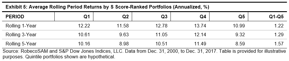
There is a less clear relationship between S scores and subsequent future performance. The back-tested returns do not show a clear underperformance from the bottom quintile, and in fact, the fourth quintile was the best-performing portfolio in the longer time periods (see Exhibits 4 and 5).

Our analysis and the decomposition of the individual ESG scores highlight some interesting information. It appears that for portfolios ranked by G and E scores, investors may be economically better off by screening out securities in the worst quintile of the ranking universe. However, the relationship is less clear between the S score and future stock performance.

The analysis shows that while ranking by overall ESG score could indicate some positive return information, the three underlying subcomponents have different relationships with future stock performance. Therefore, investors may wish to alter the weight of each subcomponent in the overall ESG score.

Our next blog will explore different combinations of the three subcomponent scores.


i The underlying universe is the RobecoSAM coverage universe comprised of global companies starting from December 2000 with 400 stocks and increasing to over 4,000 stocks in 2017.


The posts on this blog are opinions, not advice. Please read our Disclaimers.

Indexing Canadian REITs: A Look at the S&P/TSX Capped REIT Income Index

Contributor Image
Smita Chirputkar

Former Director, Global Research & Design

S&P Dow Jones Indices

In a previous blog post, Evolution of Canadian REITs, we outlined the evolution of the Canadian REITs market. In this post, we will explore in detail the S&P/TSX Capped REIT Income Index, which is designed to serve as an income-producing strategy.

The index seeks to measure the performance of REIT companies in the S&P/TSX Composite, while overweighting and underweighting companies based on their risk-adjusted income distribution yield. It is tilted in favor of securities with yields that have not fluctuated widely. By using risk-adjusted yield—computed as 12-month trailing yield divided by the standard deviation of yield—the higher weight is placed on securities with more stable yields. Also, given that REIT securities tend to be more volatile than the market, the methodology aims to ensure that higher yield does not come at the price of higher return volatility.

To allow for capacity, the constituents are weighted by their risk-adjusted yield ratio times their float-adjusted market cap, with the maximum weight capped at 10%. This way, smaller companies with high yields do not have such a disproportionate weight in the index, and the same applies for large companies with lower yields.

The standard deviation of yield is calculated using the previous 36 months of income distribution yield history. The ability to pay dividends over three years indicates a firm’s strength and stability. There is also less chance of dividend cuts, which are perceived negatively in the market.

Exhibit 1 shows that the S&P/TSX Capped REIT Income Index outperformed the benchmark, the S&P/TSX Composite, on a risk-adjusted basis over the period studied. Historically, the S&P/TSX Capped REIT Income Index exhibited higher best monthly returns, average monthly returns, and maximum rolling 12-month returns compared with the benchmark.

Exhibit 2 shows the calendar year performance of the S&P/TSX Capped REIT Income Index versus the underlying benchmark. We can see that the strategy outperformed the underlying broad market in 8 out of 12 years.

Higher Yield Than the Broad Market

From December 2006 to February 2018, the S&P/TSX Capped REIT Income Index generated an average historical yield of 6.1%, compared with 2.8% for the benchmark.

A full report on the S&P/TSX Capped REIT Income Index can be found here.

The posts on this blog are opinions, not advice. Please read our Disclaimers.

Standard Benchmarks Extend Standard of Living Through Retirement

Contributor Image
Jodie Gunzberg

Former Managing Director, Head of U.S. Equities

S&P Dow Jones Indices

What are the steps in selecting a retirement income option?  Of course cost is one of the considerations, but did you know ERISA does not require selecting the lowest cost investments?  These questions and more are explored in a recent video with Ian Kopelman (DLA Piper), and Tim Kohn (Dimensional Fund Advisors):

What are some best practices for plan sponsors as they discharge their fiduciary duties when thinking about adding an income option to a plan’s menu?

Satisfaction of the Employee Retirement Income Security Act (ERISA) fiduciary responsibilities is process-driven.  In other words, in order for an ERISA fiduciary to satisfy his or her fiduciary obligations, it is imperative to establish and follow a process through which the decision maker can determine and analyze its various options on a comparative basis, apply a cost-benefit analysis on each taking into account the various characteristics of the particular plan in question and its participant population, and on that basis, choose the option that the fiduciary reasonably believes best fits the needs of the plan and its population. 

When selecting an income option for a plan, this involves:

  1. determining various potential income options available
  2. determining the variables of each option (income production, growth, safety, investment to retirement or through retirement, etc.)
  3. determining the particular characteristics of the plan’s workforce and applying each option’s characteristics to that workforce to find a match
  4. analyzing past performance of each option to compare each option’s performance equally
  5. factoring in each option’s cost
  6. factoring in any legal and other variables

Many items listed above need a standard index for comparative analysis.

How may an asset manager assist in this fiduciary process?

An asset manager may help by providing investment solutions that are low cost, broadly diversified and that follow a transparent investment process.  This way, as plan sponsors discharge their fiduciary duties to not only select but monitor those investments over time, they can understand the process and help translate it back to 401(k) or other plan participants.

It is important to note that ERISA does not state you must to staff your investments with the absolute lowest cost or you should use that as it is sole decision-making criteria.  The important thing is to make sure that if after the analysis the lowest-cost spread is not chosen, the reason can justify why the lowest cost burden was not chosen – so documenting is crucial.

What current regulatory and/or legislative guidance might be considered when thinking about adding a retirement income option? 

This question raises issues relating to plan design and its interaction with legislative and regulatory guidance to determine an appropriate way to further that plan design from a legal standpoint.  In other words, the analysis should start with appropriate plan design and once that appropriate plan design is determined on the basis of corporate and retirement needs, a determination should be made as to how the legal and regulatory environment impacts those plan design decisions and the question of how those plan design decisions should best be effectuated.

Thus, the first question one should ask is what the plan sponsor is trying to accomplish with the plan.  Presumably, at least one of the goals is to enable participants to efficiently create a source of retirement income.  This may be determined at the point of retirement but more often it is being thought of as extending through the participant’s retirement to create a sustainable source of income throughout the participant’s retirement years — the old “to or through” question.

Once this design component has been analyzed, the fiduciary has the legal obligation to prudently select the income fund that best and most cost effectively achieves the end that has been determined on the basis of the plan design.  In addition, once the option has been prudently selected, the fiduciary has the legal obligation to periodically review the option selected to ensure that (i) it continues to satisfy the objective on a cost-effective basis, and (ii) other options have not been developed that will more efficiently satisfy the same ends.  Once again, this selection and oversight function requires that the option being evaluated be benchmarked against its peers since the decision to select or continue to retain must be made on a comparative basis.

When thinking about retirement what should the industry be doing to help plans and participants access the retirement income focused solution?

First, solutions should be created to focus on what participants want most in retirement, which is to spend their retirement savings to support a desired standard of living.  Too many default investments today focus only on growing an account balance and don’t fully address the risks that participants face in retirement which is three-fold, not only the market, but also the effects of inflation and interest rates on one’s savings.

Secondly, plan sponsors and their advisors should be structuring their plan to reflect this standard of living goal.  Plans should be looking closely at their Investment Policy Statements to see if they align with the goals of the overall benefits package that would likely benefit from having, as a goal of the plan, an income or outcome-focused goal.  When a plan adopts this philosophy, naturally, a goals-based type investment may be considered as the plan’s default.


The posts on this blog are opinions, not advice. Please read our Disclaimers.

Innovation in Indexing: Incorporating Options in Indexes to Help Achieve Defined Investment Outcome as a Packaged Solution

Contributor Image
Berlinda Liu

Former Director, Multi-Asset Indices

S&P Dow Jones Indices

For decades, sophisticated institutional investors have been using combinations of options to achieve desired investment outcomes or specific payoff structures. With innovations in indexing, it is now possible to gain passive exposure to those predefined outcome goals. Before we begin to explore how those index strategies are constructed and how such access may be possible, it may be worthwhile to take a refresher on basic options.

The basic building blocks of option strategies are puts and calls. Since a call option gives an investor the right, but not the obligation, to buy an underlying security at a specified price (strike) within a specific time period, a call buyer may exercise the call and benefit when the underlying security goes above the option strike before the call expires. Conversely, a put option gives an investor the right, but not the obligation, to sell an underlying security at a specified price (strike) within a specific time period, therefore a buyer of a put may exercise the put and benefit when the underlying security goes below the option strike. In exchange of the potential benefit, an option buyer pays a premium upfront to the seller. On the other side of the trade, an option seller collects the premium as a compensation for potential loss by option expiration.

Exhibit 1 shows the payoff diagrams of the buyer and seller of an option contract.

Using the simple building blocks illustrated above, we will demonstrate how a hypothetical, complicated defined payoff may be achieved.

For example, a call spread can be constructed with a long call (at strike K1) that offers upside growth and a short call at a higher strike (K2). This structure is widely used in a range-bound or moderate bull market as a cost-efficient alternative to a long position in the underlying security. By the option expiration day, if the underlying security falls below K1, the call spread should have no loss other than the upfront net premium paid; if the underlying security rises above K1 and below K2, the call spread should offer 1:1 upside growth; when the underlying security rises above K2, the call spread return is capped. Exhibit 2 shows the payoff of a typical call spread with K1 = 100 and K2 = 120.

Using multiple option positions, we can further demonstrate a complex strategy to target specific outcomes, such as a strategy wishing to participate up to 3x of upside (with a cap) while limiting downside losses to only 1x (assuming the underlying security price is 100).

Now, the question is how does an investor achieve this payoff? A basket of options is used to construct this hypothetical portfolio.

Put-Call Parity theorizes that A and B are equivalent to a 2x leveraged, long-forward contract at strike 60 while C and D are equivalent to a short-forward contract at strike 120. The net effect of these four options is a net long-forward contract and a 1:1 exposure to the upside and downside. E offers another 2x exposure to the upside. Therefore, the basket offers 3x upside and 1x downside to the underlying security. The strategy also writes three call options F at a higher strike (x), which brings the cost of the option basket equal to a direct investment in the underlying security and the upside should be capped at x, consequently.

This example shows that using options to help achieve desired payoff can be a complicated tool. This is the main reason why these strategies have long been limited to OTC trading as bespoke solutions. Now, CBOE and S&P Dow Jones Indices have introduced a suite of benchmark indices that are designed to track the performance of some widely used target outcome strategies. One example is the CBOE S&P 500 3x Up, 1x Down Enhanced Growth Index Series, which seeks to offer the payoff as seen in Exhibit 3.

With these index-based defined outcome solutions, market participants can target precise payoff as they wish.

S&P® is a registered trademark of Standard & Poor’s Financial Services LLC. Cboe® is a registered trademark of Cboe, Inc. S&P Dow Jones Indices LLC does not sponsor, endorse, market or promote investment products based on its indices and will have no liability with respect thereto.

The posts on this blog are opinions, not advice. Please read our Disclaimers.

Index Investing – The Growing Mantra

Contributor Image
Koel Ghosh

Former Head of South Asia

S&P Dow Jones Indices

The growth rate of the Indian passive investing space has been impressive. Though it’s still early days for this market, the statistics are clear. At year-end 2017, Indian ETF assets stood at INR 78,000 crores (USD 12 billion), with an annualized growth rate of 76.6% over the past four years.1 For India, the passive investing space gained popularity, with a good deal of interest in gold ETFs, but in the past few years, interest has shifted to equity ETFs, which have gained prominence. This trend was supported by Indian government initiatives that provided the necessary boost, with the Central Public Sector Enterprises (CPSE) ETF and by the Employees’ Provident Fund Organisation (EPFO) investments allocated to equity ETFs.

However, for a nascent market like India, the preference is for the market benchmarks and size and sector plays. For example, the S&P BSE SENSEX, S&P BSE SENSEX 50, and S&P BSE 100 are indices that seek to represent Indian market dynamics and can be selected for indexed solutions. The markets are clearly indicating signs of a growing acceptance of passive investing. So what is it that is working for indexing?

Lower Cost

Lower cost is an important contributor. Passive investing eliminates the active manager’s costs for trading, research, management fees, etc. To get a better understanding, Exhibit 1 shows the expense ratio limit for asset management companies.

Exhibit 1: Expense Ratio of Asset Management Companies
AVERAGE WEEKLY NET ASSETS LIMIT APPLICABLE ON EQUITY SCHEMES (%) LIMIT APPLICABLE ON DEBT SCHEMES (%)
First INR 100 Crores 2.50 2.25
Subsequent INR 300 Crores 2.25 2.00
Subsequent INR 300 Crores 2.00 1.75
On the Balance Assets 1.75 1.50

Source: S&P Dow Jones Indices LLC. Data as of Dec. 31. 2017. Table is provided for illustrative purposes.

An additional 30 bps can be charged if 30% of new inflows or 15% of existing assets are from cities outside the top 15.

In comparison, current ETFs in India are operating at much lower costs. Some of the lower expense ratios vary from 5 bps (which is 0.05%) to as low as 0.9 bps (0.009%) in the case of the S&P BSE BHARAT 22 Index ETF.

This 2% difference in cost (and more in some cases) offers a strong case for passive investing. The growing popularity of passive options has the potential to offer cost-effective solutions to market participants.

Exhibit 2: Expense Ratio of ETFs in India 


Source: Bloomberg L.P. Data as of Feb. 15, 2018. Table is provided for illustrative purposes.

Benchmark Performance Over Active Management

While India is still largely an active-investment space, the dynamics are changing. Our SPIVA® India report has been outlining the same conclusion. Considering the large-cap and mid/small-cap segments as a sample, the shift is evident since 2016, when the outperformance of the benchmark over active funds was significant and continuous in the one-year period. Over the long term (i.e., five and ten years), the outperformance was consistent. A similar outperformance trend was observed in the fixed income segment covered in the India SPIVA reports. This is a good lesson about long-term investment strategy; the empirical evidence suggests that index investing is a good option.

Exhibit 3: SPIVA India Reports – Percentage of Funds Outperformed by the Index
YEAR FUND CATEGORY COMPARISON INDEX ONE-YEAR (%) THREE-YEAR (%) FIVE-YEAR (%) TEN-YEAR (%)
Year-End 2013 Indian Equity Large-Cap S&P BSE 100 78.53 66.67 69.23
Year-End 2013 Indian Equity Mid/Small-Cap S&P BSE MidCap 21.74 35.37 42.11
Mid-Year 2014 Indian Equity Large-Cap S&P BSE 100 34.18 60.36 54.36
Mid-Year 2014 Indian Equity Mid/Small-Cap S&P BSE MidCap 44.93 32.00 38.67
Year-End 2014 Indian Equity Large-Cap S&P BSE 100 23.81 57.94 52.94
Year-End 2014 Indian Equity Mid-/Small-Cap S&P BSE MidCap 10.87 22.22 35.85
Mid-Year 2015 Indian Equity Large-Cap S&P BSE 100 28.30 49.59 60.50
Mid-Year 2015 Indian Equity Mid-/Small-Cap S&P BSE MidCap 9.09 17.39 42.86
Year-End 2015 Indian Equity Large-Cap S&P BSE 100 35.79 46.79 56.52
Year-End 2015 Indian Equity Mid-/Small-Cap S&P BSE MidCap 58.14 17.78 37.93
Mid-Year 2016 Indian Equity Large-Cap S&P BSE 100 53.26 39.42 58.62
Mid-Year 2016 Indian Equity Mid-/Small-Cap S&P BSE MidCap 77.78 24.44 28.85
Year-End 2016 Indian Equity Large-Cap S&P BSE 100 66.29 30.52 54.60 54.95
Year-End 2016 Indian Equity Mid-/Small-Cap S&P BSE MidCap 71.11 48.53 42.03 46.03
Mid-Year 2017 Indian Equity Large-Cap S&P BSE 100 52.87 34.19 50.93 58.47
Mid-Year 2017 Indian Equity Mid-/Small-Cap S&P BSE MidCap 56.52 43.94 37.31 50.00
Year-End 2017 Indian Equity Large-Cap S&P BSE 100 59.30             53.00 43.40 53.54
Year-End 2017 Indian Equity Mid-/Small-Cap S&P BSE MidCap 72.09 80.00 43.94 44.29

Source: S&P Dow Jones Indices LLC. Data from the SPIVA India Reports 2013 to 2017. Past performance is no guarantee of future results. Table is provided for illustrative purposes.

Diversification

Index investing offers a select basket of stocks designed by independent providers that are neutral and objective when designing the index. Index providers create indices based on fixed methodologies that cater to the index objective. The skewness of individual stock returns can result in increasing the likelihood of underperformance of an active strategy. In his work on the “efficient market hypothesis,” Eugene Fama “concluded that stock prices follow a random walk, causing analysts to be unable to outperform consistently via fundamental or technical analysis.”2

The comparison in Exhibit 4 demonstrates that not only do individual stock strategies tend to be volatile, but over the long term, a consistent approach (such as the S&P BSE SENSEX) can provide consistent returns that, in some cases can be better than individual stock performance.

Exhibit 4. Diversification via Index Versus Individual Stock Approach

Transparency

Index values and information are available publicly. For example, all of the S&P BSE Indices values and methodologies are available at www.asiaindex.co.in. These help to track the index strategy and also to understand historical trends. The traded values of passive structures (such as ETFs) are available on stock exchange websites.

Flexibility

Passive instruments such as ETFs can be traded on the stock exchange and, hence, offer the flexibility of entering and exiting. Therefore, those market participants who are looking for the above characteristics in their investment strategy can opt to include them in their overall portfolios. The debate of active versus passive is always present, but who says one cannot include both to achieve investment goals?

  1. Mahavir Kaswa, “India ETFs Wrap-up 2017,” Feb. 7, 2018.
  2. Anu R. Ganti and Craig Lazzara, Shooting the Messenger, December 2017.

The posts on this blog are opinions, not advice. Please read our Disclaimers.