Get Indexology® Blog updates via email.

In This List

Here's Why Mid-Caps Matter As The Dollar Drops

Where Are the PIGS Now, Minus the G?

Impact of GICS Changes to Pan Asian Sectors: BAT Moving Away From Information Technology

The S&P 500 Bond Index and… Mexico!

Quality and Diversification within the Preferred Stock Space

Here's Why Mid-Caps Matter As The Dollar Drops

Contributor Image
Jodie Gunzberg

Former Managing Director, Head of U.S. Equities

S&P Dow Jones Indices

The S&P 500 just posted its best January since 1997, and also had its highest measured optimism, a 6.6% risk premium,  since October 2015.  Whether history repeats itself is yet to be seen, but just a few days after that high risk premium, the stock market topped on Nov. 3, 2015.  By December investors saw the glass as half empty, as the exuberant premium turned into a discount, and in the following period through Feb. 11, 2016, the market dropped 12.7%.

Now the stock market just logged its worst week, down 3.9%, since that last drop in 2016.  There are worries of rising inflation, interest rates and uncertainty over the dollar.  So, perhaps it is helpful to review some of the U.S. equity market sensitivities to the rising interest rates, inflation and the dollar, but in this post the focus will be solely on the impact of the falling dollar.

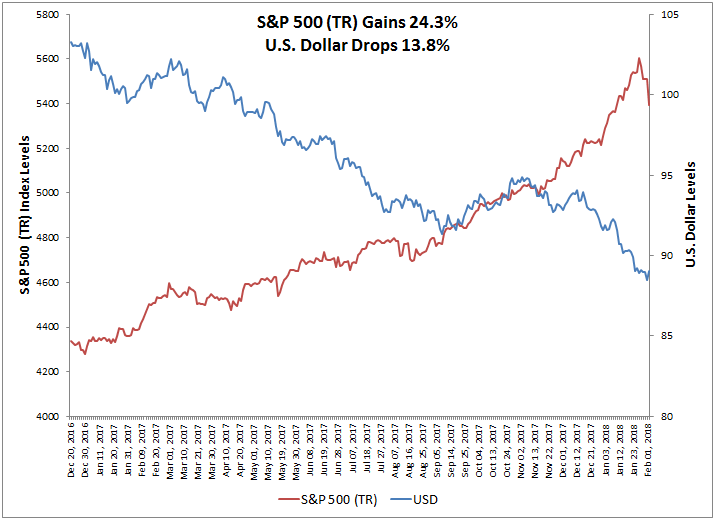
Since the U.S. Dollar peaked on Dec. 20, 2016, it has fallen 13.8% while the S&P 500 (TR) gained 24.3%.  While the relationship is opposite overall, when correlation is measured on a daily basis the correlation is nearly zero at 0.16.  This is not surprising since many other factors may drive the stock market on any given day.

Source: S&P Dow Jones Indices and https://www.investing.com/quotes/us-dollar-index-historical-data

However, when looking further back since 1988, there is positive correlation between the U.S. dollar and the S&P 500 (TR) until the Aug. 2000 stock market top (using monthly data) and then negative correlation since the Sep. 2002 bottom.  In the earlier period, the U.S. dollar and S&P 500 (TR) gained a respective 27% and 486%, and in the latter period the U.S. dollar fell -17% while the S&P 500 (TR) gained 246%.  The correlation since the global financial crisis has been consistently negative though with the U.S. dollar’s strength from 2014, the correlation rose to be less negative.

Source: S&P Dow Jones Indices and https://www.investing.com/quotes/us-dollar-index-historical-data

What changed?  Many things may have changed but the decline from the tech bubble burst certainly changed the makeup of that sector.  Before the decline in 2000, the information technology sector held the biggest weight at 33% of the S&P 500, but with the stock market drop, fell almost 2/3 to just 13%, dropping in size behind financials, health care and consumer discretionary.  Today, the sector is the biggest again comprising 24% of the S&P 500.  While the market cap weight is proportionally not as large as it used to be, the foreign revenue exposure is much bigger.  The increased globalization led to more international revenue that is reflected in the S&P 500 Foreign Revenue Exposure Index where the information technology sector is the biggest by far, making up 41% of foreign revenue in the S&P 500.  This may be driving much of the opposite relationship between the S&P 500 and the U.S. dollar in at least the last decade.

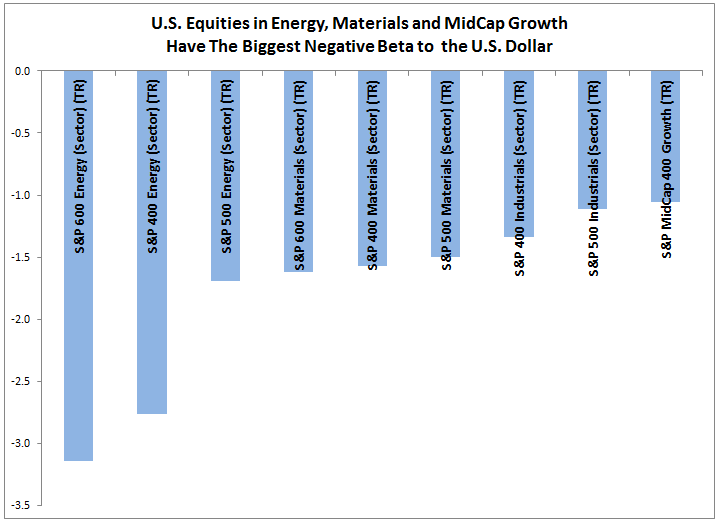
While all sectors across styles and sizes are negatively correlated with the U.S. dollar, most are only moderately negatively correlated.  Though of course energy and materials are much more negatively correlated since the commodity prices underlying the businesses in their sectors are priced in U.S. dollars.  Interestingly, the heavy weight of 40% information technology in the S&P 500 Growth (TR) makes it slightly more negatively correlated to the U.S. dollar than the S&P 500 Value (TR) that has energy as its second biggest sector, weighted at 12%.

Source: S&P Dow Jones Indices and https://www.investing.com/quotes/us-dollar-index-historical-data

Though correlation matters, especially for diversification purposes, the sensitivity of the U.S. equities to the U.S. dollar is meaningful too.  In particular, only energy and materials have negative beta less than -1 despite size, meaning it has more volatility and in the opposite direction of the U.S. dollar.  The small-cap energy sector has the biggest magnitude of negative beta of -3.14, meaning if the U.S. dollar were to fall by 10%, then small-cap energy stocks may be expected to rise 31% from that drop.  That is more than the -2.76 and -1.69 respective beta measures from energy mid-cap and large-cap.  Though large-caps may do more international business than the smaller companies, the smaller companies may have fewer resources to hedge against oil price volatility, leaving them more susceptible to the U.S. dollar moves.   Similarly the small-cap materials sector with a 1.62 beta to the U.S. dollar is slightly more sensitive than its mid and large size sector counterparts that have respective beta of 1.57 and 1.50.

Source: S&P Dow Jones Indices and https://www.investing.com/quotes/us-dollar-index-historical-data

Lastly, the falling U.S. dollar helps U.S. equities but mid-caps benefit most. For every 1% drop in the U.S. dollar, the S&P MidCap 400 (TR) rises 3.20% on average. This is more than the 2.63% on average from the S&P 500 (TR) and 2.96% from the S&P SmallCap 600 (TR).  The major exception to this, happens in energy where a falling dollar helps more than a rising dollar hurts, boosting the less hedged small-cap energy sector by 4.64% on average for every 1% dollar drop. The mid-caps are well positioned to grow international revenues with a falling dollar if they are on the cusp of expanding globally and need a catalyst.  While the large caps can benefit from the falling dollar, it is likely the mid-caps can capture more new business with the global growth opportunity.  Mid-caps are also positioned generally better than small-caps for international business due to their greater size and resources.

Source: S&P Dow Jones Indices and https://www.investing.com/quotes/us-dollar-index-historical-data

Knowing which sectors are exposed to which countries can help determine how to benefit most from the falling U.S. dollar.  Also, the distinct market cap split that the S&P 400, 500 and 600 offer is important for intentionally getting exposures and improving risk management as macro economic factors move.


The posts on this blog are opinions, not advice. Please read our Disclaimers.

Where Are the PIGS Now, Minus the G?

Contributor Image
Heather Mcardle

Director, Fixed Income Indices

S&P Dow Jones Indices

Over the past five years, the more worrisome government-issued debt in Europe has made significant progress in managing the normal mechanism of higher-perceived risk equaling higher yields. The Wall Street Journal focused on Portugal’s debt in their article, “Decade of Easy Cash Turns Bond Market Upside Down”. Quantitative easing (QE) by the European Central Bank (ECB) not only lowered rates to spur economic development in the region, but it also seems to have eased concerns about the risks of buying from some of the heaviest debt-ridden European countries. The negative yield environment created by the ECB’s QE program pushed investors to find higher yields in countries with higher risk profiles. Portugal, Italy, and Spain have all seen yields tighten significantly over the past five years, as measured by the S&P Portugal Sovereign Bond Index, the S&P Italy Sovereign Bond Index, and the S&P Spain Sovereign Bond Index, respectively. As of Jan. 31, 2018, yields for the overall indices saw both Portugal and Spain below 1%, with Italy hovering above 1% at 1.12%. Yields for all three indices have tightened from a range of 3.28%-5% back in the beginning of 2013 to a range of 0.79%-1.12%. When compared to the yield of U.S. Treasuries (2.36%), as measured by the S&P U.S. Treasury Bond Index, one may wonder what the reaction will be when the ECB reverses QE. While all four countries have different durations between 5.24 and 6.47, the U.S. has the shortest duration of them all, with the lowest risk profile and the highest yield.

The posts on this blog are opinions, not advice. Please read our Disclaimers.

Impact of GICS Changes to Pan Asian Sectors: BAT Moving Away From Information Technology

Contributor Image
Utkarsh Agrawal

Associate Director, Global Research & Design

S&P Dow Jones Indices

In November 2017, S&P Dow Jones Indices and MSCI announced revisions to the GICS® structure to be implemented in September 2018.[1] These changes are going to affect the consumer discretionary, information technology, and telecommunication services sectors. As a consequence, the Pan Asian internet giants BAT (Baidu, Alibaba, and Tencent) will be reclassified into the communication services and consumer discretionary sectors.

The key GICS structure changes are summarized as follows.

  1. The telecommunication services sector will be broadened and renamed to communication services. The renamed sector will include the existing telecommunications services companies with the addition of media and entertainment companies, which are currently classified under the consumer discretionary sector and information technology sector.
  2. The internet & direct marketing retail sub-industry under the consumer discretionary sector will include companies providing online marketplaces for consumer products and services. It will also include e-commerce companies.
  3. The internet software & services industry under the information technology sector will be discontinued and moved to a new sub-industry, internet services & infrastructure, under the IT services industry.

These changes could result in a significant impact on the composition, valuation, and performance characteristics of the sector indices. Based on the select list of large-cap companies with new GICS information released in January 2018,[2] we compiled the sector weights, return beta, and P/E of the three GICS sectors for the S&P Pan Asia LargeCap Index with the new GICS definitions (see Exhibits 1 and 2). The key observations include the following.

  1. The communication services sector will become less defensive and have more expensive P/E versus the current telecommunication services sector, mainly due to the addition of entertainment companies (such as Nintendo) and interactive media & services companies (such as Tencent). The regional sector weight increases from 4.5% to 10.4%.
  2. After the change in definition of the internet & direct marketing retail industry, the consumer discretionary sector will have higher beta and valuation, with the inclusion of Alibaba, which is currently classified as an internet software & services company. The regional weight of this sector changes from 12.2% to 14.3%.
  3. The information technology sector will have lower beta and P/E in comparison to the current GICS definition, primarily driven by the exclusion of the internet giants BAT, which represent 31.5% of the regional sector under the current classification.

Overall, 17 companies from the S&P Pan Asia LargeCap Index will be affected by the revision to the GICS structure, according to the list announced by S&P Dow Jones Indices and MSCI in January (see Exhibit 3).

Apparently, the revisions to the GICS structure will result in significant change to the risk/return profile and fundamental characteristics of the consumer discretionary, information technology, and communication services sectors. Market participants should be mindful about these changes when evaluating these sectors in their asset allocation or investment analysis.

[1]   For more details, please see https://spindices.com/documents/index-policies/20171115-gics-2018-revisions.pdf

[2]   For more details, please see https://www.spice-indices.com/idpfiles/spice-assets/resources/public/documents/646149_gicspressreleasejan2018.pdf

[3]  Note that the new company classifications are subject to change before implementation due to ongoing reviews, including for corporate events. For more details please see https://spindices.com/documents/index-policies/gics-changes-announcement-01-10-18.xlsx.

The posts on this blog are opinions, not advice. Please read our Disclaimers.

The S&P 500 Bond Index and… Mexico!

Contributor Image
Jaime Merino

Former Director, Asset Owners Channel

S&P Dow Jones Indices

When we talk about investments in the U. S., the first thing that comes to mind is the S&P 500®, since it is used to analyze and track large-cap stocks in the U.S. market. Following this iconic index, in July 2015 S&P DJI introduced the S&P 500 Bond Index, which is designed to be a corporate-bond counterpart to the S&P 500. Market value-weighted, the index seeks to measure the performance of U.S. corporate debt issued by constituents of the S&P 500. One of the uses of the S&P 500 Bond Index is to compare the equity and bond markets—some of these comparisons may include performance and sectors. Taking into account sectors, ratings, and maturities, the index has more than 150 subindices, and is calculated in several currencies. Can the index also be used to compare with indices outside of the U.S.? Let’s compare the performance and returns between the S&P 500 Bond Index and the S&P 500 Bond Index (MXN [returns expressed in Mexican pesos]), with four different Mexican indices, two sovereign bond indices and two corporate bond indices.

Exhibit 1 shows the performance over the past 10 years of the S&P 500 Bond Index, S&P/BMV Mexico Sovereign Bond Index (which tracks nominal fixed-rate bonds and bills), and the S&P/BMV Corporate Bond Index (which is designed to measure the performance of Mexican corporate-issued bonds). Then, in Exhibit 2, we can see the performance differences between the S&P 500 Bond Index (MXN), S&P/BMV Sovereign International UMS Bond Index, and the S&P/BMV Corporate Eurobonos Bond Index, both of which include the returns of the currency, since they track the eurobond market (bonds issued outside of Mexico in U.S. dollars), expressed in Mexican pesos.

With a yield-to-maturity average spread of more than 335 bps for the past three years, it is interesting how the first group behaved similarly (without taking into account the credit crisis in 2007-2008). The second group’s behavior was expected due to the currency; the correlations are shown in Exhibit 3.

Exhibit 4 shows the annual returns in different time frames, where we can see in more detail how similarly the corporate bond markets have behaved for issuers from the U.S. and Mexico—as measured by the S&P 500 Bond Index (MXN) and S&P/BMV Corporate Eurobonos Bond Index, respectively—with three-year returns of 16.00% and 16.56%, respectively, and five-year returns of 15.68% and 15.62%, respectively.

In times of volatility and when searching for yield, Mexico may provide a good portfolio diversification with the extra yield for those seeking it given the correlation between Mexico and U.S. corporate bonds, as well as with their 2017 performance.

The posts on this blog are opinions, not advice. Please read our Disclaimers.

Quality and Diversification within the Preferred Stock Space

Contributor Image
Derek Babb

Senior Portfolio Manager

Elkhorn Capital Group, LLC

Preferred stocks are a class of stock that pays dividends at a specified rate and has a preference over common stock in the payment of dividends and the liquidation of assets. This asset class offers investors a unique place in the capital structure that is often overlooked. In addition, their relatively low correlations with traditional asset classes, such as common stocks and bonds, may provide potential portfolio-diversification and risk reduction benefits.

Credit Quality is Often Overlooked

While many investors are attracted to preferred stocks due to their high yields, credit quality can often be an overlooked aspect of a preferred portfolio. A broad preferred index, such as the S&P U.S. Preferred Stock Index, can leave investors overweight junk-rated preferred issues. Adding a high quality, 100% investment grade, sleeve such as the S&P U.S. High Quality Preferred Stock Index, into a preferred portfolio can improve portfolio credit quality which may mitigate the impact of a market sell off.

Sector Composition Matters

Given their market capitalization weighted structure, most broad preferred stock indices are significantly weighted towards the Financial sector. At the end of 2017, the S&P U.S. Preferred Stock index had a 73.2% allocation to Financials, followed by Real Estate at 12.0% and Health Care at 3.5%. The S&P U.S. High Quality Preferred Stock Index exhibited more diversity in its composition, as it finished 2017 with a 59.4% weight to Financials, followed by Real Estate at 18.1% and Utilities at 12.1%.

By adding exposure to the S&P U.S. High Quality Preferred Stock Index, investors may not only benefit from increased credit quality, but will also further diversify their sector and industry exposure.

As of December 29th, 2017, the S&P U.S. High Quality Preferred Stock Index exhibited an indicative yield of 5.09%. At the same time, the indicative yield of the S&P U.S. Preferred Stock Index was 6.11%. While the difference in yield between the two indices is over 1%, what investors are losing in yield, they are gaining in increased credit quality and diversification in the S&P U.S. High Quality Preferred Stock Index.

Jason Giordano, Director of Fixed Income Indices at S&P Dow Jones Indices, states in Fixed Income 101: U.S. Preferred Stock, that preferred stock is an effective portfolio construction tool given its low correlation to both common stocks and fixed income. He notes that an allocation to preferred securities may provide an opportunity for enhanced total returns while potentially reducing overall volatility. Before allocating, however, investors should consider the allocation impact to overall portfolio credit quality and sector diversification.

The posts on this blog are opinions, not advice. Please read our Disclaimers.