Get Indexology® Blog updates via email.

In This List

Drilling Into Industries Finds What Lifts Energy Stocks With Oil

Most S&P and Dow Jones Islamic Indices Outperformed Conventional Benchmarks in Q1 Driven by Strength in the Technology Sector

Revenue Exposure of the S&P/ASX 200

The Impact of Style Classification on Active Management Performance in 2017: Part 2

Low Volatility and Market Regime Shifts: Lessons From the First Quarter

Drilling Into Industries Finds What Lifts Energy Stocks With Oil

Contributor Image
Jodie Gunzberg

Former Managing Director, Head of U.S. Equities

S&P Dow Jones Indices

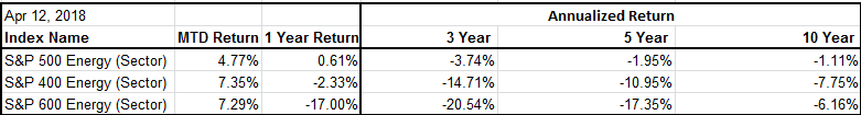
As oil prices continue to increase, the energy sector is rising but recently the mid and small cap stocks are outpacing the large caps.  Thus far in April (month-to-date through April 12, 2018,) the energy sector is leading all other sectors, but the S&P 500 Energy (Sector) is up just 4.8% versus the gain of 7.4% in the S&P MidCap 400 Energy (Sector) and 7.3% in the S&P SmallCap 600 Energy (Sector).

Source: S&P Dow Jones Indices

This is an interesting turnaround from the major large cap outperformance in energy over the last 1, 3, 5 and 10 years.

Source: S&P Dow Jones Indices

Generally when looking into what drives sector performance, examining the next most granular GICS (Global Industry Classification Standard) level called industry groups is a good starting point.  In the case of energy, there are no separate industry groups, but the next specific level called industries splits the sector into two parts: 1. Energy Equipment & Services, and 2. Oil, Gas & Consumable Fuels.

Immediately, the difference in performance between the two industries is apparent and can give some insight into what is driving the sector.  Annualized over the last 10 years that included the both the 2008-9 oil price decline and the 2014-16 drop, the large cap oil, gas & consumables industry held up better than the energy equipment & services, losing only 40 basis points annualized versus the 3.8% annualized loss over the period.  This shouldn’t be too surprising considering the energy equipment & services contains companies mainly in oil and gas drilling and equipment manufacturing, whereas the oil, gas & consumable industry includes many integrated companies, refining and marketing, and storage and transportation stocks.  The long-term performance split reflects how the upstream versus mid- and downstream oil companies are sensitive to oil price declines.  On the flip side, with the oil comeback, now the energy equipment & services are rebounding strong with returns more than double the oil, gas & consumable fuels in mid and small cap energy.

Source: S&P Dow Jones Indices

Overall, energy stocks may not fully capture oil price moves since companies hedge against some of the volatility, and also make other decisions for shareholder value that may not have direct influence from the oil price.  Large companies are more likely to hedge against oil price moves, and again, the upswing may help upstream more since they are the ones drilling and selling the direct oil rather than buying it to transport, refine and market.  According to the index data from 1995, using the S&P GSCI Crude Oil index as the oil price proxy, for every 1% rise in the price of oil, the large cap energy sector only gains about 37.5 basis points on average, while the mid- and small cap energy sectors gain 61.8 and 64.1 respective basis points. Also, the large cap energy equipment and services gains 54.5 basis points versus the gain of 34.9 basis points from large cap oil, gas and consumable fuels for every 1% rise in oil price.

Source: S&P Dow Jones Indices. Data since 1995.

However, the split between the two industries by weight is not equal but is according to market capitalization, so there may be adjustments market participants may make by deliberately tilting towards small caps or using the S&P Oil & Gas Equipment & Services Select Industry Index to get more exposure to the energy equipment & services industry.  This may be especially potent alongside the S&P 500 Energy sector where the weight to this industry is relatively small at only 14% of the sector.

Source: S&P Dow Jones Indices.

While these weights are only recent, the allocations between industries have held relatively constant through time in large and small caps, though in mid caps, the energy equipment & services diminished from almost 1/2 to 1/3 of the weight from the under-performance in the last 3 years.  Therefore, by either using small-cap energy, or if using large-cap or mid-cap energy, to supplement with the select sector S&P Oil & Gas Equipment & Services Select Industry Index may help protect against inflation and get more upside with rising oil prices.  Remember as oil prices rise, inflation is more likely and the energy sector is potentially more attractive, so it makes sense to pay attention to the more sensitive pockets in the industries of the broad sector.


The posts on this blog are opinions, not advice. Please read our Disclaimers.

Most S&P and Dow Jones Islamic Indices Outperformed Conventional Benchmarks in Q1 Driven by Strength in the Technology Sector

Contributor Image
Michael Orzano

Head of Global Exchanges Product Management

S&P Dow Jones Indices

Most S&P and Dow Jones Shariah-compliant benchmarks outperformed their conventional counterparts in Q1 2018, as the information technology sector—which tends to be overweight in Islamic Indices—led the market by a wide margin, and financials—which is underrepresented in Islamic indices—matched the returns of the broad market.

The Dow Jones Islamic Market World Index and S&P Global BMI Shariah closed the quarter slightly in the red but outperformed the conventional S&P Global BMI by 0.6% and 0.9%, respectively. Shariah-compliant benchmarks tracking Asian and European equities beat their conventional counterparts by the widest margins, while the S&P 500® Shariah eked out a small gain over the conventional S&P 500.

Global Equities Finished the Quarter in the Red in a Volatile Start to the Year

After a strong January in which the S&P Global BMI Shariah gained more than 5%, volatility set in as various risks rose to the forefront, including the potential for rising U.S. interest rates and increased global trade tensions. European and U.S. equities fared the worst among major regions, while developed markets in the Asia Pacific region and emerging markets finished the quarter in positive territory. The Dow Jones Islamic Market World Emerging Markets Index rose 1% in Q1 2018 on the heels of a gain of over 40% in 2017.

MENA Equity Markets Rebounded Following 2017 Weakness

MENA equities had a strong quarter, as the S&P Pan Arab Composite Shariah gained 6.8%, driven by strength in Saudi Arabia and Egypt. Egypt was the region’s top performer in Q1 2018. The S&P Egypt BMI jumped 17.3% in U.S. dollar terms, adding to its 21% gain in 2017, as the nation’s macroeconomic environment continued to stabilize following the IMF-supported reforms initially enacted in November 2016. The S&P Saudi Arabia BMI finished the quarter up 10.5%, as the country’s own economic and equity market reforms have, likewise, led to improved investor sentiment.

*This article was first published in Islamic Finance News, Volume 15 Issue 15, on April 11, 2018.

The posts on this blog are opinions, not advice. Please read our Disclaimers.

Revenue Exposure of the S&P/ASX 200

Contributor Image
Utkarsh Agrawal

Associate Director, Global Research & Design

S&P Dow Jones Indices

The S&P/ASX 200 is widely regarded as the institutional investable benchmark in Australia. It is composed of the largest 200 companies listed on the Australian Securities Exchange by float-adjusted market capitalization. Although the majority of the companies are domiciled in Australia, a lot of them derive a significant portion of their revenue from foreign markets. As of year-end 2017, only 60 companies in the S&P/ASX 200 derived their revenue solely from the domestic market, while the rest of the companies had exposure to foreign markets (see Exhibit 1). Consequently, potential risk from political and economic shocks in foreign markets cannot be ignored. Hence, it is worthwhile to review the global revenue exposure of the index.

Some of the key highlights from the total revenue exposure[1] breakdown of the S&P/ASX 200 as of year-end 2017 are as follows (see Exhibit 2).

  1. Only 62% of the index’s total revenue came from Australia.
  2. The index had the highest international revenue exposure to the U.S. (7.9%), followed by China (7.6%) and New Zealand (5.9%).
  3. At the sector level, total revenue exposure was most dominated by financials (28%), followed by materials (21.6%) and consumer staples (17%).

Further observation of international revenue exposure revealed the following (see Exhibit 2).

  1. Out of the 37.9% attributed to international revenue, 17.7% came from the materials sector and 7.0% came from financials.
  2. The materials sector’s revenue exposure to China (6.6%) exceeded its domestic revenue exposure (3.9%).

Since almost 38% of the S&P/ASX 200 revenue came from foreign countries, the economic and political conditions in foreign markets could have a significant impact on the index’s performance. Hence, understanding global revenue exposure is essential to comprehend the index’s inherent potential risk.

[1]   We used the FactSet Geographic Revenue Exposure (GeoRevTM) dataset to calculate revenue exposure. It provides a geographic breakdown of revenues at the country level for all companies with available data. Due to the lack of standardization in the reporting of geographic revenue segments, the dataset uses a normalization/estimation process to assign revenues to specific countries. For more information please visit https://www.factset.com/data/company_data/geo_revenue.

The posts on this blog are opinions, not advice. Please read our Disclaimers.

The Impact of Style Classification on Active Management Performance in 2017: Part 2

Contributor Image
Ryan Poirier

Former Senior Analyst, Global Research & Design

S&P Dow Jones Indices

In our previous blog, we highlighted the contribution to domestic equity market returns by mega-cap stocks in 2017 and the implications for active management. In this blog, we focus our discussion on investment style classification. Specifically, we analyze the impact of the style classification scheme on managers’ performance analysis, such as in the SPIVA® U.S. Year-End 2017 Scorecard.

A managers’ investment style is the philosophy and process in which they have stated they invest by (a characteristic guideline of acceptable investments). Moreover, investment style sets the evaluation framework through which managers’ performance and risk exposures can be measured.

Traditional “style box” investing divides investment styles along a size and fundamental valuation metrics spectrum. Exhibit 1 shows the returns of the nine S&P U.S. Style Indices over various trailing one-year periods, ending each June and December since 2015. The returns are color coded so that the darkest color indicates the best-performing style, and the lightest denotes the opposite.

As of Dec. 31, 2017, large-cap growth performed the best, while small-cap value performed the worst. The remaining styles fell in between those two categories such that shifting across the market cap range or style (as shown by the row or column, respectively) allowed for potential additional return pickup. For example, small-cap value managers would have performed better had they owned mid-cap value securities or moved closer to small-cap core.

The direction (of the green hue) and magnitude make a big difference in whether the managers of a certain style box had a better (or worse) opportunity to outperform their stated benchmark by moving styles. With respect to the direction of the green hue, one might conclude that in 2016, large-cap managers could drift down in capitalization to harvest the size premium (Exhibit 1, center table).

While style drift can potentially offer return opportunities for managers who can time correctly, there are limitations to such a decision. One potential restriction stems from the classification rules set forth by the fund ranking providers for each style. For example, according to Lipper style classifications, large- (or mid-) cap managers are defined as funds that invest at least 75% of their assets in securities that are larger (or smaller) than 300% of the 750th largest security in the S&P Composite 1500®. Similarly, small-cap managers are those that invest at least 75% of the assets in securities that are smaller than 250% of the 1,000th largest security in the S&P Composite 1500.[1]

The result is that large-, mid-, and small-cap managers have an opportunity set that is roughly represented by the 400 largest, 400th largest and below, and 600th largest and below stocks, respectively (see Exhibit 2). In other words, mid- and small-cap managers have more autonomy to express their view on the size factor without officially “drifting” outside of their defined style classification.

Therefore, depending on the market cap cutoffs used by the benchmark providers, there may be a mismatch between the funds and the benchmarks they are compared against. This blog serves as a foundation to our next discussion in which we will attempt to quantify this mismatch in style using mid- and small-cap managers as an example. Furthermore, we will discuss how to address the comparison bias through index construction.

Market participants should use this blog not solely to identify potential market environments in which style classification may be most influential, but also to prompt further investigation into whether their managers’ returns are style-consistent so as to set proper risk/return expectations. We show that there may be significant cross over between style boxes, and thus a given manager’s style should not be taken at face value.

[1]   Funds are classified into different styles by Lipper. More information can be found here: http://www.crsp.com/files/MFDB_Guide.pdf

The posts on this blog are opinions, not advice. Please read our Disclaimers.

Low Volatility and Market Regime Shifts: Lessons From the First Quarter

Contributor Image
Anu Ganti

U.S. Head of Index Investment Strategy

S&P Dow Jones Indices

Since antiquity, people have measured time in months. Unsurprisingly, investors tend to evaluate performance in monthly increments. This can be troublesome, as we will see in the case of low volatility, particularly during market regime changes.

Low volatility strategies are designed to provide investors with protection in falling markets and participation in rising markets. Disappointments can occur in two ways:

  1. The strategy underperforms falling markets
  2. The strategy falls during rising markets

Success rates for the S&P 500® Low Volatility Index approximate 85% on both of these dimensions.

The first quarter of 2018 was unusual, as the market initially underwent an expansive phase, during which cyclical sectors outperformed, up until the market peak on Jan. 26, 2018. Subsequent to this peak, the market began to decline when defensive sectors eventually outperformed.

How was low volatility affected by this regime shift? Let us start with January, when the U.S. market was off to a booming start, with the S&P 500 up 5.73%, while the S&P 500 Low Volatility Index lagged, only up 2.65%. This outcome is expected: Underperformance in a rising market is not a failure, but one of the inherent features of low volatility strategies.

In February, low volatility underperformed the market, with the S&P 500 Low Volatility Index down 4.24%, while the S&P 500 was down 3.69%. This outcome is unexpected: Underperformance in a falling market is a failure of protection, one of the key benefits of low volatility strategies.

But before we can declare failure, we need to understand better what happened in February.

An underweight to information technology, which was the best-performing sector in February, was the main driver of low volatility’s February underperformance, along with an overweight to utilities and real estate. These three sector tilts together cost the strategy 1.05% (in a month when it underperformed by only 0.55%).

But low volatility did indeed subsequently deliver protection. March’s performance was a complete reversal from February’s—low volatility now handily beat the market, with the S&P 500 Low Volatility Index up 0.85%, compared to the S&P 500’s bleak performance, down 2.54%. Overweights to utilities, real estate, and financials, along with an underweight to information technology, contributed 2.85% to the strategy’s outperformance. These are the very same sector tilts that detracted from February’s performance.

The outperformance in March required enduring some underperformance in February. This illustrates a broader, more important principle: Evaluating any factor strategy over a period as short as one quarter requires paying careful attention to the nature of the investment environment.

The posts on this blog are opinions, not advice. Please read our Disclaimers.