Get Indexology® Blog updates via email.

In This List

Examining Emerging Market FX Contagion: It was all about Relative Risk-adjusted Performance

How do you know if an ETF is truly passive? A formulaic approach to ETF identification

War Risk

COMMODITY COMEBACK

International events take the front seat

Examining Emerging Market FX Contagion: It was all about Relative Risk-adjusted Performance

Contributor Image
Bluford Putnam

Managing Director and Chief Economist

CME Group

A large number of emerging markets currencies declined en masse during the period from 30 April 2013 through 31 January 2014, with many observers applying the moniker of contagion.  Over the whole period many emerging market currencies were clustered in the range of losing between 9% and 22% of their value against the US dollar, with a few remaining stable, and some losing much more.

Our research argues that the emerging market contagion was driven by asset allocation shifts.  That is, expectations for relative risk-adjusted returns went dramatically against the emerging markets, and the Fed’s QE tapering had nothing to do with the FX activity.

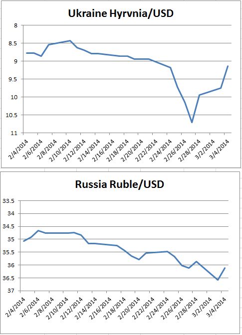
Starting with risks in the political arena from the spring of 2013 onward, developments went against emerging market.   The Syrian Civil War was complicated by the nerve gas attacks and related US-Russian diplomacy.  There were demonstrations in the plazas of Turkey over development plans as well as a scandal reaching high into the Government.  Middle class residents were taking to the streets of Brazil to demand improved government services, even as the Government was spending generously on the infrastructure for the upcoming World Cup in 2014 and Olympic Games in 2016.  In Thailand, political unrest was threatening the electoral process.  India’s election campaign was heating up, with the possibility of a major change in political power.  Argentina experienced significant inflation, a currency devaluation and overall political confusion.  Ukrainian political tensions became violent.  Some of these tensions eased while others gained momentum over the year, but they all combined to create the impression that the riskiness in many emerging market countries was rising, and that spillover effects in various regions were not only possible, but likely.

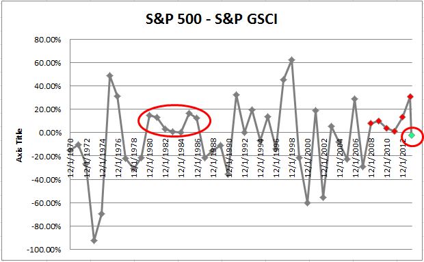
From a performance perspective, the interesting development was in the US.  US equities rallied almost 30% in 2013 even as the US 10-Year Treasury yield went from less than 1.7% at the end of April 2013 to a new range, 2.7% to 3.0%, a full 100 basis points higher than before the “Taper Talk”.  The ability of US equities in 2013 effectively to ignore the coming policy change at the Fed to taper QE while US bonds were selling-off aggressively strongly suggests to us that QE was not responsible for the emerging market contagion.

The relative equity out-performance of the US was a two-way street and had at least a part of its roots in the deceleration of economic growth in many emerging market countries.  For example, economic growth in the four largest emerging market countries of Brazil, Russia, India, and China has been slowing with weighted average real GDP growth of 8.2% in 2010 declining to an estimated 5.5% in 2013 and a forecasted 5.1% for 2014.  (See “Decelerating BRICs Face Structural Challenges”, by Samantha Azzarello, December 9th 2013, http://www.cmegroup.com/education/featured-reports/decelerating-brics-face-structural-challenges.html).  The growth slowdown was accompanies by equity declines in many countries, with the MSCI Emerging Market Index losing 5% of its value over 2013.

The juxtaposition of a powerful rally in US equities set against decelerating economic growth and rising political risks in many emerging market countries, we would argue, provided the foundation and incentives for many global asset allocators, such as pensions, endowments, sovereign wealth funds, etc., to shift their asset allocation policies in the direction of US equities and other mature industrial markets, and away from emerging market countries.  This asset allocation shift hit both emerging market equities and currencies.  We are definitely not in the camp that thinks the Fed’s QE tapering debate and decision was a primary cause of the contagion.

S&P Dow Jones Indices is an independent third party provider of investable indices.  We do not sponsor, endorse, sell or promote any investment fund or other vehicle that is offered by third parties. The views and opinions of any third party contributor are his/her own and may not necessarily represent the views or opinions of S&P Dow Jones Indices or any of its affiliates.

The posts on this blog are opinions, not advice. Please read our Disclaimers.

How do you know if an ETF is truly passive? A formulaic approach to ETF identification

Contributor Image
Michael Mell

Global Head of Custom Indices

S&P Dow Jones Indices

The acronym “ETF” was once a reliable term to identify exchange traded funds using passive investment strategies, specifically those tracking transparent, rules based independently calculated indices.  “Today, the ETF acronym is being used broadly by the fund industry and media outlets to include non-fund product structures and active management strategies”[1].   Furthermore “active ETFs stand out in 2014 launches”[2]. Thus an “ETF” is no longer a guaranteed wrapper to access the benefits of passive investing.  This matters because “once management fees are factored in, the average actively managed fund loses to passive, lower-fee mutual funds and exchange-traded funds that track broad indexes”[3].

Distinguishing active ETFs from passive ETFs is necessary and should be easy. One does not track an index and the other does.  However that approach does not work anymore.  In the past all index tracking ETFs (including firms who self-indexed) had to disclose the index methodology, holdings and have the index independently calculated.   Today an index tracking ETF can be launched devoid of the full transparency fundamental to passive indexing.

“Unlike prior exemptive orders governing the operation of self-indexing ETFs, the Orders do not attempt to address potential conflicts of interest among the ETF, its investment adviser, and the affiliated index provider by requiring, among other things, public disclosure of the underlying index methodology, the use of a third-party index calculation agent, or formal “firewall” procedures. [4]

Such opaqueness is a feature of active strategies, not passive indexing.  Full transparency has been a key input to passive index investing for decades. Without knowing how the index works and what it holds an ETF is not truly passive, it’s something else.   Moreover when the underlying index is not calculated independently, the possibility for manipulation is arguably increased.  A formulaic approach is therefore needed to identify true passive ETFs and flag active ETFs.

Passive ETF = IT + TI + IC

where:
IT = Index Tracking
TI = Transparent Index
IC = Independently Calculated

Active ETF = NIT

where:
NIT = Not index tracking

Using these formulas it will become clear which investment philosophy is imbedded into an ETF, moreover it culls out the category of index tracking ETFs that are not independently calculated and withhold full disclosure of their methodology.


[1] Rick Ferri, ETF Does Not Mean Index Fund, http://www.rickferri.com/blog/investments/etf-does-not-mean-index-fund/
[2] Cynthia Murphy http://www.etf.com/sections/features/21157-active-etfs-stand-out-in-2014-launches.html
[3] Joe Light, The Myth of a Stock-Picker’s Market, http://online.wsj.com/news/articles/SB10001424052702304856504579338800864733042
[4] Morgan Lewis, Investment Management Lawflash, http://www.morganlewis.com/pubs/IM_LF_SECIssuesNewReliefSelfIndexingETFs_17july13.pdf

The posts on this blog are opinions, not advice. Please read our Disclaimers.

War Risk

Contributor Image
David Blitzer

Former Managing Director and Chairman of the Index Committee

S&P Dow Jones Indices

Russia and the Ukraine are dominating trading around the world since last Friday. The charts show the losses and rebound in the stock markets and currencies in the Ukraine and Russia.  The bounce back reflects both a seemingly more moderate comment from Russian President Putin on Tuesday morning as well as the markets pausing after a plunge.

At times the political risks far out-weigh any economic concerns. Moreover, the reaction to Russian troops in the Crimea wasn’t limited to markets in Kiev or Moscow. The US stock market dropped and global oil prices rose. One of the largest jumps was wheat. Looking forward, if the dust settles and the Ukraine remains an independent nation, the stock markets and the currencies are likely to recover.  The turn will come once there is good reason to believe the political situation will return to its pre-crisis position – so there may be a buying opportunity.  However, there are several possible negative scenarios.  The crisis could become a stalemate in which both the Ukrainian and Russian stock markets would probably drift downward, currencies would not rebound and both countries would face recessions.  Any economic sanctions imposed by the US or the EU would hasten both recession and further currency weakness in Russia while having only limited benefits for the Ukraine.   If Russia were to assume effective control of the country, the disappearance of Ukraine’s stock market cannot be ruled out.  In some crises markets collapse. In others, including in wars, markets vanish.

source: Bloomberg data, chart S&P DJI
source:Bloomberg data, charts S&P DJI


The posts on this blog are opinions, not advice. Please read our Disclaimers.

COMMODITY COMEBACK

Contributor Image
Jodie Gunzberg

Former Managing Director, Head of U.S. Equities

S&P Dow Jones Indices

It is no surprise that now might be the perfect environment for brewing commodities.  

  • The S&P GSCI was up 4.5% in February and was in backwardation for the first time in February since 2004. In 2004, the S&P GSCI returned 17.3%.
  • 22 of 24 commodities in the S&P GSCI were positive in February.
  • All 5 sectors were positive, led by agriculture, up 9.7%, which had its best February since 2008.
  • Coffee had its best month in 20 years and its second best month in history going back to Feb 1981. The S&P GSCI Coffee gained 44.0% in Feb 2014, only behind the gain of 52.1% in June 1994.
  • 6 single commodities had a total return greater than 10% this month.  Coffeelean hogssugarsoybeanswheat and silver gained 41.7%, 12.7%, 11.4%, 11.4%, 11.1% and 10.9%, respectively.

We have discussed a number of factors that may be supportive of the asset class including inflating fears of inflation, rising interest rates, falling correlations, backwardation is back and also stocks have led the stock/commodity cycle for the longest period since the 80’s.  

See in the chart below that the S&P 500 has not outperformed the S&P GSCI for 6 years in a row since 1980-87.  While this could last another year (or more) to match its historical streak, the tide seems to be turning.  Through February this year, the  S&P GSCI is now outperforming the S&P 500 for the first time since 2007.

Source: S&P Dow Jones Indices. Data from Jan 1970 to Jan 2014. Past performance is not an indication of future results. This chart reflects hypothetical historical performance. Please note that any information prior to the launch of the index is considered hypothetical historical performance (backtesting).  Backtested performance is not actual performance and there are a number of inherent limitations associated with backtested performance, including the fact that backtested calculations are generally prepared with the benefit of hindsight.
Source: S&P Dow Jones Indices. Data from Jan 1970 to Feb 2014. Past performance is not an indication of future results. This chart reflects hypothetical historical performance. Please note that any information prior to the launch of the index is considered hypothetical historical performance (backtesting). Backtested performance is not actual performance and there are a number of inherent limitations associated with backtested performance, including the fact that backtested calculations are generally prepared with the benefit of hindsight.

Notice below that backwardation has been more prevalent since 2012, but mostly only in the summertime, led by droughts. This month, Feb 2014, was the first backwardated February since 2004, when the annual total return of commodities was 17.3%.

Source: S&P Dow Jones Indices. Data from Jan 2004 to Jan 2014. Past performance is not an indication of future results. This chart reflects hypothetical historical performance. Please note that any information prior to the launch of the index is considered hypothetical historical performance (backtesting).  Backtested performance is not actual performance and there are a number of inherent limitations associated with backtested performance, including the fact that backtested calculations are generally prepared with the benefit of hindsight.
Source: S&P Dow Jones Indices. Data from Jan 2004 to Feb 2014. Past performance is not an indication of future results. This chart reflects hypothetical historical performance. Please note that any information prior to the launch of the index is considered hypothetical historical performance (backtesting). Backtested performance is not actual performance and there are a number of inherent limitations associated with backtested performance, including the fact that backtested calculations are generally prepared with the benefit of hindsight.

The shifting environment from a world driven by expansion of supply to a world driven by expansion of demand has resulted in lower inventories making the commodities more sensitive to supply shocks, driving a positive source of return that is less correlated with equities.

February was a month where we witnessed the positive impact of these supply shocks on commodity prices. The S&P GSCI Unleaded Gasoline gained 13.2% with a total return of 6.4% from low supplies as refineries are switching to summer blends. Also, rising tension in the Ukraine drove the S&P GSCI Energy up 3.7% while other risky assets like stocks fell. 

The same rising tension that supported energy, drove the S&P GSCI Precious Metals up 7.1% to have its biggest monthly gain since August 2013.  While gold can be viewed as a safe haven, the danger in gold is that as tensions ease, there may be a sharp drop in demand and performance.

The S&P GSCI Industrial Metals gained 1.3% this month with nickel and zinc up 5.3% and 5.7%, respectively. A global deficit is being driven by large mine closings as the big zinc ore bodies are tapped out and being replaced by smaller zinc operations. Also, the ban on nickel exports from Indonesia is a potential game changer for the global cost curve that can be bullish for nickel prices.

One of the major supply shocks has been the freezing cold weather, which has affected the entire supply chain of food. Livestock may have eaten more corn this winter due to frigid temperatures and the deep frost may take time to work out of soils, potentially slowing planting. Possible irreversible damage from dryness to Brazil’s coffee crop  and rust fungus in Mexico has killed enough crop for coffee to have its best month in 20 years and second best month in index history since 1981.


The posts on this blog are opinions, not advice. Please read our Disclaimers.

International events take the front seat

Contributor Image
Kevin Horan

Former Director, Fixed Income Indices

S&P Dow Jones Indices

Due to the political issues surrounding Russia and the Ukraine, the yield of the 10-Treasury as measured by the S&P/BGCantor Current 10 Year U.S. Treasury Bond Index tightened by 8 basis points over the course of the last week of February.  The index returned 0.39% for the month as the year-to-date is now a 3.94%.

Investors move towards the safety of U.S. Treasury creating additional demand and lower yields will not have an impact on newly issued debt as there are no auctions scheduled for this week.  The next round of auctions is scheduled for the week of March 11th as a new 3-year and re-openings in the 10- and 30-year are planned.

The economic calendar contains February MBA Mortgage Applications (-8.5% prior) and ADP Employment (155k expected) along with jobless (336k exp.), manufacturing (5k exp.), factory orders (-0.5% exp.) and finally the Unemployment Rate (6.6% exp.).  All of these domestic measurements could take a back seat to the international news if the situation heats up.

The S&P U.S. Issued Investment Grade Corporate Bond Index had a positive week as well returning -.69% for the week as the index closed out the month returning 0.91% and 2.86% year-to-date.  These returns now pale in comparison to the high yield index (S&P U.S. Issued High Yield Corporate Bond Index) as the search for yield continues into 2014.  The only down day in February for the S&P U.S. Issued High Yield Corporate Bond Index was the 4th.  Month-to-date the return of this index is at 1.92% and for the year it is returning 2.70%.

Unlike high yield debt, senior loans as measured by the S&P/LSTA U.S. Leveraged Loan 100 Index sat the sidelines for the month of February.  Returning only 0.05% for the month and 0.67% year-to-date, this index seems to be experiencing investor fatigue after consistent returns over a period of years.  New issue loan deals are going well and seasoned issuers continue to be able to raise money although yields continued to drift higher.


Source: S&P Dow Jones Indices, Data as of 2/28/2014.


The posts on this blog are opinions, not advice. Please read our Disclaimers.