Get Indexology® Blog updates via email.

In This List

Inflating Fears of Inflation

Europe’s Short Rate Remains Unchanged

Olympic Metals: Going For The GOLD?!

Why U.S. Investors Are Turning to Europe

The New Fed! Yellen' About Commodities

Inflating Fears of Inflation

Contributor Image
Jodie Gunzberg

Former Managing Director, Head of U.S. Equities

S&P Dow Jones Indices

With all of the monetary policy including the unprecedented quantitative easing, the impacts have been different than expected. Assets became hyper correlated, the dollar didn’t drop relative to other currencies and inflation never showed up.

Recently, I had the privilege to sit down with Bluford Putnam, Managing Director and Chief Economist, of our partner, CME Group, to discuss why inflation is likely to appear this year.

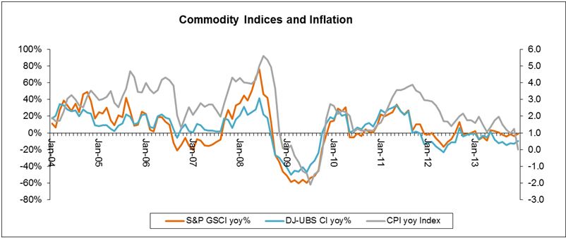
Historically, there has been a high correlation between year-over-year changes of the Consumer Price Index or CPI and commodity indices.  This is since they contain many of the same components like food and energy, and the commodity indices reflect our changing expectation of future prices through the futures contracts.  Also, because food and energy are major components of the CPI and are among the most volatile of inflation, they are key drivers of the indices.  Over the past 10 years, the S&P GSCI has had a correlation of 0.74 to CPI and DJ-UBS has had a correlation of 0.64, where more energy has provided a higher correlation.

Source: S&P Dow Jones Indices and/or its affiliates and ftp://ftp.bls.gov/pub/special.requests/cpi/cpiai.txt  Data from Jan 2004 to Dec 2013. Past performance is not an indication of future results. This chart reflects hypothetical historical performance. Please see the Performance Disclosure at the end of this document for more information regarding the inherent limitations associated with backtested performance.
Source: S&P Dow Jones Indices and/or its affiliates and ftp://ftp.bls.gov/pub/special.requests/cpi/cpiai.txt Data from Jan 2004 to Dec 2013. Past performance is not an indication of future results. This chart reflects hypothetical historical performance. Please see the Performance Disclosure at the end of this document for more information regarding the inherent limitations associated with backtested performance.

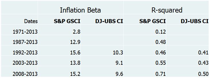
Further since food and energy typically represent a higher percentage of commodity indices than of the CPI, one dollar of investment in a commodity index will provide a basis for more than one dollar’s worth of inflation protection. In this chart, the inflation beta can be interpreted as a 1% increase in inflation results in 10.3% increase in return of the DJ-UBS  during the period from 1992 through 2013. Notice the  S&P GSCI  has had the highest inflation beta that is likely due to its world production weighting scheme that yields a higher energy weight.

SOURCE: S&P Dow Jones Indices (rolling 12-month calculations) Inflation beta data are measured by CPI-U as listed on the website: ftp://ftp.bls.gov/pub/special.requests/cpi/cpiai.txt  R-squared signifies the percentage that inflation explains of the variability in commodity index returns Inflation beta can be interpreted as: (using DJ-UBS CI 1992-2013 as an example)  A 1% increase in inflation results in 10.2% increase in return of the DJ-UBS CI during the period from 1992–2013 Time periods shown reflect first full year of returns for the S&P GSCI (1971), first year crude oil was included in the S&P GSCI (1987), first full year of returns for the DJ-UBS CI (1992), 2003 aand 2008 are 5-years and 10-years.
SOURCE: S&P Dow Jones Indices (rolling 12-month calculations)
Inflation beta data are measured by CPI-U as listed on the website: ftp://ftp.bls.gov/pub/special.requests/cpi/cpiai.txt
R-squared signifies the percentage that inflation explains of the variability in commodity index returns
Inflation beta can be interpreted as: (using DJ-UBS CI 1992-2013 as an example) A 1% increase in inflation results in 10.2% increase in return of the DJ-UBS CI during the period from 1992–2013
Time periods shown reflect first full year of returns for the S&P GSCI (1971), first year crude oil was included in the S&P GSCI (1987), first full year of returns for the DJ-UBS CI (1992), 2003 a and 2008 are 5-years and 10-years.

If we look at the super accommodative monetary policy including zero interest rates and quantitative easing, it really hasn’t worked at all.  The U.S. economy has been chugging along at about 2% GDP and we really haven’t seen any signs of inflation, just about 1% core. It is because of the kind of recession we’ve had that requires consumers, corporations, and governments to shrink or delever since they took too much debt.  During the deleveraging process the interest rates don’t matter much – or like John Maynard Keynes said, “it’s like pushing on a string.”

Now that the deleveraging seems to be ending, the US economy has come back nicely, despite the four years it took.  Consumers are borrowing again, though at more appropriate levels for their incomes, corporation have tremendous amounts of cash and are fine, and state and local governments which took a longer time to balance have stopped cutting jobs.

So, the right policy at the Fed should start working about now given inflation should be kicking in this year. Generally it takes about 18-24 months for inflation to start after the clock starts ticking, which Blu says happened around Dec 2012.  However, if there is no FX feedback (and there is none now, since the USD is doing OK), the time lag might take longer or the inflation pressure might be little more muted than otherwise.

How will the Fed respond Not clear, but if you accept the Fed’s guidance, they want to be “behind” the inflation curve and let it get started. What this means is that given their dual mandate of encouraging full employment and maintaining price stability, which is defined by them as 2% core inflation rate (that is minus food and energy), the Fed is likely to wait until inflation hits at least 2.5% until they act. 

Although, it is not just about when the data gets there. The Fed needs to feel like market expectations are rising and at that point they will probably start raising fed funds rates from its near zero level at slow increments of about 25 basis points per quarter.  According to Blu, they may do this until they get to about near or even 1% above the inflation rate

The posts on this blog are opinions, not advice. Please read our Disclaimers.

Europe’s Short Rate Remains Unchanged

Contributor Image
Kevin Horan

Former Director, Fixed Income Indices

S&P Dow Jones Indices

The European Central Bank left its key rate unchanged at a record low of 0.25%.

There was speculation around whether the European Central Bank would cut rates again in response to the low level of inflation (0.7% in January). The central bank’s president, Mario Draghi, addressed the low inflation issue by saying that the measure of inflation would remain low over the upcoming months, but he would expect it to eventually rise back to the central bank’s target rate of just under 2%. Further, he was adamant that there is no deflation in Europe. He continued by explaining how the situation in Europe is not similar to Japan’s deflationary period, touching upon the finer points of Europe’s inflation and describing how the European economic recovery is advancing.

Year-to-date, the S&P Eurozone Sovereign Bond Index is returning 2.44%, just about the 2.46% it returned for all of 2013. Hidden within the broader index though is a number of country stories. Because this is a market weighted index, the return of the index will look more like its larger constituents (aka: Italy, France and Germany). Though if you were to look at the performance of each of the individual countries, it is quite evident that investors have regained confidence in the credit worthiness of the once troubled countries such as Ireland, Italy, Portugal, Slovenia and Spain.
Performance of the S&P Eurozone Sovereign Bond Index and its country sub-indices.

The posts on this blog are opinions, not advice. Please read our Disclaimers.

Olympic Metals: Going For The GOLD?!

Contributor Image
Jodie Gunzberg

Former Managing Director, Head of U.S. Equities

S&P Dow Jones Indices

In honor of the upcoming 2014 Winter Olympics in Sochi, I thought it would be a good time to discuss gold, silver and bronze that are the metals in the Olympic medals. Since copper is the main metal in the bronze alloy, we’ll use copper as the index metal.

Let’s start with gold.  Recently, I had the privilege to discuss gold with Bluford Putnam, Managing Director and Chief Economist, of our partner, CME Group.  We talked about gold as a safe-haven, the central bank buying and the potential shutdown of miners – all which are factors that may cause gold to skyrocket or plummet.

In 2013 gold lost 28.3%, the most in a single year since 1981, when gold lost 32.8%.  Then, the recovery period for gold after the 1981 loss lasted 25 years. Also in 2013, central banks stopped buying gold and assets tracking gold ETPs fell by about 50%.  If history repeats itself, it may be a long recovery for gold but much depends on the fundamentals today.

Many investors who view gold as a safe haven, may be wondering if gold really is a safe haven. According to Blu, there will always be some investors that hold gold as a safe-haven but the central banks are the keepers of the money and hold gold. Although they started buying in the 1990-92 period, they stopped last spring since either they didn’t like the price action or they felt they had enough gold in their portfolio to be diversified. Given this, Blu feels the probability of disaster has really gone down, especially since many central bank actions have been put into place to prevent another storm. 

It seems a slowdown in central bank buying is clearly bearish for gold, but the relationship between monetary policy and gold is rather subtle.  According to Blu, if we start to see inflation but the Fed takes no action, that may be strong for the gold price since the Fed will be behind the curve. On the other hand, if the Fed takes early action and decides to move before inflation, they will be ahead of the curve and that is not good for gold. Blu stated that there is a much higher chance the Fed will be behind inflation but that inflation may not occur until 2015.

The last area of discussion between Blu and me centered around the impact of the gold price drop on gold miners. While some of the gold miners may have fallen into negative territory in 2013, some may not have been impacted since they may have hedged and locked-in an earlier, higher price. However, as the gold price approaches $1,200, Blu says that there might be some mine closures, but the reverse case of gold mining closures impacting the price of gold does not hold since when gold mines close the gold doesn’t disappear.  The much bigger influence in the price of gold is from the jewelry buying from China and India.

Now for the fun part, let’s compare the metals of the medals. Below is a picture of what the Sochi 2014 Medals look like:

Medals

To any Olympic athlete, gold is the goal; however, that may not be the case for an investor. Let’s take a look at the statistics to see how the metals stack up.  Below is a cumulative return chart of gold, silver and copper. Notice over the period that gold has the highest performance with a total of 593% followed by copper and then silver, gaining 452% and 283%.  

Source: S&P Dow Jones Indices. Data from Jan 1978 to Jan 2014. Past performance is not an indication of future results. This chart reflects hypothetical historical performance. Please see the Performance Disclosure at the end of this document for more information regarding the inherent limitations associated with backtested performance.

However, few look at returns without considering risk.  Over the time frame, risk as measured by annualized volatility was 47.6% for silver, 27.3% for gold and 26.3% for copper. Although silver had both the highest volatility and lowest cumulative return, it had the highest average monthly return, up 112 basis points. This is compared with only 73 bps for gold and 68 bps for copper in an average month. Further, in the average up month, silver had the highest gain of 8.9% versus only 6.0% for copper and 5.2% for gold. One might conclude taking the highest risk can pay off but looking at the downside counts as well. The reason gold had the highest cumulative return was since the average loss in a down month of -3.7% was smaller than for either copper’s or silver’s average monthly loss of -5.0% and -6.6%, respectively.  

One major difference between copper and both silver and gold is that copper is an industrial metal though gold and silver are precious metals. This makes copper more sensitive than gold to inflation.  Another key difference from the fact that copper is industrial is that the supply/demand model is dramatically different.  As Blu mentioned in the video, the gold is mined whether or not the miners shut down, but this is not the case for copper.  Copper supply has been stifled by declining ore grades, equipment failures and shortages, and labor disputes.  The impact can be observed and capitalized on by the roll return in the term structure of the futures curve.   See the chart below of historical backwardation and contango in copper, gold, and silver and notice the high backwardation at times for copper that are missing from gold and silver.

Source: S&P Dow Jones Indices. Data from Jan 1978 to Jan 2014. Past performance is not an indication of future results. This chart reflects hypothetical historical performance. Please see the Performance Disclosure at the end of this document for more information regarding the inherent limitations associated with backtested performance.

On average over the time period, copper’s premium or convenience yield was a positive 8 basis points per month, though gold and silver were abundant with average storage costs of 45 and 49 basis points, respectively.  See the table below for more details of premiums earned, represented by backwardation (positive roll return) and storage costs paid, represented by contango (negative roll return).

Source: S&P Dow Jones Indices. Data from Jan 1978 to Jan 2014. Past performance is not an indication of future results. This chart reflects hypothetical historical performance. Please see the Performance Disclosure at the end of this document for more information regarding the inherent limitations associated with backtested performance.

If we tally the count, and again using copper for bronze, the best medal is not as obvious to an investor as to an athlete. The bottom line is that gold is solid, silver has upside potential, and copper may be a winning hedge.

Source: S&P Dow Jones Indices. Data from Jan 1978 to Jan 2014. Past performance is not an indication of future results. This chart reflects hypothetical historical performance. Please see the Performance Disclosure at the end of this document for more information regarding the inherent limitations associated with backtested performance.


The posts on this blog are opinions, not advice. Please read our Disclaimers.

Why U.S. Investors Are Turning to Europe

Contributor Image
Tim Edwards

Managing Director, Index Investment Strategy

S&P Dow Jones Indices

The New York-listed iShares Europe 350 ETF has more than doubled in size in the past six months; the front page of last Friday’s Financial Times reported that U.S. purchases of European equities have surged, while the Wall Street Journal noted yesterday that “Europe is back.”

European equities have underperformed U.S. equities by around 45% since the financial crisis. Despite having a good year in  2013, the S&P Europe 350 remains well below its pre-crisis levels; the S&P 500 spent much of late 2013 recording new highs.  So why would U.S. investors take an interest in European stocks?

One explanation is that while the Euro crisis of 2012 discouraged transatlantic investment, with better economic news it is natural to expect some returning investment from U.S. asset allocators. But valuations may also be playing an important role.

The comparatively small rise in European stock prices since 2009 has resulted  in much more attractive valuation levels than in the U.S., both at the security and Index level.  Dividend yield provides one example:

Div yields

European equities look attractive on a risk-free rate comparison, too.  While the dividend yield for the S&P Europe 350 is well above the German 10 year rate of 1.6%, the dividend yield for the S&P 500 is below the current 10 year UST yield of 2.6%.

Such metrics are attracting attention, and not just from U.S. investors.  In the U.K., The Telegraph’s list of countries with the most attractive CAPE valuations is heavily biased towards European entries.  Other examples abound.

Note in both cases that the yield of the index (which is tilted in favour of larger companies) is higher than the average stock yield, suggesting that smaller-cap companies have not been the drivers of income.  That means that the risk profile can look attractive tooa dividend yield of 2.8% is available even when restricting attention only to those members of the Europe 350 that have increased dividends every year for the past 10 years*.

All other things equal, the Europe 350 would have to gain 50% in price to match U.S. dividend yields.  The stock markets are famed for their regular mockery of predictions, but to the degree that valuations are driving U.S. flows into Europe, such dynamics are likely to remain in place for some time.


 *For example, via the S&P Europe 350 Dividend Aristocrats Index.

The posts on this blog are opinions, not advice. Please read our Disclaimers.

The New Fed! Yellen' About Commodities

Contributor Image
Jodie Gunzberg

Former Managing Director, Head of U.S. Equities

S&P Dow Jones Indices

As we all know by now, Ben Bernanke is gone. He was focused on not having a depression on his watch so he pulled out all kinds of never-before-tried policy tools. Consequently, Janet Yellen will have to cope with the unintended consequences of QE — namely big unrealized losses in the Fed’s bond portfolio. 

Recently, I had the privilege to sit down with Bluford Putnam, Managing Director and Chief Economist, of our partner, CME Group, to discuss how the Fed under Yellen will be different from Bernanke’s Fed.

Although Yellen is also a strong advocate for the traditional Fed culture, which balances inflation and employment goals, she is likely to move to a more “hawkish” position if inflation pressures were to rise unexpectedly, at least from her point of view. Given her specialty in the labor markets, she is likely to focus in much greater detail in all areas of the labor markets, not just headline unemployment but also duration of unemployment, turnover of jobs and part-time employment. She wants to see who got fired versus who left their job voluntarily since a voluntary move may reflect confidence to secure another job, possibly indicating greater market confidence.  By evaluating the numbers in greater depth than the prior Fed, Yellen will use her insight into the labor markets as the starting point to forecast inflation.  While she doesn’t want inflation more than anyone else, her way may be different of finding the indication.

Another key difference in the New Fed is the addition of the new Vice-Chair, Stanley Fischer. He is the former head of the Israeli Central Bank, a former MIT Professor (Bernanke studied under Fischer), and brings an international view that has been missing at the Fed since Robert Heller retired from the board 20 years ago.  The policy implications for the US dollar and other currencies and central banks may get some much needed attention that has been absent for decades.

When Bernanke adopted QE, he made the asset size of the Fed’s balance sheet huge so its importance to the economy and to politicians has increased dramatically.  Possibly as a result of that, the second confirmation vote in the Senate (2010) had more dissents than any previous vote.  That trend followed through to Yellen.  According to Putnam, The Fed Chair is going to be a very divisive appointment in Jan-2018 when Yellen terms is up.  On the way, as members of the Board of Governors leave their posts, each new appointment may face greater political scrutiny and polarization in the US Senate.

For more on the New Fed, my colleague, David Blitzer, also posted some of his New Fed insights earlier this year.

The posts on this blog are opinions, not advice. Please read our Disclaimers.