Get Indexology® Blog updates via email.

In This List

Other Strategies for Fixed Income in Brazil

The S&P Risk Parity Indices: Return Contribution and Leverage

The S&P BSE 500: How Has it Performed?

The Biggest Bull Didn't Win

Strong Returns Over 32+ Years for BXMD Index That Writes OTM SPX Options

Other Strategies for Fixed Income in Brazil

Contributor Image
Jaime Merino

Former Director, Asset Owners Channel

S&P Dow Jones Indices

Over the past 10 years, the highest overnight reference rate from the Brazilian Central Bank has been 14.25% from July 2015 through September 2016. In an attempt to hold back the depreciation of the Brazilian real and to keep inflation within the target range, the reference rate dropped 775 bps to 6.50% at the end of August 2018, which is a record low. In addition, of the USD 1.8 trillion in outstanding debt, almost 60% are sovereign bonds. Because of these factors, a new surge of income has been necessary over the past couple of years.

One way to get exposure to fixed income other than typical bonds are derivatives, and S&P Dow Jones Indices, in partnership with B3, has created the S&P/BM&F One-Day Interbank Deposit 3Y Futures Index. The index is designed to measure the performance of a hypothetical portfolio holding a three-year One-Day Interbank Deposit (DI) Futures Contract. The DI contract is on the Brazilian one-day interbank rate, which is used by Brazilian banks to lend and borrow from each other. The contract provides a way to hedge for or speculate on short-term Brazilian interest rates.

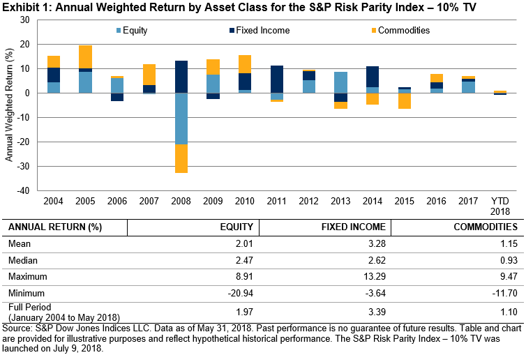
The index offers a benchmark for financial institutions to measure the return on their holdings and can serve as the base of an investment vehicle, as the index is easy to replicate and was created with potential tax benefits in mind. It is also calculated in U.S. dollars, which makes it accessible to investors outside of Brazil. Exhibit 1 shows the performance of the indices calculated as excess return and total return.

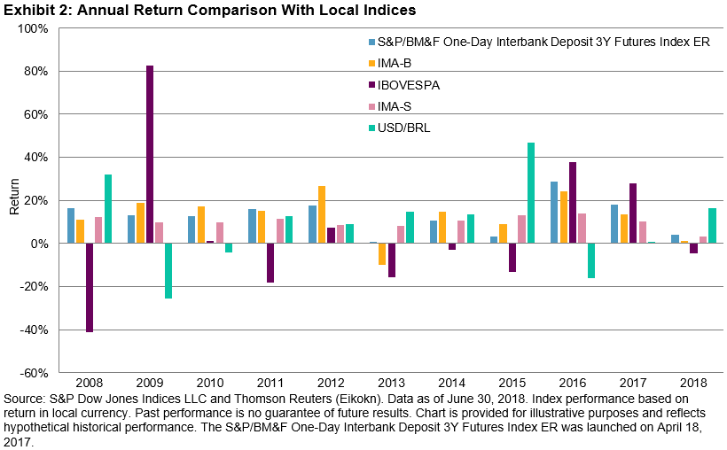
For the first time, this index provides the opportunity for a local fixed income investment vehicle in the Brazilian market that would provide diversification and could be used to gain core fixed income exposure or to hedge current positions. Exhibit 2 shows the comparison of annual returns with other local indices. In the past 10 years, none of the local indices outperformed in particular, but kept steady. However, when comparing the risk/return profiles, the S&P/BM&F One-Day Interbank Deposit 3Y Futures Index significantly outperformed, meaning that it could help in the reduction of risk in a portfolio (see Exhibit 3).

The posts on this blog are opinions, not advice. Please read our Disclaimers.

The S&P Risk Parity Indices: Return Contribution and Leverage

Contributor Image
Berlinda Liu

Former Director, Multi-Asset Indices

S&P Dow Jones Indices

My earlier blog showed that equal risk allocation is different from equal capital allocation. The S&P Risk Parity Indices had roughly equal risk contribution from all three asset classes, while about 60% of the capital was allocated to fixed income.

The historical performance of each asset class also showed that equal risk allocation did not lead to equal return contribution (see Exhibit 1). Not surprisingly, fixed income had the highest return to the overall portfolio over the full period studied, as this low risk asset class has significant overweight in risk parity strategies.

The return decomposition of the S&P Risk Parity Index – 10% Target Volatility (TV) showed that the return contribution by asset classes varied significantly from year to year due to changes in the performance of individual asset classes and the correlation among them, affecting the overall portfolio performance. In 2008, equity and commodities experienced market drawdowns, and only the fixed income apportion had a positive return. As a result, the overall portfolio posted a loss.

Another key feature of risk parity strategies is leverage. Risk parity strategies tend to allocate heavily to less volatile asset classes, and managers usually use leverage on low risk asset classes to achieve an overall return that is similar to a market portfolio. The combination of equal risk contribution from multiple asset classes and leverage help a risk parity portfolio to meet the challenges of achieving market returns and reducing the risk of a multi-asset portfolio.

We can see this demonstrated by the S&P Risk Parity Index – 10% TV. For example, its leverage ranged between 1.32 and 2.24 in our back test (see Exhibit 2). Note that leverage is created so that the overall portfolio volatility matches the target volatility each month. As such, leverage rose in low volatility markets and dropped in high volatility markets. On average, the index had a leverage of 168% or 1.68.

The posts on this blog are opinions, not advice. Please read our Disclaimers.

The S&P BSE 500: How Has it Performed?

Contributor Image
Mahavir Kaswa

Former Associate Director, Product Management

S&P BSE Indices

As highlighted in a prior post, “Getting to Know the S&P BSE 500,” the S&P BSE 500 is considered a proxy for India’s listed equity market, as it covers more than 88% of India’s listed equity universe in terms of total market capitalization. The index also offers diversified exposure to all key sectors of India’s economy and all size segments. In this post, we will review the historical performance of the S&P BSE 500.

As shown in Exhibit 1, from Aug. 1, 2006, to April 30, 2018, the S&P BSE 500 posted an annualized total return of 13.4%, outperforming the S&P BSE 100 and S&P BSE 250 SmallCap Index, while lagging the S&P BSE 150 MidCap Index. The S&P BSE 500 exhibited volatility that was close to the S&P BSE 100’s volatility—not surprising given that S&P BSE 100 constituents account for approximately 79% of the total index weight (see Exhibit 1).

Exhibit 2 shows rolling absolute returns for three-year horizons (750 trading days). All indices compared here performed similarly for most of the period, showing relatively higher correlations with each other. Historically, the S&P BSE 500 and S&P BSE 100 exhibited relatively lower probabilities of negative returns over the three-year investment horizon.

As illustrated in Exhibit 3, out of the total 2,192 trading days observed from Aug 1, 2006, to April 30, 2018, the S&P BSE 500 noted only 113 trading days with returns less than 0%. The relatively more volatile S&P BSE SmallCap 250 Index noted the greatest (452) number of days with negative returns, while the S&P BSE 100, which represents large caps, noted the fewest (52) number of days with negative returns.

The posts on this blog are opinions, not advice. Please read our Disclaimers.

The Biggest Bull Didn't Win

Contributor Image
Jodie Gunzberg

Former Managing Director, Head of U.S. Equities

S&P Dow Jones Indices

The big news in August was that the aging Bull market (since March 9, 2009) became the longest-running Bull market in S&P 500 history, as it posted an annualized 16.6% equity return and 19.1% with dividends, as my colleague, Howard Silverblatt pointed out.  While the record-breaking Bull market for the S&P 500 is spectacular, mid-caps and small caps did even better.  The S&P MidCap 400 posted an annualized 18.6% equity return and 20.5% with dividends, and the S&P SmallCap 600 posted an annualized 20.9% equity return and 22.4% with dividends.

Source: S&P Dow Jones Indices. Daily data from Mar. 9, 2009 through Aug. 31, 2018.

Though large caps outperformed by the most in 2017 since 1999, small caps have made a stellar comeback, nearly doubling the large cap performance year-to-date ending Aug. 31, 2018.  The S&P 600 (TR) is up 18.3% ytd, as compared with 9.9% for the S&P 500 (TR) and 8.7% for the S&P 400 (TR).  The small cap outperformance was widened in Aug. with a monthly return of 4.8% versus 3.3% for large caps and 3.2% for mid-caps.  It was the sixth straight positive month for small-caps delivering a total return of 20.0% over the period in the strongest run since the six months ending Mar. 2012, when the index gained of 31.2%.

Source: S&P Dow Jones Indices. Only total returns of gains from six consecutively positive months are shown.

While all eleven sectors are positive year-to-date for mid and small caps, some of the small cap sectors are having near record years. For example, industrials, the biggest sector in the S&P 600, is having its best year since 1997, up 17.5% ytd, and its third best on record.  The smaller companies of this sector may be more insulated from U.S.-China trade tensions and also has less revenues coming from overseas so has outperformed the large-cap industrials.  Also, heath care in small caps is having its second best year on record, up 47.4%, the best ytd performance since 2000.  That is also driving the S&P 600 Growth (TR) that has nearly 20% in health care to have its second best ytd performance on record, up 23.5% – the most since 2003.  On the other hand, small cap-energy lost more in Aug. than large caps in energy from supply disruptions that drove oil price volatility.

Source: S&P Dow Jones Indices

In Sept., please be reminded of the implementation of the expansion of the telecommunication services sector into the communication services sector according to Global Industry Classification Standard (GICS.)  For more information, please visit our website.


The posts on this blog are opinions, not advice. Please read our Disclaimers.

Strong Returns Over 32+ Years for BXMD Index That Writes OTM SPX Options

Contributor Image
Matt Moran

Head of Index Insights

Cboe Global Markets

In recent years at many investment conferences I heard that many public pension plans face underfunding challenges, and they are very interested in investments with strong returns and moderate risk. While past performance is not a guarantee of future results, the Cboe S&P 500 30-Delta BuyWrite Index (BXMDSM) has shown higher returns and lower volatility than the S&P 500®, MSCI EAFE®, and S&P GSCI indexes in the period from its inception in mid-1986 through July 2018.

LINE CHART – BXMD INDEX ROSE 2527%

Note in the line chart below that since mid-1986 the BXMD index (which writes out-of-the money (OTM) SPX options) (a) rose 2527%, and (b) generally had bigger upside moves during bull markets than the Cboe S&P 500 BuyWrite Index (BXMSM), (which writes at-the-money (ATM) SPX options).

DESCRIPTION OF BXMD INDEX

The BXMD Index is designed to track the performance of a hypothetical covered call strategy that holds a long position indexed to the S&P 500 Index and sells a monthly out-of-the-money (OTM) S&P 500 Index (SPXSM) call option. The call option written is the strike nearest to the 30-Delta SPX call option at 10:00 a.m. CT on the Roll Date. www.cboe.com/BXMD

BAR CHARTS – BXMD HAD HIGHEST ANNUALIZED RETURN OF 10.7%

As shown in the two bar charts below, the BXMD Index had the highest annualized returns of the nine indexes shown, and the BXMD also had lower volatility than the S&P 500 and S&P GSCI indexes.

BXMD – LESS LEFT TAIL RISK IN HISTOGRAM

The histogram with the S&P 500 and BXMD indexes shows that the S&P 500 had 13 months with declines of worse than 8 percent, while the BXMD Index had 9 such months. Certain index options strategies can be used to help manage left tail risk.

RETURNS AND VOLATILITY CHART – BXMD INDEX IS NORTHWEST OF STOCK AND COMMODITY INDEXES

In the Returns and Volatility chart, the BXMD Index had the highest returns of all 11 indexes, and had lower volatility than the stock and commodity indexes.

TABLE WITH METRICS FOR 12 INDEXES – BXMD HAD HIGHEST RETURN AND HIGH RISK-ADJUSTED RETURN

In the table below with metrics for 12 benchmark indexes:

HIGHEST RETURNS. The BXMD Index had the highest annualized returns;

HIGHER BETA. When compared to the market (the S&P 500), the BXMD Index had a beta of 0.82 and an r-squared of 90.55%; both of these numbers are higher than for most of the other option-based benchmark indexes. A strategy that writes OTM index options has the potential to more closely track its related stock index when compared to a strategy that writes ATM index options. The OTM option writing usually takes in lower premiums than the ATM index option writing strategy, but the OTM strategy can participate in the upside moves in bull markets. The BXMD Index is not designed for diversification and portfolio risk reduction goals.

HIGH RISK-ADJUSTED RETURNS. In the table below, the three indexes with the highest Sharpe Ratios were the Cboe S&P 500 Putwrite Index (PUTSM) (0.687); Cboe S&P 500 Covered Combo Index (CMBOSM) (0.591) and the BXMD Index (0.586). The Sharpe Ratio is one of the most popular metrics for risk-adjusted returns, but a key caveat in use of the Sharpe Ratio is that it works best when comparing investments with normal distributions of returns, but most of the indexes in the table below have non-normal distributions of returns with negative skewness. The skewness over the period of 32+ years was negative 2.14 for the PUT Index, negative 1.11 for the BXMD Index, and negative 0.81 for the S&P 500 Index.

HIGHER RISK-ADJUSTED RETURNS AND THE VOLATILITY RISK PREMIUM

An inquisitive investor might ask – how could the BXMD have higher returns, lower volatility, and higher risk-adjusted returns than several key “traditional” indexes over several decades? One possible explanation for the strong relative performance of the BXMD Index is the volatility risk premium – in recent decades SPX options generally have been richly priced. Exhibit 8 of the paper by Wilshire at www.cboe.com/wilshire shows that S&P 500 implied volatility usually has been higher than subsequent realized volatility, and this has facilitated higher risk-adjusted returns for option-selling indexes such as the BXMD and PUT indexes.

The posts on this blog are opinions, not advice. Please read our Disclaimers.