Get Indexology® Blog updates via email.

In This List

No Longer Calm but Not Chaotic

ESG and Supply Chain: Why Both Matter

Evolution of Canadian REITS

Why Your Interest In Weights Should Rise With Rates

Palladium, More Precious Than Silver, Platinum, and Gold

No Longer Calm but Not Chaotic

Contributor Image
Fei Mei Chan

Former Director, Core Product Management

S&P Dow Jones Indices

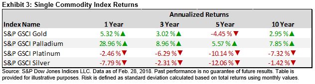
Although market volatility has retreated somewhat since the spike in early February, it has remained elevated. In the last 30 trading sessions, the S&P 500 moved by more than 1% (in either direction) 14 times.

VOLATILITY FOR S&P 500 (21-Day Rolling)

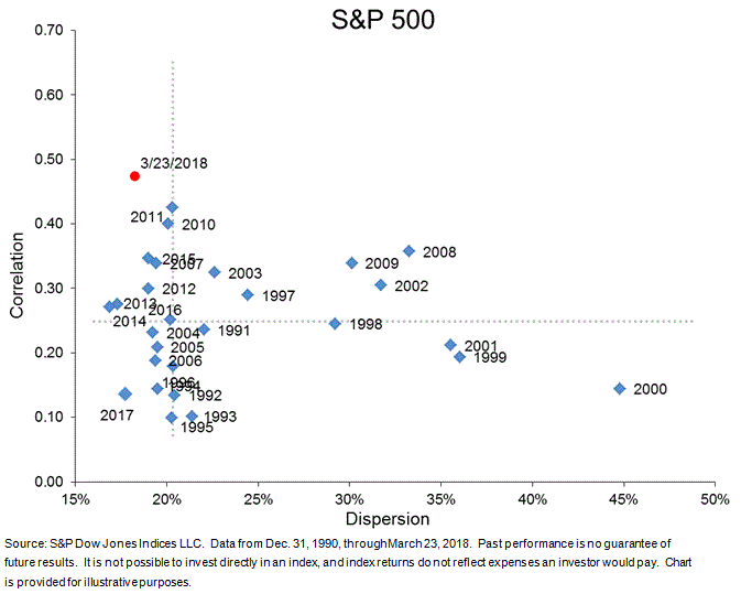
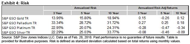
Volatility manifests itself in both dispersion (a measure of the magnitude of differences among an index’s constituent returns) and correlation (the tendency of assets to move in the same direction at the same time).  This means that observing combinations of dispersion and correlation can give us some insight into the dynamics of market volatility.

In February, we put the markets’ record decline—and spike in volatility—in the context of the dispersion-correlation map. The chart below provides an update of where we currently stand in this framework. Immediately following the S&P 500’s 4.1% drop on February 5th, both dispersion and correlation jumped significantly. In the days following, both measures climbed further before they started to retrace. Currently, correlation remains elevated but dispersion is much closer to the levels we saw in January.

ROLLING 21-DAY DISPERSION-CORRELATION YEAR TO DATE

In context of broader history, dispersion is below the median measured from 1991 through 2017 (annual levels are averages of monthly figures), though correlation is still well above median. Things are no longer tranquil like they were in 2017, but we’re also far removed from tumultuous years like 2000 and 2008 when dispersion levels were much higher.

DISPERSION-CORRELATION MAP

The posts on this blog are opinions, not advice. Please read our Disclaimers.

ESG and Supply Chain: Why Both Matter

Contributor Image
Byford Tsang

Senior Analyst

Trucost, part of S&P Global

There has been a rapid shift in the world of corporate disclosure. In the past 12 months, we have seen investment giants writing to CEOs urging them to report on their long-term strategies and socio-environmental goals and the world’s first gender pay gap reporting regulation coming into effect. Companies are responding to the growing need to report environmental, social, and governance (ESG) related information. Research by Trucost found that the number of companies that disclose greenhouse gas emissions increased by 33% from 2012 to 2016. More than 6,000 companies now report to CDP, an investor-led environmental data disclosure initiative.

While these are encouraging signs, the ESG disclosure of most companies focuses on direct operations and largely overlooks their supply chains, where the majority of the risks can lie. Trucost analyzed 19 industry sectors and found that, for most, nearly all of the environmental impacts occurred outside company operations. A CDP study also shows that greenhouse gas emissions in supply chains are, on average, four times as high as those from a company’s direct operations. Companies failing to manage ESG issues in the supply chain are left exposed to reputational, operational, and financial risks.

Growing awareness of the environmental and social impact of companies, and government regulations in response to it, are leaving companies more exposed to disruptions in their supply chains. In 2016, IOI Group, a Malaysian palm oil producer, lost some of its biggest buyers, including prominent international consumer brands such as Unilever and Nestlé, after an investigation found that its suppliers were breaching sustainable sourcing standards. Recently, China’s decision to ban importation of all plastic and mixed paper waste has taken the world by surprise. The share price of Biffa, one of the UK’s largest waste management companies, plunged 12% as investors expected an increase in the cost of locating alternative destinations for recycled goods.

Companies are increasingly being scrutinized not only by shareholders, but also by civil society. An investigation by Amnesty International in 2016 found that Kellogg’s used palm oil produced by child workers in its products. In response to the report, Kellogg’s quickly set up a dedicated team to rectify the issue, established an executive training program on human rights, and reported the progress in its 2017 corporate sustainability report. A newspaper exposé on slavery caused a top British supermarket to pull its beef products from JBS, the largest meat processing company in the world, off the shelves.

Quantifying ESG impact in the supply chain is a valuable first step that companies can take in order to understand their total risk profile. Trucost’s supply chain service helps companies to efficiently measure their environmental and social impact across diverse supply chains. Our analysis draws on a validated database of socio-environmental performance data from more than 13,000 companies and fills any data gaps with our granular environmentally extended input-output (EEIO) model.

Quantified metrics allow companies to prioritize suppliers or products to manage and track progress over time. Companies can also make use of supply chain ESG data to identify opportunities to reduce costs. A group of leading purchasing organizations reported 551 million metric tons of greenhouse gas savings from their supply chain in 2017, which translated to USD 14 billion in cost savings.

Knowing your supply chain is the key to managing and reducing your overall ESG risks. As investors, regulators, and the civil society continue to push for further corporate disclosure, supply chain ESG risks will likely come into the spotlight in the near future.

The posts on this blog are opinions, not advice. Please read our Disclaimers.

Evolution of Canadian REITS

Contributor Image
Smita Chirputkar

Former Director, Global Research & Design

S&P Dow Jones Indices

The Canadian REITs industry will mark its 25th anniversary in June 2018. In light of this milestone event, it is worthwhile to review the evolution of the market as well as the characteristics of the asset class.

Canadian REITs were born after the recessionary period in the late 1980s and early 1990s. There were five REITs in the Canadian market by late 1996. From 1998 to 2000, when technology stocks were soaring, REITs were trading at a discount in Canada. After the burst of the technology bubble, market participants were searching for companies that owned the hard assets, and REITs became a widely accepted vehicle, as they owned or managed the physical assets and satisfied the income needs of investors at that time. The total market capitalization of Canadian REITs grew from CAD 16 billion in June 2005 to over CAD 57 billion by December 2017, as measured by the S&P Canada REIT.

REITs Have Low Correlation With Traditional Asset Classes

In Canada, REITs have outperformed the equities and fixed income asset classes on an annualized return basis over the past 20 years. Despite higher returns, the risk over the test period was similar to that of equities (see Exhibit 2). Over the period studied, the average rolling 12-month correlation of REITs against equities was 0.43, while that of fixed income was 0.21. Correlations of REITs with traditional asset classes are time varying, and the correlation with equities reached a peak of 0.89 shortly after the 2008 financial crisis (September 2009) and gradually fell to 0.29 by December 2010.

REITs Have Low Correlation With Other Dividend-Paying Equity Sectors

Utilities and telecommunication services are typically regarded as high-dividend-paying sectors. Over the period observed, REITs had average correlations of 0.41 and 0.26 with the utilities and telecommunication services sectors, respectively. The correlation with utilities peaked at 0.88 in June 2003, while the correlation with telecommunication services peaked at 0.8 in October 2009, when the Canadian market experienced downturns. Given the low average rolling correlations to other income-producing sectors, REITs and stocks from the utilities and telecommunication services sectors could potentially offer diversification benefits for market participants seeking income.

In the next blog, we will explore in detail the S&P TSX Capped REIT Income Index, which is designed to serve as an income-producing strategy.

The posts on this blog are opinions, not advice. Please read our Disclaimers.

Why Your Interest In Weights Should Rise With Rates

Contributor Image
Jodie Gunzberg

Former Managing Director, Head of U.S. Equities

S&P Dow Jones Indices

Historically as interest rates have risen, equities have done well.  As illustrated in this post, since 1971, the S&P 500 (TR) has gained about 20% on average in rising rate periods, has gained 8 of 9 times and has gained nearly 40% twice with less than a 4% loss for its worst rising rate period.  Also shown in the same note is that every sector, size and style rise on average with rising interest rates, though small caps do particularly well.  This is since growth and inflation are taken into account in many cases when measuring equity duration, where if the growth and inflation outpace the discount rate (based on the interest rate,) the impact is likely positive for stocks.  Given the relatively strong performance of small caps with rising rates, inflation, GDP growth and the falling dollar, now is an interesting time to examine the alternative weighting index performance from the market capitalization weighted indices.

Market cap weighted indices by design, are meant to measure the most basic beta, or systematic risk of the market.  In other words, they just reflect the market composition, so bigger companies get bigger weights resulting in less exposure to smaller companies.  While those indices represent the markets well, the resulting risk and return may or may not be suitable for particular investment goals.  One of the oldest and most common solutions is to include more of the small cap premium by equally weighting each stock in the index, and as shown in this post, equally weighted indices work well historically on average.

Another way to adjust weights is by style, commonly split by value and growth.  Although there are indices that only include style specific stocks many of them still weight the stocks by market cap; however, weighting the stocks by style is more potent, especially for large caps.  So, equally weighted large caps at the core with large cap pure style weighted indices, both growth and value, can give more of performance usually generated by a separate small cap allocation.

Source: S&P Dow Jones Indices. Monthly total returns from December 31, 2007 to December 29, 2017.

The S&P 500 Pure Growth outperforms largely due to its over-weights in financials and health care and under-weights in technology.  Similarly, the S&P 500 Pure Value outperforms from its over-weights in financials and consumer discretionary at the expense of technology in addition to energy, industrials and materials.

Source: S&P Dow Jones Indices. Monthly total returns from December 31, 2007 to December 29, 2017.

The S&P MidCap 400 Pure Growth also adds alpha, particularly with a falling dollar, since the index is more heavily weighted towards information technology.  This mid-cap sector benefits most from the weaker dollar due to more international growth prospects than in any other sector. While the pure growth and equal weights mostly outperformed across sizes, the pure value outperformance only held in large caps.  This is since much more of the weight is redistributed across the large cap spectrum than in the mid and small cap range.

Source: S&P Dow Jones Indices, LLC. As of close of business Mar. 8, 2018.

Although the pure styles have provided outperformance particularly in large caps, the returns between the styles cycle, just like in the size cycle.

Source: S&P Dow Jones Indices, LLC. As of close of business Dec. 29, 2017.

Wherever one may believe the cycle is, one thing that is clear is that in periods of rising rates, large caps benefit most from an alternative weight like equally weighted or pure style, and given longer term size and style premiums exist, these may be strong core choices.  For every 100 basis point rise historically, the S&P 500 has risen on average 1.5%, whereas the S&P 500 Equal Weight rose 4.7% and the Pure Styles of Value and Growth rose a respective 6.1% and 7.9%.  While the small caps still outperform in rising rates, the best bang for the buck from alternative weights is in large caps.

Source: S&P Dow Jones Indices.


The posts on this blog are opinions, not advice. Please read our Disclaimers.

Palladium, More Precious Than Silver, Platinum, and Gold

Contributor Image
Marya Alsati

Former Product Manager, Commodities, Home Prices, and Real Assets

S&P Dow Jones Indices

On March 5, 2018, S&P Dow Jones Indices launched the S&P GSCI Precious Metals, Platinum & Palladium Equal Weight to provide market participants with a reliable and publicly available benchmark for investment performance in the gold, palladium, platinum, and silver commodity markets. The index is equally weighted on a quarterly basis.

What is the added value, if any, of utilizing equal weighting and adding palladium and platinum to the S&P GSCI Precious Metals, which includes only gold and silver with a weight ratio of approximately 9:1? Exhibit 1 depicts the performance of the two indices.

Looking at performance over a 10-year period, it appears that adding palladium and platinum to gold and silver, with an equal weighting improved the performance over the shorter horizon, but how do the indices fair when compared since their base values on Jan. 16, 1995?

The S&P GSCI Precious Metals Index gained over 250% since its base date, compared with the S&P GSCI Precious Metals, Platinum & Palladium Equal Weight, which gained almost 600%. The appreciation was mostly driven by palladium, which increased by over 1,000% since 1995.

Palladium was also the best-performing single commodity for the other annualized time frames, and its stellar performance compensated for its higher annualized risk levels, which resulted in better risk-adjusted returns (see Exhibit 4).

Gold, the second-best-performing precious metal and generally considered a safe haven asset during turbulent market conditions, tends to lose its attractiveness when market participants can obtain better returns elsewhere. Palladium, a byproduct of platinum and nickel, is similar in its status because of its use in precious jewelry and its sensitivity to changes in the U.S. dollar, as it is traded in dollars and becomes expensive when the dollar value increases compared with other currencies. However, palladium also has an industrial application, as it is used in catalytic converters in cars and trucks to reduce pollution, as well as capacitors in consumer electronic equipment. In addition, palladium has been in a deficit since 2012, when it was plagued by challenges in the mining sector and mine closures in Zimbabwe and South Africa, the third- and fifth-largest platinum-producing countries.

Finally, the low correlation in performance of platinum and palladium compared with the traditional precious metals may have a diversification benefit. For comparison, gold and silver have a correlation of 0.72, while gold’s correlation with palladium and platinum is 0.25 and 0.57, respectively.

The posts on this blog are opinions, not advice. Please read our Disclaimers.