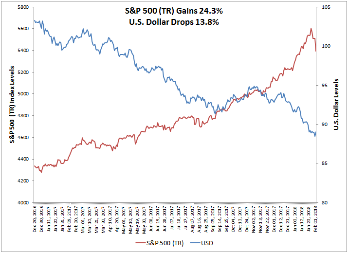
Risk is once again part of investors’ vocabulary. Through yesterday’s close, the S&P 500 lost a total of 6%, made all the more jarring by the practically straight line rise in most of 2018 prior to the losses. Volatility has, of course, ticked up, but in the context of the broader 27 year history, not dramatically so.
ROLLING 21-DAY VOLATILITY FOR S&P 500
While the stock market’s recent declines seem quite traumatic (in point terms, the Dow Jones Industrial Average’s decline was a record), insight into the factors that contribute to volatility may alleviate some worries. The dispersion-correlation map below gives us a way to put the recent jump in market volatility into context. A rolling 21-day look at the dispersion and correlation levels so far this year shows a general trend of increasing dispersion. As of the market’s close on February 5th, dispersion had increased to slightly higher than median levels, and correlation made a significant jump.
ROLLING 21-DAY DISPERSION-CORRELATION YEAR-TO-DATE
The longer-term dispersion-correlation map below shows that 2017 was among the sleepiest of years and, in the context of stock dispersion and correlation, was similar to the boom years of the mid 1990s when volatility was also subdued. Current conditions are at approximately the same levels as in 2011 (a year that experienced significant volatility mid-year but ended more or less flat).
Years of extreme market distress such as 2000 and 2008 witnessed dispersion levels that were much higher than the current environment. If the past is any gauge, therefore, what has happened in the last week hasn’t propelled us to crisis levels.
DISPERSION-CORRELATION MAP