Get Indexology® Blog updates via email.

In This List

There's Nothing Equal About Equal Weight Returns

Green Bond Issuance Doubled in 2017

A new volatility regime? VIX® don't think so!

ESG Meets Behavioral Finance: Part 1

Mexican Sovereign Debt Structure

There's Nothing Equal About Equal Weight Returns

Contributor Image
Jodie Gunzberg

Former Managing Director, Head of U.S. Equities

S&P Dow Jones Indices

Let’s use the S&P 500 as a starting point since it is the most basic beta, or representation of the U.S. stock market.  Since its launch in 1957, it has grown with the stock market and has become the most widely used benchmark of the U.S. stock market with numerous products tracking it.  Although in the beginning of its history, it tracked basically the entire stock market, it still captures about 80-85% of the total market today.

In order to be included in the S&P 500, a stock must be a common stock of a U.S. company, there should be a minimum market cap of $6.1 billion with at least half of outstanding shares available for trading, and there should be a positive sum of the most recent 4 quarters of earnings with the last quarter positive.  However, once the stocks are in the index, they don’t necessarily need to meet these criteria to remain in the index.  The index is reviewed at least monthly to determine any changes, and there have been about 20-25 changes per year based on events that happen to the companies such as mergers and acquisitions.

There are currently 505 constituents with a median market cap of $21.6 billion and average market cap of $48.4 billion.  In the index, the stocks are weighted by float adjusted market capitalization.  The results is the top ten constituents make up just over 20% of the S&P 500, and information technology is the biggest sector, making up over 25% of the index.  Together with the financial sector, they comprise about 40% of the index.

Source: S&P Dow Jones Indices, LLC. As of close of business March 7, 2018.

While the S&P 500 represents the U.S. stock market and can be considered the purest beta, the return profile may not be for everyone.  So, many managers have entered the industry through the past several decades trying to beat the index.  With that has come much great research, in particular, showing a small cap premium.  In 1984, on the back of research by Rolf Banz, Russell launched the Russell 2000 to measure their small cap managers in their consulting business, and most of the time, the managers were able to beat the benchmark.

However, a decade later, the better known Nobel prize winner Eugene Fama and his co-author Kenneth French introduced the 3-factor model using market risk and value in addition to small cap, and it has since been shown by many, including Assness, the small cap premium is stable and significant when quality is a factor.  This research led to the development of the S&P MidCap 400 and S&P SmallCap 600 by 1994, which are much harder for managers to beat, and it is important for the exposure and performance in equally weighted and pure style indices.

Source: S&P Dow Jones Indices, LLC. Index levels from Dec 31, 1994 as of close of business March 6, 2018

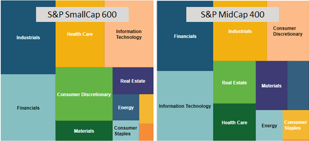
The S&P MidCap 400 and the S&P SmallCap 600 are constructed similarly to the S&P 500 with market capitalization ranges between $1.6 and $6.8 billion for mid-cap and between $450 million and $2.1 billion for small-caps.  While there is still representation across the 11 sectors, and the financials and technology still add up to around 40% in the midcap index, the weights in the two sectors are much more evenly split.  Also, the top ten holdings only make up about 7% of the S&P MidCap 400 that is much less than the 20% of the S&P 500 constituted by its top ten.  The S&P Smallcap 600 concentration is similar to the mid-cap but the technology sector continues to shrink, replaced by industrials.  Together the industrials and financials make up about 35% of the small-caps and the top ten are still about 7% of the index.

Source: S&P Dow Jones Indices, LLC. As of close of business March 8, 2018

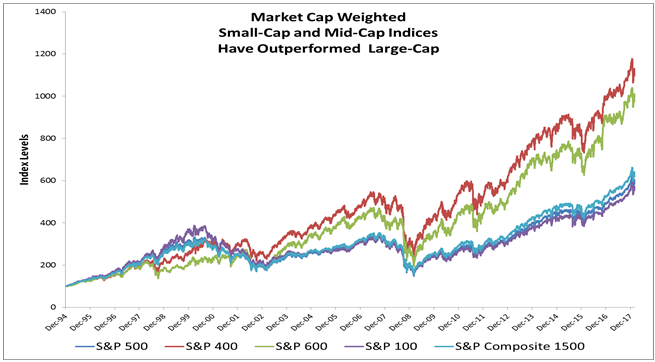
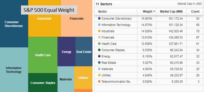
These indices are both more well diversified than the S&P 500, and contribute to the S&P 500 Equally Weighted Index returns versus the 500 itself.  Equally weighted indices have a smaller market capitalization mathematically so have outperformed the market cap weighted indices over the long-term.  Simply, the S&P equally weighted indices for their respective sizes use the universe from relevant the market cap universe and allocate 100%/(n stocks) weight to each stock, then rebalances quarterly.  For example, the S&P 500 Equal Weight Index rebalances quarterly to equal weight each stock in the S&P 500 at the company level of 1/500 = 0.02%.

This results in an index with a concentration as a result of the number of stocks rather than by market capitalization.  The top ten amount to about 2.5% of the index while the consumer discretionary sector rises to the top of weights but with technology, industrials, financials and health care not far behind.  The largest holding as of March 7, 2018 was Netflix at 0.34%, which is a function of performance since the last quarterly rebalance. This is far more diversified than the top ten of the S&P 500 that make up over 20% with nearly 4% in Apple.

Source: S&P Dow Jones Indices, LLC. As of close of business March 07, 2018

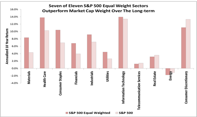
The equally weighted indices across the sizes have outperformed their market cap weight counterparts in the long run, annualized over ten years.  This is since the equally weighted indices have smaller market capitalization by the simple math of construction.  This biggest impact naturally is from the large caps in the move from market cap weighted 500 to equally weighted 500 with a gain of 1.6% annualized.

Source: S&P Dow Jones Indices, LLC. As of close of business March 7, 2018

Also, on average for most sectors the equally weighted outperformance is greatest for large caps.  However, equally weighted technology midcaps have had a greater premium than the other sizes, while small-cap equally weighted had the highest premium for consumer discretionary and telecom. Telecom is harder to measure since there are barely any companies in the large and midcaps with only 3 large and 1 mid– as opposed to 9 in small cap. Also, the technology mid caps may have a bigger premium from the increased international business growth opportunities in that segment of the market.  Technology has more international revenues than any other sector and the midcaps are big enough to go global but small enough to get new business growth.

Source: S&P Dow Jones Indices, LLC. As of close of business March 7, 2018.

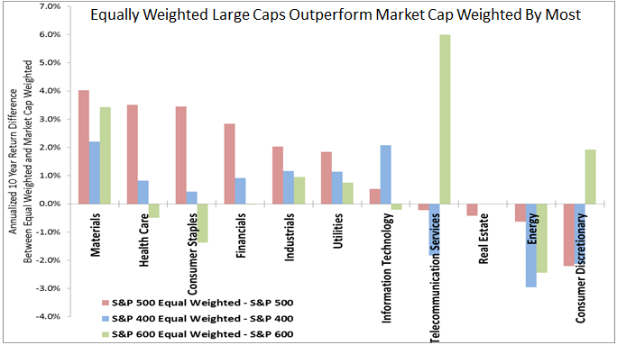
While on the whole the S&P 500 Equal weighted Index is more diversified and has provided a small cap risk premium, and this premium also holds for the majority of the sectors, it doesn’t hold for all.  Sometimes larger size helps, depending on sector or market environment.  For example, in energy, many of the larger energy companies hedge against falling oil prices, so in the past decade of fallen oil, the large companies may not have fallen as much with the price of oil.  On the flip side, when oil rises, the same unhedged companies that are smaller (if they survived the downturn) will probably rise more than their bigger and better hedged counterparts. Though smaller companies can be more nimble, there are instances where larger size is useful for purchasing power or distribution.

Source: S&P Dow Jones Indices, LLC. As of close of business March 7, 2018.

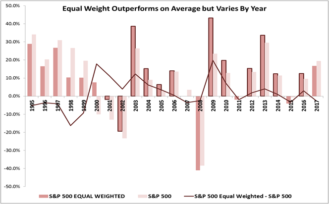
Lastly, when looking at the performance annually, there are specific periods where the S&P 500 equal weight outperforms the S&P 500.  This generally happens in cycles and has fundamental underpinnings that support smaller stocks. Interesting times when equal weights underperformed have been in the financial crisis when smaller companies were beaten down by the credit environment, and recently last year when the market was anticipating Trump’s tax cuts but were delayed so the excitement over small caps diminished.  In 2017, large caps have outperformed small caps by the most since 1999, which historically does not hold.

Source: S&P Dow Jones Indices, LLC. As of close of business Dec. 29, 2017.

In an environment where rising interest rates, accelerating growth, possibly rising inflation and a falling dollar are in place, it may help small and mid caps, especially in energy, financials, materials and information technology.  The equally weighted indices may be a good choice for smaller cap exposure without making a separate small-cap allocation.


The posts on this blog are opinions, not advice. Please read our Disclaimers.

Green Bond Issuance Doubled in 2017

Contributor Image
Dennis Badlyans

Former Associate Director, Global Research & Design

S&P Dow Jones Indices

Gross issuance of green bonds reached USD 157 billion in 2017, nearly double that of the previous year. Fourth quarter issuance was the fastest quarterly pace on record, adding USD 48 billion, 30% more than seen in each of the previous three quarters.

Issuers and issuance types continue to diversify. Asset-backed security (ABS) issuance had the largest year-over-year increase, accounting for USD 36 billion (23% of gross 2017) of total issuance, up from USD 8.6 billion (8.6% of gross 2016). Development Banks, which historically have been the dominant issuers, issued USD 21 billion (14% of gross 2017), down from USD 24 billion (28% of gross 2016) the previous year. Sovereign issuance, which began with Poland in December 2016, has grown to USD 14 billion as of March 2018, with French Treasury, Fijian, Nigerian, Belgium, and Indonesian sovereign bonds. Hong Kong outlined a grant for first-time green corporate bond issuers and plans to issue the largest amount of green sovereign bonds this year.

Despite steady persistence of issuance from China, the U.S. took the top spot in 2017, driven by the increase in ABS issuance. China, a latecomer to the green bond market, took second place, despite the outsized sovereign issuance by the French government, and held on to its third place spot in total issuance.

USD 113 billion of the primary issuance in 2017 qualified for the S&P Green Bond Index, which is designed to track the global green bond market. The primary inclusion rule for the broad index is price availability—currently, the USD 26.3 billion of Fannie Mae ABS issuance is not being included. Of the bonds included in the broad index, 70% by market value qualified for the S&P Green Bond Select Index. This narrower index further limits inclusion with more stringent financial and extra-financial eligibility criteria (see Exhibit 3).

The S&P Green Bond Select Index can help diversify core fixed income exposure away from treasuries. Despite the ramp up in sovereign issuance, agencies, supras, and local authorities account for the lion’s share of the S&P Green Bond Select Index, representing 60% of the index, while treasury bonds constitute less than 6%. In comparison, core fixed income markets are primarily made up of treasuries. For example, in the Bloomberg Barclays Global Aggregate Bond Index, treasuries make up about 60% of the index.

Investors looking to add an element of green exposure to their core portfolio may be able to replace a portion of their global aggregate bonds with green bonds without sacrificing performance. Despite the differences in composition, historical performance of green bonds has been much like the aggregate index. Over the past year, when regressing the daily returns of the S&P Green Bond Select Index against the Bloomberg Barclays Global Aggregate, there was a 0.91 correlation, with a statistically significant (at 95%) slope of 1.03, and a small positive alpha (see Exhibit 4). That means that market participants looking to green up their portfolio may not need to sacrifice performance to do so.

The posts on this blog are opinions, not advice. Please read our Disclaimers.

A new volatility regime? VIX® don't think so!

Contributor Image
Hamish Preston

Head of U.S. Equities

S&P Dow Jones Indices

Global equity markets experienced a challenging February.  A U.S.-led selloff triggered a spike in volatility; the Cboe Volatility Index (VIX) recorded its largest ever daily increase on February 5 to reach its highest level since August 2015.

But is higher volatility here to stay?

Towards the end of last year, we published a paper – and a practitioner’s guide – offering a way to convert a VIX level into an estimate for future S&P 500® volatility.  Using the steps outlined in these papers (and a previous blog post), we calculate that given the recent market environment, we might expect the VIX to be around 24.061.  Instead, it closed last night at around two-thirds of that: ending the day at 16.54.

The significant difference between the actual and expected level of VIX suggests that realized volatility may decline at a faster-than-usual rate from its present highs.  In numerical terms, the details of our paper – applied to the present circumstances – tell us that we might anticipate S&P 500 volatility of around 11% (annualized) over the next 30 days2.  Of course, this is a far from perfect prediction; the actual realized volatility of the S&P 500 is extremely unlikely to be exactly as predicted.

Nonetheless, once suitably interpreted, the information encoded in VIX has a moderately impressive record in predicting future changes in volatility.  Despite the recent uptick in volatility, VIX is telling us that market participants are expecting a return to calmer waters.

(1,2) Realized volatility in the S&P 500 over the last 30 days was 19.97% annualized, giving an expected “mean reverted” (MR) volatility of 18.52%.  Adding the expected premium of 5.54 for this level of MR volatility provides an Expected VIX of 24.06.  Subtracting the 7.52% difference between VIX and Expected VIX from the MR volatility of 18.52% provides the expected volatility of 11.00%.  See “Reading VIX: Does VIX Predict Future Volatility?” for more details of both calculations.

The posts on this blog are opinions, not advice. Please read our Disclaimers.

ESG Meets Behavioral Finance: Part 1

Contributor Image
Lauren Smart

Managing Director, Global Head Financial Institutions Business

Trucost, part of S&P Global

Behavioral economics has had a transformational effect on the fortunes of millions of people saving for retirement through the introduction of auto enrollment, default plans, and “save more tomorrow” schemes. In a series of blogs, I will explore how insights from behavioral economics could be used to revolutionize ESG investing, providing critical levels of capital flows to finance the transition to a more sustainable economy.

‘Nudging’ Sustainable Finance Into the Mainstream: How Behavioral Finance Could Transform Capital Flows to ESG

Richard Thaler won his Nobel Prize for incorporating psychological realism into economic theory, helping transform the pension industry through supposedly irrelevant behavioral “nudges” and making millions of people better off in their old age. He highlighted how human inertia means many people do not join pension schemes, even when employers contribute, essentially turning down “free” money. The rational human of classic economic theory would not behave in this way, but people are not always rational; they are often predictably irrational. Humans prefer the status quo, procrastinate despite best intentions, and underestimate future risks, such as inadequate retirement savings. When these are addressed, for example through auto enrollment, pension participation shoots up. In a recent paper addressing inertia in the Swedish Pension Plan, only 0.9% of people were actively selecting their pension choice, while 99% were on the default plan.[1]

Can We Harness the Power of Inertia to Provide Additional Outcomes for Retirees?

In surveys, millennial market participants are clear that they want more than just a good annuity in retirement. Members enrolling today may not retire for 50 years, during which time the impact of climate change, pollution, and resource scarcity could affect their investments, health, and living environment. The EU taskforce on sustainable finance recommends that pension funds consult beneficiaries on their sustainability preferences and reflect those in their investments;[2] however there is an intent-action gap between what new members say they want and how they actually invest. This can be explained, in part, by inertia, because sustainability funds are usually opt-in. A solution would be for pension funds to default to a sustainability option as NEST, the UK government-backed DC scheme, does. It allocates to UBS’s “Climate Aware World Equity Fund,” which delivers index returns but tilts companies to address climate risks and opportunities. Their rationale is not moral, but rather improved outcomes for members in the face of a green economic transition, because they are “shareholders in that future.”[3] In 2017, HSBC’s UK Pension Scheme transitioned the GBP 1.85 billion equity component of its DC default strategy to LGIM’s “Future World Fund,” a factor-weighted, passive global equity strategy incorporating climate change tilts and exclusions. They echo concern for long-term outcomes for members, “the climate factor tilts [are] especially important as 60% of our members are under 40 years old.”[4] If all schemes defaulted to climate-aware strategies, it could have a profound impact on capital flows to mitigate some of the most damaging financial impacts of climate change and holistically improve outcomes for retirees.

The green elephant in the room is what stands in the way of all pension funds adopting similar approaches. It is a common assumption that sustainability compromises returns; however, this can be traced to cognitive biases such as the “no free lunch” heuristic, confirmation bias, and irrational exuberance about future risks. This is compounded by confusion between “ethical” investing based on values and “sustainable” investing grounded in long-term value generation. Lack of knowledge is another obstacle, both in terms of the pervasive impacts of climate change on asset valuations and an outdated understanding of how sustainability can be incorporated into portfolio construction to deliver myriad risk/return objectives. These topics will be tackled in this blog series and in another recent blog, “Can “Being Green” Deliver Enhanced Returns?

[1]   Cronqvist, Thaler, and Yu (2018), “When Nudges are Forever: Inertia in the Swedish Premium Pension Plan.”

[2]   EU Commission (2018), “Final Report of the High Level Expert Group on Sustainable Finance.”

[3]   National Employment Savings Trust (2017), “NEST responds to climate change.”

[4]   HSBC (2017), “The Best of Both Worlds?

If you enjoyed this content, join us for our Seminar Discover the ESG Advantage in
London on May 17, 2018.

The posts on this blog are opinions, not advice. Please read our Disclaimers.

Mexican Sovereign Debt Structure

Contributor Image
Jaime Merino

Former Director, Asset Owners Channel

S&P Dow Jones Indices

A couple of months ago, we took a look at the Chilean sovereign bond market and indices. This time, we will analyze the case of Mexico, starting with the local bond market, followed by its structure, and ending with its index performance.

Mexican domestic sovereign debt is issued by the Ministry of Finance (Secretaría de Hacienda y Crédito Público—SHCP) through the Central Bank (Banco de México—Banxico). It is issued through weekly auctions based on the annual finance plan, and on a quarterly basis, the Auction Program of Sovereign Securities is published.

The auctioned securities are:

  1. CETES: Mexican Federal Treasury Certificates are the oldest tradable debt instruments issued by the federal government, issued for the first time in 1978. They are zero-coupon securities that are traded at a discount rate, with a face value of MXN 10 and maturity terms of 28, 91, 182, and 364 days.
  2. MBONOS: Mexican Federal Government Development Bonds with a fixed interest rate are securities issued for terms longer than one year. They pay a coupon every six months, have a nominal value of MXN 100, and have maturity terms of 3, 5, 10, 20, and 30 years.
  3. UDIBONOS: Federal Government Development Bonds, denominated in Investment Units (UDIs), which are inflation linked, were developed in 1996. They are investment instruments that protect the holder from unexpected changes in the inflation rate. UDIBONOS pays a coupon every six months based on a fixed rate plus a gain or loss that is indexed to the performance of the UDI. They have a face value of 100 UDI’s and maturity terms of 3, 10, and 30 years.
  4. BONDES D: Federal Government Development Bonds are instruments that pay floating coupons every 28 days based on the weighted average interbank funding rate, with a maturity term of five years.

Using outstanding amount data, we can see the structure for these four types of bonds with a total of USD 270,000 million (see Exhibit 1). Exhibit 2 shows the maturity profile, including the total per bucket, and we can see that one-third of the total maturities occur between 2019 and 2021. In 2018, without taking into account CETES, USD 32,000 million in bonds are expected to mature between Bondes D and MBonos.

The S&P/BMV Fixed Income Indices have more than 25 different indices, which are mainly divided into maturity buckets, that track the performance of such bonds. Four of them cover the complete curves, tracking more than 170 bonds.  Their performance and annual returns are shown in Exhibits 3 and 4.

The posts on this blog are opinions, not advice. Please read our Disclaimers.