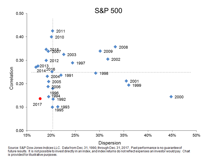
If 2016 was unremarkable, 2017 was downright sleepy…at least as far as equity markets were concerned. In 2017, the S&P 500 notched the lowest level of volatility in 27 years. Both dispersion and correlations were among the lowest levels in the same period. This is in spite of a year that was far from lacking in terms of macroeconomic catalysts—major elections took place and Catalonia threatened to separate from Spain while, domestically, the U.S. government seesawed on major legislation.
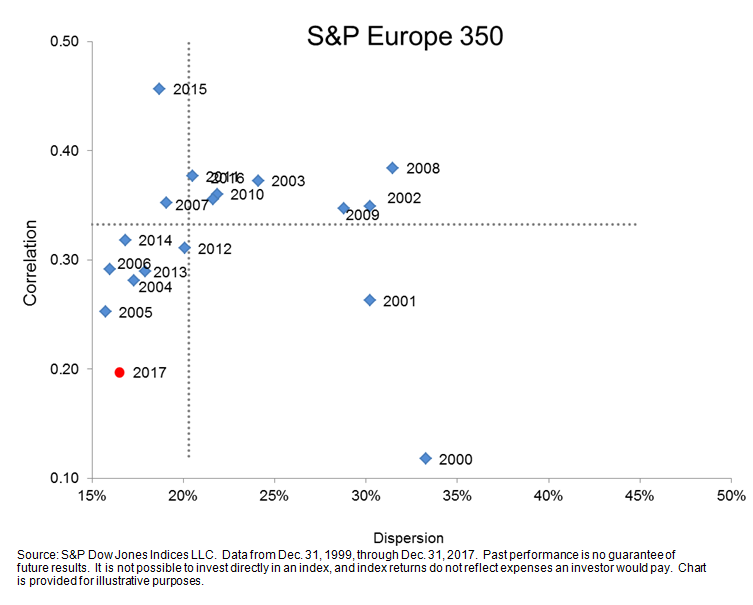
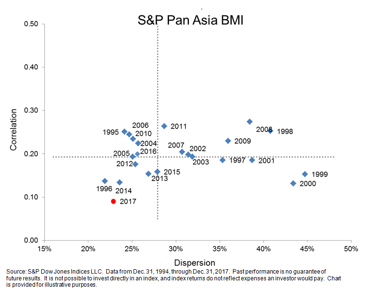
Nevertheless, as the dispersion-correlation maps reflect below, markets took it all in stride. The well below median levels of dispersion and correlation contributed to the extraordinarily muted volatility. This is true not just in the U.S. but also internationally. Dispersion-correlation maps for both the S&P Europe 350 and S&P BMI Pan Asia paint similar pictures.
The S&P 500 gained 22% in 2017 and the good times weren’t limited to just the U.S. Both Europe and Asia enjoyed a good year as well. Understandably, as we head into 2018, investors might be somewhat concerned with froth. The dispersion-correlation map won’t help us predict what 2018 will bring but it offers helpful context around turbulent times. Historically, turmoil in equity markets (such as 2000 and 2008) have been defined by dispersion levels much higher than average…and as the maps below indicate, current levels are far from there.
Dispersion-Correlation Maps