Get Indexology® Blog updates via email.

In This List

Federal Reserve Becomes Buyer of Last Resort

The SPIVA Latin America Scorecard Shows Diverging Countries

Coronaviral Correlations

The Rising Importance of ESG Data

Why the S&P 500® VIX® Short-Term Futures Index Rose More than VIX in March

Federal Reserve Becomes Buyer of Last Resort

Contributor Image
Jason Giordano

Director, Fixed Income, Product Management

S&P Dow Jones Indices

In a previous blog, we discussed the U.S. Federal Reserve’s initial responses to the current market volatility and resultant dislocations. In short, dropping rates to 0% and adding over USD 1 trillion to the funding markets did little to abate the severity of the situation. In an effort to prevent a liquidity crisis from turning into a solvency crisis, the Federal Open Market Committee (FOMC), in combination with the Department of Treasury, has rolled out the following measures.

  1. Quantitative Easing (QE): QE is back and bigger than ever: The FOMC will purchase at least USD 500 billion of Treasury securities and at least USD 200 billion of mortgage-backed securities.

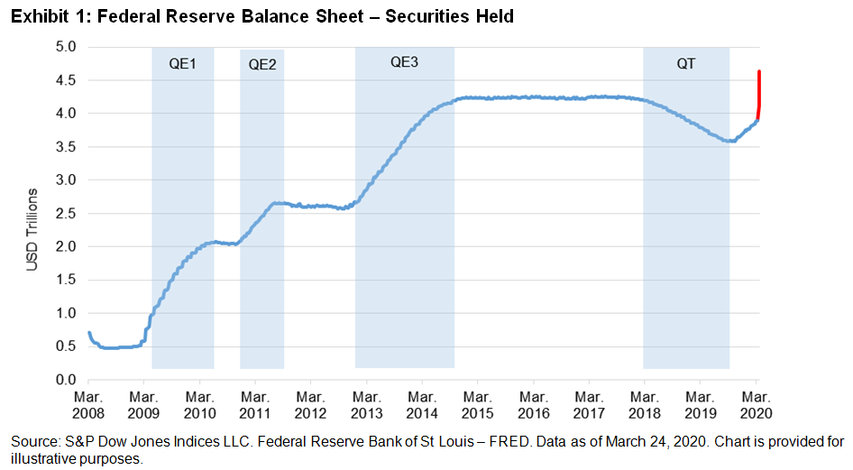
There’s no telling exactly what this amount could climb to, given that the objective is to purchase “amounts needed to support smooth market functioning and effective transmission of monetary policy to broader financial conditions and the economy.”1 Exhibit 1 shows the securities held on the Fed’s balance sheet since 2008 through prior QE phases and the 17-month period of quantitative tightening that began in 2017. The red line shows the rapid expansion taking place the week of March 23.

  1. Term Asset-Backed Securities Loan Facility (TALF): USD 10 billion funded by the Department of Treasury.

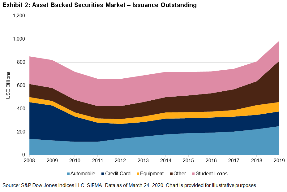
Another tool from the GFC, the TALF will “enable the issuance of asset-backed securities (ABS) backed by student loans, auto loans, credit card loans, loans guaranteed by the Small Business Administration(SBA), and certain other assets.”1 Exhibit 2 shows the current composition of the asset-backed securities market and its growth following the GFC.

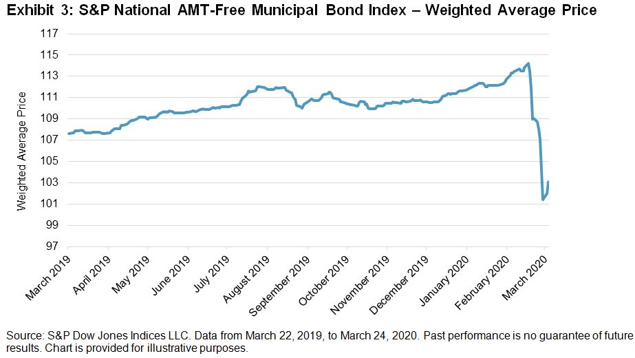
  1. Expansions to the Money Market Mutual Fund Liquidity Facility (MMLF) and the Commercial Paper Funding Facility (CPFF): In an effort to facilitate the flow of credit to municipalities, the Federal Reserve is expanding the MMLF and the CPFF to include high-quality, tax-exempt issues as eligible securities.

This will have a greater impact on money markets than on municipalities, as state and local governments will most likely require more direct intervention. However, Exhibit 3 shows that the announcement encouraged some price support in the broad municipal bond market.

  1. Establishment of Two New Facilities: In an effort to support credit to large employers, the FOMC established the Primary Market Corporate Credit Facility (PMCCF) for new bond and loan issuance and the Secondary Market Corporate Credit Facility (SMCCF) to provide liquidity for outstanding corporate bonds; each facility will begin with USD 10 billion funded by the Department of the Treasury.

This is, perhaps, the most drastic measure the FOMC is taking in an effort to support funding for large corporations. The PMCCF will allow investment-grade companies access to credit and will provide bridge financing of four years. The SMCCF will purchase corporate bonds in the secondary market issued by investment-grade U.S. companies and U.S.-listed exchange-traded funds whose investment objective is to “provide broad exposure to the market for U.S. investment-grade corporate bonds.”1

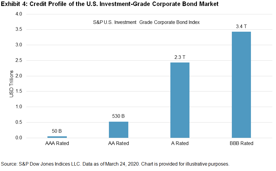
The FOMC is prohibited from selecting specific corporate issuers, and they can only purchase bonds with a rating of BBB- or higher. Exhibit 4 shows the current credit profile of the U.S. investment-grade corporate bond market. Of the USD 6.3 trillion of corporate bonds, more than 55% are rated BBB. While both facilities will surely grow in size to support the market need, the greater risk is the further degradation of credit quality of the USD 3.4 trillion of corporate bonds outstanding.

While the measures outlined in this post are intended to provide support to corporate and municipal debt markets, monetary policy (no matter how extreme) may not be enough to prevent further repricing. More than likely, the highly anticipated fiscal response is what will ultimately determine how soon stability returns to financial markets.

  1. Board of Governors of the Federal Reserve System; federalreserve.gov.

The posts on this blog are opinions, not advice. Please read our Disclaimers.

The SPIVA Latin America Scorecard Shows Diverging Countries

Contributor Image
Maria Sanchez

Director, Sustainability Index Product Management, U.S. Equity Indices

S&P Dow Jones Indices

The SPIVA® Latin America Year-End 2019 Scorecard was released last week, showing divergent results for Latin American equities markets. The report covers Brazil, Chile, and Mexico in selected fund categories. In the framework of stable inflation, a decline in unemployment, and lower interest rates, 2019 was a great year for Brazilian equities markets, as measured by its benchmarks across three fund categories; the S&P Brazil BMI returned 35%, the S&P Brazil LargeCap returned 26%, and the S&P Brazil MidSmallCap returned 55%. Compared with Brazil, Mexico’s equities market was positive, but with moderate results; the S&P/BMV IRT increased 2%. The case of Chile was much more unfortunate, especially considering the recent social unrest, with the S&P Chile BMI falling 8.8% during the 12-month period ending on Dec. 31, 2019.

The rise in the Brazilian equities markets lead to active large-cap fund managers’ outperformance against the S&P Brazil LargeCap during the one- and three-year periods, although they couldn’t repeat the performance for longer-term periods. Mexican active equities fund managers and Chilean active equities fund managers failed to beat their benchmarks over the one-, three-, five-, and ten-year periods (see Exhibit 2). Mexican funds led survivorship across the four observation periods.

For more details on the SPIVA Latin America Year-End 2019 Scorecard, please click here.

The posts on this blog are opinions, not advice. Please read our Disclaimers.

Coronaviral Correlations

Contributor Image
Craig Lazzara

Former Managing Director, Index Investment Strategy

S&P Dow Jones Indices

Mea culpa: Roughly a month ago I used a dispersion-correlation map to describe how index dynamics can illuminate market movements.  In particular, I reported that since high dispersion seems to be a necessary condition for a bear market, and S&P 500 dispersion levels at the end of February were far below those prevailing in past declines, conditions at that time did not look like bear markets had historically looked.  Since our analysis uses a 21 trading day lookback, I providentially noted that “in 21 more days we’ll have a completely new set of observations.”

21 days have now passed, and we have a completely new set of observations.  Market dynamics have evolved with extraordinary speed, as any sentient observer knows.  Exhibit 1 shows the decline in the S&P 500 since its February 19th high, plotted against comparable data from the 2007-09 financial crisis.  The index declined 32% from its peak through the close of trading on March 20, 2020.  The comparable loss of value during the financial crisis required a full year.

Exhibit 1.  Current Decline vs. Financial Crisis

Source: S&P Dow Jones Indices. Data from Oct. 9, 2007 (blue) and Feb. 19, 2020 (orange). Graph is provided for illustrative purposes. Past performance is no guarantee of future results.

Just as values deteriorated rapidly, dispersion and correlation shifted rapidly.  Exhibit 2 plots 21-day trailing dispersion and correlation between February 19 and March 20.  The movement toward higher dispersion and higher correlation – upward and to the right – is striking.  Bear markets seem less dependent on correlation than on dispersion, and dispersion has increased dramatically.  But what’s particularly striking is today’s elevated levels of correlation.

Exhibit 2.  Evolution of Dispersion and Correlation Since the Market Peak

Source: S&P Dow Jones Indices. Data from Feb. 19, 2020 to March 20,2020. Graph is provided for illustrative purposes.

This makes fundamental economic sense, of course, since correlation measures the degree to which the components of the index move together.  A pandemic of still-unknown duration and severity can be expected to affect every business adversely.  The degree of adversity will obviously vary across industries, with some (e.g., airlines and hotels) suffering more than others (which accounts for heightened dispersion).  But almost all will move down, driving correlations higher.

Exhibit 3 makes it clear that this has happened to an unprecedented degree, as correlations within the S&P 500 reached record levels for the month ended March 20.  Students of index dynamics will not be surprised: high volatility can be expected when both dispersion and correlation are elevated.  It is hard, in fact, to find other months comparable to this one; Exhibit 3 highlights those closest to today in the upper right corner.

Exhibit 3.  Dispersion and Correlation by Month

Source: S&P Dow Jones Indices. Data from Jan. 31, 1971 through March 20, 2020. Graph is provided for illustrative purposes only.

Exhibit 4 identifies each month in which dispersion was above average and correlation was elevated (above 0.45), and asks what happened in the aftermath of the market’s reaching those levels.  There have been 11 such months since 1971; in every case the market was higher a year later, with an average gain of 24%.

Exhibit 4.  The Aftermath of High Volatility

Source: S&P Dow Jones Indices. Chart is provided for illustrative purposes only. Past performance is no guarantee of future results.

Past results legendarily do not predict future returns, and today’s correlation levels suggest that more spikes in volatility might lie ahead.  But selling stocks in environments like the present has historically meant missing out on the recovery.

The posts on this blog are opinions, not advice. Please read our Disclaimers.

The Rising Importance of ESG Data

Contributor Image
Jaspreet Duhra

Managing Director, Global Head of Sustainability Indices

S&P Dow Jones Indices

The demand from investors for environment, social, and governance (ESG) data and ESG products has never been stronger. This has triggered a growing industry of ESG data providers in the market. It is vital for S&P Dow Jones Indices (S&P DJI), when choosing ESG data providers who drive our ESG solutions to work with market-leading global practitioners. These practitioners must be able to demonstrate in-depth company analysis and robust governance structures, ensuring the quality of their data and our products.

Some investors have used ESG data in investment processes for many decades. S&P DJI launched the first-ever global sustainability benchmark, the Dow Jones Sustainability World Index[i] over 20 years ago, partnering with ESG rating specialist SAM. In recent years, the uptake in using ESG data in the investment community has been notable. For instance, the number of financial institutions signing up to the Principles for Responsible Investment has been increasing year over year, with over 2,250 signatories in 2019.[ii]

There are many drivers for this increased interest in ESG investing. One is expanding regulations, particularly in Europe. Another is more ESG data being made available to investors as a result of improving company disclosures. There is also increasing awareness and acceptance from investors regarding the financial materiality of ESG data and the role it can play in aiding investment decisions.

This momentum behind ESG investing has intersected with a trend toward passive investment, as investors continue to look for transparent, low-cost, and tax-efficient alternatives to actively managed, higher-cost products. This dual increase of money moving into passive and ESG solutions makes it essential for S&P DJI to continue to invest in quality, innovative, and deep ESG sources.

S&P DJI’s long-term partner, SAM, continues to provide us with some of the most robust ESG ratings available in the market, with a depth of company engagement that is unrivaled among its peers. The data that SAM provides us also powers our own S&P DJI ESG scores, which are used in many of our ESG indices, including our S&P ESG Index Series launched in 2019.[iii]. SAM was acquired by S&P Global in January 2020. In our recent webinar—Using ESG Data to Simplify the Complex—Manjit Jus of SAM explored how ESG data sets can be used in ESG indices.

Climate is often the top issue for investors when considering ESG issues. This has long been recognized by S&P DJI, as we launched the S&P Global Carbon Efficient Index Series back in 2009. In developing our carbon-efficient indices, we sought to partner with a high-quality global carbon data provider, ultimately selecting Trucost (part of S&P Global since 2016). Trucost provides us with a wide range of climate metrics that enable us to create the breadth of climate indices demanded by investors. It has proven to be at the forefront of climate innovation by regularly launching new climate data sets as investor needs evolve. For instance, in developing an index concept that aligns with requirements of the EU climate benchmark regulations, we rely upon several innovative Trucost datasets, including global scope 3 data, physical risk datasets, and transition pathway data.[iv]

Our offerings provide access to the highest-quality ESG data and ESG indices, utilizing the in-house research of SAM and Trucost, both of which are part of S&P Global. This, coupled with our lengthy history of providing independent and transparent indices, positions us well to supply the broad suite of high-quality ESG index solutions increasingly required by the market.

You can learn more about the vital role of data in ESG indices in the replay of our recent webinar, Using ESG Data to Simplify the Complex.

[i] Dow Jones Sustainable Index https://spdji.com/indices/equity/dow-jones-sustainability-world-index

[ii] PRI 2020, About the PRI https://www.unpri.org/pri/about-the-pri

[iii] S&P 500 ESG Index https://spdji.com/indices/equity/sp-500-esg-index-usd

[iv] Conceptualizing a Paris-Aligned Climate Index for the Eurozone https://www.spglobal.com/en/research-insights/articles/conceptualizing-a-paris-aligned-climate-index-for-the-eurozone

The posts on this blog are opinions, not advice. Please read our Disclaimers.

Why the S&P 500® VIX® Short-Term Futures Index Rose More than VIX in March

Contributor Image
Berlinda Liu

Former Director, Multi-Asset Indices

S&P Dow Jones Indices

Markets are down over 20%, COVID-19 is a global pandemic, negative global growth is looming—all of that just in the first 20 days of March! During same time period, VIX rose 65%, while the S&P 500 VIX Short-Term Futures Index jumped 175%. With a long-term beta of 0.7 to spot, a question might be—why did the S&P 500 VIX Short-Term Futures Index jump more than the spot?

The reason for this is that March was a time for catching up. In February, the spot jumped 113%, while the front two months’ futures lagged, rising 44% and 30%, respectively, thereby leading to a 134% and 146% respective catch-up in March.

Now, interestingly, the S&P 500 VIX Short-Term Futures Index, an unleveraged hypothetical basket of the first two VIX futures contracts, returned more than either of its constituents. This is because of “roll yield” due to the curve being in backwardation—where rolling an expensive first month to a cheaper second month adds to returns. VIX has been backwardated since Feb. 24, 2020, as shown in an earlier blog.

Exhibit 1 shows the VIX term structure on Jan. 2, 2020 (in contango) and on March 20, 2020 (in backwardation). In the first case, the S&P 500 VIX Short-Term Futures Index sold first-month futures at USD 14.08 and bought the same second month portion at USD 16.13, incurring a per-unit roll cost of USD 2.05. While on March 20, 2020, the daily roll of the index would sell higher at USD 61.53 and buy lower at USD 56.63, thus enjoying a per-unit profit of USD 4.90. Since VIX futures were backwardated for almost a month, this additional roll return was not negligible.

If a VIX futures gradient on a given day is quantified as its slope between the first- and second-month contracts, a positive slope (or a contango) amounts to a roll cost, while a negative slope (or backwardation) yields a roll carry.

Further, we define monthly average VIX futures gradient as the average of daily slopes during that month. Since the S&P 500 VIX Short-Term Futures Index rolls continuously, this is essentially the actual monthly roll cost. A positive number indicates cost, while a negative number indicates roll yield. Exhibit 2 shows that the daily roll in the first 20 days of March contributed a positive return of 13% to the index return.

Exhibit 3 shows that the negative correlation between the S&P 500 VIX Short-Term Futures Index and the S&P 500 is stronger in a bear market than in a bull market. Interestingly, the correlation between its monthly roll cost and the equities market is also much stronger when the market goes down (see Exhibit 4). Thus, in a stressed market, it is more likely that the VIX futures term structure will be backwardated and investors will benefit from the daily roll of the index.

Vladimir Lenin said, “There are decades where nothing happens; and there are weeks where decades happen.” While the market has faced unprecedented pressure from a pandemic, the S&P 500 VIX Short-Term Futures Index has generated positive returns from the elevated VIX level and the roll yield from the VIX futures term structure. Backwardation is uncommon, but it has come to the rescue when it was needed most.

The posts on this blog are opinions, not advice. Please read our Disclaimers.