Get Indexology® Blog updates via email.

In This List

The Most Dangerous Words

Capture the Growth of Australia’s Technology Industry

Profiling the "Personality" of 2 Dividend Strategies – A Factor Look

Protection and Participation

Brent versus WTI Crude

The Most Dangerous Words

Contributor Image
Craig Lazzara

Former Managing Director, Index Investment Strategy

S&P Dow Jones Indices

The four most dangerous words in investing are “This time it’s different.”  –  Sir John Templeton

As investors ponder the ultimate extent of the coronavirus epidemic, this week’s equity market declines are of natural concern to every asset owner.  The obvious question, after near-record point drops in major indices yesterday and today, is how much worse the damage might get.

To relieve your suspense immediately, I confess that I don’t know.  Furthermore I don’t know anyone who does know, and I am cynical enough to suggest that anyone who claims to know should be presumed to have a tenuous (and possibly mendacious) grasp of reality.  It’s not just the compliance department that keeps us from giving investment advice.

What we can do, however, is to offer some insights from our study of index dynamics.  In 2016, we introduced the dispersion-correlation map to provide perspective on both good and bad markets, as shown in Exhibit 1.

Exhibit 1.  Dispersion-Correlation Map for S&P 500

Source: S&P Dow Jones Indices. Graph is provided for illustrative purposes. Past performance is no guarantee of future results.

Each point in the exhibit represents the average dispersion and correlation for the S&P 500 in the indicated calendar year; the numbers in parentheses are the year’s total return.   The exhibit shows that truly bad markets —  the deflation of the technology bubble, or the global financial crisis — have only occurred in the presence of very high dispersion.  The converse is not true — some high dispersion years have seen strong positive returns.  But it’s fair to observe, based on data back to 1991, that high dispersion seems to be a necessary though not sufficient condition for a bear market.

Comparing the month ended February 24th with these historical data suggests that we are not on the verge of a prolonged market decline.  This conclusion is reinforced when we look at monthly data for two notably bad years.

Exhibit 2.  Dispersion and Correlation by Month, 2001 and 2008

Source: S&P Dow Jones Indices. Graph is provided for illustrative purposes. Past performance is no guarantee of future results.

The data in Exhibit 2 show dispersion and correlation for individual months, as opposed to the annual averages of Exhibit 1.  It’s  clear that current dispersion levels are far below those prevailing in 2001 or 2008.  This can change, of course — in 21 more days we’ll have a completely new set of observations.  And it’s certainly possible that the pattern we’ve observed for the past 30 years can admit of an exception.  But unless such an exception occurs, or unless dispersion increases dramatically from its current level, it seems unlikely that we’re on the cusp of a sustained bear market.

The posts on this blog are opinions, not advice. Please read our Disclaimers.

Capture the Growth of Australia’s Technology Industry

Contributor Image
Michael Orzano

Head of Global Exchanges Product Management

S&P Dow Jones Indices

In partnership with the ASX, we recently introduced the S&P/ASX All Technology Index, which, for the first time, brings together ASX-listed companies across a range of industries whose businesses are primarily technology focused. In a market heavily concentrated in banks and natural resource companies, the S&P/ASX All Technology Index provides access to a unique, underrepresented segment of the Australian equities market that has also recently been the country’s fastest-growing sector.

In the past five years, the number of S&P/ASX All Technology Index constituents nearly doubled from 24 to 46, while the total market cap of these companies increased more than fivefold from AUD 17 billion to nearly AUD 92 billion.

As illustrated in Exhibit 2, the S&P/ASX All Technology Index substantially outperformed other major Australian equity sectors and the broader Australian equity market over the trailing one-, three-, and five-year periods ending Dec. 31, 2019. Over the past five years, the index recorded an annualized total return of 17.4% compared with the 9.0% return of the S&P/ASX 200.

In order to fully capture technology-driven businesses in Australia, we felt it was important to expand the scope of the index beyond the GICS® Information Technology sector. This allows the index to include other innovative technology-related industries such as health care technology and companies operating online marketplaces that are classified in other GICS sectors. Exhibit 3 illustrates the top 10 members of the index as of Dec. 31, 2019.

To learn more about the S&P/ASX All Technology Index, please see our Talking Points that introduces the new index.


The posts on this blog are opinions, not advice. Please read our Disclaimers.

Profiling the "Personality" of 2 Dividend Strategies – A Factor Look

Contributor Image
Andrew Neatt

Private Investment Advice

TD Wealth

How do the personalities of two dividend index portfolios look when reviewed under the “Factor Lens”? Using the Optimal Asset Management’s Factor Allocator tool, let’s review two strategies – S&P 500 Dividend Aristocrats and the S&P 500 High Dividend Index.

We can identify the average factor exposures of each strategy since January 1995 by viewing their Best Factor Fits (BFF).

The BFF for the S&P 500 Dividend Aristocrats is the following:

…compared to the BFF of the S&P 500 High Dividend Index:

One observation from the above factor comparison is their similar exposure to Low Volatility.  From there, the differences between the strategies become apparent. To begin, only the S&P 500 Dividend Aristocrats has exposure to Quality. Secondly, the S&P 500 High Dividend Index has a larger exposure to Value and Low Momentum.

So, let’s focus on the differences.  As of November 29, 2019, the following is the performance of each of these factors since January 1995.

When comparing to the S&P 500 benchmark, the S&P 500 High Dividend Index’s larger exposure to Low Momentum appears to have hurt its returns and increased its volatility. Also, High Dividend’s larger exposure to Enhanced Value may have helped its returns but increased its volatility. However, the S&P 500 Dividend Aristocrat’s exposure to Quality appears to have enhanced its performance and reduced its volatility.

How did the individual factors perform during different market regimes when compared against the S&P 500 (benchmark) according to Optimal Asset’s Factor Allocator tool?

One observation is the Factor Allocator indicates Quality’s returns were relatively strong during weak market environments while Low Momentum and Value provided relatively poor returns in this same environment. Another observation provided by the Factor Allocator tool is Low Momentum and Value provided elevated volatility in all market regimes while Quality provided some reduced volatility during periods of weak markets.  One could argue based on this data that the S&P 500 High Dividend Index consisted of less defensive factors when compared to S&P 500 Dividend Aristocrats.

The posts on this blog are opinions, not advice. Please read our Disclaimers.

Protection and Participation

Contributor Image
Fei Mei Chan

Former Director, Core Product Management

S&P Dow Jones Indices

Through Feb. 20, 2020, the S&P 500 Low Volatility Index® is up 5.9% compared to a gain of 4.7% for the S&P 500. Equities roared out of the gate in 2020 but a hiccup in late January allowed Low Vol to catch up and eventually overtake the S&P 500. Those who are familiar with low volatility strategies are not surprised. The strategy’s explicit goal is to muffle the magnitude of movements—in both directions.

By design, Low Vol aims at protection and participation.  A well-designed low volatility index should go down less when the market is down but also go up less when the market is up. Strong markets are the worst environments for low volatility indices, which generally underperform by the largest margin then. But the trajectory of strong markets also play a role in Low Vol’s performance. Choppiness tends to be Low Vol’s best friend. (Relatedly, the S&P 500 High Beta Index usually does well in strong markets but in this choppy environment, the index is up only 2.2% through Feb. 20, 2020.) Strong markets are generally not times for Low Vol to shine but choppiness often allows Low Vol to close the lag (and occasionally even overtake the lead).

Following the market’s strong finish at the end of 2019, it’s not surprising to see that volatility declined across all eleven S&P 500 sectors.

The latest rebalance for the S&P 500 Low Volatility Index is effective after market close Feb. 21, 2020. Industrials had the biggest increase in weight which came largely at the expense of Real Estate.  Consumer Discretionary and Technology experienced the largest reduction in volatility at the sector level but Low Vol only added an extra percent to its Technology holdings while Consumer Discretionary actually experienced a reduction in weight, pointing to higher relative volatility at the stock level.


The posts on this blog are opinions, not advice. Please read our Disclaimers.

Brent versus WTI Crude

Contributor Image
Jim Wiederhold

Former Director, Commodities and Real Assets

S&P Dow Jones Indices

Crude oil is the most abundant and most traded commodity in the world, and it is one of the first places market participants look when seeking commodity exposure. Crude oil prices are also closely watched as investors try to glean clues about global economic growth; even after the collapse of oil prices in 2014, the commodity remains a bellwether for economic activity and market sentiment.

However, it is important to distinguish between the two most commonly traded contracts of crude oil in the markets: Brent and West Texas Intermediate (WTI). Brent refers to oil that is produced in the Brent oil fields and other sites in the North Sea. Brent is the benchmark for African, European, and Middle Eastern crude oil and is often considered the benchmark targeted by OPEC. WTI crude is sourced from the U.S. and is seen as the benchmark in the Western Hemisphere. Both are light, sweet crude oils, although WTI is generally sweeter and lighter than its European counterpart.

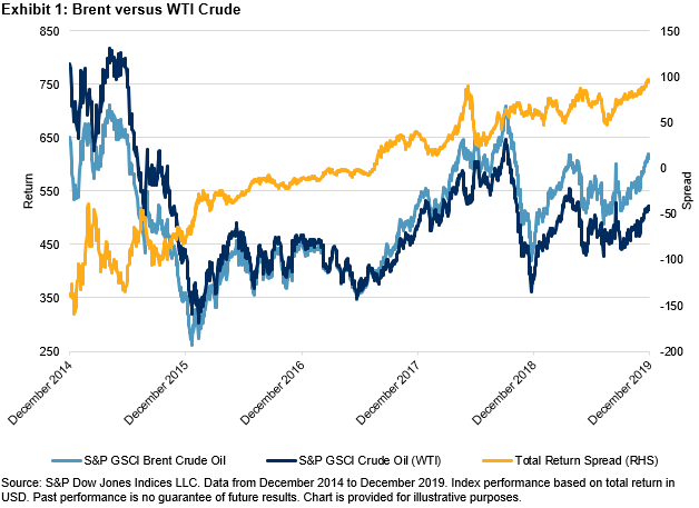
Exhibit 1 shows the performance of the S&P GSCI Brent Crude Oil versus the S&P GSCI Crude Oil (the measure for WTI) over the past five years. Since the lows in early 2016, the S&P GSCI Brent Crude Oil overtook the S&P GSCI Crude Oil and the spread between the two total returns steadily moved higher.

As the American shale revolution has taken hold, cheaper production has led to lower breakeven costs for U.S. producers of WTI crude oil. In 2019, daily U.S. crude production surpassed Russia and Saudi Arabia to rank the country as the world’s largest oil producer. This helped to keep a lid on WTI prices.

Combining to account for about a third of world oil consumption, China and the U.S. are the world’s largest importing countries. The start of the U.S.-China trade war in the summer of 2018 caused large oscillations in the spread between the S&P GSCI Brent Crude Oil and the S&P GSCI Crude Oil (see Exhibit 2). The trade war coincided with sanctions on Iran and Venezuela and a change in OPEC production targets.

The correlation between Brent and WTI prices is close to one, but there are idiosyncratic factors driving the performance of each. Historically, Brent crude oil was more affected by geopolitics than was WTI crude oil. Currently, geopolitical tensions are markedly high in the Eastern Hemisphere, where most of Brent production and distribution takes place. Flare-ups have led to higher beta moves by Brent crude oil during price spikes in comparison with WTI crude oil. A blog by Fiona Boal, Head of Commodities and Real Assets at S&P DJI, details the market reaction to the escalated tensions in January 2020 between Iran and the U.S. and discusses structural changes in the oil markets. OPEC+ has attempted to affect Brent crude oil prices specifically as the oligopoly collectively has acted to maintain certain levels of production in an attempt to manage prices.

WTI crude oil has historically been less sensitive to geopolitics, and short-term price moves have often closely tracked U.S. crude inventories. The largest customers of WTI crude oil differ from those of Brent crude oil. Before the lifting of the 40-year-old export ban by the U.S. in 2015, 94% of WTI was imported by Canada. However, this reliance on one export market has fallen considerably, and the U.S. is now a key exporter to Asia and Europe.

Our colleagues at S&P Global Platts constructed an interactive periodic table of oil illustrating the differences in crude oil grades in more detail.

S&P DJI offers a robust menu of crude oil futures-based indices tracking Brent and WTI crude oil. Variations of each, including leveraged and inverse versions, can be found through the Index Finder on the S&P DJI Index website.

The posts on this blog are opinions, not advice. Please read our Disclaimers.