Get Indexology® Blog updates via email.

In This List

The VIX Futures Curve Is in Backwardation

The Darkest Hour

Bye Bye Bull Market: Reaction to Coronavirus

Key Takeaways from the 10th Annual Australian Indexing & ETF Masterclass

The S&P Eurozone Paris-Aligned Climate Index Concept: A Greenwashing Minimization Approach to High Climate Impact Sector Neutrality

The VIX Futures Curve Is in Backwardation

Contributor Image
Tianyin Cheng

Former Senior Director, ESG Indices

S&P Dow Jones Indices

Backwardation is incredibly uncommon in the VIX® futures curve. While the reason behind this term structure is not perfectly understood, the conclusion is clear: long and hold does not work for VIX futures, as the roll cost burns.

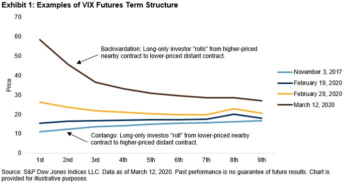
There are different ways to measure VIX futures backwardation: by using the relationship between the VIX level and the front-month futures, between the first and second month futures, or between points further out on the curve.

One way I think highly insightful is to calculate the roll yield by taking the return of the S&P 500® VIX Short-Term Futures ER MCAP Index (ER measures the price return plus the roll return) less the returns of the S&P 500 VIX Short-Term Futures Index (which measures the price return only). Backwardation was implied by a positive result, whereas contango was implied by a negative result. This approach also allows us to decompose the return of the S&P 500 VIX Short-Term Futures ER MCAP Index into the price change of VIX futures (at constant one-month maturity) and roll yield/cost.

Backwardation is incredibly uncommon in the VIX futures curve. Since 2005, there have only been four periods where the roll yield was wider than 1%—during the financial crisis, when the U.S. lost its ‘AAA’ credit rating in 2011, in February 2018, and now.

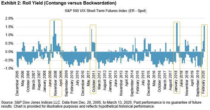
The implication of this is that when VIX futures are backwardated, exchange-traded products that track the S&P 500 VIX Short-Term Futures ER MCAP Index may earn a positive return from rolling into a cheaper contract before expiry, independently from the futures price change. Thus if the VIX level is unchanged, the index can still provide positive returns through the roll yield. For example, this roll yield averaged 1.2% per day last week (March 9-13, 2020).

We know backwardation is an uncommon occurrence, and Exhibit 3 provides some historical context of how long backwardation has lasted in prior periods.

Note the longest streaks in Exhibit 3 were 76 and 63 days and they occurred in 2011 and 2008, respectively. During both periods, roll yield contributed 115% and 45% to the S&P 500 VIX Short-Term Futures ER MCAP Index, respectively.

We have been in backwardation for three weeks (as of March 13, 2020), and VIX is approaching an all-time high; if the markets continue to be volatile, we could be in this situation for some time.

The posts on this blog are opinions, not advice. Please read our Disclaimers.

The Darkest Hour

Contributor Image
Chris Bennett

Former Director, Index Investment Strategy

S&P Dow Jones Indices

It is always darkest just before the Day dawneth

-Thomas Fuller

The bull market is over.  After 11 years of impressive and relatively steady gains, last week the S&P 500® slid into bear market territory, marking the end of the glory of the 2010s and the start of a new regime.  Volatility is back with a vengeance, and safe haven assets are now the belles of the ball.  But what does this mean for markets? Should we panic yet? The short answer is: probably not.

While there have been many painful market declines, including the 2000-2002 bursting of the tech bubble, the 2008 financial crisis, and the current coronavirus-driven sell-off, the historical market trend has been strongly positive.  Since 1950, there have been very few periods during which the S&P 500 has been down over a five-year period, and even fewer over ten-year periods, as shown in Exhibit 1.

This isn’t too much of a leap given what we know:  The S&P 500 today is higher than when it was launched, and the long-run trend will likely remain positive.  Short-term sentiment may shift day to day or even hour to hour depending on a variety of factors, but the market has historically risen more often and to a greater extent than it has declined.   What this means is that bad days or volatile periods tend to be temporary dislocations rather than sea changes.  After major drops, the S&P 500 typically rebounds.  If we take, for example, the 10 worst daily declines in the S&P 500 dating back to the 1951 Fed-Treasury accord, as shown in Exhibit 2, we see that the index has recovered from most major drops within a year.  Even when the recovery took a bit longer, the damage eventually became history.

Of course, past performance is no guarantee of future results. Our intent is not to call a market bottom or to predict short-term movements, but rather to highlight what history tells us: the market tends to recover.  Unless there is an absolute need for immediate liquidity, riding out the storm has generally been a better decision than running away at the start of a panic.  In fact, many of the best days in the market have followed the worst ones.  The only way to capture these rebounds is to be in the market.  While timing the recovery is a fool’s errand, betting that there will be one is a fairly safe wager.  Consider that before you take your chips off the table.

The posts on this blog are opinions, not advice. Please read our Disclaimers.

Bye Bye Bull Market: Reaction to Coronavirus

Contributor Image
Hamish Preston

Head of U.S. Equities

S&P Dow Jones Indices

The last few weeks have definitely felt like a “where were you when…?” moment as coronavirus fears spread around the world and many people’s day-to-day lives have been disrupted.  Amid the anxiety and disruption, global financial markets nosedived, sending all major equity indices tumbling, VIX® soaring to levels not seen since the financial crisis, and yields on U.S. Treasuries falling to record lows.

Highlighting just how long it feels since the S&P 500® notched its latest all-time high closing price level on February 19th, the benchmark officially entered correction territory – measured by a 10% decline from its recent high – at breathtaking pace (6 trading days) towards the end of February.  Precipitous falls this month – the 9.51% plunge on March 12th represented the index’s worst daily return since Black Monday in 1987 – then cemented the end of the longest bull market in historybull markets don’t die slowly but with a bang.

The turnaround in market sentiment also impacted smaller U.S. companies: while the S&P 500 sat 27% lower than its all-time high at last Thursday’s close, the S&P MidCap 400 (-32%) and the S&P SmallCap 600 (-34%) both fell more over the same period.  Given smaller companies’ revenues are typically more domestically focused, and so are usually more reliant on the domestic consumer and the health of the domestic economy, recent returns may reflect increasing expectations for a slowdown in the U.S. economy and the relative difficulty smaller companies may have in navigating such a scenario.

More broadly, fears surrounding coronavirus contributed to 20% declines in all but three U.S. sector indices between February 19 and March 12.  Energy companies were particularly hard hit given the recent moves in oil.  And although Friday’s gains offered some respite – the S&P 500 (+9.32%), S&P 400 (+8.46%), and S&P 600 (+8.18%) posted their best daily total returns since October 2008, and all sectors rose, as the U.S. administration set out plans for containing the virus – there remains some way to go to recover prior losses.

So where do the recent market movements leave us?  Undoubtedly, the last few weeks have been extremely challenging as new information on the coronavirus has been priced in real time, contributing to sizable market moves.  But as Friday’s moves highlighted, market volatility can go both ways: larger market recoveries have typically followed larger declines.  Given the difficulties in correctly timing the market, keeping calm and avoiding knee-jerk reactions may be helpful.


The posts on this blog are opinions, not advice. Please read our Disclaimers.

Key Takeaways from the 10th Annual Australian Indexing & ETF Masterclass

Contributor Image
Stuart Magrath

Former Senior Director, Channel Management, Australia and New Zealand

S&P Dow Jones Indices

On March 3 and 5, 2020, S&P Dow Jones Indices hosted its 10th Annual Australian Indexing & ETF Masterclass series in Melbourne and Sydney. The events saw over 200 financial advisers come together in a week that, until the week after, had been the most volatile for financial markets since the stock market rout of 1987. That advisers were willing to spend four hours on their professional development at a time when many clients would have needed reassurance to “stay the course” with their current portfolios, or to make any changes, is an extremely positive sign, particularly when so much of the content and discussion revolved around the client.

The delegates to our masterclass had the privilege of hearing Michael Jones, a U.S.-based financial adviser, share his thoughts on the experience that advisers in the U.S. underwent as they transitioned from a brokerage model (i.e., commission-based revenue) to a fee-based model, most commonly AUM related. Michael was a captivating speaker and eloquently described that transition, along with the benefits that accrued not only to clients, but also to financial advisers. The key benefit was that now advisers and clients had aligned interests to grow AUM. The Australian experience has been somewhat different, and Michael was at pains to point out that the U.S. experience was not a template for Australia, but that there may be some valuable learnings for the financial advice industry here in this country.

Due to increasing interest in environmental, social, and governance (ESG), our 2020 masterclass included a session on S&P DJI’s approach to this theme. Priscilla Luk, Managing Director & Head of Asia Pacific, Global Research & Design at S&P DJI, presented from Hong Kong via Skype and provided background on why investors around the globe should consider integrating ESG themes into their investment portfolios. Priscilla also addressed the international growth of ESG assets and why ESG data is so vital to successfully accomplish ESG integration.

“Masterclass Week” always provides an opportunity to hear directly from a large number of financial advisers, and in particular their “what keeps me awake at night” concerns. Apart from the conversations with advisers at the events, we also set a cracking pace to meet advisers in their offices during the week. Michael Jones was a participant at these meetings in Melbourne and Sydney, but also this year in Toowoomba, Queensland.

The overarching theme emerging from these meetings is that advisers are continuing to work through the implications for their businesses, and ultimately their clients, in the aftermath of the recommendations, as well as the heightened compliance requirements from the Hayne Royal Commission. These themes include the hard intellectual work of determining a firm’s value proposition to clients in a meaningful manner. This may include a focus on “asset gathering” and outsourcing “asset allocation” and “asset management” to third-party partners. Alternatively, it may include building their own model portfolios of ETFs, or even building bespoke blends of ETFs and direct equities and managed funds.

“Masterclass Week” is also the time of year for the release of our  SPIVA® Australia Year-End 2019 Scorecard. As in previous scorecards, the results show that it remains difficult for active managers to outperform their respective index benchmarks across most asset classes, with the exception of the Australian Equity Mid- and Small-Cap fund category. This result, however, was not persistent over the five-year period.

If you wish to learn more about the masterclass, or have a discussion around SPIVA, please email or phone me: stuart.magrath@spglobal.com, +61 (0)2 9255 9869.

The posts on this blog are opinions, not advice. Please read our Disclaimers.

The S&P Eurozone Paris-Aligned Climate Index Concept: A Greenwashing Minimization Approach to High Climate Impact Sector Neutrality

Contributor Image
Ben Leale-Green

Former Associate Director, Research & Design, ESG Indices

S&P Dow Jones Indices

In January 2020, S&P Dow Jones Indices released a paper for the S&P Eurozone Paris-Aligned Climate Index Concept (PAC Concept). The PAC Concept aims to align with the proposals of the EU Technical Expert Group on Sustainable Finance (TEG), as published in its Final Report on Climate Benchmarks and Benchmarks’ ESG Disclosure dated September 2019,1 for the Paris-Aligned Benchmark—the more stringent of the two benchmarks proposed by the EU. Furthermore, the PAC Concept aims to align with the TCFD’s recommendations on Climate Related Financial Risks and Opportunities. Since publication of the paper, we have received a lot of feedback on our approach, particularly with respect to the application of high climate impact sector neutrality.2

The PAC Concept uses “Trucost3 sector” data, which has been mapped to the NACE4 sections defined as high emitting.5 There are 464 “Trucost sectors,” which are based on revenue streams. Therefore, companies can have exposure to multiple different “Trucost sectors” and by extension, exposure to both high and low climate impact sectors. This can be seen in Exhibit 1, where more companies have a mix of high and low climate impact revenue streams than those with only low impact or only high impact.

The PAC Concept’s granular view on revenues from high climate impact sectors ensures the same revenues, per dollar invested, as the underlying index. This objective would not be achievable if we only used company-level sector classification. This helps to minimize any unintentional greenwashing from index design within the TEG proposed high climate impact sector framework when company classifications are applied, rather than revenue classifications. Constructing the index using sector classifications means index design can transfer weight into companies with far less exposure to high-climate-impact sectors, as opposed to companies with more carbon-efficient practices. The latter are likely to be at the forefront of the low-carbon transition.

There are revenues from both high and low climate impact sectors6 in most GICS® sectors (see Exhibit 2). The same is observed within GICS industry groups (see Exhibit 3).

Exhibit 4 shows where large weights from Energy and Materials may have been placed within high climate impact revenue streams. The X axis shows the percentage of revenues coming from high climate impact sectors and the Y axis shows the difference in sector weight between the parent index and PAC Concept. The size of the bubbles represents the weight of each sector within the parent index.

We can see weight being taken from Energy and Materials. A lot of this weight appears to be redistributed into Consumer Staples and Health Care. These two sectors had slightly less exposure to high climate impact sectors; however, this was where much of the weight ended up. There was also an overweight of the Consumer Discretionary sector, which has high climate impact exposure.

GICS industry group analysis shows a similar story at the more granular level. Household & Personal Products, Pharmaceuticals, Biotechnology & Life Sciences, and Semiconductors & Semiconductor Equipment all saw overweighting, while having high exposure to high climate impact sectors.

1 The EU Technical Expert Group on Sustainable Finance Final Report on Climate Benchmarks and Benchmarks’ ESG Disclosure, September 2019. The final report will serve as the basis for the European Commission for the drafting of the delegated acts under Regulation 2019/2089.

2 Climate Impact Sector neutrality is mandated by TEG in its Final Report.

3 A part of S&P Global.

4 NACE (a French term “nomenclature statistique des activités économiques dans la Communauté européenne”) is a revenue-based sector classification used within the European Union.

5 High climate impact sectors as defined by the TEG in the Final Report.

6 The percentage of revenues has been calculated as the weighted average of the percentage of each company’s revenues from high climate impact sectors, weighted by their weight in the S&P Eurozone LargeMidCap.

The posts on this blog are opinions, not advice. Please read our Disclaimers.