Get Indexology® Blog updates via email.

In This List

Reviewing S&P Pure Style Indices from a Sector Perspective

S&P Pure Style Indices Versus S&P Style Indices: The Impact of Security Selection and Weighting on Excess Returns

An Unfair Fight: Value Managers Were Crushed

Communication Services Is Getting Louder

A Little Bit of Low Vol Can Go a Long Way

Reviewing S&P Pure Style Indices from a Sector Perspective

Contributor Image
Melody Duan

Former Senior Analyst, Multi-Asset Indices

S&P Dow Jones Indices

The S&P Pure Style Indices select and weight securities based on their style scores, unlike the traditional S&P Style Indices. In our previous blog post, we demonstrated that differences in index construction play a major role in the performance differential between the S&P Style Indices and the S&P Pure Style Indices. We estimated that the differences in style purity and weight scheme mostly contributed positively to the excess returns of pure style indices over style indices.

In this blog, we examine the excess returns from a sector perspective. With its higher style focus, we expect the S&P Pure Style Indices may also have more concentrated sector exposures. Therefore, we assess the performance differences between the two style series using sector grouping. In Exhibit 1, we lay out the sector weights for the two style indices compared with their benchmarks.

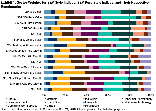
Across all size segments for value indices, the pure versions had higher concentration in fewer sectors compared with the style indices. One such sector is Consumer Discretionary, where the pure value had almost double the weight versus value.

Interestingly, the sector allocation for pure growth indices was less distinctive compared with growth indices, based on data as of Dec. 21, 2018. Energy was the only sector where pure growth indices had consistently more weight relative to growth for all size segments. A potential reason for this lies in the growth factors used in index construction. Although Energy did poorly in 2018 in terms of price momentum, it increased significantly in terms of earnings and sales growth (which is on a three-year basis).[1] We covered the fundamental analysis for these indices with more detail in the first blog of this series.

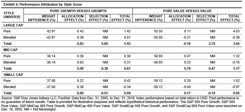
But did this higher concentration in sectors detract from performance? Using sector grouping, we computed the performance attribution on an annual basis and reported the average of the figures in Exhibit 2.

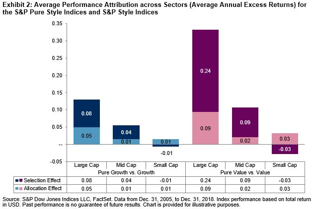
We found that stock selection played a larger role in explaining the returns than allocation differences for large- and mid-cap segments when grouped by sectors. The opposite occurred in small caps, where allocation differences among the sectors drove the excess returns. For full details and numbers by sector, please see our paper, Distinguishing Style from Pure Style.

In a following post, we will look at how these indices behave in different market and style cycles and explore implications for those characteristics.

[1]   Based on the Index Earnings Report for the S&P 500, S&P MidCap 400 and S&P SmallCap 600, which can be accessed under the Additional Info tab at https://spindices.com/indices/equity/sp-500, https://spindices.com/indices/equity/sp-400, https://spindices.com/indices/equity/sp-600, respectively.

The posts on this blog are opinions, not advice. Please read our Disclaimers.

S&P Pure Style Indices Versus S&P Style Indices: The Impact of Security Selection and Weighting on Excess Returns

Contributor Image
Melody Duan

Former Senior Analyst, Multi-Asset Indices

S&P Dow Jones Indices

The S&P Style Indices and the S&P Pure Style Indices have distinct long-term performance differences and risk/return characteristics. We highlighted those in a prior blog where we reviewed the two approaches to constructing traditional style and pure style indices.

What are the drivers of the return differentials between pure style and style? We know that pure style indices differ from style indices in two aspects: weighting scheme and security selection. In this post, we continue to take a deeper dive into these style indices by examining the impact that weighting scheme and style selection have on relative performance.

To estimate the portion of excess returns arising from weighting scheme,[i] we compute the hypothetical market cap weighting of the pure style indices. We then compare the returns of the market-cap-weighted versions to the returns of the actual indices, which are weighted by style score.

Exhibit 1 shows the average annual excess returns of the pure style indices relative to the style indices. The second column shows the average annual excess returns when the pure style indices are weighted by market cap. The difference between the first and the second column is an approximation of the resulting excess returns coming from alternatively weighting. For example, the average annual excess return of the S&P 500® Pure Growth and S&P 500 Growth in period 1 was 3.68%, of which roughly 3.28% was due to the weighting scheme.

Over the long-term investment horizon, with the lone exception of the S&P MidCap 400 Pure Growth, weighting by style score resulted in positive excess returns compared with weighting by market cap.

Next, we determine the performance impact of holding only pure style securities—those with a style score of 1—compared with the overall style universe, which contains pure and non-pure securities. To test this, we group securities of a given style universe into two groups (pure and blended) and look at the performance attribution using the groupings.

The allocation effect in Exhibit 2 indicates the amount of average annual excess returns that were attributable to style purity between the S&P Style Indices and S&P Pure Style Indices.[ii]

For the most part, the difference in style purity (pure versus blended), as indicated by allocation effect, contributed positively to excess returns, with the exception of the S&P 500 Pure Value. For example, the average annual excess return of the S&P 500 Pure Growth over the S&P 500 Growth over the entire period was 1.43%, of which the difference in value definitions (allocation effect) added 0.83%.

In an upcoming post, we will review allocation differences among sectors for the two style series to see if stock selection remains the main driver of the performance differential.

[i]   It is not possible to cleanly attribute how much of the return difference came from security selection versus weighting by style score. This is because style scores are used in both selection and weighting, creating an interaction effect between the two.

[ii]   Although reported in Exhibit 1, selection effect is not meaningful for this analysis, as it also includes the interaction effect between selection and weighting. Exhibit 2 better represents the impact of the weighting scheme on performance.

The posts on this blog are opinions, not advice. Please read our Disclaimers.

An Unfair Fight: Value Managers Were Crushed

Contributor Image
Shaun Wurzbach

Managing Director, Head of Commercial Group (North America)

S&P Dow Jones Indices

When I was in the U.S. Army, the doctrine for an attack specified a desired ratio of at least three of us versus every one of them. This would help to ensure an unfair fight. When your life is on the line, you want the odds in your favor.

Why should that desire to tilt the odds in your favor be any different in your doctrine for portfolio management? While some combatants in the active versus passive battle (it’s not a debate) are hoping for an armistice, our Global Research & Development team opened up a new campaign front when they published Distinguishing Style From Pure Style. Findings from the paper show that most value managers were decisively engaged and defeated by the S&P Pure Value Indices across numerous business cycles.

A 15-year period of comparison is particularly interesting to look at, because it takes into account value performance before, during, and after the global financial crisis. Using data from S&P Dow Jones Indices and the Center for Research in Security Prices (CRSP) from Dec. 31, 1997, to June 29, 2018, and looking back 15 years, only 16.9% of active managers with a large-cap value mandate outperformed the S&P 500® Value. How many of those same active mutual fund value managers outperformed the S&P 500 Pure Value? Zero. No prisoners were taken. Exhibit 1 shows fairly similar results across mid-cap value funds.

In the U.S. small-cap space, some actively managed mutual funds survived to fight another day. Exhibit 1 shows that 13% of these funds outperformed the S&P SmallCap 600 Pure Value. I doubt they celebrated that as a grand, historic victory, since only 5.4% outperformed the S&P SmallCap 600 Value in that same time period.

My team is often describing indices as tools. But when it comes to the S&P Pure Style Indices, we might want to start calling them weapons. Weapons of mass active manager destruction.

The posts on this blog are opinions, not advice. Please read our Disclaimers.

Communication Services Is Getting Louder

Contributor Image
Jodie Gunzberg

Former Managing Director, Head of U.S. Equities

S&P Dow Jones Indices

Since the sector shakeup on Sep. 24, 2018,  the S&P 500 fell 19.5% through the close of Dec. 24, 2018 then rebounded 12.2% by the close of  Jan. 23, 2019 for a loss of 9.6% in the full period.  The annualized volatility of 22.8% in the past 82 days has been the highest since the 82 days ending Feb. 1, 2012, when the level was 22.9%.  While the volatility is higher than the 15.7% average for 82-day periods since Jan. 4, 1928, it is not near the high of 65.5% that occurred in the 82-day period ending on Jan. 2, 2009.  Nonetheless, the distinct down and up periods are interesting to evaluate, especially for the newly configured sectors.

Inside of the S&P 500 on Sep. 24, 2018, the market capitalization ($MM) for communication services was 2,444,289, consumer discretionary was 2,501,033 and information technology was 5,133,491, which resulted in respective index weights of 9.9%, 10.2% and 20.8%.  This meant information technology was the biggest sector in the S&P 500, consumer discretionary was the fourth largest and and communications services was the fifth largest.  Through Dec. 24, 2018, the S&P 500 Information Technology lost 23.1%, the S&P 500 Consumer Discretionary lost 22.0% and the S&P 500 Communication Services lost 17.8%.  Of the three sectors, only the communication services sector avoided a bear market and outperformed the S&P 500.

Source: S&P Dow Jones Indices.

The losses were severe in all three sectors, with market capitalization ($MM) declines of 437,154, 565,886 and 1,196,100 in communication services, consumer discretionary and information technology, respectively.  However, since the communication services sector held up better than the consumer discretionary sector, its index weight gained 0.25% while the index weight of consumer discretionary lost 0.35%.  This propelled communication services to become the fourth largest sector, weighing 10.2% of the S&P 500, overtaking consumer discretionary, which fell to the fifth spot, with an index weight of 9.8%.  The information technology sector remained the largest though its weight dropped to 20.0%.

Despite better performance of 15.3% from the consumer discretionary sector than of 12.5% from communication services from Dec. 24, 2018 through Jan. 23, 2018, when the S&P 500 gained 12.2%, the communication services has held its place as the fourth largest sector.  In this time-frame, communication services gained 250,482 of market capitalization ($MM), slightly less than the 295,316 gained in consumer discretionary, resulting in an increasing index weight of 10.1% in consumer discretionary versus a nearly constant 10.2% in communication services.  Through the period, information technology, though recovering 459,319 of its market capitalization ($MM), lost a full percentage point of its weight since the sector shuffle, now with an index weight of 19.8%, but still the largest.

Source: S&P Dow Jones Indices.

While the rebound has not been big enough to recoup all the losses in these sectors, overall the communication services held up best from Sep. 24, 2018 – Jan. 23, 2019.  Over the period, the S&P 500 Communication Services lost 7.5% as compared to the S&P 500 Information Technology that lost 14.0% and the  S&P 500 Consumer Discretionary that lost 10.1%.

Source: S&P Dow Jones Indices. Data from Sep. 24, 2018 – Jan. 23, 2019.

Though the stocks within each sector performed differently, most of them moved in the same direction from these overarching pressures.  The range of stock performance was tightest inside the communication services sector with a range of 51.6% between the best performer, TRIP, up 8.7%, and worst performer ATVI, down 42.9% over the period.  Both information technology and consumer discretionary had a spread of 75% between the best and worst performers.

Source: S&P Dow Jones Indices.

In the S&P 500 Communication Services, 7 of the 26 stocks in the sector gained over the full period measured: TRIP 8.7%, FOX 8.5%, TWTR 8.3%, FOXA 8.1%, VZ 7.9%, OMC 7.3% and CMCSA 3.5%.  All 26 stocks gained in the rebound period, while TRIP, FOX and FOXA gained a respective 3.0%, 0.9% and 0.9% also in the declining period. VZ overtook T in weight, rising from 9.1% to 10.6% of the sector, now only smaller than GOOG/GOOGL and FB.

Source: S&P Dow Jones Indices.

In the S&P 500 Information Technology, only 6 of the 65 stocks in the sector gained over the full period measured: RHT 30.7%, XLNX 13.2%, AVGO 3.2%, VRSN 2.6%, INTC 2.2% and PYPL 1.0%.
Every stock gained in the rebound period except QCOM, which lost 3.5%, while RHT and XLNX gained a respective 28.2% and 0.2% during the declining period. MSFT overtook AAPL in weight, rising from 17.1% to 18.8% of the sector, while AAPL diminished from 19.7% to 15.8% of the sector.

Source: S&P Dow Jones Indices.

Lastly, in the S&P 500 Consumer Discretionary, 12 of the 64 stocks in the sector gained over the full period measured: FL 19.4%, SBUX 17.2%, MCD 13.9%, CMG 11.9%, DLTR 10.3%, AZO 9.1%, GM 8.4%, DG 5.9%, PHM 4.0%, YUM 3.9%, ULTA 2.6% and ORLY 1.4%.   Every stock gained in the rebound period except M and KMX, which lost 12.3% and 0.1%, respectively.  In the declining period, AZO, SBUX, MCD and FL held up, gaining a respective 7.6%, 6.8%, 4.3% and 3.1%.  AMZN fell in weight from 31.7% to 30.2% of the sector and remains dominant with HD as the next biggest stock, comprising 9.0% of the sector.

Source: S&P Dow Jones Indices.

It is important to remember the GICS (Global Industry Classification Standard) aims to reflect the market landscape, and why the sector changes happened.  Sector fundamentals are important in driving performance of stocks that are classified together, especially in sub-industry groups.  However, sometimes there are more influential, overarching forces, as we may be experiencing now like the Fed, Brexit and the trading tensions that are responsible for the broad-based moves.


The posts on this blog are opinions, not advice. Please read our Disclaimers.

A Little Bit of Low Vol Can Go a Long Way

Contributor Image
Hamish Preston

Head of U.S. Equities

S&P Dow Jones Indices

The fourth quarter of 2018 was pretty turbulent for global equities.  Volatility and correlations rose, the majority of the S&P Global BMI’s 48 country constituents declined by double digits, recent darlings among factor strategies (momentum and growth) lagged, and the S&P 500’s 13.52% quarterly plunge left the benchmark with its first calendar-year loss in a decade.  Navigating the heightened volatility environment was likely a priority for many market participants.

Exhibit 1: Most country constituents of the S&P Global BMI declined by double digits in Q4
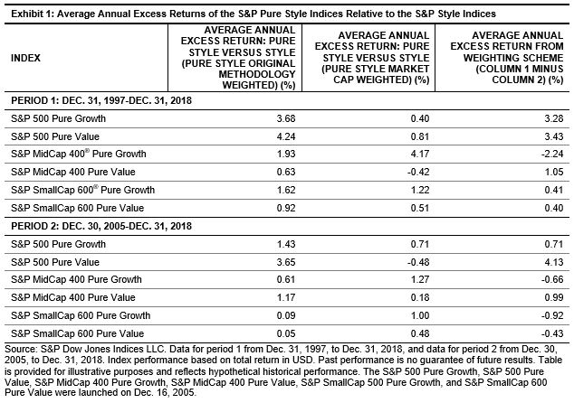
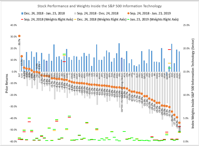
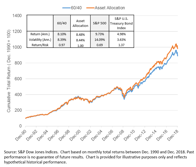
Source: S&P Dow Jones Indices’ “
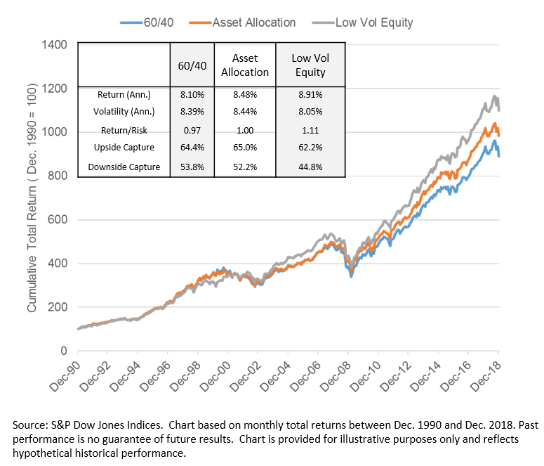
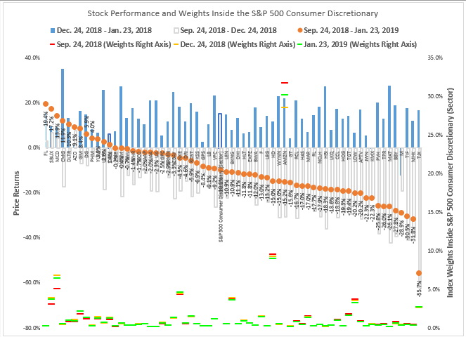
Daily Dashboard”.  Data as of Dec. 31, 2018.  Returns calculated in USD.  Past performance is no guarantee of future results.  Chart is provided for illustrative purposes only.

Perhaps unsurprisingly, more defensive equity strategies typically receive greater attention during periods of heightened volatility.  Against that backdrop, we review stylized examples of asset allocation strategies using the S&P 500, the S&P 500 Low Volatility Index, and the S&P U.S. Treasury Bond Index.

Exhibit 2 shows the impact of switching S&P 500/S&P U.S. Treasury Bond allocations from 70%/30% to 50%/50% each month, depending on whether the S&P 500’s subsequent monthly total return was positive or negative, respectively.  These allocations were chosen so that, on average over the entire period, the hypothetical asset allocation strategy allocated 60% to equities and 40% to bonds.  Armed with a prediction that correctly identified the directional movement in the S&P 500 over the next month with 52% accuracy, the hypothetical “asset allocation” strategy could have provided higher risk-adjusted returns than a hypothetical 60% equity and 40% fixed income allocation, rebalanced monthly.

Exhibit 2: Asset allocation offered higher risk-adjusted returns compared to a static portfolio.

Given there is no crystal ball that tells us whether the S&P 500 will rise or fall over the next month, an asset allocation strategy runs the risk of not obtaining the desired downside protection, or missing out on equity market gains, if predicted outcomes do not materialize.  One way to bypass this issue is to maintain static equity and fixed income allocations, and to incorporate equity factor strategies designed to mitigate downside risks.  Low volatility may be an appealing choice for many, given its historical propensity to marry downside protection and upside participation.

Exhibit 3 shows the cumulative total returns of a hypothetical “low vol equity” portfolio with static 30%/30%/40% allocations to the S&P 500/S&P 500 Low Volatility/S&P U.S. Treasury Bond Index, rebalanced monthly.  The hypothetical portfolio offered greater downside protection than either of the 60/40 or asset allocation strategies: on average, the low vol equity portfolio captured 44.8% of S&P 500 returns during months when the equity benchmark declined, compared to over 50% for the other hypothetical portfolios. This helped it to outperform on a risk-adjusted basis, historically.

Exhibit 3: The hypothetical “low vol equity” strategy outperformed on a risk-adjusted basis.

Of course, there are many ways that market participants may seek to navigate equity market turbulence and there are many different paths that returns could take when using an uncertain prediction.  But the above example shows how incorporating low volatility within a static equity allocation could act as an alternative to adjusting asset allocations.  Not only would such a strategy bypass the difficulty in correctly timing the market, but it could have improved upon the hypothetical performance of an asset allocation strategy, historically.

The posts on this blog are opinions, not advice. Please read our Disclaimers.