Get Indexology® Blog updates via email.

In This List

Developing Expectations for Long-Term U.S. Stock Returns

Bearish Divergence May Signal Stock Market Warning

Steps Toward a Low-Carbon Economy: From Footprints to Forward Estimates of Earnings at Risk

Measuring Earnings Quality – Balance Sheet Accruals Ratio Versus Earnings Variability

Combining the Quality Factor With Carbon-Efficient Portfolios – A Higher Quality Tilt With a Lower Carbon Footprint

Developing Expectations for Long-Term U.S. Stock Returns

Contributor Image
Philip Murphy

Former Managing Director, Global Head of Index Governance

S&P Dow Jones Indices

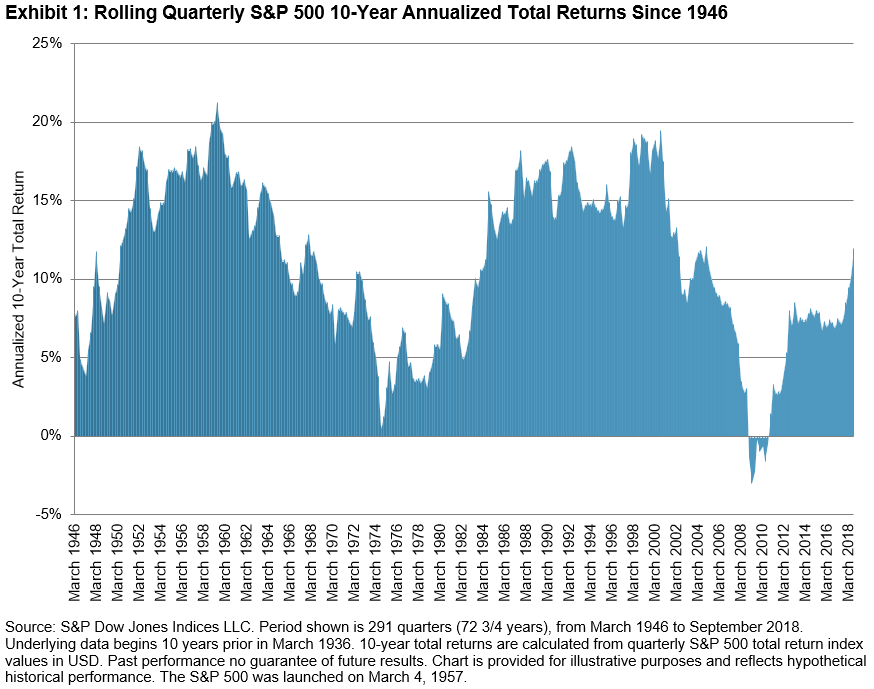
In this bull market, by some measures the longest running in U.S. history, investors may wonder what its prospects for continuation are. Judging by rolling quarterly 10-year annualized returns, the S&P 500® does not necessarily seem over-extended. As Exhibit 1 shows, since the end of World War II, large retracements followed lengthy periods of greater-than-10% annualized total returns with significant sub-periods north of 15% per year. The median 10-year annualized total return over the entire post-war period was 11.08%. As of Q2 2018, it was 10.17%, its first quarterly value greater than 10% since Q1 2005. As of Q3 2018, it rose to 11.97%.

On the other hand, backward-looking valuation measures, such as Shiller’s CAPE ratio, paint a less sanguine picture. They generally indicate the market is fully valued, if not over-extended. Exhibit 2 shows 4 regressions of 10-, 7-, 5-, and 3-year forward-looking annualized returns on the CAPE ratio. The explanatory power of the linear regression increases with window length. For example, R2 of the 10-year forward returns is almost 0.52, while R2 of the 3-year forward returns is barely over 0.20. The data are clustered more tightly around their respective regression lines as the forward-looking period grows longer. There is too much random variability to use CAPE as a short-term timing tool, however over longer periods its relationship with future returns grows more significant.

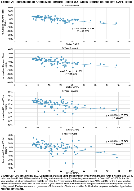
Plugging in the current observed CAPE of about 33ii into the regressions shows that it is signaling low expected returns. For example, using the 10-year regression equation we have:

-0.52% (33) + 19.26% = 2.10%

After inflation, a nominal return of about 2% would probably equate to a near-zero, or even negative, average real return over the coming 10 years.

Nonetheless, backward-looking data may currently be less representative of the future than before. On the positive side for U.S. corporate profits, tax cuts have juiced earnings. But an important question is whether earnings can remain elevated relative to the economy, or whether they have peaked. There is also significant uncertainty about the outlook for global trade, and the prospect that U.S. monetary policy may work at odds with fiscal policy. Therefore, market participants may benefit from incorporating a wide degree of variability into their capital market return expectations. “Moderation” is probably a good word to bear in mind when considering reasonable expectations for U.S. stocks, while granting plenty of room for both downside and upside surprises.

i   French, Kenneth. http://mba.tuck.dartmouth.edu/pages/faculty/ken.french/data_library.html

ii As of Oct. 2, 2018 CAPE was reported on Robert Shiller’s website at 33.18. See http://www.econ.yale.edu/~shiller/data.htm

The posts on this blog are opinions, not advice. Please read our Disclaimers.

Bearish Divergence May Signal Stock Market Warning

Contributor Image
Jodie Gunzberg

Former Managing Director, Head of U.S. Equities

S&P Dow Jones Indices

Despite escalating trading tensions between U.S. and China that built through Sep., large caps were largely unaffected.  The aging Bull market (since March 9, 2009) showed no signs of stopping, as the S&P 500 posted new highs and posted an annualized 16.51% equity return and 18.91% with dividends, as mentioned by Howard Silverblatt in Market Attributes.  However, also noted by Silverblatt, Q4 appears to be full of politics and turmoil.  Based on the monthly performance measurement of the small cap premium, perhaps the market is showing at least one sign of fear.

The S&P 500 gained 0.43% in Sep., reaching a new high, while the S&P SmallCap 600 failed to keep pace and lost 3.32%.  This formed the biggest monthly large cap outperformance over small caps in 4 years, measuring 3.75%.  Back in Sep. 2014, when the spread was 3.94%, though the magnitude of the large cap outperformance was impressive, it was less meaningful since both large caps and small caps fell together.  During 78% of months when the S&P 500 is negative, the S&P SmallCap 600 is negative too, and on average when both indices fall together, the S&P 500 loses 5.09% versus the average S&P Small Cap 600 loss of 4.10%

What is far more interesting is what happens after the S&P 500 reaches a new high while the S&P SmallCap 600 falters.  In only 24 of 297 months, or in 8.1% of months, has the S&P SmallCap 600 lost while the S&P 500 gained.  Not only is this the current scenario but the bearish divergence has only been bigger 7 times in history where 2 of those times preceded major stock market drops.  The S&P 500 reached new highs while the S&P SmallCap 600 fell prior to the declines in 2000-2002 and in 2007-2009.

Source: S&P Dow Jones Indices. Monthly data from Jan. 1994 – Sep. 2018. Bearish diversion shown is when the S&P 500 reached a new high at the same time the S&P SmallCap 600 fell, with the small cap premium less than the current -3.75%.

In Jul. 2006, the S&P 500 gained 0.51% while the S&P SmallCap 600 lost 3.50%, resulting in a small cap premium of -4.01%.  The S&P 500 did not reach its high until Oct. 2007 but subsequently lost 52.6% through Feb. 2009.  While there were 15 months from the Jul. 2006 bearish diversion date until the top, the S&P 500 still declined 42.2% from that time of large cap outperformance.  Moreover, the other bearish diversion (bigger than the current amount with the S&P 500 at a new high despite the S&P SmallCap 600 loss) measured -13.4% in Mar. 2000.  This was just 5 months ahead of the high in Aug. 2000 when the market began its 46.3% decline, ending in Sep. 2002.  From the bearish diversion date in Mar. 2000, the market declined 45.6%.  Even if the large cap outperformance does not happen exactly on the market high, or if the bearish diversion signal is just the first of many, it seems there may be a bearish signal from the inability of small caps to keep up with the large cap momentum.

Going into Q4, there may be politics and turmoil, but if there is growth, rising interest rates, inflation or a rising dollar, those conditions are historically supportive of small caps.


The posts on this blog are opinions, not advice. Please read our Disclaimers.

Steps Toward a Low-Carbon Economy: From Footprints to Forward Estimates of Earnings at Risk

Contributor Image
Mona Naqvi

Global Head of ESG Capital Markets Strategy

S&P Global Sustainable1

The landmark Paris Agreement to accelerate the transition to a low-carbon economy marked a sea change in the global fight against climate change. A swelling tide of carbon-limiting regulations has since emerged, shifting the narrative from a largely ethical debate to a material set of risks and opportunities for the financial markets, today. As the debate continues regarding the link with human activity, the policy response to limit greenhouse gas (GHG) emissions is an undeniable channel through which the underlying transition risk—that is, the risk that comes from a shift in the global modes of production from carbon-intensive to energy-efficient activities—will materialize. These shifts are potentially material for asset values and capital allocation decisions from an investor’s perspective, while many companies will have to adapt to remain profitable.

Companies are used to dealing with fluctuations in the price of materials in their production process—and investors watch these closely. When it comes to investment fundamentals, carbon-limiting regulations, such as taxes and emissions trading schemes, are no different. Exhibit 1 shows that 51 countries, regions, and cities will have adopted carbon-pricing schemes by 2020, capturing 20% of global GHG emissions.[1] Thanks to the Paris Agreement, the number of these measures is on the rise, and the pace of change in 2018 alone has been astonishing. In the EU, the carbon price increased from 8 to 18 euros per ton between January and August 2018 and this could increase to 25 euros per ton by the end of 2018.[2] To put this into context, carbon prices would need to increase to USD 120 per ton by 2030 to meet the goals of the Paris Agreement.[3] By design, these measures are transforming the underlying economics to favor more carbon-efficient technologies across all sectors. But just as with commodity price fluctuations, an investor might ask—are companies in certain sectors and regions more prone to (carbon) price risk than others?

Measuring Carbon Earnings at Risk

Carbon pricing will most likely not have uniform effects across portfolios, with both winners and losers emerging. First, carbon pricing across different regions and sectors varies substantially. Second, even companies within the same sector can have varying levels of carbon intensity—they engage in different operations, make use of different technologies, and have different practices that influence their carbon efficiency. Third, varying supply chain elasticities influence the cost pass-through from carbon pricing. As a result, companies and portfolios with different regional and sector exposures can have significant differences in carbon price risk exposure. Thus, any meaningful approach to monetize carbon price risk may need to account for granularity in the range of sectors, geographies, and decarbonization pathway scenarios.

Trucost’s approach is based on a carbon price risk premium, defined as the gap between current and expected future carbon prices in a given time period. This premium depends on three parameters: (i) the initial carbon price, determined by sector and geography; (ii) the expected decarbonization pathway (multiple scenarios are available to choose from); and (iii) the cost pass-through to companies from suppliers. The result is a highly granular dataset of company carbon price premiums based on close to 10,000 sector, year, and country combinations, reflecting the additional financial cost per ton of emissions from expected future carbon pricing regulations. We can use these premia to calculate a company’s exposure to future carbon costs and compare these to earnings metrics to determine the potential earnings at risk. Aggregated at the portfolio level and apportioned on an ownership basis or weighted based on investment exposure, we can produce financial metrics such as change in EBIT(DA) due to carbon price risk and potential impact on valuation multiples.

Investors can integrate these metrics into their decision-making process by incorporating them into a range of valuation approaches and scenario analyses. By influencing risk premiums to evaluate fixed income instruments or loans or plugging these metrics into forward-looking cash flow projections, for example, these metrics can support advanced investment research that accounts for forward-looking climate risk.

From Footprints to Forward-Looking Metrics

To date, much of the focus in mainstream ESG investing has been to manage the portfolio’s carbon footprint. While carbon footprinting often provides an essential first step toward understanding the climate risk exposure within a portfolio, it may not inform the forward-looking financial risk profile of investments from measures like a carbon price.

Exhibit 3 applies a range of Trucost carbon exposure metrics to S&P DJI global benchmarks, including carbon earnings-at-risk, and highlights how focusing solely on the carbon footprint might miss the bigger picture in terms of forward-looking risks and opportunities. Thus, to understand the impact of climate change on their investments, investors must recognize there is no silver bullet. Just as it would be prudent to consider a range of financial metrics to determine the overall financial health of a company, so too would it be wise to examine a range of climate-related risks to determine the environmental health of an investment. Moreover, investors do not necessarily have to choose between environmental and financial metrics, as next generation approaches like this may enable us to translate environmental risks into financial metrics. Thus, we can arm investors with the tools they need to assess the profitability of their investments in an ever-shifting global landscape, as we embark on our unprecedented journey toward a low-carbon economy.

[1]   Source: World Bank and State and Trends of Carbon Pricing 2018.

[2]   See https://markets.businessinsider.com/commodities/co2-emissionsrechte

[3]   (OECD, IEA, 2017; CDP, CPLC, 2017).

The posts on this blog are opinions, not advice. Please read our Disclaimers.

Measuring Earnings Quality – Balance Sheet Accruals Ratio Versus Earnings Variability

Contributor Image
Wenli Bill Hao

Director, Factors and Dividends Indices, Product Management and Development

S&P Dow Jones Indices

The balance sheet accruals ratio (BSA)[1] is widely used in the investment community to measure earnings quality.[2] This is in part due to accruals being perceived as transient and subject to considerable estimations, manipulations, and potential misrepresentations.[3]

BSA is one of the three quality metrics used in the S&P Quality Index Series. We define BSA as the change of a company’s net operating assets over the previous year, divided by its average net operating assets over the last two years. All else equal, the higher the BSA, the lower the company’s earnings quality.

Similarly, some market participants use historical earnings variability (EV) to measure the stability of earning. EV is usually calculated as the standard deviation of year-over-year earnings per share growth over (n-) number of previous fiscal years. The higher the EV, the less stable the earnings growth.

Given that there are various ways of defining and capturing earnings, it is worthwhile to dive deeper into the long-term performance of BSA and EV to understand their return patterns. Using the S&P 500® as our underlying universe, we rank securities in an ascending order based on BSA and EV separately, and divide them into quintiles.

We then select the top quintile (Q1) of each factor to form a cap-weighted hypothetical portfolio. For consistency purposes, we follow the S&P 500 Quality Index rebalancing frequency and rebalance the hypothetical quintile portfolios on a semiannual basis. Thus, the performance of these two factors is based on six-month forward returns.

To avoid survivorship bias, we include companies that currently are and historically have been in the benchmark in an attempt to ensure that the back-tested results will not suffer from survivorship bias. Compustat is the main data source for company-level fundamental data. To prevent look-ahead bias, the fundamental data is lagged by 45 days. We use the S&P DJI stock-level total return data (including both dividend and price return) from May 31, 1995, to May 31, 2018.

Exhibit 1 shows the cumulative values of the BSA and the EV quintile 1 portfolios over the whole back-tested period, assuming starting value of 100 on May 31, 1995. From May 31, 1995, to May 31, 2018, the cumulative returns of the BSA Q1 portfolio exceeded that of the EV Q1 portfolio. However, we can also see that there are periods when the BSA Q1 portfolio underperformed the EV Q1 portfolio.

Exhibit 2 shows the ratio of BSA quintile 1 portfolio to EV quintile 1 portfolio values. The ratio below 1 indicates that BSA underperformed during the period.

The BSA Q1 portfolio noticeably underperformed the EV Q1 portfolio during the tech bubble period, starting from the second half of 1999 to early 2000, with the BSA to EV performance ratio dipping from 1 to 0.79. The findings are not surprising, given that investors blindly chased earnings growth and ignored earnings quality during that period. The tech bubble burst made market participants consider the importance of earnings quality. The BSA Q1 portfolio started to outperform afterward.

After BSA’s extended outperformance over EV, BSA began to underperform in 2017, as markets focused more on earnings growth. However, if history is any indication, when there is an earnings quality event, market participants should consider turning their attention toward factors that aim to capture earnings quality.

[1]   Sloan, Do Stock Prices Fully Reflect Information in Accruals and Cash Flows About Future Earnings? The Accounting Review, Vol. 71, No. 3, 1996.

[2]   Richardson, Sloan, Soliman and Tuna, Accrual Reliability, Earnings Persistence and Stock Prices, Journal of Accounting & Economics, Vol. 39, No. 3, 2005.

[3]   Ung, Luk and Kang, Quality: A Distinct Equity Factor? S&P Dow Jones Indices Research Report, 2014.

The posts on this blog are opinions, not advice. Please read our Disclaimers.

Combining the Quality Factor With Carbon-Efficient Portfolios – A Higher Quality Tilt With a Lower Carbon Footprint

Contributor Image
Wenli Bill Hao

Director, Factors and Dividends Indices, Product Management and Development

S&P Dow Jones Indices

In a previous blog, we highlighted that carbon-efficient firms tended to be high-quality companies. Moreover, integrated quality + carbon-efficiency hypothetical portfolios tended to have higher risk-adjusted returns and were more carbon efficient than the underlying benchmark. In this blog, we look into the risk and return characteristics of those hypothetical portfolios. This exercise helps us to better understand the sector composition of those integrated portfolios and their return drivers, risk factor exposures, and risk decompositions.

Sector Compositions of Quality + Carbon-Efficiency Portfolios

The sector compositions of quality + carbon-efficiency portfolios were computed as the monthly average of historic sector weights over the whole back-tested period (see Exhibit 1).

We can see that the unconstrained quality + carbon efficiency portfolio has an overweight of 9.77% in Information Technology, an overweight of 8.05% in Consumer Discretionary, and an underweight of 10.24% in Energy in comparison with the underlying benchmark. Sector bets on other sectors are below 5%. On the other hand, the quality + carbon efficiency (SR) portfolio has sector bets less than 3%.

Sector Return Contributions of Quality + Carbon-Efficiency Portfolios

Next, we explore the return drivers behind the sector bets in quality + carbon-efficiency portfolios. Exhibit 2 shows the contribution to returns by sector, calculated as the monthly average of historic sector contributions over the whole back-tested period.

Exhibit 2 demonstrates that larger overweight and underweight in the quality + carbon efficiency portfolio had a positive contribution to active returns, with 1.27% in Information Technology, 0.62% in Consumer Discretionary, and 0.03% in Energy. All three active returns were higher than those in the quality + carbon efficiency (SR) portfolio.

Risk Exposures in Quality + Carbon-Efficiency Portfolios

With respect to active factor bets,[1] compared to the S&P United States LargeMidCap universe, the quality + carbon efficiency portfolios had lower exposures to beta, book-to-price ratio, price volatility, leverage, earning variability, and market cap (see Exhibit 3). On the other hand, quality + carbon efficiency portfolios had higher exposures to earnings-to-price ratio and EPS growth rate.

The results from Exhibits 1, 2, and 3 show that quality + carbon-efficiency portfolios have the desirable characteristics of having limited sector bets and positive return contribution. The risk attribution and decomposition figures also show that quality + carbon-efficiency portfolios have higher quality exposures and lower volatility than the underlying universe.

[1]   Active factor bets are calculated using the commercially available risk model. In this paper, we use the Northfield US Fundamental Risk Model.

The posts on this blog are opinions, not advice. Please read our Disclaimers.