Get Indexology® Blog updates via email.

In This List

Using Factor Analysis to Explain the Performance of Dividend Strategies

Does the Outperformance of UDIBonos to MBonos Have Legs?

When Will This Oil Contango End?

Try a TIPS Mixer in Your Equities Cocktail

The Dow Quickly Takes a Long Time to Hit 20,000

Using Factor Analysis to Explain the Performance of Dividend Strategies

Contributor Image
Nick Kalivas

Senior Equity Product Strategist

Invesco

Factor tilts have resulted in divergent dividend strategy performance following the November elections

November’s US elections have buoyed investor optimism about the potential for tax reform, increased infrastructure spending, reduced regulation and accelerating economic growth. These expectations led to a 0.75% spike in the 10-year Treasury yield between Nov. 8 and Dec. 16, and a 5.2% increase in the US dollar, as measured by the US Dollar Index.1

Still, by historical standards, interest rates remain low. Nearly a decade ago, the 10-year Treasury yield finished 2007 at 4.02%; it now stands near 2.50%.1 When adjusted for inflation, even the 0.75% bump in the 10-year Treasury yield amounts to a modest 0.40% increase. Compare that with the average annual real (inflation-adjusted) increase in the 10-year Treasury yield between January 1962 and November 2016 of 2.40%.1

Shouldn’t dividend stocks be underperforming?
Global demand for dividend-paying exchange-traded funds (ETFs) is strong, as evidenced by robust flows of over $20 billion in 2016; US-based ETFs accounted for more than half of that amount.1 The appeal of dividend-paying stocks is clear, as dividends can help provide a nice offset to rising inflation, while most fixed-coupon debt cannot hedge against rising prices.

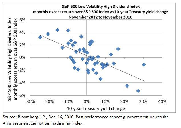
Nonetheless, the timing of recent gains is counterintuitive; typically, rising interest rates cause dividend-paying shares to lag. This is because yield-seeking investors tend to trade out of dividend stocks and into bonds when interest rates rise. This can be seen in the chart below, which depicts the relationship between the excess monthly return of dividend-paying stocks (represented by the S&P 500 Low Volatility High Dividend Index relative to the S&P 500 Index) to the monthly change in the 10-year Treasury yield. Note the inverse relationship, with higher yields creating a drag on the excess returns of dividend payers.

Capture

Dividend stock performance running contrary to long-term trends
With yields rising, dividend stocks are bucking this long-term trend, although performance has varied by index. Following the Nov. 8 election through Dec. 16, the S&P 500 Low Volatility High Dividend Index lagged the S&P 500 Index by only five basis points, returning 5.76%, while the NASDAQ US Dividend Achievers 50 Index outpaced the S&P 500 Index by 3.20%, returning 9.01%.1 These counterintuitive returns may have investors wondering about the reasons behind the results.

One way to analyze portfolio returns is through factor exposure. Both the S&P 500 Low Volatility High Dividend Index and the NASDAQ US Dividend Achievers 50 Index are dividend-based indexes, but each has different factor tilts beyond just dividends, which can affect performance.

Let’s take a closer look:

  • The S&P 500 Low Volatility High Dividend Index has a value factor load of 0.51 and a growth factor load2 of -0.60, meaning that it is more of a value-oriented index than a growth index.1 Keep in mind that value stocks outperformed growth stocks following the election. From Nov. 8 through Dec. 16, the S&P 500 Value Index rose 8.66%, compared with 5.81% for the S&P 500 Index and just 3.07% for the S&P 500 Growth Index, which helps explain the strong performance of the S&P 500 Low Volatility High Dividend Index.1 Put another way, meaningful value exposure and negative growth exposure helped to mute the impact of rising rates – boosting index performance.
  • By contrast, the NASDAQ Dividend Achievers 50 Index did not have material value exposure, but did have negative exposure to the growth factor (-0.43). More importantly, the index had a negative factor load (-0.90) to large-cap stocks, with 44% of its holdings in smaller-cap stocks.1 Thus, with the S&P SmallCap 600 Index outpacing the large-company S&P 500 Index by 10.35% from Nov. 8 through Dec. 16, the  strong performance of the NASDAQ Dividend Achievers 50 Index is no great mystery.1

Factor exposure matters
To reiterate: While dividend-paying stocks may have surprised investors with their robust performance in the face of rising interest rates following the Nov. 8 election, much of this performance can be explained by factor tilts. In this case, exposure to value and smaller-cap stocks helped mitigate the impact of rising interest rates. As you can see, factors are not only valuable building blocks for constructing portfolios, but also useful tools for gauging portfolio performance.

The posts on this blog are opinions, not advice. Please read our Disclaimers.

Does the Outperformance of UDIBonos to MBonos Have Legs?

Contributor Image
Dennis Badlyans

Former Associate Director, Global Research & Design

S&P Dow Jones Indices

Since the U.S. presidential election on Nov. 8, 2016, the S&P/BMV Sovereign UDIBONOS Bond Index, which seeks to track inflation-protected Mexican government bonds, outperformed its nominal counterpart, the S&P/BMV Sovereign MBONOS Bond Index (see Exhibit 1).  What was the driver behind this outperformance, and can we expect it to persist?

Exhibit 1: S&P Mexico Sovereign Bond Indices Performance

udibonos Exhibit 1


One way to analyze the relative value of inflation-linked bonds versus nominal bonds is to compare the implied break-evens priced between the two against near-term inflation expectations.  Since November 2016, break-even points have widened out substantially; December 2017 bonds are wider by 2.4%, at 5.9%, and June 2022 bonds are wider by 1.7%, at 4.7%.  In other words, for a market participant to see more value in the June 2022 UDIBono inflation-linked bond than in the nominal version, they must believe that inflation will surpass 4.7% over the investment horizon.

Exhibit 2: December 2017 and June 2022 Nominal Versus Real Bond Break-Evens

udibonos Exhibit 2

Can forward-looking inflation deliver the returns priced in UDIBonos?

Anticipating seasonal patterns as well as identifying the near-term drivers and associated risks to assumptions are key in the decision-making process.  Over the past decade, monthly consumer price inflation in Mexico has tended to reach a peak in November, slowing through the first quarter to a trough in May (see Exhibit 3).

Exhibit 3: Distribution of Monthly Inflation in Mexico

udibonos Exhibit 3

In late December 2016, Mexican authorities announced plans to liberalize domestic gasoline prices starting in January 2017.  The effects of the decision can already be seen in the first bi-weekly inflation print of the year.  The CPI of 1.51% for the first two weeks of 2017 surprised economists—a Bloomberg survey found that economists’ CPI expectations for this period ranged from 0.53% to 1.46% (see Exhibit 4).  As a result of the record high print and unfavorable base effects, the year-over-year bi-weekly CPI for Jan. 15, 2017, jumped to 4.78% from 3.24% print on Dec. 31, 2017.  The central bank’s target range is 3% ±1%.

Exhibit 4: Mexico Bi-Weekly Inflation History

udibonos Exhibit 4

In addition to higher domestic gasoline prices, pass-through from the sharp exchange rate devaluation since the U.S. presidential election on Nov. 8, 2016, will likely continue to pressure the index in the coming months.  The MXN slipped nearly 14.9% between the Nov. 8, 2016, close and the Jan. 25, 2017, close (see Exhibit 5).

Exhibit 5: Movement in Value of the Mexican Peso

udibonos Exhibit 5

Although we are now entering a low seasonal period with historically high break-even points, the balance of risks seems to be to the upside.  With the record-breaking first bi-weekly print behind us, it shouldn’t take much more than the historical median (see Exhibit 4) to buoy the UDIBonos.

The posts on this blog are opinions, not advice. Please read our Disclaimers.

When Will This Oil Contango End?

Contributor Image
Jodie Gunzberg

Former Managing Director, Head of U.S. Equities

S&P Dow Jones Indices

Today “oil jumps to a nearly 3-week high as output cuts take hold” as March West Texas Intermediate crude CLH7, +1.82%  rose $1.03, or 2%, to settle at $53.78 a barrel on the New York Mercantile Exchange—the highest settlement since Jan. 6. The S&P GSCI Crude Oil (Spot Return) is now positive in 2017 through Jan. 26, up 0.1%.  However, the S&P GSCI Crude Oil Excess Return that includes the rolling return is down 1.5%.  In fact, from the bottom of the S&P GSCI Crude Oil (Spot Return) on Jan. 20, 2016, it has gained 89.7% but the S&P GSCI Crude Oil Excess Return has only gained 9.4%.

Source: S&P Dow Jones Indices. Daily data from Jan. 27, 2014- Jan. 26, 2017

Notice though that it took until November 2014 before the spot return started outperforming the excess return after the prior peak in June 2014. That is since the cycle of backwardation and contango represent the inventory shortages and excess. Although many perceive the futures to always have a rolling cost, this is not the case and many times there is a rolling premuim.

Using monthly data going back to Jan. 1987, the S&P GSCI Crude Oil has been in backwardation for 157 months and contango in 203 months, that amounts to 44% in backwardation and 56% in contango. Further the gain from backwardation is 1.7% versus the 1.5% loss from contango. Given the payoff from the positive roll from backwardation, it is worth examining when it might show up again.

Now that crude oil has been rising for nearly a year, how long after a bottom might it take before the curve switches from contango to backwardation? The answer is on average is that it takes about 9 months. Crude oil is now into a 25 month stretch of contango with 11 months since the bottom (using Dec. 2016 as the last monthly data point, though Jan. is still in contango). It is the second longest stretch in history after the 36 month period from Nov. 2008 – Oct. 2011.  Crude oil came so close to equilibrium in Oct. 2016 with a roll loss of only 92 bps, but the high production ahead of OPEC cuts increased the cost again to just over 2% in Dec, and now is already nearly 1.4% this month.

Source: S&P Dow Jones Indices. The gray background shows backwardation and white space shows contango. The red line shows index levels with green points as bottoms in periods of contango. A positive roll return of the excess return minus the spot return represents backwardation. A negative roll return of the excess return minus the spot return represents contango.

If OPEC cuts hold and inventories deplete, it is worth considering how to invest in commodities and energy equities.  While rising oil floats all commodity boats, when there is a switch in oil to backwardation from contango it may motivate more flows into oil from other commodities as evidenced by the loss for every single commodity except sugar, coffee, cattle, soybeans, gold, wheat and crude oil (of course.)

Source: S&P Dow Jones Indices

Also, a rolling 90 day correlation chart of S&P GSCI Crude Oil (Spot Return) to energy equities (S&P 500 Energy)  and the S&P GSCI Crude Oil Total Return (that includes rolling costs and collateral return) shows on average between spot and total return futures the average rolling 90-day correlation is 0.9963 but to equities is only 0.3987.  Note the correlation between crude oil and equities has risen through time, and the 90-day rolling average in just the past 10 years is 0.5951, past 5 years is 0.6027, 3 years is 0.6169 and 1 year is 0.7609.

Source: S&P Dow Jones Indices.

Further it is interesting that correlation between equities and oil almost double during periods of contango. On average the rolling 90-day correlation during contango is 0.4815 but during backwardation is 0.2648, showing companies may be hedging more at the wrong times.

Source: S&P Dow Jones Indices

Last, some think energy may drive the Dow Jones Industrial Average that just crossed 20,000, much higher in 2017. However, if oil increases, energy equities might be the wrong play.

The posts on this blog are opinions, not advice. Please read our Disclaimers.

Try a TIPS Mixer in Your Equities Cocktail

Contributor Image
Philip Murphy

Former Managing Director, Global Head of Index Governance

S&P Dow Jones Indices

As product manager of the S&P STRIDE Indices, I sometimes find myself extolling the virtues of Treasury Inflation-Protected Securities (TIPS), which I believe are an underappreciated asset class.  When inflation is relatively tame, people often ask why they should think about TIPS.  The answer is that TIPS don’t hedge expected inflation—that’s already priced in.  TIPS hedge unexpected inflation, and we are fortunate, because unexpected inflation is what produces particularly unpleasant circumstances if one’s portfolio does not keep up.

But hedging unexpected inflation is not the only benefit of TIPS.  They also seem to mix well with stocks. Historically, TIPS have exhibited low and sometimes negative correlations with U.S. equities.  Exhibit 1 compares the rolling 36-month correlation of the S&P 500® and the S&P 500 Bond Index (made up of corporate bonds issued by S&P 500 companies) to that of the S&P 500 and the S&P US Treasury TIPS 7-10 Year Index.  The correlation of stock returns to TIPS returns is consistently and significantly lower than the correlation of stock returns to nominal corporate bonds.

Exhibit 1: 36-Month Rolling Correlations

Capture

For the 15-year period ending December 2016, the stocks-bonds correlation of monthly total returns was 0.256, while the stocks-TIPS correlation of monthly total returns was only 0.047.  Because TIPS generally exhibit lower correlations to stocks than do nominal bonds, they may be a better portfolio diversifier.  To examine this possibility, we constructed two hypothetical portfolios, one comprising a 50/50 blend of the S&P 500 with the S&P 500 Bond Index and the other a blend of the S&P 500 with the S&P US Treasury TIPS 7-10 Year Index.

Capture

While past performance is no guarantee of future results, the benefits of lower correlation can be seen in the performance of the indices and hypothetical portfolios over the 15-year period ending December 2016.  Even though the S&P 500 Bond Index offered the best risk-adjusted return on a stand-alone basis, we see that the blend of stocks and TIPS captured most of the upside of the S&P 500 with a fraction of the volatility.  For equity market participants, getting a bit “TIPSy” may not be a bad idea.

The posts on this blog are opinions, not advice. Please read our Disclaimers.

The Dow Quickly Takes a Long Time to Hit 20,000

Contributor Image
Jamie Farmer

Former Chief Commercial Officer

S&P Dow Jones Indices

Walt Whitman said in Song of MyselfDo I contradict myself? Very well, then I contradict myself, I am large, I contain multitudes.”  Well, as does The Dow Jones Industrial Average – so I’ll present two contradictory data points from today’s record close.

First, the move from 19,000 to 20,000 was quick, happening in just 42 trading days (not calendar days, mind you).  This was the second fastest such move since the DJIA first climbed from 10,000 to 11,000 over 24 days in the spring of 1999.  The longest was from the DJIA’s May 1896 inception to the first 1,000 point level; that run took over 76 years.

Capture

On the other hand, the DJIA took its sweet time meandering through those last 100 points.  As I wrote recently in The Red Zone, the march from 19,900 to 20,000 had already taken more trading sessions than the 10 prior milestones.  In the end, it took 28 trading days to cover that ground.

Capture

Much will be written this week about this first ever close above 20,000.  One of the more common debates is the tug of war between the “psychologically important achievement” and “arbitrary milestone” camps.  I’ll leave the smart people on both sides of the divide to continue to wage that battle.  What I will assert, though, is that no other measure provides us with so much history on which to conduct that battle.  With 120+ years of performance – through expansion, recession, depression, peace-time and war – the DJIA remains an ever-reliable indicator of investor sentiment.

Finally, in transparency the Whitman quote wasn’t the first “contradictory” reference that occurred to me.  Instead, it was this rather less literate doctor’s office scene from Fletch (1985), which I’ll submit here simply because I doubt I’ll ever have any other reason to use it…

Dr. Joseph Dolan: You know, it’s a shame about Ed.
Fletch: Oh, it was. Yeah, it was really a shame. To go so suddenly like that.
Dr. Joseph Dolan: He was dying for years.
Fletch: Sure, but… the end was very… very sudden.
Dr. Joseph Dolan: He was in intensive care for eight weeks.
Fletch: Yeah, but I mean the very end, when he actually died. That was extremely sudden.

The posts on this blog are opinions, not advice. Please read our Disclaimers.