Get Indexology® Blog updates via email.

In This List

S&P 500 Has Its Hottest Start Since 2003

Watching For Recession

Dividend Growth Strategies and Downside Protection

Q4 2018 Performance Review for the S&P Risk Parity Indices

A Look at the Investability and Replicability of the S&P/BMV IPC

S&P 500 Has Its Hottest Start Since 2003

Contributor Image
Jodie Gunzberg

Former Managing Director, Head of U.S. Equities

S&P Dow Jones Indices

In the first seven trading days of 2019, the S&P 500 returned 3.6%, its 12th best start on record since 1928 and best since 2003.  Also, the S&P MidCap 400 and S&P SmallCap 600 surpassed large caps by posting their best gains ever to start a year.  Lastly, more than half the segments by sector, size and style have posted their biggest gains in history.

Source: S&P Dow Jones Indices

The S&P 500 posted five consecutively positive days, ending January 10, 2019, returning a total of 6.1%.  The last time the S&P 500 returned five consecutively positive days was ending September 14, 2018, but the cumulative return was just 1.2% then.  Five straight days of positive returns has happened 4% of the time since January 4, 1928, but in just 44 prior instances or 0.2% of the time, has the return been bigger than now.  The last time the five day return (with all positive days) was bigger than 6.1% happened in the streak ending July 13, 2010, returning 6.5%.  The last January that had a five day winning streak this big happened in January 1987 that occurred in the first five trading days of that year and returned 6.2%.

Source: S&P Dow Jones Indices.

Across all the size, style and sector segments, 22 of 42 total posted their best start to any year in the first seven trading days.  The S&P SmallCap 600 and S&P MidCap 400 each posted their best start in history, gaining a respective 6.4% and 5.9% with value outperforming growth.  Eight of eleven small cap sectors, six of eleven mid-cap sectors, and just two of eleven large cap sectors started strongest this year. Energy and consumer discretionary each had their best start despite size.

Source: S&P Dow Jones Indices

The leading sectors may be currently influenced by the falling dollar and trade negotiations.  Historically the falling dollar is best for mid-caps, since a falling dollar may help mid-caps grow internationally as they are big yet nimble enough to take advantage of new opportunities overseas.  However, energy is particularly sensitive to the dollar drop since oil is priced in dollars.  Though all sizes of energy performed well with oil’s recent rise, mid- and small-cap energy returned more than double its large cap counterpart, which is not surprising with rising oil as larger companies hedge more against the price volatility.

Source: S&P Dow Jones Indices

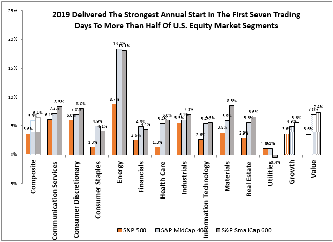
The S&P SmallCap 600 and S&P MidCap 400 respective gains of 6.4% and 5.9% to start the year outpaced large caps gain of 3.6%, which is historically typical in early bull markets.  However, it may be too soon to tell whether the Fed has more influence on the stock market than other unresolved issues both domestically and abroad like trade tensions, Brexit and the partial government shutdown. Historically in a rebound, the financial sector and real estate sector performed best but this bounce is led by energy, consumer discretionary, industrials and materials, showing the move may be more focused on issues abroad – in addition to interest rate comments from the FedIf the dollar rises more, small-caps have done historically best from their high percentage of domestic revenues, but energy might be put under pressure with the rising dollar, especially in the less hedged mid-and small caps.


The posts on this blog are opinions, not advice. Please read our Disclaimers.

Watching For Recession

Contributor Image
David Blitzer

Former Managing Director and Chairman of the Index Committee

S&P Dow Jones Indices

Recent anxiety about an imminent recession sparked discussion of inverted yield curves and falling long term interest rates, The slope of the yield curve – the difference between the yield on the five or 10 year treasury note and a short term instrument like three month T-bills – may signal a recession. The chart shows the slope of the yield curve and recession dates since April 1953. The slope moved below zero as each recession began.

The idea of using the yield curve to predict the economy has a long history. Other combinations of treasury notes and bills show the same patterns; the choice of five or ten year notes and three-month bills gives the longest data history. There is some theoretical backing: when consumers and investors fear a recession is coming, they are likely to move assets into intermediate and long-term bonds as a hedge against future economic difficulties. This asset re-allocation may raise bond prices, lower yields and dampen the stock market. (See “Forecasts of Economic Growth from the Bond and Stock Markets” by Campbell Harvey, Financial Analysts Journal, September-October 1989)

While the first chart suggests that the yield curve is a useful predictor, the next chart shows that the stock market gives less accurate predictions. The market moves associated with the recessions in 2000-2001 and 1990-1991 were largely after the recessions. The economy kept on rolling despite the 1987 market crash.

The financial markets are not the only thing driving the economy – changes in employment matters.  The last chart shows the weekly Initial Unemployment Claims series published by the Bureau of Labor Statistics. When economic activity begins to fade companies respond by cutting hiring and letting people go. Jobs-losers file for unemployment. A rule of thumb is an initial claims number above 400,000 is cause for concern while a figure under 300,000 signals an unusually strong economy.

With all these, what is the risk of a recession near term? Initial claims suggest there is little to worry about while the yield curve signals some caution.

The posts on this blog are opinions, not advice. Please read our Disclaimers.

Dividend Growth Strategies and Downside Protection

Contributor Image
Phillip Brzenk

Managing Director, Global Head of Multi-Asset Indices

S&P Dow Jones Indices

2018 ended on a sour note for the S&P 500®, as the index declined by more than 9% in December alone. The drop-off resulted in the first negative calendar year return (-4.38%) for the S&P 500 (TR) since the financial crisis (2008). Meanwhile, the S&P 500 Dividend Aristocrats®, which is designed to measure the performance of S&P 500 companies that have increased their dividends for the last 25 consecutive years, fared relatively better in 2018 but still ended in the red (-2.73%). The S&P 500 Dividend Aristocrat’s outperformance of the benchmark led us to explore the downside protection characteristics of dividend growth strategies relative to the broad equity market. In addition, we attempt to answer the question of whether outperformance in a down year is typical for dividend growth strategies, or if 2018 was an anomaly.

Since year-end 1989, there have been six calendar years of negative performance for the S&P 500—and in all six years, the S&P 500 Dividend Aristocrats outperformed the equity benchmark by an average of 13.28%. In fact, the S&P 500 Dividend Aristocrats produced a positive total return in three of those years (see Exhibit 1).


To see how the S&P 500 Dividend Aristocrats stacks up against the S&P 500 in shorter periods, we next look at historical monthly returns. First, we classify all months into up and down months based on the S&P 500’s returns. We then compute the monthly hit rates (batting average) and average excess returns of the S&P 500 Dividend Aristocrats compared to the S&P 500.

The S&P 500 Dividend Aristocrats outperformed the S&P 500 53% of the time, by an average of 0.16%. When isolated to down markets, the S&P 500 Dividend Aristocrats outperformed over 70% of the time and by an average of 1.13%. In up markets, the S&P 500 Dividend Aristocrats underperformed 56% of the time, but at a lower average magnitude (-0.34%). This shows that the S&P 500 Dividend Aristocrats has delivered downside protection in months when the S&P 500 lost ground.

Stemming from the results in Exhibit 2, our final question is: does the magnitude of return influence return differentials? To answer this question, we broke out the historical monthly returns of the S&P 500 from -10% to 10% in 1% increments. We then computed hit rates (light blue diamonds, primary axis) and average excess returns (navy columns, secondary axis) for each group in Exhibit 3.

We are able to confirm that the lower the return of the S&P 500, the better the relative performance was for the S&P 500 Dividend Aristocrats. We see the batting average was typically better for the more negative months than the less negative months. Additionally, we observe that the average excess return over the S&P 500 was higher in the most negative months. Since 1989, the S&P 500 has lost 5% or more in 31 out of 348 months (~9% of the time). In these months, the average excess return for the S&P 500 Dividend Aristocrats was 2.46%, with a hit rate of 81%. The median excess return was of similar magnitude (2.32%); therefore, the results were not skewed by only a few months—rather, there was consistent outperformance.

Based on the results, we have demonstrated that the S&P 500 Dividend Aristocrats outperformed the S&P 500 in down markets by an average of 1.13% per month. The results were more evident when the S&P 500 lost the most, with the S&P 500 Dividend Aristocrats outperforming by an average of 2.46% when the S&P 500 lost at least 5%. The underlying reasons why the S&P 500 Dividend Aristocrats outperforms will be discussed in another post.

To learn more about dividend growth strategies, register here for an upcoming webinar on Thursday, January 10th featuring S&P DJI’s Aye Soe, CFA, Managing Director, Global Research & Design.

The posts on this blog are opinions, not advice. Please read our Disclaimers.

Q4 2018 Performance Review for the S&P Risk Parity Indices

Contributor Image
Rupert Watts

Head of Factors and Dividends

S&P Dow Jones Indices

As the ball dropped this New Year’s Eve, most investors were more than happy to bid adieu to what proved to be a volatile end to 2018. The fourth quarter began with the October sell-off, which was just the start of a highly volatile quarter. The S&P 500® fell almost 7% in October alone, with losses accelerating into the end of the year during what is likely to be one of the worst Decembers on record.

Large equity market drawdowns such as these remind us of the importance of portfolio diversification. Traditionally, this has been achieved by building multi-asset portfolios that combine complementary asset classes such as stocks and bonds.

First generation multi-asset strategies, exemplified by a 60/40 allocation, seek to create balanced portfolios by diversifying across asset classes in fixed proportions. However, this technique does not maximize diversification benefits because it ignores the risk contribution of each asset class.

The recognition of these shortcomings led to the development of a class of investment strategies called risk parity, which seeks to equalize the risk contribution of each asset class. The primary goals of risk parity are to provide a smoother return profile and minimize losses from equity market drawdowns like we saw in the fourth quarter of 2018—so let’s examine how they performed.

While each of these portfolios also posted negative returns, the losses seen in the 60/40 portfolio and the S&P Risk Parity Indices were modest compared with the large drawdowns witnessed in equity markets (see Exhibits 1 and 2). As one might expect, the “risk-balanced” S&P Risk Parity Indices outperformed the global 60/40 portfolio across each volatility target.

Now let’s take this analysis to the next level and examine the asset class performance attribution within these indices (using excess returns). The S&P Risk Parity Indices comprise three asset class sub-components: equities (broad indices across the U.S., Europe, and Asia), fixed income (sovereign bonds across the U.S., Europe, and Asia), and commodities (energy, softs and livestock, grains, and metal sub-sectors).

The equity component drove the bulk of the negative performance, contributing a loss of 4.72%. The fixed income component offset some of the negative equity performance, contributing a gain of 2.79%, with the majority of the positive performance coming in December. The commodities component did not fare as well, contributing a loss of 2.97%, which in essence canceled out the diversification benefit provided by fixed income.

Q4 2018 may not be a stellar example of the power of diversification, but it underlines the need to maximize the so-called “only free lunch in finance.” When equities are given an outsized risk allocation, equity market losses like those seen in Q4 2018 will dominate portfolio performance. However, when each asset class is given equal footing, the diversification benefits have a better chance of shining through. Given the opportunity, investment strategies such as the S&P Risk Parity Indices have the potential to help smooth out drawdowns and improve risk-adjusted returns.

The posts on this blog are opinions, not advice. Please read our Disclaimers.

A Look at the Investability and Replicability of the S&P/BMV IPC

Contributor Image
Maria Sanchez

Director, Sustainability Index Product Management, U.S. Equity Indices

S&P Dow Jones Indices

In a prior blog, Getting to Know the S&P/BMV IPC – An Iconic Representation of the Mexican Equity Market, we examined the evolution of the S&P/BMV IPC and tracked its role from being a financial market indicator to serving as the basis for index-linked liquid investment products. In this blog post, we look at the investability criteria incorporated in the index methodology, allowing it to meet the liquidity needs of market participants and index-linked investment products.

The investability of an index is a function of two variables—the liquidity of the underlying constituents and the weight of the securities in the index. For instance, a security with low liquidity should not necessarily have a high weight in the index, all else being equal. Moreover, the investability of an index determines its investment capacity.

Therefore, index design should strive to achieve an investable and replicable index for the target market. With that in mind, we look at the index mechanics of the S&P/BMV IPC and review how the methodology addresses liquidity needs. Some of the most relevant points were:

  • Weighting scheme: In 1999,[1] the S&P/BMV IPC methodology changed from total market-cap weighted to a float-adjusted market-cap weighting scheme. The index also employs additional constraints to reduce concentration risk: no single stock’s weight can exceed 25% and the aggregate weight of the five largest stocks cannot exceed 60%.
  • Minimum float inclusion criteria: The free float factor measures the percentage of company shares available to be traded in a market. The S&P/BMV IPC methodology added this requirement in 2012[2] as inclusion criteria for constituents. To be part of the S&P/BMV IPC, stocks must have an investable weight factor (IWF) of at least 10%.
  • Volume-weighted average price (VWAP) float-adjusted market cap inclusion criteria: To be part of the S&P/BMV IPC, stocks must have a minimum VWAP float-adjusted market cap of MXN 10 billion (MXN 8 billion for current constituents). VWAP float-adjusted market cap is calculated by multiplying the number of shares outstanding by the assigned company’s IWF and by the VWAP over the prior three-month period.
  • Median daily value traded (MDVT) inclusion criteria: to be part of the S&P/BMV IPC, stocks must have a MDVT of at least MXN 50 million (MXN 30 million for current constituents) over the prior three- and six-month periods.
  • Median traded value ratio (MTVR) inclusion criteria: Stocks must have an annualized MTVR of at least 25% over the prior three- and six-month periods.

Do these index mechanics improve the overall liquidity profile of the index? We reviewed the daily trading volume of the S&P/BMV IPC constituents to find out. As of Nov. 30, 2018, the six-month MDVT of the index was around USD 8.80 million on average, compared with that of S&P/BMV IPC CompMx constituents at USD 5.29 million. Hence, the S&P/BMV IPC was nearly 50% more liquid than the broader index.

A quick capacity analysis using the index composition as of Nov. 30, 2018, and the constituents’ six-month MDVT showed that a portfolio of USD 140 million could be completely traded in a single day (assuming 100% of the six-month MDVT). On the other hand, trading the same portfolio size on the broader S&P/BMV IPC CompMx would take double that amount of time.

Currently, the S&P/BMV IPC serves as the underlying benchmark for an ETF with assets of over USD 3 billion.[3] The size of this index-linked product is a testament to the importance of having a liquid and investable underlying benchmark.

[1]   The S&P/BMV IPC Turns 40

[2]   The S&P/BMV IPC Turns 40

[3]   Source: ETFGI. https://etfgi.com/news/press-releases/2018/10/etfgi-reports-assets-etfs-and-etps-listed-latin-america-see-net-inflows. ETFGI is the leading independent research and consultancy firm on trends in the global ETF/ETP ecosystem and is based in London, England. Deborah Fuhr, Managing Partner, co-founder, ETFGI website www.etfgi.com.

The posts on this blog are opinions, not advice. Please read our Disclaimers.