Get Indexology® Blog updates via email.

In This List

Small Caps Rebound Big in March

Do Dividends Really Pay?

What's In A Sector?

Performance Analysis of the S&P High Yield Low Volatility Corporate Bond Index for 2017

Takeaways From the SPIVA® India Year-End 2017 Scorecard

Small Caps Rebound Big in March

Contributor Image
Jodie Gunzberg

Former Managing Director, Head of U.S. Equities

S&P Dow Jones Indices

The first quarter of 2018 will be remembered as the quarter that ended the 9 quarter winning streak for the S&P 500 (TR).  As the volatility rose, the market went from posting its best January since 1997, up 5.7%, to losing 3.7% in February, its first monthly loss in 15 months.  February wasn’t only bad for large-caps but for the mid-size and smaller stocks too.  As a quick recap for Feb., 10 of the 11 sectors in the S&P 500 (TR) fell, the S&P MidCap 400 (TR) lost 4.4%, also with 10 sectors down, and the S&P SmallCap 600 (TR) lost 3.9% with all 11 sectors losing.

In March, large caps continued to trend down.  The S&P 500 (TR) lost 2.5% with 8 of 11 sectors losing.  Financials, the second biggest sector with an index weight of nearly 15%, lost the most for the month, -4.3%, positing its worst monthly loss since Jan. 2016.  The tariffs, trade war tensions and falling treasury spreads really hurt the banksInformation Technology, the biggest sector, lost 3.9% in its worst month since Apr. 2016.  The sector is suffering from the privacy issues brought to the forefront by Facebook’s data privacy scandal.  Real Estate performed best, gaining 3.8% in March, ending its 3 month losing streak, but the sector is under 3% of the index so didn’t have much impact.  Real estate may be positioned well despite rising rates since the rates are still so low. That combined with the accelerating growth could support the sector, so extra exposure through equally weighted strategies or sector rotation may benefit.

The equally weighted indices by definition have greater weight in smaller stocks and have historically done well with rising rates, GDP growth, inflation and a falling dollar.  This is starting to show in the performance of the S&P MidCap 400 (TR) and S&P SmallCap 600 (TR) that both gained in March.  While the S&P MidCap 400 (TR) gained just 93 basis points, the S&P SmallCap 600 (TR) gained over 2.0% that pushed its year-to-date returns into positive territory, up 57 basis points in 2018.  In mid-caps, 9 of 11 sectors were positive, and in small caps, 8 of 11 sectors were positive, which is a relatively rare sector recovery, happening in less than 10% of the time.  The last time a rebound for mid-cap sectors that big happened was in Oct. 2014 and for small-caps in Nov. 2016.

Again, as a reminder, here’s what February looked like in one chart:

Source: S&P Dow Jones Indices.

Notice how well mid-caps and small -caps rebounded in March despite the continued weakness is large-caps.

Source: S&P Dow Jones Indices.

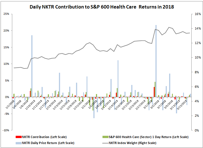
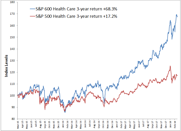
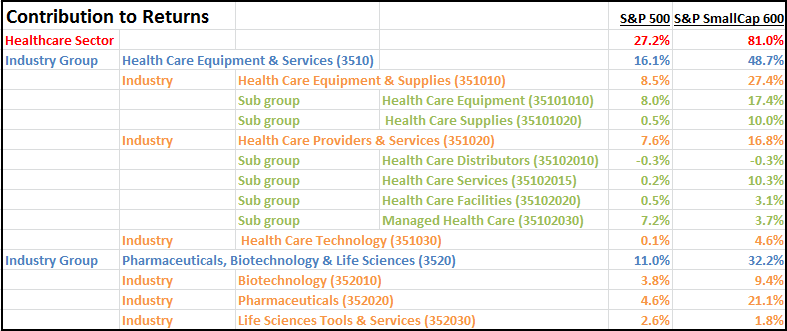
Health Care posted the biggest small-cap premium with a 7.3% outperformance in March, explained in detail here.  Financials and Tech also had significant small cap premiums in March of 6.1% and 4.7%, which will be analyzed in subsequent posts.

The posts on this blog are opinions, not advice. Please read our Disclaimers.

Do Dividends Really Pay?

Contributor Image
Philip Murphy

Former Managing Director, Global Head of Index Governance

S&P Dow Jones Indices

What benefits do dividend payments and dividend yields convey? The answers may sometimes be overlooked as market participants seek equity income or the perceived safety of dividend strategies. In 1961, Merton Miller and Franco Modigliani (M&M) theorized that dividend policy is irrelevant to company value.[1] Of course theories are models of reality and require simplifying assumptions. There is room for debate about the limitations introduced by M&M’s assumptions, but it pays to consider their theory because if dividend policy is even close to irrelevancy in the determination of company value, then it is not a fundamental driver of total return. In much of the leading research and literature on risk premia and factors, dividends and dividend yields generally have not been widely found to generate a return premium. Carry is closely related to yield and it originated in foreign exchange markets. It has recently been researched broadly to comprise other asset classes, including equities.[2] However, while equity carry is related to dividend yield, it is a forward-looking measure derived from the valuation of index futures. Most dividend growth or dividend yield strategies do not capture equity carry per se.

All of which is not intended to imply that dividend payments do not contribute to total returns; they obviously do. But they may behave more as a component, rather than a driver, of cash flows. Think of it this way—you are paid by your employer with direct deposit into two bank accounts, Bank A and Bank B. The key drivers of your pay include the health of your employer’s business and your job performance. Whether you get paid through Bank A or Bank B has no bearing on the amount of your pay. The banks serve as cash flow conduits, just like dividends and capital gains. In a theoretical world without market frictions, investors would be able to create dividend-equivalent cash flow by selling shares, as Exhibit 1 illustrates.

If dividends do not drive returns in and of themselves, why do investors seek them? The real world does have market frictions, and there turns out to be an array of potential behavioral, financial, and even legal reasons behind investors’ dividend preference. For example, it may be psychologically easier to receive dividends than to sell holdings, because one may avoid the regret of selling at a loss. There may be emotional reasons, or even legal ones for some types of trust accounts, to avoid an invasion of principal. Financially, there are no sales commissions for dividends, while there may be for selling shares (though many funds can now be sold without transaction fees). Finally, dividends may simply be more convenient. One does not need to plan or remember to transact in order to receive a dividend, while one generally would for selling shares (though many asset managers and financial service providers offer automated withdrawal services). In a nutshell, dividends seem to have potential benefits psychologically, in some cases legally, and in terms of cost and convenience. While M&M made a strong theoretical case for dividend irrelevance, in the presence of market frictions dividend preference becomes somewhat clearer.

Furthermore, even if dividends do not generally drive total returns, they may serve as economic signals. This explanation provides another, possibly theoretically stronger, footing for dividend preference. For example, growing dividends may convey financial strength, while high dividend yield may be correlated with value. Of course, financial strength is closely associated with the quality factor, and value is one of the most widely accepted factors. Therefore, by virtue of a signaling aspect, dividend strategies may offer access to risk premia.

One thing is certain, which is that one dividend strategy can be quite different than the next. Market participants should carefully consider the role of specific dividend strategies with respect to their portfolios’ investment policy and factor exposure. An important overall consideration is that all dividend strategies are somewhat less diverse than the broad market, because not all stocks pay dividends. Therefore, the best dividend strategies are those that compliment diversified portfolios in ways that contribute to desirable characteristics on a case-by-case basis. In my next post, I’ll pick up on dividend strategies again and provide a bit of a deeper dive.

[1]   Miller, Merton H. and Modigliani, Franco. “Dividend Policy, Growth, and the Valuation of Shares.” The University of Chicago Press. The Journal of Business. Vol. 32, No. 4. Pp. 411-433. October 1961.

[2]   Koijen, Ralph S. J., Moskowitz, Tobias J., Pedersen, Lasse Heje, and Vrugt, Evert B. “Carry.” Fama-Miller Working Paper. Nov. 1, 2016.

The posts on this blog are opinions, not advice. Please read our Disclaimers.

What's In A Sector?

Contributor Image
Jodie Gunzberg

Former Managing Director, Head of U.S. Equities

S&P Dow Jones Indices

Following an index announcement stating Nektar (NKTR) among other stocks would be moving to the S&P 500 prior to the open on March 19, 2018, an inquiry came in about the index impact of NKTR on the S&P SmallCap 600 Health Care Index performance.   Given the stock rose over 70% in 2018, it seemed reasonable to ask about how one company can influence a market cap-weighted index.

In order to answer this question, the weights and returns of each constituent in the index were measured for a contribution to return.  For this particular analysis, data from Jan. 2, 2018 through Mar. 16, 2018 was used.  Through this time, the weight of NKTR increased from 8.6% to 13.4% with an average weight of 11.4%.  The compounded daily index contribution from NKTR was 7.5% to the 16.4% of the S&P 600 Health Care Index.  The graph shows the daily index contribution of NKTR (in red), making it clear that the contribution does not rise directly just with the weights or returns but depends on the combination, that in turn depends on the performance of other stocks in the index.

Source: S&P Dow Jones Indices

If NKTR, the one stock that rose 70% didn’t drive the whole small-cap health care sector, what else mattered?  The index had 78 stocks contributing to the return, of which 64 stocks or 82% (more than 4 of 5) were positive.  The worst stocks in the best sectors generally benefit.  However, then why have the small caps outperformed the large caps by so much in health care if they are in the same sector?

Source: S&P Dow Jones Indices

Looking deeper than the sector level is required to answer this question, and more granular groups by GICS classifications can say a lot about the performance of a sector.  When analyzing sector performance using (in order from broadest to narrowest) industry groups, industries and sub-industries, insight can be gained into what is driving a sector and whether a stock is going with its group or if individual fundamentals are at play.

In the case of the health care sector, there are two industry groups, illustrated below with weights in each of large caps and small caps through time. Note that large cap healthcare equipment & services increased through time from 33% to 41% and pharmaceuticals, biotechnology and life sciences decreased in large caps from 67% to 59%.  The opposite happened in small caps where the pharmaceuticals, biotechnology and life sciences increased from 31% to 40% while the healthcare equipment & services decreased from 69% to 60%.

Source: S&P Dow Jones Indices

Next breaking down the sector weights by industry group, industry and sub-industry shows large cap Health Care Equipment and Managed Health Care are biggest and have grown most from 13.8% to 19.2% and 9.4% to 13.4%, respectively, while the Biotechnology and Pharmaceuticals fell most from 24.3% to 20.6% and 38.4% to 32.2%, respectively.  In small caps, the Biotechnology and Pharmaceuticals grew most from 10.1% to 14.3% and 16.9% to 23.2%, respectively.  On the other hand in small caps, Health Care Equipment dropped from 25.0% to 10.0% and Health Care Technology fell from 10.1% to 3.9%. Also, in small caps, the Health Care Distributors are almost gone with only Aceto Chemicals left at 0.19%.

Knowing the weight distribution helps focus where to look for performance contribution.  The 3-year annualized return spread of S&P 600 out-performance over the S&P 500 for the health care sector, industry group and industries shows an interesting split.  While (very slightly) more of the out-performance came from Pharmaceuticals, Biotechnology & Life Sciences (Industry Group) at 14.1%, all 3 industries from Health Care Equipment & Services (Industry Group) showed a small cap premium.  Only Pharmaceuticals did from its broader industry group, but it outperformed by 21.8% annualized over the three years.

Source: S&P Dow Jones Indices

This is the information needed to measure the contribution to returns.   Overall the returns of the health care sector were 27.2% and 81.0% for the S&P 500 and S&P 600, respectively.  Healthcare Equipment & Services contributed 16.1% and 48.7% to large caps and small caps, respectively – that was more than the Pharmaceuticals, Biotechnology & Life Sciences contribution of 11.0% and 32.2%, respectively, to large and small caps. Healthcare equipment & supplies contributed most of that at 8.5% and 27.4% , respectively for large and small cap. Pharmaceuticals added 21.1% to small caps that was the 2nd most significant industry behind healthcare equipment & supplies.

Source: S&P Dow Jones Indices. Estimation based on sum of daily contributions.

The result of this sort of deeper sector analysis can lead to understanding the drivers of performance.  In this case of small caps outperforming large caps in health care, the credit can be given to deal making, increased expectations for acquisition of smaller companies, stronger innovation from smaller companies and that smaller companies may be more immune to concerns about regulatory pressures in healthcare.  These reasons are all mentioned in this article that leads to conclusions about specific stock and ETF choices as ways to benefit from these intra-sector moves.


The posts on this blog are opinions, not advice. Please read our Disclaimers.

Performance Analysis of the S&P High Yield Low Volatility Corporate Bond Index for 2017

Contributor Image
Hong Xie

Former Senior Director, Global Research & Design

S&P Dow Jones Indices

The S&P U.S. High Yield Low Volatility Corporate Bond Index (the HYLV index) was launched on Dec. 20, 2016, with the aim of capturing high yield bonds with less credit risk and lower return volatility than the broad investment universe of U.S. high yield bonds. One year after the index launch date, we present a performance analysis of the HYLV index versus the benchmark S&P U.S. High Yield Corporate Bond Index for 2017.

Exhibit 1 shows the performance decomposition for both indices. In 2017, carry was the biggest driver of performance, returning 5.9% for the benchmark and 4.8% for the HYLV index. Spread tightening contributed 2.8% return for the benchmark and 2.0% for the HYLV index, with the option-adjusted spread being tightened by 62 bps and 36 bps for the benchmark and the HYLV index, respectively.

Exhibit 1 also demonstrates the sources of performance difference between the HYLV index and the benchmark. Overall, the HYLV index underperformed the benchmark by 2.3%, including a carry of 1.1% and a spread of 0.8%. Underperformance of the HYLV index from carry and spreads in a spread-tightening environment is not surprising, given its lower yield profile and more defensive positioning of credit risk than the benchmark. More importantly, does the HYLV index mitigate portfolio risk and provide downside protection as it intends to?

Exhibit 2 shows the monthly returns for the benchmark and the HYLV index. The HYLV index did show lower volatility, at 1.67% compared to 2.0% for the benchmark. Exhibit 3 includes the scatterplot of the relative return of the HYLV index over the benchmark from spread changes versus benchmark spread returns. The negative correlation of -0.66 between these two variables indicates that when the broad high yield universe benefited from spread tightening, the HYLV index underperformed the benchmark from spread changes, and that spread widening would have less downward impact on the HYLV index than the benchmark.

The posts on this blog are opinions, not advice. Please read our Disclaimers.

Takeaways From the SPIVA® India Year-End 2017 Scorecard

Contributor Image
Akash Jain

Director, Global Research & Design

S&P BSE Indices

In a year with strong equity returns in India, the S&P BSE 100 ended in the black with a 33.3% annual return. However, the S&P Indices Versus Active (SPIVA) India Year-End 2017 Scorecard shows that a majority of active funds in the Indian Equity Large-Cap and Mid-/Small-Cap categories lagged their respective benchmarks over the one-year period ending in December 2017.

The biannual SPIVA India Scorecard attempts to capture the performance of active funds (both equity and bond funds) domiciled in India against the S&P BSE benchmarks over different time horizons. The study revealed that over the one-year period ending in December 2017, 59.4% of Indian Equity Large-Cap funds, 27.9% of Indian ELSS funds, and 72.1% of Indian Equity Mid-/Small-Cap funds underperformed their respective benchmark indices. Additionally, the majority of the Indian Composite Bond funds underperformed the S&P BSE India Bond Index over the 3-, 5-, and 10-year periods, and the majority of Indian Government Bond funds underperformed the S&P BSE India Government Bond Index over the 1-, 3-, 5-, and 10-year periods (see Exhibit 1). 

In the three equity fund categories—Indian Equity Large-Cap, Indian ELSS, and Indian Equity Mid-/Small-Cap—the asset-weighted average fund returns were higher than their respective equal-weighted average fund returns over the 10-year horizon. This difference was most pronounced in the Indian Equity Large-Cap category (87 basis points) among the three equity categories, indicating that the larger funds by AUM in this category performed better over the 10-year period (see Exhibit 2). However, an opposing trend was observed for the one-, three-, and five-year periods, when the equal-weighted average fund returns exceeded their respective asset-weighted average returns, in the Indian Equity Mid-/Small-Cap category, which implies that the alpha generation from mid- and small-cap selection was more constrained for the large funds, due to the low investment capacity of mid- and small-cap stocks in recent years.

Exhibit 2: Difference Between Asset-Weighted and Equal-Weighted Fund Returns 
FUND CATEGORY 1-YEAR (%) 3-YEAR ANNUALIZED (%) 5-YEAR ANNUALIZED (%) 10-YEAR ANNUALIZED (%)
Indian Equity Large-Cap -0.16 -0.09 0.29 0.87
Indian ELSS -0.33 -1.03 -0.32 0.53
Indian Equity Mid-/Small-Cap -2.40 -0.68 -1.00 0.12

Source: S&P Dow Jones Indices LLC, Morningstar, and Association of Mutual Funds in India. Data from December 2007 to December 2017, based on the SPIVA India Year-End 2017 Scorecard. Past performance is no guarantee of future results. Chart is provided for illustrative purposes.

In the year-end 2017 report, the number of Indian Equity Large-Cap active funds at the start of the three-year period shrunk to 100 from 155, a drop of 55 funds in the universe compared with the figures reported in the SPIVA India Mid-Year 2017 Scorecard. This drop was mainly caused by the introduction of a new fund category, Flexicap, by Morningstar in the second half of 2014. The Flexicap category includes funds that invest at least 65% of their total assets in Indian equities but invest no more than 65% of total assets in either large-cap stocks or small-/mid-cap stocks. Of these 55 large-cap funds, 46 were reclassified to Flexicap while the seven other funds were merged during this six-month period.

Additionally, the number of Indian Equity Large-Cap active funds at the start of the one-year period in the SPIVA India Year-End 2017 Scorecard decreased to 64 from 87, a drop of 23 funds in the universe compared with the figures reported in the SPIVA India Mid-Year 2017 Scorecard. This drop was due to a change in the definition of large-cap funds in the second of 2016 by Morningstar. The minimum requirement for percentage of assets in large-cap stocks for large-cap funds was changed from 65% to 75%. As a result, 20 large-cap funds were reclassified to Flexicap funds.

To discover more about the performance of Indian active funds versus their benchmarks, check out the SPIVA India Year-End 2017 Scorecard.


The posts on this blog are opinions, not advice. Please read our Disclaimers.