Get Indexology® Blog updates via email.

In This List

Canada: Bonds Recover as Central Bank Leaves Rates Unchanged

Speculating About the Fed’s Timing

Asian Fixed Income: Rising Momentum of Islamic Finance in China

Global Infrastructure Investments

Scanning Oil: Reading Between The Lines

Canada: Bonds Recover as Central Bank Leaves Rates Unchanged

Contributor Image
Kevin Horan

Former Director, Fixed Income Indices

S&P Dow Jones Indices

The Bank of Canada left its key interest rate unchanged at 0.5% last Wednesday, Sept. 9, 2015.  The message from the central bank was that it could be “considerable time” before there is significant recovery from the collapse of oil prices that pushed the economy into a technical recession.  The last rate cut was back on July 15, 2015, and the central bank feels the effects of that action are still working their way into the economy.  The number of jobs is also an important factor to watch.  The Canadian economy added 12,000 jobs in August and exports were up for the second month in a row, but the unemployment rate also rose to its current level of 7%.

So far, September has been positive for Canadian indices, as Exhibit 1 indicates.  Bonds rated CCC and lower have returned 0.17% for the month, while they have lost 14.19% YTD, as of Sept. 15, 2015.  The S&P Canada CCC & Lower High Yield Corporate Bond Index was as low as -18.36% YTD as of Aug. 20, 2015, before recovering to the level seen as of Sept. 14, 2015.  The S&P Canada B High Yield Corporate Bond Index, which measures single B bonds, had a total return as high as 5.84% YTD at the beginning of July, but as of Sept. 14, 2015, it has returned 3.29% YTD after bouncing back from a 1.71% YTD return on Aug. 25, 2015.

Exhibit 1: Canadian Indices Returns
Returns of Canadian Indices


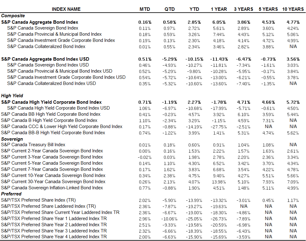
Source: S&P Dow Jones Indices LLC.  Data from Sept. 14, 2015.  Past performance is no guarantee of future results.  Table is provided for illustrative purposes.

The posts on this blog are opinions, not advice. Please read our Disclaimers.

Speculating About the Fed’s Timing

Contributor Image
David Blitzer

Former Managing Director and Chairman of the Index Committee

S&P Dow Jones Indices

Little new data, lots of chatter from Wall Street and no clear signals about what the Fed might do at next week’s FOMC meeting. The announcement, either no change or a rate increase, is expected on Thursday afternoon September 17th around 2 PM Washington DC time.

Those looking for some hint of what this might mean for the stock market can lean on a bit of history reported in the Economist this week.  Since 1955 there have been 12 Fed tightening cycles, averaging two years each with an average increase of five percentage points. Typically recessions appears after three years, but not always. Given the changes in the economy, business cycles and inflation, 12 cycles are not enough observations to identify a pattern.  One favorable piece of history is that in nine of the 12 cycles equity prices rose in the year after the start of a tightening cycle. One reason may be that the Fed tends to move when the economy is strong, earnings are climbing and it fears over-heating.  Today earnings per share on the S&P 500 are roughly flat: the change from June 2014 to June 2015, based on available data, was -3.2%.

For those who prefer pictures to numbers, the chart shows the S&P 500 and the Fed Funds rate monthly since 1954 with recessions marked by the vertical lines. More often than not, rising rates lead to falling stock prices.

The story for bonds is simpler. From the early 1950s to 1982 bond yields rose and bond prices fell.  Yields peaked in mid-teens for treasuries. Since the August 1982 peak yields have come down to their present rock-bottom level. While bond yields may not rise in lock-step with the Fed funds rate, we are at the zero lower bound and the next move will be up. The chart below shows the modern history of US treasury bonds and the Fed funds rate.

Those who prefer trading signals to economic history can look to the CME Group’s FedWatch which offers a probability distribution for the funds rate based on the Fed Funds futures market. As of Friday afternoon, the odds for the funds rate on September 17th were 77% for 25 bp and 23% for 50 bp.  Looking ahead to the December FOMC meeting, the odds for 25 bp are 41%, 43% for 50 bp and 16% for 75 or 100 bp.

Taking everything together, a rate hike is coming but no one knows when.

The posts on this blog are opinions, not advice. Please read our Disclaimers.

Asian Fixed Income: Rising Momentum of Islamic Finance in China

Contributor Image
Michele Leung

Former Director, Fixed Income Indices

S&P Dow Jones Indices

In the Islamic Finance News Report “China- the time is now”, it highlighted a few initiatives that demonstrated the rising momentum of Islamic finance in China, see examples below,

  • Chinese brokerage Southwest Securities forged a partnership with Qatar International Islamic Bank to pave the way for Islamic finance transactions in the country. The Qatari bank confirmed with IFN that it will leverage on this MoU to develop an Islamic finance framework for China.
  • Chinese banking giant, the Industrial and Commercial Bank of China (ICBC), also the world’s largest bank by assets, through its leasing arm entered into a collaborative agreement with the Islamic Corporation for the Development of the Private Sector (ICD), which is targeted to focus on multiple lines to develop Islamic capabilities and opportunities.

Separately, there is news that HNA Group, owner of Hainan Airlines, is planning on issuing USD sukuk.  It would be the first Islamic financing deal by a mainland Chinese company. Chinese property company, Country Garden Holdings, also plans a sukuk programme of at least RM1 billion. Since sukuk is a viable option in a diversified funding approach, more Chinese companies could be expected to tap into the sukuk market.

As of Sep. 10, 2015, the YTD total return of the Dow Jones Sukuk Index is 1.39%.  Among the rating-based subindices, the Dow Jones Sukuk A Rated Total Return Index has outperformed and gained 1.43% YTD as of the same date.

In terms of new issuance, a total par amount of USD 9.5 billion sukuk was added to the index YTD. Sukuk from United Arab Emirates and Malaysia both contributed USD2.75 billion.  Hong Kong issued another USD 1 billion five-year sukuk in June, which reaffirmed Hong Kong’s ongoing commitment to developing Islamic finance in the region.  Currently, sukuk from the GCC represent 53% of the overall market exposure (see Exhibit 1).  Interesting to note, the new issues in the index were all launched in the second quarter, while recent primary activities have been muted on the back of market uncertainty.

Exhibit 1: Market Exposure by Par Amount of the Dow Jones Sukuk Index

Source: S&P Dow Jones Indices LLC. Data as of Sept. 10, 2015. Past performance is no guarantee of future results. Chart is provided for illustrative purposes.
Source: S&P Dow Jones Indices LLC. Data as of Sept. 9, 2015. Past performance is no guarantee of future results. Chart is provided for illustrative purposes.

The posts on this blog are opinions, not advice. Please read our Disclaimers.

Global Infrastructure Investments

Contributor Image
Todd Rosenbluth

Director of ETF and Mutual Fund Research

S&P Capital IQ Equity Research

Once every four years, America’s civil engineers provide a comprehensive assessment of the nation’s major infrastructure categories. The latest report card has a poor cumulative GPA for infrastructure of D+, with rail and bridges each earning a C+. While Congress continues to debate whether, and how, to fund the projects to improve the quality of the nation’s backbone, there has been some encouraging news at the state level. Nearly one-third of U.S. states, including Georgia, Idaho and Iowa, are addressing infrastructure investment through gasoline tax increases to support improvement of local roads and bridges.

Indeed, nearly two thirds of the assets inside the S&P Global Infrastructure index are domiciled outside of the U.S, with China (5%), Japan (4%), Italy (8%), Spain (5%), and the United Kingdom (7%) among the ten largest countries. The S&P Global Infrastructure index seeks to provide broad-based exposure to infrastructure through energy, transportation, and utility companies in both developed and emerging markets.

S&P Capital IQ Equity Analyst Jim Corridore thinks that companies that construct infrastructure are likely to see increased demand over the next several years due to the need for upgrade and expansion of infrastructure both within the U.S. and around the world. Within the U.S., aging and outdated roads, electric transmission grids, and energy transmission facilities are in dire need of repair and replacement, according to Corridore. Meanwhile pipelines, water treatment, and rail are seeing increased demand and need for expansion.

From an industry perspective, transportation infrastructure (40% of assets) are well represented in the global infrastructure index, but this is partially offset by stakes in electric utilities (22%) and oil, gas & consumable fuels (20%) companies. Holdings include Kinder Morgan (KMI) National Grid (NG) and Transurban Group (TCL).

The S&P Global Infrastructure index generated a 9.6% annualized return in the three-year period ended July 2015. However, given the strength in the US dollar relative to most currencies in the last three years, many currency hedged international approaches have outperformed those that hold just the local shares. This is one of those examples, where the currency neutralized infrastructure index was even stronger with a 13.0% three-year return. On a calendar year basis, the hedged index outperformed in 2013 and 2014, after underperforming in 2012.

Meanwhile, from a risk perspective the three-year standard deviation for the hedged S&P Global Infrastructure index was 20% lower.

S&P Capital IQ thinks that global infrastructure needs has created some investment opportunities. However, we think investors need to be mindful of the impact currencies can play.  There are four ETFs that offer global infrastructure exposure and 39 non-institutional mutual fund share classes.

To keep up with ETF trends, follow me at @ToddSPCAPIQ or check out http://trymsatoday.com/

—————————————————————————————————–

S&P Capital IQ operates independently from S&P Dow Jones Indices.
The views and opinions of any contributor not an employee of S&P Dow Jones Indices are his/her own and do not necessarily represent the views or opinions of S&P Dow Jones Indices or any of its affiliates.  Information from third party contributors is presented as provided and has not been edited.  S&P Dow Jones Indices LLC and its affiliates make no representations or warranties of any kind, express or implied, regarding the completeness, accuracy, reliability, suitability or availability of such information, including any products and services described herein, for any purpose.


The posts on this blog are opinions, not advice. Please read our Disclaimers.

Scanning Oil: Reading Between The Lines

Contributor Image
Jodie Gunzberg

Former Managing Director, Head of U.S. Equities

S&P Dow Jones Indices

Barcode symbologies are mappings which allow humans and computers to communicate by simplifying the language into a code of bars and spaces that scanners can read.  If complex information can be depicted so simply that a computer can read it, why not use a barcode to better understand oil? If you see the pattern below, congratulations – you might be a computer (or an oil analyst.) If you don’t see the pattern, then don’t worry – you’re human.

Source: S&P Dow Jones Indices

Let’s walk though the symbology that maps the above barcode to its underlying message.  The first step in decoding the barcode is to show the labels of the chart.

Source: S&P Dow Jones Indices. Monthly data from Jan 1987 - Aug 2015. The monthly return difference of S&P GSCI Crude Oil Excess Return - S&P GSCI Crude Oil is plotted in black as contango if it is negative. It is plotted in white as backwardation if it is positive.
Source: S&P Dow Jones Indices. Monthly data from Jan 1987 – Aug 2015. The monthly return difference of S&P GSCI Crude Oil Excess Return – S&P GSCI Crude Oil is plotted in black as contango if it is negative. It is plotted in white as backwardation if it is positive.

The chart is simple. It’s just binary; 0 for backwardation and 1 for contango, where a black bar represents a month of contango. (As a refresher, contango describes the shape of a forward curve when the contract expiring nearby is cheaper than the contract expiring further out. It is losing for a long only investor. Conversely, backwardation describes the shape of a forward curve when the contract expiring nearby is more expensive than the contract expiring further out. It is profitable for a long only investor.) Notice contango and backwardation tend to come mostly in thick lines, or in other words, there are several consecutive months of either backwardation or contango.

Why is this? Backwardation happens when there is a shortage, and contango happens when there is excess inventory. Since it takes time for inventories to build and deplete, the conditions persist. Not only do the conditions generally persist, they stubbornly persist. There are only 15 of 343 months where oil’s curve shape flipped for only a single month. It was twice as likely to see a shortage peek through for a month during contango than it was to see an excess during backwardation. That should make sense since it is harder to grow, mine and drill enough commodities to replenish inventories during a shortage than it is to buy cheap commodities in a glut.

If by glancing, you think it looks like contango happens more than backwardation, then you are correct. Historically, contango is measured just over half the time, in about 55% of months, and backwardation is measured in about 45% of months. However, backwardation is more potent. Not only is it harder for a surplus to interrupt a shortage but the average monthly return gained (roll yield) from backwardation is 1.7% versus 1.4% lost in months of contango.

On average since 1987, there is only a slightly negative roll yield of 2 basis points per month, but the contango since 2005 helped drive the S&P GSCI Crude Oil Total Return down to the lowest since 1999 (on Aug. 24, 2015,) wiping out an additional 10 years of gains for investors.

Since then, there were a few historically winning days, driving oil up 15.6% by the end of Aug. However, contango still persists, making the S&P GSCI Crude Oil Total Return’s loss of 10.3% month-to-date through Sep. 10, 2015, on track for the worst month in history.

Finally, will contango persist? To put the contango streak into historical context, if Sep. stays in contango, that will be the 10th month straight which is not even close to a record losing streak. Plus the glut from OPEC, the U.S. and others in a market share competition for China as a consumer can prolong it, especially since China’s economy is under pressure and their currency is devalued, making it more expensive for them to import oil. There are six longer contango streaks than the current one at 10 months, and the longest lasted three years that was part of a 61 month streak from June 2008 – June 2013 that was only interrupted by two separate months of backwardation in Oct. 2008 and Nov. 2011. Please see the table below:

Source: S&P Dow Jones Indices.

The S&P GSCI Crude Oil Total Return has only fallen 30.9% since its recent high on May 6, 2014. That again is far from its worst total return loss of 82.3% in the global financial crisis. From the current index level, another 74.3% needs to be shaved off to match that drawdown but with the help of persistent contango, it’s possible.

To hear more about views on oil, please join us for our 9th annual commodities seminar.

The posts on this blog are opinions, not advice. Please read our Disclaimers.