Get Indexology® Blog updates via email.

In This List

New Year’s Resolution: Lose Weight...in Carbon

The S&P 500's Flat Year

Most-Read Blog Posts Q4 2015

Dow Jones Industrial Average - 2015 Year in Review

The Rieger Report: 500 Index Sectors - Final 2015 Results

New Year’s Resolution: Lose Weight...in Carbon

Contributor Image
Neil McIndoe

Head of Environmental Finance

Trucost

Global emissions of carbon dioxide (CO2) would have to fall by about 60% by 2050 to limit the increase in average temperature to 2°C above pre-industrial levels. Over the last 40 years, CO2 emissions have mostly risen or remained flat, and fallen only following major economic crises. Add to this a global population that is projected to grow to 9.6bn by 2050 and that 2°C target looks increasingly unrealistic. The International Energy Agency has stated that the world is on course for average temperature rises of at least 4°C, not the 2°C targeted by policy makers. Correcting this gap will almost certainly involve a much tougher regulatory framework with a higher cost of carbon at its core.

The current response to such carbon cost risks from the fund management industry is extremely varied and therefore continues to be a concern for institutional investors including pension funds. Without accurate measurement of these risks, investors may struggle to manage the risk effectively.

Step onto the scales

A carbon footprint analysis quantifies the greenhouse gas emissions (GHG) emitted by companies in the portfolio. The analysis also takes account of purchased electricity, business travel, and logistics. The carbon footprints of portfolios, expressed in tonnes of carbon dioxide equivalent (CO2e) provide a comparable measure of emissions associated with holdings and provide a useful indicator for related exposure to carbon costs.

The carbon footprints of funds can vary dramatically. In one case we analysed two funds with the same investment style where the smaller footprint was 209 tonnes of CO2e per £ million invested and the larger footprint was 1,487 tonnes CO2e/£ million—that’s seven times more exposure to potential carbon costs. Neither fund manager considered CO2 in their investment process.

Other useful metrics include an analysis of a portfolio’s exposure to stranded fossil fuel assets. If only one-third of already discovered fossil fuel deposits can be burned if we are to keep to a 2 degree limit, why are many oil & gas companies allocating large capex to discovering more?

A measure can also be given for the alignment of a portfolio’s energy investments with pathways that would support a low-carbon economy. This is useful because any regulation and subsidies that come forward to support such a transition could have cost implications for the heavier carbon fuel producers.

Climate change risk is therefore an issue that pension funds trustees may increasingly look to assess and actively manage. Carbon exposure, in particular, may be a clear risk to portfolio returns that can be quantified.

Low-carbon indices – healthier benchmarks?
In response to demand for benchmarks that take into account carbon exposure risk, S&P DJI has introduced low-carbon versions of many of its well-known indices. For instance, the S&P Carbon Efficient family includes the S&P 500® Carbon Efficient Index, which closely tracks the performance of the S&P 500 while significantly reducing the carbon footprint of the overall portfolio. It has a six-year track record of delivering returns that are similar to those of the S&P 500, but with around 50% less exposure to potential carbon emission risks.

Working out a carbon fitness regime
To achieve low carbon exposure, investors may wish to:

  • Track how a fund’s carbon exposure compares to that of the benchmarks.
  • Monitor portfolios on greenhouse gas emissions and related exposure to carbon costs under existing and planned regulatory frameworks.
  • Develop processes to proactively manage emissions-related risks and opportunities in portfolios to better protect savings.

Wishing you a healthy and prosperous new year.

The posts on this blog are opinions, not advice. Please read our Disclaimers.

The S&P 500's Flat Year

Contributor Image
Craig Lazzara

Former Managing Director, Index Investment Strategy

S&P Dow Jones Indices

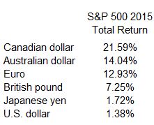
By now we are all painfully aware that the U.S. equity market was essentially flat in 2015.  The S&P 500’s total return was 1.38%, all of which was a function of dividend income — the index’s price return was -0.73%.  Other large-cap averages were in the same ballpark — the Dow Industrials, e.g., logged a total return of 0.21% — and smaller cap indices lagged slightly, as the S&P MidCap 400 and S&P SmallCap 600 both lost -2% on a total return basis.  Although there were peaks and valleys during the year, 2015 as a whole was notable for not being notable.

This is only true, of course, from a provincial American perspective.  What we often overlook is that in 2015, the strength of the U.S. dollar produced impressive results for investors from outside our borders:500 TR 2015 by currency

We’ve remarked on the importance of currency movements before.  There’s no alchemy involved here — as the U.S. dollar rose against the euro, e.g., European investors in the U.S. market benefited from being in the stronger currency.  And it’s worth noting that currency effects cut both ways.  Euro-based investors would have reaped a total return of 8.61% in the S&P Europe 350; U.S. investors in the same index lost -2.52%.

We profess no ability to forecast the course of either global equity markets or currencies.  What we can say is that if the U.S. dollar continues to strengthen, it will continue to benefit international investment into the U.S., as it did in 2015, and to penalize U.S. investment abroad.


The posts on this blog are opinions, not advice. Please read our Disclaimers.

Most-Read Blog Posts Q4 2015

Contributor Image
Paul Murdock

Manager, Content & Delivery

S&P Dow Jones Indices

In case you missed them, we’ve compiled the most read blogs from the fourth quarter below.

Losing My Religion: Value in the USA
How have value indices performed and will value investing “work” in the future?

The Rieger Report: Munis Lead the Pack in the Final Lap
How did the municipal bond market perform in 2015?

Energy Stocks and Bonds Say Oil May Have Bottomed
Has oil reached its bottom or is this just the market sentiment?

How Did European Active Managers Perform Over the Past 10 Years?
What were the results of the 2015 mid-year SPIVA® Europe Scorecard?

DJSI: A Journey Toward Sustainability and Beyond
How have the DJSI played a supporting role in leveraging sustainability as a key business driver for corporate success?

ETF Industry in India Over the Years
How has the ETF industry in India advanced over the years?

The posts on this blog are opinions, not advice. Please read our Disclaimers.

Dow Jones Industrial Average - 2015 Year in Review

Contributor Image
Jamie Farmer

Former Chief Commercial Officer

S&P Dow Jones Indices

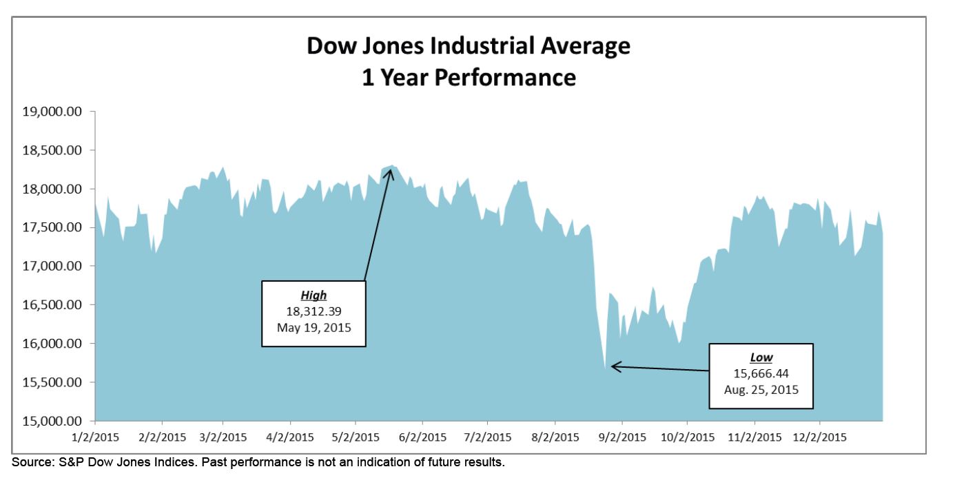
The Dow Jones Industrial Average ended 2015 at 17,425.03 – down 398.04 points on the year for a -2.23% annual return.

  • Leader & Laggard – Nike (NKE) was the biggest contributor during 2015;
    Walmart (WMT) was the biggest detractor.
  • Industry Performance – Consumer Services was the leading industry for the
    year; technology the worst.
  • Worst Day (In Points & Percent) – down 588.40 points or -3.57% – on August
    24th. While bad – the worst 1 day loss since August 2011 – it could have been
    worse: the DJIA was down over 1,000 points in early trading before recovering.
  • Best Day (In Points & Percent) – a mere two days later, on August 26th, the DJIA
    finished up 619.07 points or 3.95% as investors were drawn back to the markets
    following a period of apparent panic selling.
  • New Highs – the second half of 2015 saw no new highs for the DJIA, the last
    having been struck on May 19, 2015 when the Average closed at 18,312.39.
  • Changes – there was a momentous component change when Apple replaced
    AT&T. Additionally, there were a few significant stock splits in 2015.

Capture

Download the full report

The posts on this blog are opinions, not advice. Please read our Disclaimers.

The Rieger Report: 500 Index Sectors - Final 2015 Results

Contributor Image
J.R. Rieger

Former Head of Fixed Income Indices

S&P Dow Jones Indices

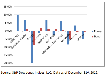
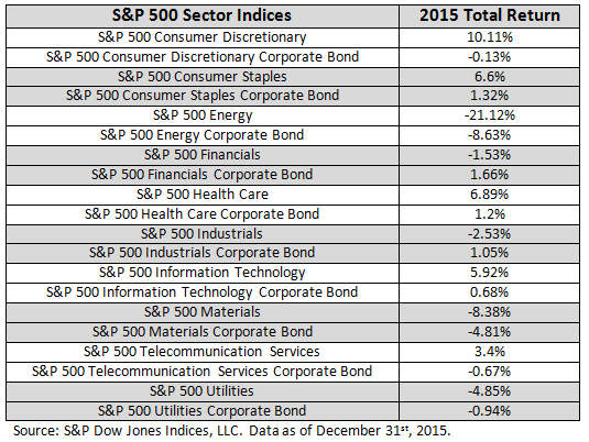
The S&P 500 Bond Index sectors creates the opportunity to examine sector performance on both the stock and bonds issued by the companies in the S&P 500 Index.   The 2015 results: As expected corporate bonds were less volatile than their equity counterparts but they still suffered from the energy and materials onslaught.

Highlights (total returns used for comparability):

  • Of the ten sectors sampled, five equity sectors saw positive returns in 2015.
  • Bonds of the five sectors with negative performance did better than equities of those sectors.
  • Energy was the biggest mover with equities down over 21% and bonds of those same companies down over 8.6%.
  • Materials was also impacted hard in 2015 with equities down over 8.3% and bonds of those same companies down over 4.8%.

Chart 1: Selected S&P 500 sector indices for stocks and bonds

Blog Sectors 1 4 2015 Chart

Table 1: Selected S&P 500 sector indices for stocks and bonds

Blog Sectors 1 4 2015 Table

The posts on this blog are opinions, not advice. Please read our Disclaimers.