Get Indexology® Blog updates via email.

In This List

Performance Attribution of the S&P 500® Quality Index

Brexit: Sell on May and Run Away?

Let’s talk about Communication

S&P 500 Drops 90 points

Mid Caps Less Risky Than Large Caps?

Performance Attribution of the S&P 500® Quality Index

Contributor Image
Wenli Bill Hao

Director, Factors and Dividends Indices, Product Management and Development

S&P Dow Jones Indices

The past two months saw bouts of market volatility, which in turn is causing market participants to refocus on defensive equity strategies. Quality, together with other defensive factors such as low volatility, has a higher degree of downside protection compared with other risk factors like value or momentum. For example, during months in which the returns of the S&P 500 are negative, the quality factor has higher returns than the benchmark about 75% of the time (see Exhibit 1).

As such, we examine the long-term performance of the S&P 500 Quality Index to understand the underlying sources of the excess returns. To do so, we look at the security selection criteria of the S&P Quality Indices.

The S&P Quality Index Series uses a company’s overall quality scores for security selection. The overall quality score is composed of three fundamental ratios: balance sheet accruals ratio (BSA), return on equity (ROE), and financial leverage ratio (leverage).[1]

To understand the performance sources of the S&P 500 Quality Index, we dissect the index performance into three components: the S&P 500 Quality BSA Attribution, S&P 500 Quality Leverage Attribution, and S&P 500 Quality ROE Attribution.[2] Assuming a starting value of 100 on June 30, 1995, Exhibit 2 shows the cumulative values of the S&P 500 Quality Index and its three attribution components from June 30, 1995, to Nov. 30, 2018.

In Exhibit 2, we can observe that the BSA factor has had the highest cumulative returns among the three factors, followed by ROE and leverage. In fact, in recent periods, the performance of the BSA has surpassed that of the S&P 500 Quality Index. However, cumulative return is just one dimension in the performance evaluation of a factor. Risk, as measured by standard deviation, is another dimension worth looking into in order to better understand a strategy or a factor’s return/risk profile (see Exhibit 3).

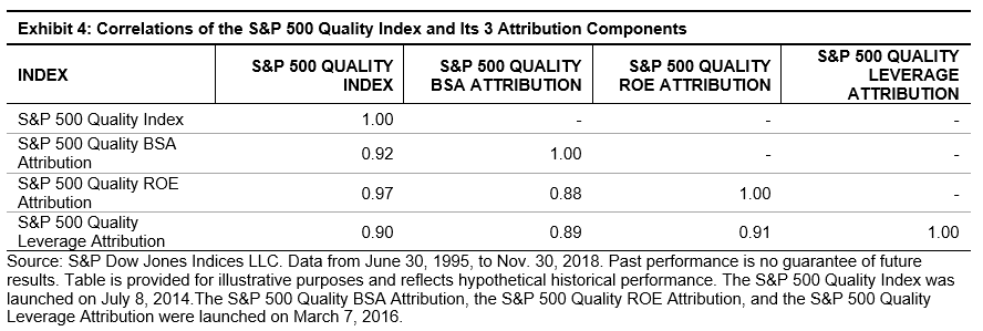
According to Exhibit 3, the integrated portfolio, as represented by the S&P 500 Quality Index, had the highest return/risk ratio when compared with the underlying component indices. This finding is not surprising given the potential diversification benefits of its subcomponents when combined in a portfolio context. The return correlations of the S&P 500 Quality Index and its components are fairly high, but not perfectly correlated (see Exhibit 4).

Market volatility has a way of making investors rethink defensive equity strategies. The S&P 500 Quality Index, with a high hit rate of 75% during down months, is a factor that has historically had a higher degree of downside protection compared with riskier factor strategies. Among its three subcomponents, the attribution analysis shows that the BSA factor has had the highest cumulative returns, followed by ROE and leverage. The potential diversification benefits of its subcomponents attributed to the integrated S&P 500 Quality Index having the highest return/risk ratio when compared with the underlying component indices.

[1]   The detailed factor definition and index construction are laid out in the S&P Quality Indices Methodology.

[2] S&P 500 Quality BSA Attribution. Securities in the eligible universe are selected for index inclusion based on their accruals ratio z-score determined during the semiannual rebalancing of the S&P 500 Quality Index. The values for all securities are ranked in ascending order.

S&P 500 Quality Leverage Attribution. Securities in the eligible universe are selected for index inclusion based on their financial leverage ratio z-score determined during the semiannual rebalancing of the S&P 500 Quality Index. The values for all securities are ranked in ascending order.

S&P 500 Quality ROE Attribution. Securities in the eligible universe are selected for index inclusion based on their return-on-equity z-score determined during the semiannual rebalancing of the S&P 500 Quality Index. The values for all securities are ranked in ascending order.

The posts on this blog are opinions, not advice. Please read our Disclaimers.

Brexit: Sell on May and Run Away?

Contributor Image
Chris Bennett

Former Director, Index Investment Strategy

S&P Dow Jones Indices

29 months after the referendum that triggered Britain’s departure from the E.U., and a little over four months from the scheduled departure date, the nature of the ultimate exit deal (if any) remains uncertain. What can indices tell us about the market’s reaction and expectations?

The volatility of the pound sterling has offered a direct link to the uncertainty faced by market participants. And with a parliamentary vote on the proposed terms of Britain’s withdrawal expected on December 11th, the CBOE/CME FX British Pound Volatility index (BPVIX) has risen to its highest levels since the referendum.

UK equities tell a similar story; the S&P U.K. Focused Domestic Revenue Exposure Index and S&P U.K. Focused Foreign Revenue Exposure Index were designed to measure the performance of UK companies with primarily domestic and primarily foreign revenues, respectively. Comparing these indices provides a better understanding of how the markets believe companies in the UK will fare. Exhibit 2 compares their performance since the beginning of 2016. (The Brexit referendum was held on June 23, 2016.)

Through Dec. 3, 2018, UK companies with primarily foreign revenue exposure had gained 14% since the Brexit referendum, while UK companies with primarily domestic revenue exposure had lost 21%. For those counting, that’s a 35% return spread.

Part (but not all) of this decline may be attributed to currency movements. The pound sterling’s relative decline against the U.S. dollar and other major currencies has elevated the value of foreign earnings to companies that have them. Currency cannot take all of the blame, however. Another driver of the decline could be an expectation that UK domestic consumer demand will decline (or at least not grow as fast) as equivalent demand from those abroad.

Safety among British equities may lie in shiny objects. Sectors with greater exposure to commodities have weathered the Brexit storm admirably, particularly the Materials sector, which is up 76% since the referendum. On a more granular level, the Metals & Mining Industry has done particularly well (up 93% since the referendum).

Of course, circumstances can change quickly. The present situation has reminded some commentators of the final quarter of 2008 when, considering a politically divisive “bail out” to stave off financial collapse, the U.S. Congress initially voted against a rescue package. On the day the results become clear, the Dow plunged by over 7%. Shortly thereafter, Congress reversed its initial decision. Whether the UK political establishment will be as sensitive to the market’s concerns, and which scenarios are already “priced in”, remains to be seen. Until then, the indices highlighted in Exhibits 2 and 3 could indicate which way the winds are currently blowing, and where shelter might be found in a storm.

The posts on this blog are opinions, not advice. Please read our Disclaimers.

Let’s talk about Communication

Contributor Image
Hamish Preston

Head of U.S. Equities

S&P Dow Jones Indices

One of the largest ever changes to the Global Industry Classification Standard (GICS®) went into effect prior to the open on Monday 24th September, affecting around 10% of the S&P 500’s market capitalization.  In case you missed our previous announcements, here is a brief explanation of GICS, what changed, and why these changes went into effect.

What is GICS?  The Global Industry Classification Standard was created in 1999 to unify definitions about different market segments.  GICS assigns each company to one of the 158 (157 before September 24th) possible sub-industries, which then determine – in decreasing order of granularity – one of 68 possible industries, one of 24 possible industry groups, and one of 11 possible sectors.

Exhibit 1: GICS Hierarchy

What changed?  The GICS update involved expanding the Telecommunication Services sector to include some constituents from the Consumer Discretionary and Information Technology sectors.  Exhibit 2 shows the composition of the resulting sector, now named Communication Services, for large-cap U.S. companies (the area for each constituent is proportional to its weight in the sector).  You’ll notice a number of the so-called FAANGs are constituents.

Exhibit 2: Many FAANGs are constituents of the S&P 500 Communication Services sector

Why did these changes happen?  The manner in which people, businesses, and communities communicate has changed dramatically.  These developments didn’t occur overnight but they do mean that communications is now far broader than telecoms.  The chairman of our Index Committee, David Blitzer, provided greater clarity on the thinking behind the sector in a prior post.  Here is one of his charts.

Exhibit 3: The way we communicate has changed over time

Have similar changes happened before?  Yes, the last GICS update occurred in September 2016 when Real Estate became a stand-alone sector (previously, it was part of Financials).  More broadly, the GICS changes recognize only the latest evolution (or revolution) in the industries that compose our markets and economies.  As we highlighted in a recent paper, the first industrial revolution was associated with Railroads – hugely important in 1900 and accounting for more than 50% of the U.S. equity market.  The second industrial revolution was associated with mechanization of manufacturing; the Manufacturing sector dominated U.S. equities by 1950.

Exhibit 4: Sector changes reflect the evolution in industries that compose our markets

The recent updates to GICS reflect changes to the way we communicate, and the sensitivities (especially to advertising revenues) that these communications companies share.  Remembering these sensitivities may be particularly useful for market participants looking to understand the performance of communications companies: concerns over declining ad revenue growth contributed to many investors being bitten by the FAANGs during the recent bout of market volatility.

The posts on this blog are opinions, not advice. Please read our Disclaimers.

S&P 500 Drops 90 points

Contributor Image
David Blitzer

Former Managing Director and Chairman of the Index Committee

S&P Dow Jones Indices

Why?

Trade Hopes dashed – It turned out a deal with China wasn’t quite yet a done deal. Politicians should be reminded that markets move much faster than trade negotiations or Congress.

Yield Curve approaching inversion – Five-year drops below two-year, but maybe we should wait for the ten year to drop too.

Rising Interest rates – based on Fed fund futures, the chance that the Fed raises interest rates on December 19th is 80%

Brexit – British Prime Minister May lost a round in Parliament while the European Union might let Britain withdraw its Article 50 request to leave – if the British were to change their minds.

The US Economy – GDP growth is good, unemployment is low but home sales are slowing and business capital spending looks soft.  Will the stock market spoil consumers’ optimism?

VIX above 20 – just about normal. Since the end of 2000, the average is 19.5

While anything, and everything, on this list could explain why the market dropped over 3% today, the main reason was probably that it started to sink and everyone followed along.

The posts on this blog are opinions, not advice. Please read our Disclaimers.

Mid Caps Less Risky Than Large Caps?

Contributor Image
Jodie Gunzberg

Former Managing Director, Head of U.S. Equities

S&P Dow Jones Indices

In November, there was high market volatility in response to at least a few major events including the U.S. midterm elections, Brexit, G20 and Fed Chair Powell’s comments.  The risk (measured by 30-day annualized volatility) on Nov. 30, 2018 for the S&P 500 was 20.6%, which is 3.5 times higher than its risk of 5.9% on Oct. 9, before the Oct. 10th sell-off, and 1.4 times higher than its average risk of 15.2% (using daily data since Jan. 2, 1991, the earliest common date of the S&P 500 and S&P MidCap 400, through Nov. 30, 2018).   While the S&P MidCap 400 risk of 19.1% and S&P SmallCap 600 risk of 21.8% were also elevated ending Nov. 30, 2018, it is interesting to note the large-cap risk was higher than the mid-cap risk.  The last November when this happened occurred in 2007.

Source: S&P Dow Jones Indices

November 2007 is clearly an interesting point since it was just following the bull market ending on Oct. 9, 2007.  This does not necessarily mean the market will decline but it may be time to think about mid-caps since now the premium might be available for less risk.  Going back to 1991, when the S&P MidCap 400 was launched, it has delivered on average 3.2% extra of annualized return but at a cost of higher 1.4% annualized risk, based on daily data from Jan. 2, 1991 – Nov. 30, 2018.  It seems attractive to have earned that premium but it is not available consistently.  Note, over many commonly measured periods, mid-caps underperform large-caps.  Though, in November, mid-caps outperformed.

Source: S&P Dow Jones Indices

There seem to be moments in mid-caps that are powerful in capturing upside and limiting downside returns of the S&P 500.  Overall, the upside capture ratio is 112 while the downside capture ratio is 97.  This means, on average, for every 1% increase in the S&P 500, the S&P MidCap 400 gained 1.12%, and also, on average, for every 1% decrease in the S&P 500, the S&P MidCap 400 lost 0.97%.  Since 1991, when the S&P 500 had a positive month, it rose 3.0% while in those same months, the S&P MidCap 400 rose 3.4%.  During that same time period, when the S&P 500 fell in a month, it lost 3.4% while the S&P MidCap 400 lost 3.3%.  In fact, in 88% of months (295/335), both sizes moved in the same direction, magnifying the gains and losses. When both the S&P 500 and S&P MidCap 400 gained, the large-caps were up 3.3% versus 3.9% for mid-caps.  However, when both lost, the large-caps fell 3.9% versus 4.2% for mid-caps on average.

On an annual basis, there have been moments when strong mid-cap premiums appeared, and have been particularly helpful during difficult times such as the financial crisis, the tech bubble bust and the early 1990’s recession.  The S&P MidCap 400 outperformed the S&P 500 by 38% from 1991-1993, 81% from 2000-2005 and by 24.1% in 2007-2010.  Not only were the premiums big, but in the latter two times, the returns of the S&P 500 were negative 15.0% and 11.3%, respectively, while the S&P MidCap 400 gained 66.0% and 12.8%, respectively.  In years after the November 2007 risk discount of mid-caps to large-caps showed up, the mid-cap premium was prominent.  It was especially great when the November 1999 risk discount persisted from the preceding October. This appears similar to the current risk discount that is in its second consecutive month.

Source: S&P Dow Jones Indices. Annualized risk used daily data for the stated year. Returns are annual per year. 2018 ends on Nov. 30, 2018 and the return is not annualized.

This November, the S&P 400 gained 2.9% versus the 1.8% from the S&P 500 and the 1.4% from the S&P SmallCap 600.  In mid-caps, 9 of 11 sectors were positive, while 8 of 11 large-cap sectors gained and 6 of 11 small-cap sectors gained.  Energy in the S&P MidCap 400 was the worst performer, losing 10.2% for the month on the back of a 16.7% loss, making it the worst consecutive 2-month energy sector loss since Dec. 2015 – Jan. 2016.  However, the mid-cap consumer discretionary sector rebounded, posting its biggest monthly spread over consumer staples since Sep. 2017, which could be viewed as optimistic.

Source: S&P Dow Jones Indices.

Finally in November, the S&P 500 had its biggest 3-day gain of 4.23% during November 26-28 since the 3 days ending on June 30, 2016, when the index gained 4.91%.  This was largely driven by Powell’s comments and anticipation of improving trade relations from the G20 Summit.  While there have been 3-day gains larger than 4.23% only 1.8% of the time (or 436 out of 23,614 instances) in the whole history of the S&P 500 since 1928, many have happened in trending or turning environments.  In the past 5 years, 3-day gains have only happened after bottoms (or temporary bottoms.)  After the 3-day gain ending December 19, 2014, it was another 216 days until the peak and 249 days before the next bottom.  Subsequently, another rebound happened with a 3-day gain of 6.49% ending on August 28, 2015 with 67 days until the next top and 167 days until the next bottom that happened on February 11, 2016 (the index never dropped below that index level afterwards) followed by another big 3-day rebound of 5.43%, ending on February 17, 2016.

Source: S&P Dow Jones Indices.

There are many factors going into December that are bullish for equities, especially mid-caps.  Equities historically perform well on average in December with every size, style and sector gaining. But mid-caps have done best.  If trading tensions ease, helping growth and pushing the dollar down, mid caps may be best positioned to perform best based on historical sensitivity.  Mid-caps gain most from a 1% dollar drop, rising on average 3.2% versus 2.6% for large-caps.  Oftentimes, the falling dollar acts as a catalyst for new international growth and propels returns beyond the mature large-caps.  Lastly, the S&P MIdCap 400 has a total return on average of 4.9% versus the S&P 500 total return on average of 4.0% per 1% of historical GDP growth.

Source: S&P Dow Jones Indices

The posts on this blog are opinions, not advice. Please read our Disclaimers.