Get Indexology® Blog updates via email.

In This List

Large Caps and Growth Outperformed By Most Since 1999

2017…Among the Sleepiest of Years

The Top 10 Dow Jones Industrial Average Factoids – 2017 in Review

Investing in the U.S. Corporate Bond Market From an Asian Perspective

Considering Tax Diversification Benefits of Roth Accounts May Be Timely

Large Caps and Growth Outperformed By Most Since 1999

Contributor Image
Jodie Gunzberg

Former Managing Director, Head of U.S. Equities

S&P Dow Jones Indices

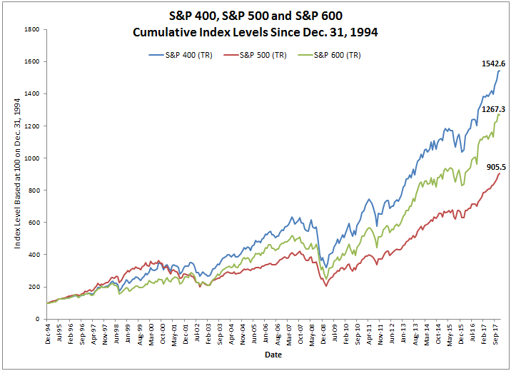
In December, the S&P 500 (TR) gained 1.1%, posting its 14th consecutive monthly gain, the longest monthly streak on record (data since Sep. 1989.) Also, the S&P MidCap 400 (TR) gained 0.2%, while the S&P SmallCap 600 (TR) lost 0.5%, bringing the 2017 performance to a respective 21.8%, 16.2% and 13.2% for the S&P 500 (TR), S&P MidCap 400 (TR) and S&P SmallCap 600 (TR).

Source: S&P Dow Jones Indices.

Though in December, the energy sector gained most in mid-caps (+6.9%) and small-caps (+5.5%,) while telecom gained most in large caps (+5.8,) nothing notable in sector performance on the positive side happened in December.  However, the utility sector had a particularly bad month.  The S&P 600 Utilities (Sector) (TR) had its 13th worst month on record, losing 5.8%, its worst since Sep. 2014, while the S&P 500 Utilities (Sector) (TR) lost 6.1%, posting its worst month since Feb. 2015, and the S&P 400 Utilities (Sector) (TR) lost 5.2%, posting its worst month since Jun. 2015.  

Source: S&P Dow Jones Indices.

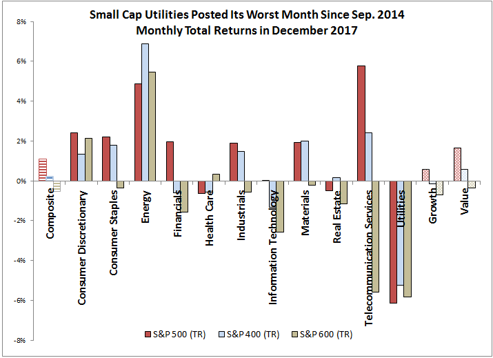
Despite the gains in Dec. from energy and telecom, it wasn’t enough to get their sectors positive for the year, but all other sectors (9 of 11 in total) were positive across market cap sizes in 2017.  During the bull market since 2009, at least 9 of the sectors have been positive across market caps in every year except in 2011 and 2015, which is a much higher positive move in lockstep than the 50% rate before 2009 (back to 1990.)  Note energy was the only sector negative in 2017 across all market caps, which is not surprising in a positive year for the S&P GSCI Energy (+12.3%).  

Source: S&P Dow Jones Indices.

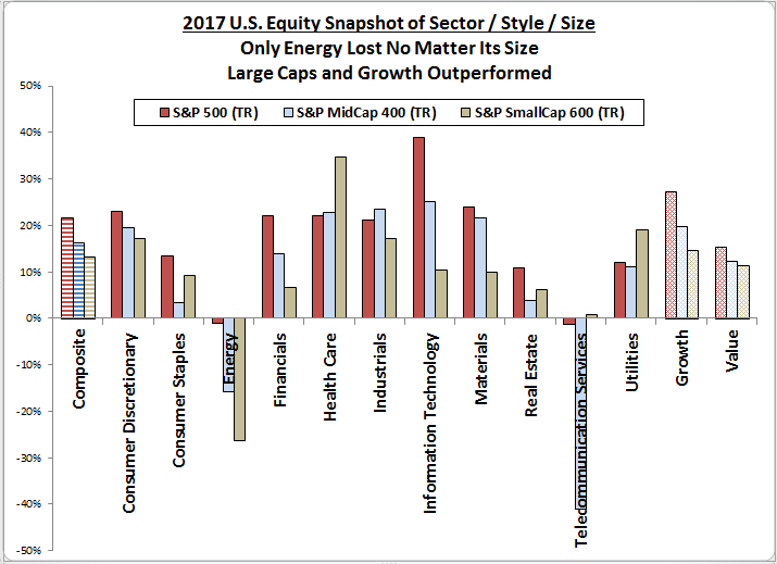
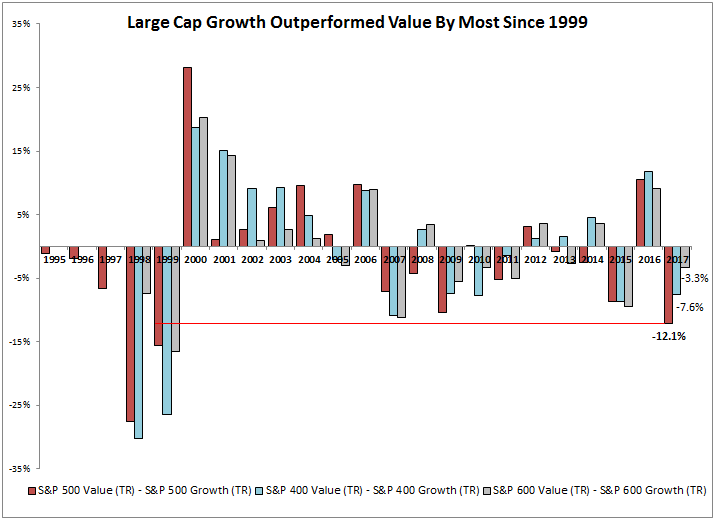
Also, in the above charts, although in December value outperformed growth no matter the size, growth outperformed value for the year.  Historically, value outperforms growth in about half of the months since Feb. 1994 with 52% of months where value beats growth in the S&P 500, 51% of months in the S&P 400 and 48% of months in the S&P 600.  The premiums and discounts are also very close with an average monthly value premium of 1.7%, 1.9% and 1.6%, and discount of
-1.7%, -2.0% and -1.7%, respectively for the S&P 500, S&P 400 and S&P 600.  The value premium and discount is also strikingly close when measured on an annual basis with average annual value premiums of 7.3%, 8.0% and 6.8%, and discounts of -8.0% -11.4% -6.7%, respectively for the S&P 500, S&P 400 and S&P 600.  However, year by year, the style matters and in 2017 growth outperformed value by the 3rd most in a year and the most since 1999.

Source: S&P Dow Jones Indices.

While style mattered, and choosing growth over value would have paid off, choosing large-cap would have helped too, with 7 of the 11 S&P 500 sectors outperforming their mid-cap and small-cap counterparts.   The size premiums on average per month are also very close (like style) with large beating mid in 49% of months, mid beating small in 54% of months and large beating small in 50% of months.  On average in a month, when large beat mid, it was by 1.4% with a loss of 1.8% when mid beat large.  Also when mid beat small it was by 1.4% and the loss was 1.5% on average in a month when small beat mid.  When large beat small, it was by 2.2% and when small beat large it was by 2.4% on average in a month.  So, there is an argument for the small size premium but on average in a month, it is small.  By year, it makes more of a difference with an average annual premium of 5.0% (large-mid,) 5.4% (mid-small) and 7.0% (large-small,) with respective discounts of -7.4%, -4.5% and -10.2%.  In 2017, large-caps outperformed both mid-caps and small-caps by the most since 1999.

Source: S&P Dow Jones Indices.

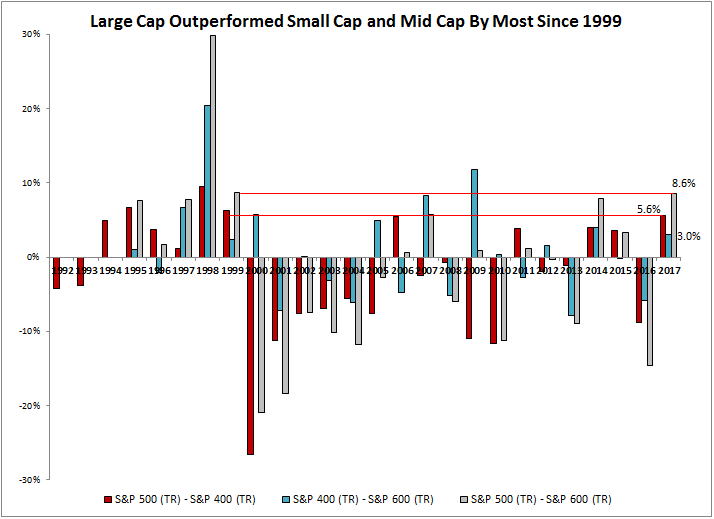
Based on history, it seems the large caps never held onto outperformance this big, so perhaps it will be a better year for the mid and smaller cap equities ahead.  If it is time for small caps, and even more so value with quality, the S&P SmallCap 600 should be the small-cap benchmark of choice… and here’s why.


The posts on this blog are opinions, not advice. Please read our Disclaimers.

2017…Among the Sleepiest of Years

Contributor Image
Fei Mei Chan

Former Director, Core Product Management

S&P Dow Jones Indices

If 2016 was unremarkable, 2017 was downright sleepy…at least as far as equity markets were concerned. In 2017, the S&P 500 notched the lowest level of volatility in 27 years. Both dispersion and correlations were among the lowest levels in the same period. This is in spite of a year that was far from lacking in terms of macroeconomic catalysts—major elections took place and Catalonia threatened to separate from Spain while, domestically, the U.S. government seesawed on major legislation.

Nevertheless, as the dispersion-correlation maps reflect below, markets took it all in stride. The well below median levels of dispersion and correlation contributed to the extraordinarily muted volatility. This is true not just in the U.S. but also internationally. Dispersion-correlation maps for both the S&P Europe 350 and S&P BMI Pan Asia paint similar pictures.

The S&P 500 gained 22% in 2017 and the good times weren’t limited to just the U.S. Both Europe and Asia enjoyed a good year as well. Understandably, as we head into 2018, investors might be somewhat concerned with froth. The dispersion-correlation map won’t help us predict what 2018 will bring but it offers helpful context around turbulent times. Historically, turmoil in equity markets (such as 2000 and 2008) have been defined by dispersion levels much higher than average…and as the maps below indicate, current levels are far from there.

Dispersion-Correlation Maps

The posts on this blog are opinions, not advice. Please read our Disclaimers.

The Top 10 Dow Jones Industrial Average Factoids – 2017 in Review

Contributor Image
Jamie Farmer

Former Chief Commercial Officer

S&P Dow Jones Indices

OK, that might be hyperbole.  This may not be the Top 10.  Let’s just say it’s a Top 10.  Regardless, it’s hard to deny that 2017 was a standout year for US equity markets.  To wit:

  1. At the Close – despite losing 118+ points during the final trading session, the DJIA ends the year at 24,719.22, close to its all-time high, and having advanced just shy of 5000 points for an annual gain of 25.08%. That performance is the best since 2013 when the DJIA gained 26.50%.
  2. Prominent Themes – Trump’s inauguration and subsequent grappling with his new administration, a major continuation of the bull market, mixed legislative results from Congress, improving corporate and economic data, a dearth of volatility and varied geopolitical issues including repeated threats from North Korea’s nuclear program.
  3. New Highs – In 2017, the DJIA reached more new highs – 71 in total – than any year in history. Put another way, more than 1 of every 4 trading days closed in record territory.  By comparison, 1995 and 1925 were in the #2 and #3 slots with 69 and 65 new highs respectively. There have been 52 calendar years when the DJIA notched at least 1 new high and 70 when none were recorded.
  4. Milestones – With 5 new 1000 point milestones (20k, 21k, 22k, 23k & 24k), 2017 was the most active such period on record. It took nearly twice as long for the DJIA to hit the first 1000 points (achieved on November 4, 1972) as it has for all subsequent milestones combined. Similarly, the speed with which the DJIA crossed these thresholds is notable: it took only 257 trading days to run through those 5 marks.  By comparison, it took 483 days for the DJIA to move from 18k to 19k.  Of course, there is a big caveat:  it’s important to note that as the DJIA gains in value each successive 1000 point milestone represents a smaller percentage gain.
  5. Quarterly Gains – the DJIA posted a return of 10.33% in Q4, the 9th quarterly advance in a row and the best 3 month return since Q1 2013 when the DJIA advanced 11.25%.
  6. Best & Worst Days:
    • Best Day in Point Terms – November 30 (up 331.67 points), when the Dow sped through the 24k level as investors cheered progress on the GOP tax reform bill.
    • Best Day in Percent Terms – March 1 (up 1.46%), when the DJIA closed above 21k as investors were heartened by (unexpectedly?) measured remarks in Trump’s 1st address to Congress.
    • Worst Day in Point & Percent Terms – May 17 (down 372.82 or 1.78%), when markets were hammered by concerns that Trump sought to obstruct Comey’s investigation of Michael Flynn.
  7. Large Moves – Or, since muted volatility was a major theme in 2017, this is more appropriately the lack of large moves. In 2017, there were only 10 trading sessions when the DJIA posted a move of 1% or greater.  This is the lowest total since 1964 when only 3 such moves were recorded for the entire year.  Since 1940, the annual average is 49 one percent moves or an experience that typically occurs in about 1 of every 5 trading sessions.  By comparison, in 2017 a 1% move occurred in only 1 of every 25 sessions.
  8. High vs. Low – with a spread of over 5,100 points, the difference between the year’s high and low levels saw the biggest gap since 2008.
  9. Stock Contributions – Boeing (BA) was the biggest contributor to the DJIA’s advance, adding over 955 points. Caterpillar (CAT) and UnitedHealth Group (UNH) were in the #2 and #3 spots respectively.  General Electric (GE), suffering from widely reported troubles, was the worst performer in 2017, sapping 97+ points.  IBM and Exxon Mobil were the second and third worst performers.   In all, twenty six stocks added to the DJIA while 5 detracted.  Astute observers will note that totals 31 stocks event though the DJIA only captures the performance of 30 “industrial” companies: the discrepancy arises from the newly combined DowDupont shares added in August (thus both DD and DWDP are counted in the totals).
  10. Sector Contributions – the Industrials sector was the largest contributor in 2017, followed by Consumer Discretionary and Technology. All industries, save Telecom (which itself lost only ~3 points), made positive contributions in 2017.

The posts on this blog are opinions, not advice. Please read our Disclaimers.

Investing in the U.S. Corporate Bond Market From an Asian Perspective

Contributor Image
Michele Leung

Former Director, Fixed Income Indices

S&P Dow Jones Indices

As Asian market participants have become more aware of the importance of portfolio diversification, they have been paying more attention to the U.S. corporate bond market. The S&P 500 Bond Index seeks to measure the broad and relatively liquid U.S. corporate bond market, and it is designed to be a corporate-bond counterpart to the iconic S&P 500, widely regarded as the best single gauge of large-cap U.S. equities. In addition to the popularity of the equity index, Asian market participants should be familiar with some of the index constituents like Apple, JPMorgan Chase, Microsoft, and Wal-Mart.

Since 90% of the index is made up of investment-grade debt from blue-chip companies, it can be viewed as a proxy for the U.S. investment-grade bond market. As of Dec. 26, 2017, the index delivered a YTD total return of 5.52%, while its yield-to-maturity tightened 5 bps to 3.32%.

The S&P 500 Bond Index market value is larger than China’s and Japan’s corporate bond markets; it’s even larger than the sum of all Pan Asia local currency corporate bond markets. The S&P 500 Bond Index currently tracks over 5,000 constituents with a combined market value of USD 4.6 trillion.

Over the past decade, the S&P 500 Bond Index rose 5.66% annually; it outperformed the S&P Pan Asia Corporate Bond Index and the S&P Japan Corporate Bond Index, which gained 4.15% and 1.36%, respectively, in the same period.

Hence, the S&P 500 Bond Index could offer Asian market participants the benefits of familiarity, good returns, and stable yields.

Exhibit 1: Total Return Comparison of the S&P 500 Bond Index, the S&P Pan Asia Corporate Bond Index, and the S&P Japan Corporate Bond Index


The posts on this blog are opinions, not advice. Please read our Disclaimers.

Considering Tax Diversification Benefits of Roth Accounts May Be Timely

Contributor Image
Philip Murphy

Former Managing Director, Global Head of Index Governance

S&P Dow Jones Indices

The S&P 500® was up 22.1% YTD as of Dec. 19, 2017 (including reinvested dividends), and international stocks were generally even more kind to USD investors (S&P Global Ex-U.S. BMI Gross Total Return [USD] was up 26.3% YTD). However, in most types of accounts we do not get to keep gross returns. Capital gains and dividends are sheltered from immediate taxation in traditional retirement accounts, such as 401(k)s, but are ultimately taxed at (presently unknown) future income tax rates.

Retirement savers must consider an extremely long horizon, encompassing career-long wealth accumulation as well as in-retirement decumulation. Diversifying account types in order to help manage future income tax liabilities may be worthwhile, especially considering that new federal income tax legislation is expected to significantly add to the nation’s outstanding debt and may also exacerbate income inequality. These two catalysts could eventually produce a political or economic reaction that could result in significantly higher income tax rates down the road.

If it were known with certainty that neither the income tax code nor one’s tax bracket would change, it would make no difference in final wealth whether one made traditional tax-deductible contributions or non-tax-deductible Roth contributions. For most people, it is a safe assumption that before-tax income is likely to be lower during retirement than when they worked. So in the context of stable tax law, traditional tax-deductible contributions make sense. But because future tax law is not known, the trade-off between making traditional or Roth contributions is about hedging one’s bets with respect to future tax liabilities.

The lower current marginal income tax rates become, the less valuable current income tax deductibility is and the more valuable locking a future tax rate of 0% through the use of Roth accounts is. Currently, rates are heading lower in the short term, but in the longer term, they may need to revert back to prevailing levels or higher. For retirement savers, this represents a significant potential future liability as they draw down traditional retirement savings. The size of the liability is not known because future tax law is not known.

Some retirement plan participants have access to Roth 401(k) accounts, while others may be able to contribute to Roth IRA accounts. The general consensus is that contributing enough into a traditional or Roth 401(k) to get a company match is a good idea. Beyond that, one may want to give some thought to diversifying account types. Because they are not taxableRothupon withdrawal, Roth accounts are not subject to required minimum distributions. That makes them ideal for providing some flexibility when managing income taxes during retirement.

The posts on this blog are opinions, not advice. Please read our Disclaimers.