Get Indexology® Blog updates via email.

In This List

Remarkably Unremarkable

Visualizing Factor Exposures

Rieger Report: Municipal bonds in 2017?

LIBOR at 1% for First Time in 7 Years – A Significant Level for Leveraged Loans

In the “Year of Surprises,” UK Bond Markets Manage Their Way

Remarkably Unremarkable

Contributor Image
Fei Mei Chan

Former Director, Core Product Management

S&P Dow Jones Indices

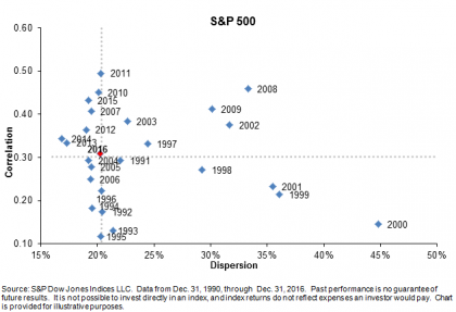
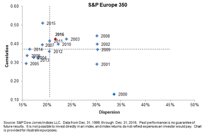
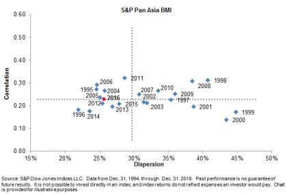
In geopolitical terms 2016 was a tumultuous year. From the outcome of the Brexit referendum to the surprising conclusion of the U.S. presidential election, 2016 was a year of political surprises. The markets, braced or not, reacted differently in each case. We saw heightened correlation in the aftermath of Brexit and observed higher dispersion immediately after the U.S. presidential election.  Heightened dispersion and/or correlation levels can accompany market weakness, but in both of these cases, the markets rallied and dispersion and correlation readings returned to average levels in fairly short order.

Despite being buffeted by remarkable political events, 2016 looks unremarkable in terms of our dispersion-correlation map. For the U.S., November’s spike in dispersion after the election was resolved by the end of December. Dispersion returned to below-average levels and, for all of 2016, dispersion and correlation essentially plot at the midpoint for the last 26 years. One would be hard-pressed to find a more nondescript point. It’s a very similar story in Europe, even though the U.K.’s exit from the European Union is a work in progress. In Asia, dispersion is lower than average while correlation is right around average.  Market dynamics can certainly change quickly, but dispersion levels suggest that adding value by active management will continue to be challenging.

Dispersion-Correlation Maps

remarkably-unremarkable1 remarkably-unremarkable2 remarkably-unremarkable3

The posts on this blog are opinions, not advice. Please read our Disclaimers.

Visualizing Factor Exposures

Contributor Image
Craig Lazzara

Former Managing Director, Index Investment Strategy

S&P Dow Jones Indices

Measuring the away-from-benchmark exposures of active portfolios (or “smart beta” indices) is not inherently complicated.  To what degree, for example, is a portfolio cheaper than its benchmark, or more tilted toward high quality stocks?  Practitioners typically approach the question in one of several ways:

  • Calculating weighted average differences – e.g., the yield on my portfolio is 3.0% vs. my benchmark’s yield of 2.1%.
  • Calculating standardized (Z) scores – e.g., my portfolio is 0.4 standard deviations cheaper than my benchmark.
  • Performing a regression analysis – e.g., 20% of historical return is attributable to my portfolio’s exposure to the momentum factor.

Each of these methods (especially the first) has some intuitive appeal, but none of them tells us how difficult or easy it might be to achieve a given level of factor exposure.  If I want to target 0.4 standard deviations of cheapness, in other words, or 90 basis points of incremental yield, how easy is it to get there?

Here’s a simple and intuitive approach:

  • List every stock in the benchmark in factor order, noting also each stock’s benchmark weight.  If quality is a factor of interest, e.g., rank each benchmark stock by its quality score, and keep track of its benchmark weight.
  • Form portfolios.  Portfolio 1 owns 1% of index cap — the 1% with the lowest quality score.  (Depending on the interaction of quality and index cap, Portfolio 1 might hold only one stock.)  Portfolio 2 is the lowest quality 2% of the index, Portfolio 3 is the lowest quality 3%, etc.
  • Portfolio 100, in this construction, is the benchmark itself.  The weighted average factor exposure of Portfolio 100 tells us our benchmark’s factor exposure.
  • We can keep going: Portfolio 101 excludes the lowest quality 1%, Portfolio 102 excludes the lowest quality 2%, and so on.  In this way we proceed to Portfolio 199, which includes only the highest quality 1% of the benchmark.  (Alternatively, portfolio 199 excludes the lowest quality 99% of the benchmark.)
  • We now have a series of portfolios from 1 to 199, with decreasing exposure to the factor in question.  We can compare any other index (or active portfolio) to these portfolios by calculating its weighted average factor score.

Defining portfolios in this way provides a useful link to the concept of active share .  The active share of portfolio 100 is 0%.  The active share of portfolios 99 and 101 is 1%, the active share of portfolios 98 and 102 is 2% – and so on until we reach portfolios 199 and 1, both with active share of 99%.  Since active share is an indicator of portfolio aggressiveness, it gives us a way to answer the question we asked earlier — if I want to target 0.4 standard deviations of cheapness or 90 basis points of incremental yield, how easy is it to get there?  If 90 basis points of incremental yield requires an active share of 40%, say, it’s not a big deal.  If it requires an active share of 80%, it’s much tougher to do.

For every factor in which we’re interested, we can create a series of 199 portfolios with steadily increasing factor exposure.   We can then position any portfolio of interest on a scale derived from these 199 factor portfolios (in fact, 7 times 199 such portfolios, one set of portfolios for each factor).  For example:

sample-factor-index

The dotted orange line represents the S&P 500 benchmark, with an active share of 0%.  The origin, and the outer rim of the chart, both reflect an active share of 100%.  The origin represents tilts away from the factor, while the outer rim reflects tilts towards the factor.   This means that, although low volatility and value, say, are scaled differently, on our graph they achieve an analogous and logical representation.

The posts on this blog are opinions, not advice. Please read our Disclaimers.

Rieger Report: Municipal bonds in 2017?

Contributor Image
J.R. Rieger

Former Head of Fixed Income Indices

S&P Dow Jones Indices

A look back may be a telling way to view municipal bonds in 2017. The modest total return of the S&P Municipal Bond Index (0.77%) in 2016 masked an atypical year of volatility for the normally staid market place.  During the year, municipal bonds enjoyed being one of the ‘risk off’ asset classes and as low and negative yields permeated the global bond markets municipal bonds became a source for incremental yield over other options.  Countering all the positives was the worst performing month for municipal bonds since 2008 as November (the index was down over 4.8%) reflected the tax uncertainty the future holds for tax-exempt bonds post the U.S. presidential election.

Table 1: Select bond indices, their yields and returns as of December 30, 2016:

1) Yield represented is Yield to Worst as of December 30, 2016 2) Taxable Equivalent Yield assumes a 39.6% tax rate. Source: S&P Dow Jones Indices, LLC. Data as of December 30, 2016. Table is provided for illustrative purposes. It is not possible to invest directly in an index. Past performance is no guarantee of future results.

How does this impact 2017?

  • The devastation of municipal bond prices following the U.S. presidential election has created opportunities as the yields of non-callable, investment grade, tax-exempt municipal bonds have risen to a point where they cannot be ignored. Two examples are:
    • The five year range tracked in the S&P AMT-Free Municipal Series Dec 2022  and the ten year range tracked in the S&P AMT-Free Municipal Series Dec 2026 had year-ending yields higher than their U.S. Treasury bond equivalents and when viewed from the perspective of Taxable Equivalent Yield the yields of municipal bonds ended incrementally higher in yield than similar U.S. corporate bonds.
  • Factors impacting municipal bonds in 2017 could include:
    • Clarity on potential tax law changes. Potential tax rate cuts along with other changes could impact the value of tax-exempt municipal bonds negatively.
    • New issue supply.
    • Inflation expectations.
    • Sourcing of funding for U.S. infrastructure improvements.  Infrastructure has typically been funded via the municipal bond markets.  Alternative bond like financing could have an impact on supply.
    • Continued and elevated global uncertainty driving ‘risk off’ investing behavior. (Russia, Syria, China et al)
    • Continued and sustained global low and negative yield environments fueling the drive for yield.
    • Retail investor sentiment as measured by fund inflows and outflows continues to play an important role in the direction of bond prices and hence returns in the municipal bond market.

A deeper dive into 2016 performance:

  • The S&P Municipal Bond Investment Grade Index ended in positive territory but underperformed relative to its corporate bond peer substantially due to the tax uncertainty illustrated in November 2016. The result is that yields have risen to become attractive verses taxable bonds.
  • The S&P Municipal Bond High Yield Index was impacted by the rebound in Puerto Rico but also underperformed verses corporate bonds. This complex and less liquid market has historically demanded a ‘yield premium’ which currently is illustrated in both its nominal yield and Taxable Equivalent Yield.
  • The S&P Municipal Bond Puerto Rico Index saw a rebound of over 11% in 2016 as the future of the revenue bonds became a bit clearer.  However, there is much more work to be done in Puerto Rico.
  • Long duration ‘tobacco settlement bonds tracked in the S&P Municipal Bond Tobacco Index also saw another year of positive returns. Down over 6.7% for the last three months of the year, the index still reflected a positive 4.79% in total return for 2016. Advance refundings of higher cost debt also contributed to these returns and a slower pace of advance refundings may be seen in 2017 particularly if rates continue to rise. An important negative is the long duration nature of these bonds.
  • Long duration high grade municipal bonds tracked in the S&P Municipal Bond 20 Year High Grade Index ended the year down over 2% after suffering through a tough last quarter down over 9%.  Another long duration segment that could suffer more as rates rise.
  • The high debt per capita of the Virgin Islands has finally caught up with the ‘Puerto Rico syndrome’ as this small sliver of the municipal bond market was down over 13%.  A 2017 recovery while not impossible would be surprising.

Table 2: Select bond indices tracking the five year maturity range, their yields and returns as of December 30, 2016:

1) Yield represented is Yield to Worst as of December 30, 2016 2) Taxable Equivalent Yield assumes a 39.6% tax rate. Source: S&P Dow Jones Indices, LLC. Data as of December 30, 2016. Table is provided for illustrative purposes. It is not possible to invest directly in an index. Past performance is no guarantee of future results.

Table 3: Select bond indices tracking the ten year maturity range, their yields and returns as of December 30, 2016:

1) Yield represented is Yield to Worst as of December 30, 2016 2) Taxable Equivalent Yield assumes a 39.6% tax rate. Source: S&P Dow Jones Indices, LLC. Data as of December 30, 2016. Table is provided for illustrative purposes. It is not possible to invest directly in an index. Past performance is no guarantee of future results.


The posts on this blog are opinions, not advice. Please read our Disclaimers.

LIBOR at 1% for First Time in 7 Years – A Significant Level for Leveraged Loans

Contributor Image
Jason Giordano

Director, Fixed Income, Product Management

S&P Dow Jones Indices

For the first time since May 2009, the three-month LIBOR reached 1% on Dec. 29, 2016.  LIBOR, which stands for London InterBank Offered Rate, is a benchmark interest rate that most of the world’s largest banks charge each other for short-term loans.  The most common rates for which LIBOR is quoted are for overnight, one-month, three-month, and six-month terms.  These rates serve as the predominant base index for loans that reset or “float” at specific intervals.  As shown in Exhibit 1, the three-month LIBOR has nearly tripled since October 2015:

capture

Generally speaking, floating-rate instruments have a two-part coupon: a market-driven base rate plus a contractual credit spread.  While the credit spread component stays constant, the coupon will fluctuate as the base rate changes.  Most floating-rate loans reset quarterly and therefore use the three-month LIBOR as the base rate.  During periods of rising interest rates, the base rate will also increase, creating a coupon rate that keeps pace with current interest rates.  Hence, the appeal of floating-rate loans in rising-rate environments.

Leveraged loans (also called bank loans or senior loans) are a particular type of floating-rate instrument.  These are loans that are typically taken on by firms with higher existing levels of debt (hence the use of “leveraged” in the name).  However, the loans are senior in the capital structure and are often secured by assets of the borrowing company.

Due to the floating-rate characteristics discussed previously, leveraged loans tend to perform well in environments of rising rates (or expected rising rates).  As shown in Exhibit 2, both the S&P/LSTA Leveraged Loan Index and the S&P/LSTA U.S. Leveraged Loan 100 Index performed well in 2016, as the indices posted gains of 10.1% and 10.8%, respectively.

capture

An additional characteristic of most leveraged loans is that they often carry minimum base rates or “floors.”  These minimum rates can be beneficial when rates are low or when rates drop below the level of the floor, since they act as assurance of a minimum coupon payment (i.e., the coupon is equal to the sum of the credit spread plus LIBOR or the LIBOR floor, whichever is higher).  However, when rates are excessively low and significantly under the floor rate (as they have been since 2009), investors are not compensated as the base rate increases.  This is why the three-month LIBOR at 1% becomes significant: there are approximately 1,200 loans in the S&P/LSTA Leveraged Loan Index and 90% of all loans have a LIBOR floor.  Of those loans with floors, over 67% have floors of 1%.

As LIBOR breaks through the 1% floor, the floating-rate mechanics will produce coupons that continue to increase as rates rise.  This could lead to more demand of what is already an appealing asset class and one to watch if more rate hikes are in store for 2017.

The posts on this blog are opinions, not advice. Please read our Disclaimers.

In the “Year of Surprises,” UK Bond Markets Manage Their Way

Contributor Image
Heather Mcardle

Director, Fixed Income Indices

S&P Dow Jones Indices

UK bond markets managed to perform well, with significant YTD returns during a year filled with public vote surprises, as well as both rate decreases and hikes globally.  The S&P U.K. Investment Grade Corporate Bond Index had a YTD return of 10.75% as of Dec. 21, 2016, while the S&P U.K. Gilt Bond Index gained 8.72%.  During the same period, corporate bond yields tightened 76 bps and U.K. gilts have tightened 57 bps, but not without some swings in between.

capture

In June 2016, UK bond markets responded to the unexpected Brexit vote by tightening, which equates to bond prices going up and yields going down.  The S&P U.K. Gilt Bond Index tightened 28 bps, as uncertainty over the Brexit’s effect on the UK economy prompted market participants to buy bonds with the highest quality—UK gilts—a phenomenon known as the “flight to quality” effect.  Despite the uncertainty of Brexit’s effect on UK corporations, the S&P U.K. Investment Grade Corporate Bond Index also tightened by a more modest 5 bps.

August saw yields sink to their lowest point of the year (and highest prices) after the Bank of England (BoE) cut rates for the first time in seven years.  Rates were cut to a record low of 0.25% from 0.5%, and the BoE also expanded its quantitative easing program.  Bond markets generally react to the lowering of rates by rallying, causing yields to go down.  The S&P U.K. Gilt Bond Index saw yields as low as 0.65%, while the S&P U.K. Investment Grade Corporate Bond Index was as low as 1.89%.

Moving to November 2016, the surprise win by Trump in the U.S. presidential election saw UK bonds responding mutely, with prices selling off.  UK investment-grade corporate bond yields widened 5 bps and UK Gilts widened 1 bp immediately after the results.  This was attributed largely to comments made by Trump about spending.  A Trump spending spree in U.S. infrastructure would cause an increase in prices, and inflation fears are generally a negative for bond prices.

Rounding out the year, on Dec. 14, 2016, the U.S. Fed increased rates to the range of 0.5%-0.75% in response to a stronger U.S. economy and an increase in U.S. prices.  UK gilts and corporate bond markets widened 8 bps, again in fear that rising rates will put negative pressure on bond markets.  Since this move, UK bond yields have tightened back to levels seen just before the rate increase, indicating that despite rising global rates and inflationary fears, UK bond markets may still have room to rise.

The posts on this blog are opinions, not advice. Please read our Disclaimers.