Get Indexology® Blog updates via email.

In This List

Fallen Gold May Help India's Diwali and Monetisation Plan Shine

How Have South African Active Fund Managers Performed?

WTI Reclaims No.1 Spot As The Benchmark Oil In 2016

What's Brewing In The Commodities Cauldron?

How Indexing Works in Financial Literacy

Fallen Gold May Help India's Diwali and Monetisation Plan Shine

Contributor Image
Jodie Gunzberg

Former Managing Director, Head of U.S. Equities

S&P Dow Jones Indices

Could India’s gold obsession be over? The Indian government seems to think so, since they are betting that their people are willing to part with their precious metal to earn just 2.5% interest. Last Thursday, Prime Minister Narendra Modi launched three programmes aimed at reducing physical gold demand and luring tonnes of gold from households into the banking system. That’s a big bet considering gold in India is a status symbol of wealth, and is widely used for wedding gifts, religious donations and as an investment.

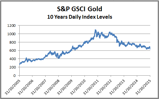
However, it is possible Indian investors might follow the sentiment of investors in in other parts of the world that have already given up on gold. The record selloff in 2013 happened for a reason. Some place the main blame on the strong U.S. dollar, but the historical correlation of gold to the U.S. dollar is relatively weak measuring only about -0.3 to -0.4. So, it’s not only a strong dollar that is hurting gold but also the missing inflation and interest rates with the lack of demand for the physically backed ETF. It has caused the S&P GSCI Gold index to lose almost half its value, -43%, since Aug. 2011. Even after gold lost 28% in 2013, posting its biggest annual decline since 1981, it never bounced back but lost an additional 10%.

Source: S&P Dow Jones Indices

This loss has changed the perception of gold as a safe haven – and that is crucial. After all, the last two bull runs were driven by gold as a safe haven. When Nixon took the dollar off the gold standard in 1973, inflation tripled, the dollar crashed and years of erratic monetary policy followed, investors piled into gold as a safe haven. Again in 2001, fear rippled through the market, triggering the flight to safety into gold. The drivers of inflation and a weak dollar that supported gold through the 1970’s bull run were back. These factors plus the global financial crisis and worries about government reform led gold to a record high. Such forces in addition to the growing popularity of the gold ETF as a new way for investors to access gold sent gold soaring more than 600% over the next ten years, until its peak in Aug. 2011. If gold is not the safe haven it was thought to be, one might even question if another bull run is possible.

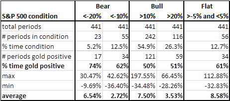
Since gold’s role as a safe haven is so seemingly important as a catalyst for a bull market, it is a legitimate concern as to whether gold has actually protected investors in past market crises. Since many investors use the S&P 500, let’s start with that as the market proxy. Using rolling 12-month returns (monthly year-over-year) from Jan 1979 – Sep 2015, the result shows that whether there was a bull, bear or flat stock market, gold was positive at least half the time. The stock market condition didn’t necessarily say anything about gold returns, but gold performed well when there were bear market conditions. It was positive the highest percentage of the time, 74%, in bear markets that lost more than 20%, an on average gold gained 6.5% historically in this condition.  Based on this, the case can be made that gold has protected in down markets and has been a good diversifier.

Source: S&P Dow Jones Indices

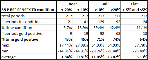
Unfortunately for Indian investors, this does not hold true. The same analysis using the S&P BSE Sensex  with the time period starting in Sep. 1996 shows gold performs far better in Indian stock bull markets than in Indian stock bear markets. Gold was only positive 43% of the time in the worst bear markets, and on average, lost 1.8%.

Source: S&P Dow Jones Indices

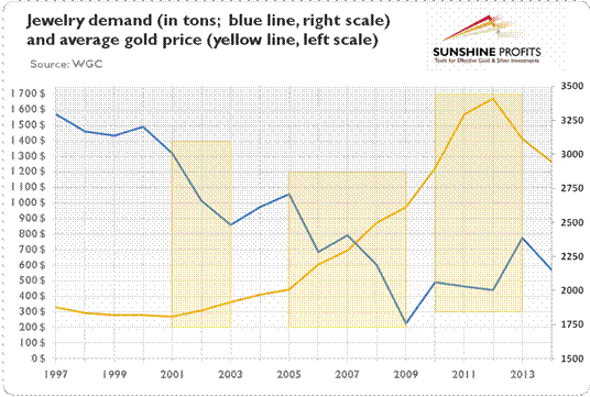
Is that enough to steer Indian gold buyers away from large purchases during Diwali? Probably not – and based on historical behavior, regardless of portfolio protection, diversification or future bull-run potential, the low prices have driven more gold buying.  The below chart shows that when gold prices increased (decreased), jewelry demand decreased (increased):

http://www.kitco.com/commentaries/2015-07-24/Does-Jewelry-or-Central-Bank-Demand-Drive-the-Gold-Price.html

Then if low gold prices increase gold buying for Diwali, will the buyers turn their gold over to the banking system? The lower value may make it more likely if gold loses its power to boost status and wealth in India.

The posts on this blog are opinions, not advice. Please read our Disclaimers.

How Have South African Active Fund Managers Performed?

Contributor Image
Daniel Ung

Former Director

Global Research & Design

The performance of the South African equities market has been lackluster as a result of poor employment data, weak consumer confidence, and continued power shortages.  This has led to an underperformance of approximately 5% in ZAR-denominated domestic equities, as measured by the S&P South Africa Domestic Shareholder Weighted (DSW) Index, compared with global equities.

Equities:

  • Over a five-year period, about 91% of domestic funds underperformed the benchmark.
  • Over the same period, over 96% of global funds underperformed the S&P Global 1200.

Fixed Income:

  • Over a five-year period, over 74% of diversified and aggregate funds underperformed the benchmark.
  • Over the same period, the majority of the active short-term bond funds outperformed the benchmark.

For more details on the report, please click here.

Capture

The posts on this blog are opinions, not advice. Please read our Disclaimers.

WTI Reclaims No.1 Spot As The Benchmark Oil In 2016

Contributor Image
Jodie Gunzberg

Former Managing Director, Head of U.S. Equities

S&P Dow Jones Indices

S&P Dow Jones Indices today announced the composition and weights for the 2016 S&P GSCI and Dow Jones Commodity Index. The two indices have the same constituents by definition but the weighting methodologies are different. The DJCI is equally weighted with 1/3 of its weight to each sector – energy, metals, and agriculture and livestock, then the constituents inside are liquidity weighted by the 5-year average of the total dollar value traded. The more interesting weighting of the two flagships happens in the world-production weight of the S&P GSCI. This is because the world production is a reflection of the relative significance of each of the constituent commodities to the world economy.

2015 was a historically significant year for oil in indexing since it was the first time Brent overtook WTI as the biggest commodity in the S&P GSCI since Brent Crude was added in 1999. Please see the graph below for the historical weight difference between WTI Crude Oil and Brent Crude in the S&P GSCI:

Source: S&P Dow Jones Indices. All weights prior to 2015 are actual index weights after the rebalance that may differ from the target weights due to price fluctuations.

Notice the Brent significantly caught up to WTI in 2013, but now WTI is set to outweigh Brent in 2016 by even more than in 2013, putting into question Brent’s ability to hold as a real oil benchmark. Although the brent field only produces about 1,000 of 94 million barrels per day, volumes of the contract have more than doubled since 2009 to more than a million contracts per day. It is this volume (in addition to price) that catapulted brent to compete with WTI as the global heavyweight in the S&P GSCI. The index uses a world production for the entire petroleum component (WTI, Brent, Gasoil, heating Oil and Unleaded Gasoline) then adjusts the individual constituents by a 12 month average of total dollar value traded based on price and volume from the current year’s August through the prior year’s September. Based on this, the index is now reflecting what the rest of the world already suspects – that is brent is drying up too quickly to remain a global oil benchmark. For example, below is a chart from our commodity conference in 2012 questioning the viability of Brent.

Source: Wood Mackenzie, Aug 2012. Presented at S&P Dow Jones Commodity Conference. Sept, 2012. Jan-Hein Jesse, JOSCO Energy Finance & Strategy Consultancy.

A bigger question for benchmark pricing and index weight is how the composition of the brent contract may change to stay competitive. The brent field’s output used to be 100% of the brent contract but is now only at 0.1%. Please see the chart below of the decline from a WSJ blog:

BCG Falling Brent

Further, the WSJ reports in this article that changes may need to happen sooner rather than later by adding oil into the benchmark from West Africa, Central Asia or possibly from Brazil. This is because the there is a huge market based on the benchmark pricing where businesses, such as refineries, price the crude they process into gasoline and diesel, influencing prices at the pump. It has a great potential impact.

Brent decline WSJ

Finally, notice how the spread of WTI to Brent has narrowed. It is hard to argue there is an unfair value. Even if production is rising, the relative volume decline of brent to WTI is the prevailing force of brent’s futility.

Source: S&P Dow Jones Indices


The posts on this blog are opinions, not advice. Please read our Disclaimers.

What's Brewing In The Commodities Cauldron?

Contributor Image
Jodie Gunzberg

Former Managing Director, Head of U.S. Equities

S&P Dow Jones Indices

Overall in October, the gassy hogs (natural gas -15.3%, lean hogs -11.3%) cast a spell over the sweet meat (sugar +12.7%, all cattle +8.5%) for a flat brew of commodities that were neither a trick nor treat. Although the S&P GSCI was up just 23 basis points and the Dow Jones Commodity Index was down only 87 basis points, commodities in October may be waking from the dead.

This past July, just three months ago, every single commodity was negative except for one. Commodities have made a remarkable comeback with more than half (13 of 24) posting positive returns in October. There has never been a time in history where 12 single commodities went from posting a negative month to a positive month this quickly after 23 were negative together. However, in January 2009, 11 single commodities came back, just before the S&P GSCI hit its bottom, the next month in February 2009. That month, 8 commodities were positive but by May 2009, 13 additional commodities posted gains so that almost all were positive (21 of 24.) Also, in August 1999, 18 single commodities were positive after just 4 were positive in May that year, following its bottom, just a couple months earlier in February.

Source: S&P Dow Jones Indices

A few other scary statistics in October are the following:

  • S&P GSCI Total Return is -19.3% YTD through October 30, 2015, the 4th worst on record since 1970.  Worse YTD returns through Oct happened in 2008, 2001 and 1998, down 27.5%, 27.1% and 25.6%, respectively.
  • S&P GSCI Total Return is on pace for the 6th worst year on record since 1970. 2008,1998, 2014, 2001 and 1981 were worse, losing 46.5%, 35.8%, 33.1%, 31.9% and 23.0%, respectively.
  • S&P GSCI is on pace to set the 1st 3-year consecutive negative annual return. 2013 and 2014 lost 1.2% and 33.1%, respectively.
  • S&P GSCI is set to have the worst back-to-back 2-year loss in history since 1970, but 2008’s loss alone, is still worse by 51 basis points – even with 2013 included.
  • This is the 3rd worst October on record for number of commodities in contango. 17 of 24 commodities in the S&P GSCI were in contango in October, compared to just 12 in October 2014. Only October 2001 and October 2009 had more commodities in contango with 18 and 20 in contango, respectively.
  • S&P GSCI Natural Gas Total Return lost 15.3% in October 2015, recording its 3rd worst October in history (since Feb 1994) and worst October in 10 years. October 1998 lost 15.9% and October 2005 lost 15.3%.


The posts on this blog are opinions, not advice. Please read our Disclaimers.

How Indexing Works in Financial Literacy

Contributor Image
Shaun Wurzbach

Managing Director, Head of Commercial Group (North America)

S&P Dow Jones Indices

It is encouraging and inspiring to see that organizations and professional bodies are willing to roll up their sleeves and help for a good cause.  The good cause in this case is financial literacy, and the organizing body was the New York Public Library during their semi-annual Financial Planning Day on October 23rd.

McGraw Hill Financial (MHFI), the parent company of S&P Dow Jones Indices, supports the New York Public Library’s Science, Industry, and Business Library (SIBL) in their Financial Literacy campaign.  MHFI’s Corporate Responsibility and Sustainability team Co-Sponsored this event with the Financial Planning Association (FPA) of New York.  More than a dozen other organizations participated with volunteers and information for attendees.  Counselors from FPA NY, Community Service Society of NY, and the Health Insurance Information and Counseling and Assistance Program were on hand to provide advice.  MHFI was asked by the organizers to provide an information session to attendees on how indexing works.

To do that, I invited Dr. David Blitzer, Chairman of our S&P DJI Index Committees, and Todd Rosenbluth, Head of ETF and Mutual Fund Evaluation at S&P Capital IQ, to collaborate and present on this topic together.  Our approach was to combine index education from S&P DJI with fund education from S&P Capital IQ to help the audience better understand some of the investment choices they might find in everyday life such as investing with funds in an Individual Retirement Account (IRA) or through a 401K plan.  Here are some of the key points that David and Todd communicated:

Dr David Blitzer, S&P DJI:

  • Historically, over any period of a year or more, about 2 out of 5 mutual funds outperform and three of five underperform their benchmark
  • Good performance does not persist for many active mutual funds – our data has shown a 40% chance of beating an S&P benchmark in 1 year, 16% for two years in a row, 6% in three consecutive years
  • Why? Index products typically have lower fees than active products – better to keep as much of your money as you can, not give it away to manager fees.

Todd Rosenbluth, S&P Capital IQ / SNL:

  • Finding actively managed funds that outperformed the S&P 500 index over the short and long term is hard. This is why investors pulled $150 billion out of active mutual funds and ETFs in the 12 months ended September 2015 and added $461 billion to passive products according to Morningstar data.
  • Those that want active management should seek out funds with a below-average expense ratio and an experienced management team, and that have generated strong returns with below average volatility.
  • If investors do their homework they may reduce the likelihood of holding a below-average fund, but it may still end up in their portfolio.

The audience of 75 was interested, attentive, and asked very good questions, such as “why use an equally weighted index rather than the S&P 500?” and “Can an index keep pace with rapidly adopted innovations in an economy, or is it too passive to do that?”  David and Todd answered all questions and stayed afterwards with attendees who lined up to ask more questions.

The posts on this blog are opinions, not advice. Please read our Disclaimers.