Get Indexology® Blog updates via email.

In This List

Weighing In: Reaching Your Goal Weight

No Place to Hide? Consider Cash

No Bread And Water After Doomsday

Unemployment Puts The Question of A Rate Increase In Play

Why is the VIX so high?

Weighing In: Reaching Your Goal Weight

Contributor Image
Jodie Gunzberg

Former Managing Director, Head of U.S. Equities

S&P Dow Jones Indices

“Weighing In:” will be a series of posts comparing and contrasting the impact of different weighting schemes within commodity indices. The series will be the first to feature our two headline indices, the equally weighted Dow Jones Commodity Index (DJCI) and the world production weighted S&P GSCI.  The purpose of the series is to help you reach your portfolio goals by understanding the effect of weighting inside commodity indices. We will kick off with a description of the difference between the two major weighting schemes, and in subsequent discussions will analyze the historical behaviors of each of the indices.

Both the DJCI and S&P GSCI have the same methodologies with the exception of the weighting schemes and the rebalance periods back to their respective target weights. The resulting index compositions differ dramatically. See below for a comparative snapshot of weights as of July 9, 2014:

Source: S&P Dow Jones Indices.

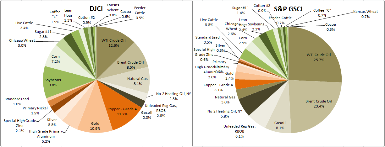
Notice the significant difference in the weights, especially in energy where the DJCI has 33.8% and the S&P GSCI has an energy weight of 72.1%. Also notice the relatively low weight in the S&P GSCI of metals at 9.6% versus 35.5% in the DJCI, and lower agriculture and livestock weight 18.2% in the S&P GSCI versus 30.7% weight in the DJCI.

Why is this?

Again, It is from the different weighting methods between the indices. The DJCI is an equally weighted index where step one is to liquidity weight each commodity by a 5 year average of total dollar value traded. Next the commodities are grouped into components by their physical similarities and correlations to apply caps to further diversify. The caps are applied so that no more than one component is greater than 32% and no subsequent component is greater than 17%. This is done in an interative process until the requirement is filled. Last the sectors are limited to 33% each and this is rebalanced quarterly.  The goal is to incorporate diversification and liquidity as the intrinsic characteristics of the index.

The S&P GSCI is a world production weighted index where the goal is to reflect the relative significance of each of the constituent commodities to the world economy, while preserving the tradability of the index by limiting eligible contracts to those with adequate liquidity.

With respect to each Designated Contract, a Contract Production Weight (CPW) is calculated based on world production and trading volume. The final CPWs are rounded to seven digits of precision.

The calculation of the CPWs of the Designated Contracts involves a four-step process: (1) determination of the World Production Quantity (WPQ) of each S&P GSCI Commodity, (2) determination of the World Production Average (WPA) of each S&P GSCI Commodity over the WPQ Period, (3) calculation of the CPW based on the Contract’s percentage of the relevant Total Quantity Traded (TQT), and (4) certain adjustments to the CPWs.

World Production Quantity (WPQ)

The WPQ of each S&P GSCI Commodity is equal to the total world production of the S&P GSCI Commodity over the WPQ Period.

The use of the five-year WPQ Period (and the averaging of that five-year period to determine the WPAs) is intended to mitigate the effect of any aberrational years with respect to the production of a particular commodity.  For example, if a given commodity is produced primarily in one part of the world that suffers damage from hurricanes or earthquakes in a particular year, resulting in curtailed production levels, the use of that year’s production figures might not accurately reflect the significance of the commodity to the world economy.  Commodity production in a particular year may also be higher or lower than would normally be the case as a result of general production cycles, supply and demand cycles, or worldwide economic conditions.  Measuring production levels over a five-year period should generally smooth out any such aberrational years.

The definition of the WPQ Period imposes a delay of approximately one-and-one-half (1 ½) years between the end of the WPQ Period and the end of the relevant Annual Calculation Period.  This delay is because world production statistics are often incomplete and subject to revision after their original publication.  Imposing a delay on the WPQ Period generally enhances their accuracy and reliability.

The WPQ Period is defined as the most recent five-year period for which complete world production data is available for all S&P GSCI Commodities from sources determined by S&P Indices to be reasonably accurate and reliable. This procedure is intended to assure that the same WPQ Period is used for all S&P GSCI Commodities, which allows comparisons between production figures to be made without taking into account temporary aberrations in different time periods.

World Production Average (WPA)

The WPA is simply the average annual production amount of the S&P GSCI Commodity based on the WPQ over a five-year period.

Contract Production Weight (CPW)

In calculating the CPW of each Designated Contract on a particular S&P GSCI Commodity, the WPA of such Commodity is allocated to those Designated Contracts that can best support liquidity. 

With respect to each Designated Contract, the CPW is equal to the Percentage TQT for such Contract multiplied by the WPA of the underlying S&P GSCI Commodity (after any necessary conversion made for purposes of the calculation) and divided by 1,000,000.

The simpler of the two is the equally weighted DJCI. However, both indices are used as asset class representations in order to fulfill different portfolio goals.  The most popular reasons investors use commodity indices are for diversification and inflation protection, so we will evaluate the historical effectiveness of both indices in these roles. Additionally, we may explore how well each of the indices fills requirements of other motivations behind commodity allocations such as liquidity, emerging markets exposure, or hedging against rising interest rates.


The posts on this blog are opinions, not advice. Please read our Disclaimers.

No Place to Hide? Consider Cash

Contributor Image
David Blitzer

Former Managing Director and Chairman of the Index Committee

S&P Dow Jones Indices

Today’s New York Times headlined an article, “The Everything Boom: How it Might End” (here) pointing out that prices in almost every asset class have reached stratospheric levels driven by low interest rates and easy money.  The article suggests three ways the boom might end: The good where the economy grows into currently high asset values and interest rates slowly rise; the bad where the economy stagnates and investment returns fade towards zero; or, the ugly where inflation or some crisis leads to collapse.  It missed a fourth – today’s irrational exuberance evaporates when people realize how far prices are from any fundamental values.

Rather than argue about the future, is there anything investors who fear the end can do now? Consider cash.  Shifting part of an investment to cash from stocks, bonds or commodities reduces its volatility and shrinks the size of the maximum drawdown while trimming prospective returns. Cash earns zero return with zero volatility.  The attractive part is the zero volatility.   Inflation is a risk to cash since rising prices makes the cash worth less. However, it is a slow moving risk compared with falling stock and bond prices: 10% annual inflation is quite high, hasn’t been seen in the US since the early 1980s and would take time to become part of the economy; a 10% drop in stocks or bonds can happen in a matter of days or weeks.

The chart shows a strategy of 60% tracking the S&P 500 and 40% tracking cash compared to 100% tracking the S&P 500.  The figures are quarterly beginning with the first quarter of 2000 and rebalancing to 60/40 each quarter.  Dividends, taxes and expenses are not included.  Starting close to the peak of the Tech boom and continuing through the second quarter of 2014, the 60% stocks-40% cash strategy out-performs the 100% in stocks approach until the end of the third quarter last year.  At the end of June, 2014 the all stocks is ahead by 6%.  Over the 13-1/2 years, the volatility of the 60/40 strategy is 10.4% compared to 17.4% for the S&P 500. Likewise, the maximum draw down for the 60/40 is 14% compared to 23% for the 100% in the S&P 500.

Cash is not always the answer though.  Had one started the same comparison with the fourth quarter of 2002 – the end of the Tech bust – the results would have been different. The 100% in stocks choice would have out-performed the 60/40 strategy except for a few quarters and ended with a spread of about 25%. The volatilities differ only slightly due to a different time period and the maximum draw downs (which occurred during the financial crisis) are the same.  While the moment to switch some holdings to cash is the peak of a market cycle, no one knows the peak until long after it happens.

A final thought to how the Everything Bubble might end is that under each of the scenarios mentioned above investment returns will fall.

The posts on this blog are opinions, not advice. Please read our Disclaimers.

No Bread And Water After Doomsday

Contributor Image
Jodie Gunzberg

Former Managing Director, Head of U.S. Equities

S&P Dow Jones Indices

According to farmers, doomsday predictions by climate scientists don’t matter.  Doomsday already happened on June 26, 2011 – at least in Vega, Texas where temperatures reached 114 degrees Fahrenheit and winds were 40-50 mph.

We speak about weather conditions as a driver of commodity prices on a regular basis. We discuss droughts, freezes, hurricanes and even ideal conditions. Although in many places ideal conditions are being reported, industry trade group, Kansas Wheat, said that “fields across Kansas”, the top US wheat producing state, “continue to dry up as farmers state-wide are scrambling to finish harvesting their wheat.”

Why might this be the case? There is a water source that comes from underground rather than the sky. It is not generally part of the weather report but it is vital to the American Breadbasket that feeds billions throughout the world. This water source is called the Ogallala Aquifer and is a shallow water table aquifer located beneath the Great Plains in the United States. It is drying up and impacts the prices of wheat. YTD, the S&P GSCI (Chicago) Wheat is -7.2% YTD, while the S&P GSCI Kansas Wheat is +7.2% YTD (through July 3, 2014.) 

Notice in the chart below, how the water under Kansas is drying up:Bread and Water

Since Doomsday on June 26, 2011, the DJCI All Wheat TR, which is made up of both Chicago and Kansas Wheat, has lost 31.5%, though there have been summertime spikes throughout. Notice in the chart below, between June 30-Aug 31, 2011, there was a gain of 22.5%; from June 1-July 20, 2012, there was a gain of 48.7%; and in 2013, from Sept 5-Oct 23, a gain of 10.0%. On July 1, 2014, the index hit a new low from the record set on Jan 29, earlier in the year. Despite “ideal weather conditions” in some parts, this may be the low before the next summertime spike – which may be higher than ever as the underground water dries up.

Source: S&P Dow Jones Indices. Data from June 2011 to July 2014. Past performance is not an indication of future results.


The posts on this blog are opinions, not advice. Please read our Disclaimers.

Unemployment Puts The Question of A Rate Increase In Play

Contributor Image
Kevin Horan

Former Director, Fixed Income Indices

S&P Dow Jones Indices

After starting last week at a yield of 2.52%, the yield of the S&P/BGCantor Current 10 Year U.S. Treasury Bond Index climbed to a high of 2.72% to close the index before the July 4th holiday.  The 6.1% unemployment number moved yields higher as the markets were expecting an unchanged result from the prior level of 6.3%.  Indicators of a strengthening economy have market participants speculating as to the timing of a possible Fed rate increase.

Investment grade municipal bonds as measured by the S&P National AMT-Free Municipal Bond Index were down on the week having returned -0.37%, though on the year are returning 5.52%.  All eyes have been on Puerto Rico and its developing events as the S&P Municipal Bond Puerto Rico Index whose year-to-date return was at a high of 10.65% at the end of June has now dropped to a -0.16%.

Last week high yield as measured by the S&P U.S. Issued High Yield Corporate Bond Index gave up very little ground and continues to return 5.51% year-to-date.  Over the same time frame, the S&P U.S. Issued Investment Grade Corporate Bond Index dropped -0.72% month-to-date and its year-to-date return had moved from 5.59% at the start of the month down to 4.82%.  Both markets experienced plenty of new issuance as investment grade names such as Anadarko Petroleum, Goldman Sachs and Oracle, along with the high yield names of Ithaca Energy, Jaguar and RJS Power all issued debt last week.

Consistently yielding 4.35%, the S&P/LSTA U.S. Leveraged Loan 100 Index returned +0.12% month-to-date in comparison to the similar credit of high yield which was down -0.04%.  Year-to-date the shorter life senior loan market lags behind the longer duration high yield by only having returned 2.59% year-to-date.

A light economic calendar this week as the bond market and its participant’s kick the start of the vacation season into full gear.  Though smaller releases will occur Tuesday, Wednesday’s Fed release of the June 17th / 18th meeting along with MBA Mortgage Applications (-0.2% prior) should grab some attention.  Initial Jobless Claims are expected to be unchanged at 315k, while Wholesale Inventories month-over-month for May is expected to be 0.6% versus the prior 1.1%.  A true summer Friday is expected as the only release for the day will be June’s monthly U.S. Treasury Federal Budget Debt Summary number which is surveyed to be an $80 billion surplus.  In addition to weekly bill auctions, the U.S. Treasury will be auctioning $27 billion 3-years while also tapping $21 billion 10-years and $13 billion 30-years.


Source: S&P Dow Jones Indices, Data as of 7/3/2014, Leveraged Loan data as of 7/6/2014.

The posts on this blog are opinions, not advice. Please read our Disclaimers.

Why is the VIX so high?

Contributor Image
Tim Edwards

Managing Director, Index Investment Strategy

S&P Dow Jones Indices

No, our crack proofreading team didn’t muff the headline.  After several weeks of seemingly unanimous commentary about how investor complacency has resulted in VIX® levels that are “too low,” we want to ask the contrarian question.  Rather than being too low, why is the VIX so high?

The question is germane because there has been hardly any volatility in the S&P 500®. Realized volatility has been running at roughly 6%-7% annualized. And although the VIX is a measure of implied, or anticipated, rather than actual, volatility – it still ought somehow to be anchored in realized volatility data.

The VIX is currently much, much higher than realized volatility – at around 11.5 as we write.  One interpretation of this is that the market “expects” next month’s volatility to be nearly double what we’ve seen recently. Moreover, the futures market is pricing in an expected gain in the VIX to around 17 by March 2015 — nearly triple the current level of realized volatility.  Two questions naturally emerge:

  1. Does the market really expect a doubling or tripling of volatility?  Otherwise said, is the VIX “worried” about something that the equity market hasn’t noticed yet?
  2. Can I make money from this?

The first question relates to the information that the VIX ultimately conveys. To simplify, suppose two types of events can affect the equity markets: i) day to day economic or company-specific news driving the cut-and-thrust of market flows and ii) extraordinary events – sometimes called tail risks – which might (or might not) be financial in nature (a major earthquake, for example).

Total risk is of course a combination of events of type i) and type ii) and everything in between.  It happens to be the case that recent data comprise a steady trickle of the former and none of the latter. But lower risk of the first type does not necessarily imply lower risk of the second type. To use a geological analogy: there were no earthquakes in California last month (i.e. no short-term volatility), but the probability of a major temblor along the San Andreas fault (i.e. a tail event) has not gone down. This is somewhat intuitive: the average institutional investor may be reassured by Yellen’s so-far steady chairmanship or the overall macroeconomic outlook, but the tail risk gods are supremely indifferent.

As a consequence, a high proportion of the risk in equity markets currently is accounted for by the possibility of tail events (a phenomenon manifest in so-called “skew”).  In other words, a VIX several points higher than realized volatility is consistent with a market expectation of continuing similar volatility unless something surprising happens. The mere possibility of tail events – invisible in current equity valuations – provides the VIX with a different perspective, evoking Michel de Montaigne:

 “My life has been full of terrible misfortunes most of which never happened.”

Turning to opportunity for profit: the key judgement relates to whether the likelihood of an extreme event is overpriced.  Selling S&P 500 put and/or call options can realize a profit if volatility proves less than expected, as can taking short positions in either VIX futures or in related exchange-traded products. Indeed, such strategies are popular ways to capture any “premium” to the VIX systematically. However, the risks of such strategies are far from symmetric: if the VIX were to remain roughly where it is for the next month, a short position in the July 2014 VIX future stands to make a 6% return. On the other hand, the occurrence of a tail event could quite conceivably send the VIX towards the top of its historical range. The losses on a short position during such a scenario would then be several multiples of the notional amount invested.

Even when profit is possible, or highly likely, dramatic risks remain.  Selling volatility remains a strategy exclusive to the courageous.  Perhaps that is one reason why the VIX is so high.

The posts on this blog are opinions, not advice. Please read our Disclaimers.