Get Indexology® Blog updates via email.

In This List

U.S. Preferred Stock: Equity & Bond Characteristics Helping or Hurting Performance?

Hedging Geopolitical Risk With Oil

Dreams to Sell

A Tale of Two Benchmarks: Reconstitution Effect

Unconstrained Sector Weighting: A Feature, Not a Side Effect

U.S. Preferred Stock: Equity & Bond Characteristics Helping or Hurting Performance?

Contributor Image
J.R. Rieger

Former Head of Fixed Income Indices

S&P Dow Jones Indices

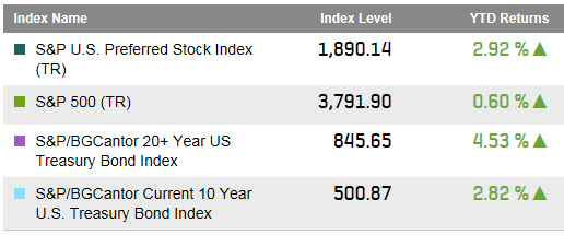
In this prolonged low interest rate environment, the S&P U.S. Preferred Stock Index has performed well, returning 2.92% year-to-date.   Meanwhile, the S&P 500 (TR) is up a modest 0.6% and long term bonds tracked in the S&P/BGCantor 20+ Year U.S. Treasury Bond Index are up 4.53% in total return.  So far, the preferred stock market with characteristics of both equities and bonds has performed as expected – somewhere in the middle of the performance of stocks and long term bonds.

Select Indices: Year to Date Performance (March 27, 2015):

Source: S&P Dow Jones Indices LLC.  Data as of March 27, 2015.
Source: S&P Dow Jones Indices LLC. Data as of March 27, 2015.

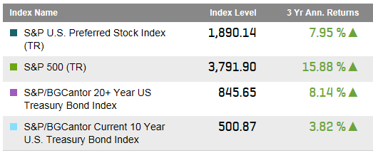
Over a three year period, the annualized returns of the U.S. preferred market have been more bond like than equity like.  The S&P U.S. Preferred Stock Index had a three year annualized return of 7.95% while long U.S. Treasury bonds have returned 8.14%.  Meanwhile, the three year annualized return of the S&P 500 has been well over 15%.

Select Indices: Three Year Performance (March 27, 2015):

Source: S&P Dow Jones Indices, LLC.  Data as of March 27, 2015.
Source: S&P Dow Jones Indices, LLC. Data as of March 27, 2015.

While it is easy to relate the performance of preferred stock and long term bonds to interest rate changes, the two asset classes have shown a low correlation to each other over the last three years.  Actually, the S&P U.S. Preferred Stock Index has had a higher correlation to the S&P 500 than it did to long term to bonds.  There is a danger in just looking at the last three years of course as interest rates have been held low during the period.

Three Year Correlations:

Source: S&P Dow Jones Indices, LLC.  Data as of March 27, 2015.
Source: S&P Dow Jones Indices, LLC. Data as of March 27, 2015.

Will a rising interest rate environment bring the same pain to preferred stocks as it might to long term bonds?  The short term history illustrates that the combined equity and bond like characteristics of preferred stock both play a role in actual performance.  Like all things still to come, we will just have to wait and see how the markets unfold.

The posts on this blog are opinions, not advice. Please read our Disclaimers.

Hedging Geopolitical Risk With Oil

Contributor Image
Jodie Gunzberg

Former Managing Director, Head of U.S. Equities

S&P Dow Jones Indices

This morning, I woke up to the headline Oil just spiked again, on news Saudi Arabia is bombing rebel positions in Yemen. It was the perfect reminder of a call I had earlier in the week from a large pension looking for an oil index to hedge geopolitical risk. After the call, my colleague asked, “Why would an investor use oil to hedge against geopolitical risk?” He continued with more questions like why not use equities or credits from those countries and isn’t it impossible to hedge against geopolitical risk?

In remarks from the Bank of Canada, geopolitical developments often have a major impact on oil prices since they can affect oil supply directly and since the threat of future supply disruptions can also build a risk premium into oil prices. As a notable example, in the early part of 2014, conflicts in Libya and Iraq led to temporary outages in their oil production, keeping world prices high, even as supply elsewhere in the world continued to ramp up. When production from those two countries came back on stream, that was an important trigger for the plunge in oil prices later in the year.

Notice in this chart produced by WTRG Economics the spikes in oil price jumped more than 2 times on average during these critical periods except the first Gulf war.

War Oil History

This behavior is no different today as demonstrated in the chart of oil prices for the past two weeks, hourly. Notice the oil spike from the Yemen bombing, despite the fact it is only the world’s 39th largest producer.

geopolitical risk Yemen

Not only do geopolitical events spike oil (and other commodities) but they may simultaneously hurt the stock market. An article posted by CNN Money just hours ago states, “The surge in oil followed a sharp sell off in the U.S. stock market overnight. European markets were all declining by about 1% to 2% in early trading and most Asian markets closed with losses.” The chart below shows another example of the S&P GSCI rising while the S&P 500 fell during the Persian Gulf War.

geopolitical risk Persian Gulf

Based on the above, oil has historically performed better than stocks in times of war, though stocks have remained relatively flat in many cases as shown in the table below.Stocks War

Although not all the countries with high geopolitical risk are necessarily high yield, there should be a link between them given the methodology from OECD to classify the country risk. According to OECD, “the country risk is composed of transfer and convertibility risk (i.e. the risk a government imposes capital or exchange controls that prevent an entity from converting local currency into foreign currency and/or transferring funds to creditors located outside the country) and cases of force majeure (e.g. war, expropriation, revolution, civil disturbance, floods, earthquakes).”

The high yield market has had a positive correlation with equity markets for many years when comparing the percentage change in spreads (over Treasuries) for key high yield indices vs. the percentage change in level for equities, and this correlation has become even more pronounced since the global financial crisis.

HYStocks

According to PIMCO, equity market volatility and its associated effects on enterprise value have driven high yield spreads. The investment implications of the equity–high yield correlation say that if you expect equity valuations to increase for a certain sector or name – whether based on general growth prospects, a changing environment or new information – then, all else being equal, you could expect credit spreads in that sector or name to decrease in the future. For example, spreads on credits related to metals and mining sectors widened in 2012 from relatively weak equity performance in the sector, mainly due to decreased demand from China.

Even if stocks hold up in war times, it is possible investors will flee high yield bonds first since they may not feel they are getting compensated to take the geopolitical risk. As zerohedge.com points out, “geopolitical risk is causing a pause… Investors tend to flee riskier assets during times of turmoil.” This may cause a decoupling of high yield from stocks as seen in the chart below:

HYStocks Decouple

So if oil is the choice for hedging against geopolitical risk, then what type of strategy performs best? That depends on whether the term structure is backwardated or in contango.  When backwardation is prevalent, the front month contracts have outperformed, and when contango is predominant, the forward months have performed better.  From 2004-2011, contango dominated but in 2013 that changed.  However, it takes time to move from one persistent term structure to the next given inventories can be slow moving in either direction. It can take some time for inventories to be drawn down and also may be difficult to replenish. This is similar in energy as it is in other commodities that are difficult to store, like agriculture.

Below is a chart and table demonstrating the long term gain by using a dynamic roll strategy in energy.  The sector is comprised roughly of 35% each WTI and Brent, 10% gasoil, 7.5% each of heating oil and unleaded gasoline, and 5% natural gas. Overall the annualized return since inception in 1999 is 12.7% for the S&P GSCI Energy Dynamic Roll and 3.5% for the S&P GSCI Energy.

energy dynamic roll

Certain commodities are more sensitive to the term structure that you can see below in the table. For example, heating oil and unleaded gasoline have front contracts that have outperformed later dated, more flexible strategies.  As oil gets cheaper, the price for refined oil like heating oil and unleaded gasoline may drop, causing demand to increase and inventories to fall.

energy dynamic roll

Source: S&P Dow Jones Indices. Past performance is not an indication of future results.


The posts on this blog are opinions, not advice. Please read our Disclaimers.

Dreams to Sell

Contributor Image
Craig Lazzara

Former Managing Director, Index Investment Strategy

S&P Dow Jones Indices

If there were dreams to sell, a poet asked, what would you buy?  Much more prosaically, if you could design your dream investment process, what would it look like?

A simple way to think about the question is to separate success into two dimensions: frequency and magnitude.  Frequency means how often we “win” (i.e., how often our strategy outperforms its benchmark); magnitude measures the size of the winnings (i.e., the average value added when we win, and the average value lost when we lose).  In the best of all possible worlds, we’d win most of the time, and the average outperformance in our winning months would be much higher than the average underperformance in our losing months.

Since we don’t live in the best of all possible worlds, compromise is necessary.  Suppose we could only outperform half the time.  Our investment process would still be a net winner if its wins were bigger than its losses — in other words, if its average outperformance (during winning months) were bigger than its average underperformance (during losing months).

Dispersion gives us a way to gauge the likely differences between the returns of a particular strategy and those of a market benchmark.  This is true whether the strategy in question is active or is a factor or “smart beta” index.  When dispersion is high, the strategy is likely to deviate from its benchmark by a relatively large amount; when dispersion is low, deviations are likely to be smaller.  So: if our wins occur when dispersion is relatively high, and our losses when dispersion is relatively low — our investment process might still accumulate considerable value, even it wins only half the time.

There’s a strong historical tendency for high dispersion and negative returns to go hand-in-hand, as shown here for the S&P 500:

Dispersion by market regime

When the S&P 500’s returns are at their most negative, dispersion tends to be well above average.  When returns are positive, dispersion tends to be slightly below average.  This means, other things equal, that a strategy that tends to win when the market is down and to lose when the market is up will have a natural performance advantage, since its hits will occur in times of high dispersion.

This is exactly the pattern of returns exhibited by low volatility indices, as well as by other defensive strategies such as the S&P 500 Dividend Aristocrats.  We expect such strategies to do relatively well when the market declines.  The remarkable thing about them is that they also tend to outperform over the long run, despite the market’s secular upward bias.  Arguably, this is because they tend to win when dispersion is relatively high, and to lose when dispersion is relatively low.  They are therefore more likely to outperform when the reward for outperformance is high.

Differential returns can often be a consequence of index dispersion.  The distribution of dispersion favors strategies that outperform in down markets.

The posts on this blog are opinions, not advice. Please read our Disclaimers.

A Tale of Two Benchmarks: Reconstitution Effect

Contributor Image
Phillip Brzenk

Managing Director, Global Head of Multi-Asset Indices

S&P Dow Jones Indices

This is the second in a series of blog posts relating to the in depth analysis of performance differential between the S&P SmallCap 600 and the Russell 2000.

Numerous studies have been conducted on Russell’s annual reconstitution process in June, particularly regarding the downward price pressure placed on the Russell 2000.  As winners from the Russell 2000 move up to the Russell 1000, and losers from the Russell 1000 move down to the small-cap index, small-cap fund managers are forced to sell winners and buy losers, thereby creating negative momentum.

To study this effect, we examine the average monthly excess returns for each calendar month from 1994 through 2014.  It is seen that the S&P SmallCap 600 has an average monthly excess return of +0.68% for the month of July vs. the Russell 2000, with a statistically significant t-stat of 2.54.  These results indicate that there may be a strong relationship between the Russell 2000 annual rebalancing in June and the negative excess returns in the following month.

Capture

In an attempt to control for the July reconstitution effect, a hypothetical index was created where the monthly returns are represented by the Russell 2000, with the exception of July being represented by the S&P SmallCap 600.  From 1994 through 2014, the difference in an investment of USD 1.00 into each the Russell 2000 and the S&P SmallCap 600 amounts to USD 2.41 (USD 6.18 and USD 8.59 respectively).  The same investment in the hypothetical index results in USD 7.17, USD 1.42 lower than the S&P SmallCap 600.  Therefore, only a portion of the excess returns may be attributed to the July reconstitution effect, with the rest of the difference coming from other factors.

Capture

The posts on this blog are opinions, not advice. Please read our Disclaimers.

Unconstrained Sector Weighting: A Feature, Not a Side Effect

Contributor Image
Fei Mei Chan

Former Director, Core Product Management

S&P Dow Jones Indices

Although the low volatility anomaly was first documented more than 40 years ago, it was the trepidation and volatility in the years following the most recent financial crisis that propelled the concept to the forefront of investor interest.  In recent years, the phenomenon has been well covered, by both academics and the investment community, in the form of innovative financial instruments that exploit the anomaly and subsequent attraction of assets to those vehicles.  The low volatility anomaly exists not just in the U.S., but instead seems to be universal.  The current debate is less focused on the existence of a low volatility effect and more on the construction of various strategies to exploit the phenomenon.

In the U.S., for example, the S&P 500® Low Volatility Index outperformed its benchmark, the S&P 500, from 1991 to 2014 by 101 bps compounded annually—with 31% less volatility.  What is the reason for its success?  Our rankings-based method of portfolio construction not only screens for stocks by factor, it also weights by factor (or the inverse of the factor, in this case) to achieve its objective.  This methodology has resulted in large sector weights, historically.

However, strategic sector tilts don’t paint the complete picture here.  If we only apply the returns of the S&P 500 sectors to the respective sector weights in S&P 500 Low Volatility Index over the last 24 years, the “hypothetical” low volatility portfolio can account for 69% of the total risk reduction.  This means that being in the “correct” sector during this period accounted for more than two-thirds of the volatility reduction achieved by the S&P 500 Low Volatility Index (see Exhibit 1).  In the same period, the return increment attributed to being in the “correct” sector was only 29%, from which we can conclude that more than two-thirds of the outperformance is idiosyncratic to S&P 500 Low Volatility Index’s methodology.

As is the case with many factor-driven portfolios, various portfolio construction methods can result in lower volatility.  The ability to protect the portfolio in relatively stable sectors is a feature—not a side effect—of the S&P 500 Low Volatility Index’s rankings-based methodology.

Capture

The posts on this blog are opinions, not advice. Please read our Disclaimers.