Get Indexology® Blog updates via email.

In This List

Where’s Your Carbon Gone? How the S&P PACT Indices Decarbonize

Connecting the S&P/ASX 200 to U.S. Equity Icons

Hedging Debt Ceiling Drama with the S&P GSCI SOFR and S&P GSCI Gold

Cutting Carbon without Changing Course: Net Zero Fixed Income Indices

A Quick Look at Key USD Indices and Fixed Income ETF Flows This Year

Where’s Your Carbon Gone? How the S&P PACT Indices Decarbonize

Contributor Image
Kieran Trevor

Analyst, ESG Research & Design, ESG Indices

S&P Dow Jones Indices

As the world aims to decarbonize toward a net zero future, the importance of tracking the carbon footprint of portfolios is becoming a primary focus for many investors; specifically, to measure and understand whether portfolios emulate the emission reduction targets needed globally to help mitigate the impacts of climate change.

For investors, tracking an EU Paris-Aligned Benchmark, such as S&P 500 Net Zero 2050 Paris-Aligned ESG Index, may provide a way to avoid the hassle, as the index embeds an initial 50% greenhouse gas (GHG) reduction and a minimum 7% year-over-year decarbonization rate in its construction, while historically maintaining similar performance characteristics to the benchmark index.1

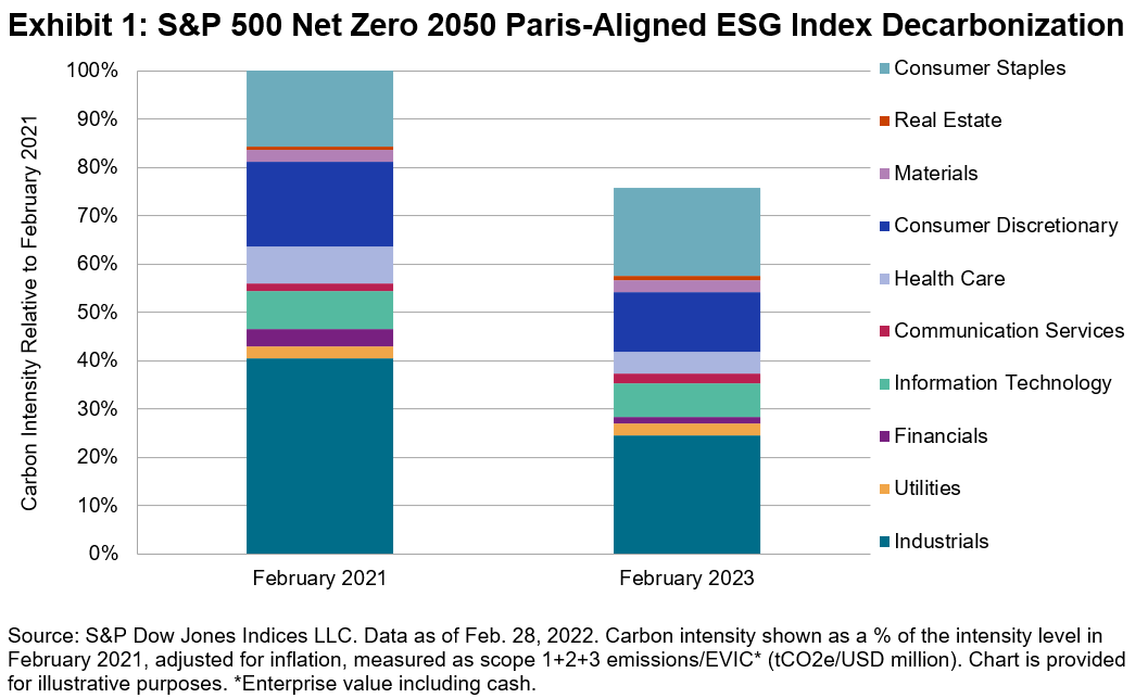
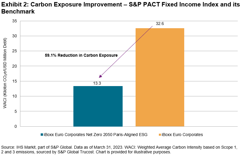
Between February 2021 and February 2023, the S&P 500 Net Zero 2050 Paris-Aligned ESG Index reduced its carbon intensity by 24.1%, beating its minimum required decarbonization of 13.5% in that same period. The Industrials, Financials, Health Care and Consumer Discretionary sectors all decarbonized by over 30%, with carbon intensity increases observed in Consumer Staples, Real Estate and Communication Services. All Energy stocks were excluded from the index throughout due to the index construction.

But how has this decarbonization been achieved? We break this down to uncover the real drivers of the changes in carbon footprint within the index.

Carbon Attribution

First, we split the index into three separate groups:

  • Incoming Positions: Representing constituents that only joined the index after February 2021;
  • Outgoing Positions: Representing constituents that were removed from the index between the February 2021 and February 2023; and
  • Maintained Positions: Representing constituents that were present in the index since February 2021.

Splitting the index into distinct periods allows us to more accurately attribute how carbon came into the index and how it has been removed. In this case, a large proportion of carbon has been removed through divestment of companies from the index, which accounted for a decarbonization of 32% (see Exhibit 2) relative to the base-level carbon intensity. Meanwhile, new companies entering the index increased carbon intensity by 4.9%, and companies that maintained their position in the index in both periods were responsible for a rise of 3%.

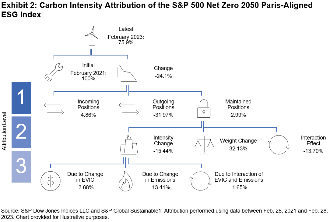
Next, we run a carbon attribution analysis on the maintained positions to see what’s driving their net growth in carbon intensity. We observe that this was driven entirely by weighting within the index, which given the reduced count of overall companies in the index during this time from 358 to 313, makes intuitive sense. The interaction effect between a company’s weight and its carbon intensity also helped reduce the index-level carbon footprint. Company behavior, represented by the actual carbon intensity change of companies in the index, had a reductive impact on overall intensity by over 15%.

Finally, breaking this promising trend down further by attributing the intensity change, we observe that this effect was driven in part by market conditions (EVIC), but mostly by emission reductions of these companies, while the interaction effect between these two was minimal.

Carbon attribution analysis can be a powerful tool for market participants looking to reduce the carbon footprint of their investments, and it can be used to help maintain their decarbonization. Luckily, the S&P PACT™ (S&P Paris-Aligned & Climate Transition Indices may provide a way to make this easier, embedding a 7% year-over-year decarbonization rate by design and aligning with a net zero future.

1 See S&P Paris-Aligned & Climate Transition (PACT) Indices Methodology for more information.

The posts on this blog are opinions, not advice. Please read our Disclaimers.

Connecting the S&P/ASX 200 to U.S. Equity Icons

Contributor Image
Sherifa Issifu

Senior Analyst, U.S. Equity Indices

S&P Dow Jones Indices

Many market participants have a “home bias,” typically having larger exposures to domestic securities than would be determined by their representation in the global opportunity set. Australia is no exception: compared to Australia’s 2% weight in the S&P Global BMI, Australian investors allocated an estimated 49% of their total equity allocation to domestic stocks at the end of 2022.1

Exhibit 1 shows that Australia’s home bias—as measured by the difference between investors’ total domestic equity exposure and the country’s weight in the S&P Global BMI—is larger than several of its developed market peers, such as Canada, Japan and the U.K.

Such home bias means that investors have less exposure to the U.S. equity market, which makes up nearly 60% of the S&P Global BMI. The S&P Composite 1500® represents the investable portion of the U.S. equity market (~90%) by combining the large-cap S&P 500®, S&P MidCap 400® and the S&P SmallCap 600® and leaving out less liquid and lower quality stocks.

The U.S. is home to well-known global mega-cap names such as Apple and Microsoft, which may help to balance Australia’s overweight to Financials and Materials. Exhibit 2 shows that combining the U.S. and Australia’s equity benchmarks may help alleviate the domestic sector biases. Compared to the S&P Global BMI, the Australian bellwether underweights Information Technology by 18%, with I.T. being the S&P/ASX 200’s second-smallest sector, at 2%.

Potential diversification benefits could also have come in the form of improved risk/return profile. Exhibit 3 highlights that the S&P 500 outperformed the S&P/ASX 200 by 2% annualized since Dec. 30, 1994, in local currency and U.S. dollar terms. This makes the long-run outperformance of the S&P 400® and S&P 600® even more impressive; the non-perfect correlations of these indices versus the S&P 500 (shown in Exhibit 4) also means there is an opportunity for investors to diversify within their U.S. equity exposure as well to gain access to the unique characteristics of U.S. mid- and small-cap indices.

Exhibit 2 which shows that differences in sector composition may help explain the non-perfect correlation between the S&P/ASX 200 to our U.S. core equity indices, which ranges from 0.44-0.52 when looking at monthly returns in AUD terms, as illustrated in Exhibit 4. This moderate correlation suggests that combining the two sets of indices may lead to better risk-adjusted return than either one in isolation.

In Exhibit 5, we take the blue-chip benchmarks of both the U.S. and Australia and create hypothetical combinations of the S&P 500 and the S&P/ASX 200. We can see that adding the S&P 500 to the S&P/ASX 200 has historically improved return per unit of risk (risk-adjusted return) across all points on the efficient frontier over exposure to the S&P/ASX 200 alone.

While there are several reasons why Australian market participants may choose to have a home bias, in the past, U.S. equities helped investors diversify from sectoral home biases and historically improved domestic returns.


1 Thinking Ahead Institute, “GPAS 2023 Pensions Survey,” 2023.

The posts on this blog are opinions, not advice. Please read our Disclaimers.

Hedging Debt Ceiling Drama with the S&P GSCI SOFR and S&P GSCI Gold

Contributor Image
Brian Luke

Senior Director, Head of Commodities, Real & Digital Assets

S&P Dow Jones Indices

The debt ceiling debate in Washington appears to be nearing an end. According to the U.S. Treasury, Congress has “always acted when called upon” and markets will look for them to do so for the 79th time this month. By index rule, all commodities in the S&P GSCI are traded in U.S. dollars, so the importance and reverence to the “world’s reserve currency” rings true every time a futures contract on the S&P GSCI is settled.

The S&P GSCI SOFR launched in May and leverages the same index construction and calculation principles as the S&P GSCI, but applies the Secured Overnight Financing Rate (SOFR) into the calculation instead of Treasury Bills. Using SOFR in lieu of Treasury Bills allows for performance tracking with alternative cash management strategies. Including rates that are collateralized by Treasury securities, there is still exposure to the faith and credit of the U.S. government. However, it excludes certain transactions that are deemed to be trading “special,” or at a rate outside the general market activity. The SOFR is published daily by the U.S. Federal Reserve and can be found on its website. As SOFR volumes rise, the ability to have a complementary index allows for potentially improved cash management capabilities through cash and derivative instruments.

Gold has long served as the alternative to fiat currency when there is concern in the market regarding the political outlook. With this year’s debate, the S&P GSCI Gold has traded near its all-time high and has outperformed broad commodities by over 18%. While fiat money can, and likely will, continue to be printed, the global production of gold is relatively flat at just 1%-2% of total supply. Central banks have purchased gold at rates not seen since the U.S. government broke its gold standard in 1971. Steady supply creates a relatively fixed base for the metal, while demand is largely driven by some of the largest holders of U.S. government debt: global central banks.

Largest Central Bank Purchases in 50 Years

Since hitting a YTD high of 12%, the S&P GSCI Gold has turned in solid, if not spectacular, results. Popularity has risen due to the recent debt ceiling debates, and despite politicians coming to a solution that would avoid default, central bankers appear to be stocking up.

The posts on this blog are opinions, not advice. Please read our Disclaimers.

Cutting Carbon without Changing Course: Net Zero Fixed Income Indices

Contributor Image
Maya Beyhan

Senior Director, ESG Specialist, Index Investment Strategy

S&P Dow Jones Indices

S&P DJI recently expanded its range of S&P PACT™ Indices (S&P Paris-Aligned & Climate Transition Indices) to go beyond equity to now cover fixed income. Within these indices, the differences between the two asset classes in terms of the balance between cost (tracking error) and reward (sustainability profile) are material and highly thought-provoking.

As shown in S&P DJI’s Climate & ESG Index Dashboard, the equity S&P PACT Indices typically have an annualized tracking error ranging from 1.8% to 2.7% versus their market-cap-weighted benchmarks as of March 31, 2023. These levels of tracking error may be challenging for investors who are highly sensitive to any deviations in performance from a standard, market-cap-weighted benchmark.

Following on the path drawn by equity indices, the suite of S&P PACT Indices expanded into fixed income with the launch of the iBoxx EUR Corporates Net Zero 2050 Paris-Aligned ESG. This index uses the broad iBoxx € Corporates as its underlying benchmark and adopts similarly ambitious sustainability and climate targets as its equity counterpart—in particular, meeting the definition of a Paris-Aligned benchmark.

What is particularly remarkable about this fixed income S&P PACT Index is that it has had a (back-tested) annual tracking error of only 0.2% versus its underlying index; specifically, it has achieved a material benchmark-relative reduction in carbon exposure of 59.1% as of March 31, 2023. Exhibits 1 and 2 summarize the carbon exposure improvement and performance characteristics as compared to iBoxx Corporates, using the same analytical engine driving S&P DJI’s Climate & ESG Index Dashboard.

Overall, these exhibits show that the fixed income S&P PACT Index maintained near benchmark-like performance while achieving a substantial improvement in carbon exposure.

The key to this result is that, while integrating sustainability and climate goals, the fixed income methodology for the S&P PACT Indices also includes steps to approximate the duration and credit quality of the benchmark. With a similar rating and maturity profile, even ambitious sustainability and climate goals can potentially be incorporated without generating materially distinct index performance. For this reason, the fixed income S&P PACT Index may be useful to those who are highly sensitive to tracking error, aligning with climate and sustainability goals at a marginal cost.

Key performance and sustainability metrics for the S&P PACT Index suite can be monitored in S&P DJI’s Quarterly Climate & ESG Index Dashboard.


1 https://www.spglobal.com/spdji/en/education/article/faq-esg-back-testing-backward-data-assumption-overview/

The posts on this blog are opinions, not advice. Please read our Disclaimers.

A Quick Look at Key USD Indices and Fixed Income ETF Flows This Year

Contributor Image
Kangwei Yang

Director, Fixed Income Indices

S&P Dow Jones Indices

2022 marked a full year of rate hikes, unprecedented since the Global Financial Crisis, which propelled short-term yields upward and in turn ultimately caused the 10-2 spread1 to fall below zero in the second half of 2022, where it has since stayed. Recent market expectations suggest that the end of rate rises is perhaps in sight as we start to see its impact on a few U.S. regional banks as well as the forced takeover of one of Europe’s largest banks—Credit Suisse—earlier this year. While the latest U.S. inflation numbers have eased, employment data continues to suggest a strong labor market. It’s anyone’s guess whether the Fed will move rates in June.

Index Performance

Let us take a look at the performance of key USD indices in 2022, and 2023 YTD. Thereafter, we will explore how the index performance may have impacted ETFs flows in their respective categories so far this year.

As can be seen in the chart above, 2022 was a pretty dismal year for USD fixed income, with the multiple rate hikes depressing the value of bonds, especially the longer tenors. The only index that was not adversely affected by the interest rate movements was the short-dated iBoxx $ Treasury Bills, which measures the performance of U.S. government bills with maturities of one year or less.

The worst-performing segment was high quality corporate bonds, as represented by the iBoxx USD Liquid Investment Grade. The index was down 17.9% in 2022.

It has been a completely different story since the start of 2023; all of these featured indices are back in the black, led by the iBoxx USD Liquid Investment Grade with a YTD return of 5.2% (as of April 30, 2023), outperforming short-term treasury bills and other U.S. government securities.

The positive performance coincided with market sentiment that we may be nearing the end of the rate hikes, which may have prompted investors to start moving away from short-term bonds into longer-tenure bonds with an emphasis on credit quality.

ETF Flows

As depicted in Exhibit 3, investors have seemingly begun to move away from inflation and money market products this year, with the majority of the flows moving into U.S. government bonds. Even though corporate investment grade bonds performed better than U.S. Treasuries (as seen in Exhibit 2), investors may still be cautious of the overall economic outlook and thus prefer the safe haven of a relatively risk-free asset over corporate investment grade bonds.

As of April 30, 2023, U.S. Treasuries—as represented by the iBoxx $ Treasuries—offered a yield of 3.73% with an annual modified duration of 6.35 years, while U.S. investment grade bonds—as represented by the iBoxx $ Liquid Investment Grade—offered a yield of 5.17% with an annual modified duration of 8.36 years.

It is perhaps of no surprise that the majority of the AUM flows were directed into U.S. fixed income ETFs, given their dominance and market share in the overall ETF market. There has also been a small outflow from APAC ETFs so far this year, perhaps due to the preference for high quality bonds and higher yields in offshore markets compared to lower local currency yields in certain APAC markets.

Short- or Longer-Term Investments Today?

In a hypothetical scenario, if one were to invest in a longer-term bond fund today and rates retreat over the next couple of years, the return on investment may be higher than the “offered yield” today due to capital appreciation of the bonds. This is due to the inverse relationship between bond prices and yields (as yields go down, bond prices go up).

As we may be approaching the end of the rate hikes, will we see a sustained shift toward medium-to-long dated bonds in the near future?

1 Source: Federal Reserve Bank of St. Louis

The posts on this blog are opinions, not advice. Please read our Disclaimers.