Get Indexology® Blog updates via email.

In This List

How Carbon Weight Adjustment May Reduce Carbon Intensity among Asian Equities

Commodities Start the Year on the Front Foot

How Deeper Data Impacts ESG Investing

The Case for Equal Weight Indexing

A Different Kind of Bubble

How Carbon Weight Adjustment May Reduce Carbon Intensity among Asian Equities

Contributor Image
Liyu Zeng

Director, Global Research & Design

S&P Dow Jones Indices

In a previous blog, we reviewed the carbon efficiencies of Asian companies in comparison with their global industry group peers. In this blog, we examine the potential carbon intensity1 reduction on various Asian markets by incorporating a carbon weight adjustment to their respective S&P Global BMI index universes, following the S&P Global Carbon Efficient Index Series methodology. The S&P Global Carbon Efficient Index Series applies a carbon weight adjustment to companies within each GICS® industry group, which overweights (or underweights) companies with lower (or higher) levels of carbon intensity, while maintaining the respective industry group weights of their underlying indices.

The decile weight adjustment factor for each company is assigned according to its carbon intensity decile rank based on the S&P Global Carbon Standard and its carbon data disclosure status (see Exhibit 1). Companies in high-carbon deciles (i.e., low carbon intensities) are assigned positive decile weight adjustment factors. In addition, companies that publicly disclose their carbon emission numbers receive higher decile weight adjustments than those that do not disclose, within the same decile.

Furthermore, the decile weight adjustments are multiplied by industry group impact factors, which vary across high-, mid-, and low-impact industry groups. The industry group impact is defined by the spread of carbon intensities across companies in each industry group2 (see Exhibit 2). Carbon weight adjustments are more significant for companies in the high-impact industry groups (Energy, Materials, Transportation, Food, Beverages & Tobacco, and Utilities).

As shown in Exhibit 3, the carbon intensity of various Asian markets ranged from 167 (Japan) to 581 (India). Evidently, companies in high-impact industry groups had much higher carbon intensities than those in mid- and low-impact industry groups, and they tended to have the highest contribution to overall portfolio carbon intensity, despite the weighted-average carbon intensities of high-impact industry groups, which varied from 549 (Japan) to 1,901 (China). On the other hand, high weighting in high-impact industry groups, such as in Australia (31.6%) and India (28.7%), also drove up the overall portfolio carbon intensity.

Among various Asian markets, Japan and Korea had the lowest overall carbon intensities (167 and 202, respectively), which was largely caused by low weighting and low carbon intensities among high-impact industry groups. The opposite was seen in India and China, where the carbon intensities were much higher (581 and 471, respectively).

Applying a carbon weight adjustment to Asian market portfolios resulted in significant carbon intensity reductions ranging from 20.7% to 53.8%, compared with their respective market-cap-weighted market portfolios. The degree of carbon intensity reduction is largely determined by the difference in carbon intensities of companies in high- versus low-carbon deciles and the weights available for adjustment (from high- and low-carbon deciles) in the high-impact industry groups.

India and China, with high weighting in high- and low-carbon deciles and a high carbon intensity range in high-impact industry groups, had a carbon intensity reduction of over 50%. In contrast, Japan and Korea, with low weighting in low-carbon deciles and low carbon intensity range in their high-impact industry groups, had smaller reductions of 21.3% and 20.7%, respectively. Despite varying levels of carbon intensity reductions across markets, the vast majority of the carbon intensity reductions were contributed from the carbon weight adjustment on companies in the high-impact industry groups.

These results indicate that, even without any industry group weight bias, reweighting companies according to their carbon intensities and industry group impacts may achieve a significant carbon intensity reduction across Asian markets, with companies in the high-impact industry groups contributing most to the reduction.

1Company-level carbon intensity is calculated by Trucost. It is defined as a company’s annual greenhouse gas (GHG) emissions (direct and first tier indirect), expressed as tons of carbon dioxide equivalent (CO2e) in millions, divided by annual revenues. Portfolio level carbon intensity is calculated as the weighted average of company level carbon intensities.

2Each industry group is classified as high, mid or low impact based on the range of carbon-to-revenue footprints across the companies within that industry group in the S&P Global LargeMidCap. Industry groups with a range bigger/lower than 500/150 (CO2e / revenue) are considered high/low impact industry groups, while the rest are mid-impact industry groups.

The posts on this blog are opinions, not advice. Please read our Disclaimers.

Commodities Start the Year on the Front Foot

Contributor Image
Fiona Boal

Managing Director, Global Head of Equities

S&P Dow Jones Indices

The headline S&P GSCI rose 4.9% in January, as the industrial portion of the global economy continued to bounce back from the first wave of the COVID-19 pandemic and lockdowns in 2020, and the prices of many agricultural commodities spiked higher on the back of record demand from Asia and the growing risk of grain export restrictions.

The petroleum complex sustained its impressive recovery in January. The S&P GSCI Petroleum rallied 7.3% for the month. While there has been some moderation to the pace of the demand rebound due to a slower start to COVID-19 vaccinations in many regions and the cautious pace of reopening, the oil market remained tight, with Saudi Arabia pledging additional, voluntary production cuts and other OPEC+ producers holding production steady. Policy shifts in the U.S. are also expected to temper long-term oil supply prospects.

After a strong 2020 for the S&P GSCI Industrial Metals, performance in January was a paltry 0.4%. Heavyweights Aluminum and Copper were little changed, while the S&P GSCI Nickel rose 6.4% and the S&P GSCI Zinc fell by almost the same amount. Demand for nickel use in electric vehicles was front of mind for market participants, while zinc fell due to an unexpected surge in stock to a three-year high in the London Metal Exchange warehouses.

The S&P GSCI Gold fell 2.6% in January after a stellar 2020, when it posted an all-time high. Consolidation has been a trend for the yellow metal over the past few months. The S&P GSCI Silver rebounded on the last day of the month by almost 4% to post a monthly gain of 1.9%. With the intensified push toward green technology, silver demand for solar and electric vehicles provided the impotence for price appreciation while the “poor man’s gold” also attracted the attention of Reddit retail investors. The S&P GSCI Palladium fell 10.0% in January after a 4.9% fall on the last day of the month. Palladium has been riding high over the past five years with the global shift to lower carbon emitting autos and booming demand. Palladium is used in the catalytic convertors for gasoline powered autos.

The S&P GSCI Corn ended the month up an impressive 13.0%. On the last day of the month, the USDA confirmed that China booked 2.1 million metric tons of U.S. corn, the largest-ever single sale to the Asian country. That brought China’s four-day buying total to 5.85 million metric tons, more corn than the U.S. has ever shipped to China in an entire marketing year. Across the rest of the agriculture complex, only the S&P GSCI Coffee and S&P GSCI Cocoa finished the month in negative territory.

It was a quiet start to the year for livestock. The S&P GSCI Livestock rose 0.9%, with lean hogs and live cattle prices both benefiting from the rally in the grains market.

The posts on this blog are opinions, not advice. Please read our Disclaimers.

How Deeper Data Impacts ESG Investing

What’s the material impact of the ESG data and scores on index construction and risk/return? Join S&P DJI’s Jaspreet Duhra, UBS Asset Management’s Andrew Walsh, and S&P Global’s Manjit Jus as they discuss the increasingly important role of market-leading ESG assessments.

Watch Now: https://www.spglobal.com/spdji/en/index-tv/article/how-deeper-data-impacts-esg-investing/

The posts on this blog are opinions, not advice. Please read our Disclaimers.

The Case for Equal Weight Indexing

Contributor Image
Hamish Preston

Head of U.S. Equities

S&P Dow Jones Indices

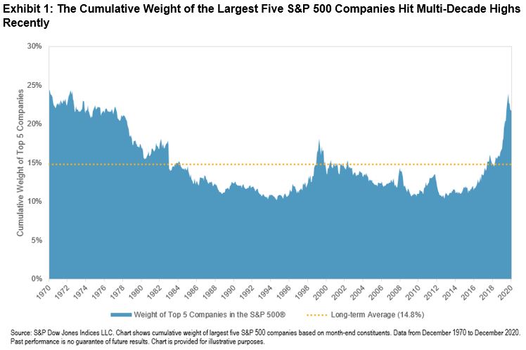
2020 witnessed outperformance from some of the largest S&P 500® companies as investors expected these firms to be better placed to navigate the COVID-19 environment. Exhibit 1 shows that this outperformance led to the largest names accounting for an unusually high proportion of the U.S. large-cap equity benchmark, and therefore having a bigger impact on the index’s returns. For investors looking to gain large-cap exposure with lower sensitivity to the biggest names, and potentially to take advantage of reductions in market concentration, Equal Weight may be worth considering.

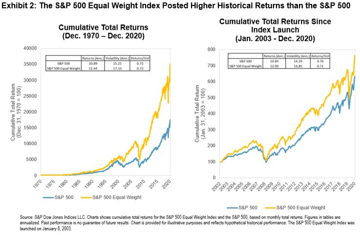
Launched in January 2003, the S&P 500 Equal Weight Index weights each S&P 500 company equally at each quarterly rebalance. Exhibit 2 shows the historical benefit from applying this weighting scheme within U.S. large caps; the S&P 500 Equal Weight outperformed since its launch as well as over its lengthier, back-tested history. Rather than being strictly a U.S. phenomenon, the outperformance in Equal Weight indices has been observed globally, including in Japan.

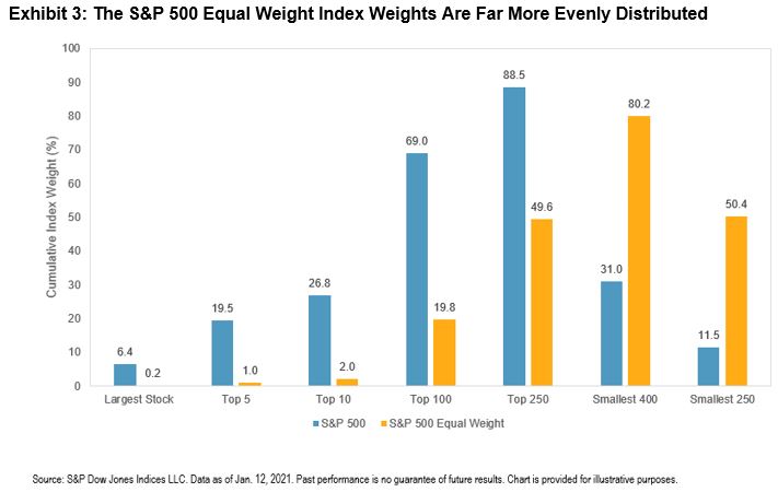
One of the key perspectives in explaining equal weight indices’ returns is their smaller size exposure: for example, over 50% of the historical variation in the S&P 500 Equal Weight Index’s relative returns is explained by size.  This exposure occurs because, as Exhibit 3 illustrates, the distribution of weights within equal weight indices is far more even than within their market-cap weighted parents. For example, the S&P 500 Equal Weight Index is far less sensitive to the performance of the largest names in the market and offers more exposure to smaller S&P 500 companies.

Equal weight’s smaller size exposure helps to explain the link between market concentration and equal weight’s relative returns. All else equal, if the largest companies (to which equal weight has less sensitivity) outperform, concentration rises, and equal weight is likely to underperform its cap-weighted benchmark. Conversely, outperformance among smaller companies (to which equal weight has greater allocations) leads to reduced concentration and the likelihood of equal weight outperformance.

Exhibit 4 shows that this dynamic is exactly what has been observed historically. The S&P 500 Equal Weight Index’s cumulative relative total return versus the S&P 500 typically rose (fell) as concentration, measured by the cumulative weight of the largest five S&P 500 companies, fell (rose). This dynamic includes December 2020, when Equal Weight outperformed and concentration declined as the beginning of vaccine rollouts particularly benefited smaller companies that had been more impacted by the “COVID correction” last year.

The current market environment may present an opportunity for investors to consider Equal Weight in order to diversify away from some of the largest market constituents. The S&P 500 Equal Weight Index’s smaller size bias may also benefit investors anticipating reductions in market concentration.

The posts on this blog are opinions, not advice. Please read our Disclaimers.

A Different Kind of Bubble

Contributor Image
Anu Ganti

U.S. Head of Index Investment Strategy

S&P Dow Jones Indices

Information Technology was the top-performing sector in 2020, up 44%, while Momentum (up 28%) was the second best-performing factor. These two results are reminiscent of the bubble we experienced two decades ago. But the Tech sector of today is not your father’s Tech sector. Similarly, we can analyze the market from a factor perspective and look at the characteristics of Momentum today versus in the late 1990s. In several respects, the differences outweigh the similarities.

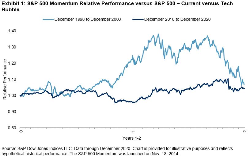
First, the recent run-up in the S&P 500® Momentum Index is much less extreme than during the late 1990s, as we see in Exhibit 1.

Moreover, Exhibit 2 illustrates that the relative volatility of Momentum was much higher then (December 1998-December 2000) than it is now, with an annualized standard deviation of daily relative returns of 15.9%—almost double the current period’s standard deviation of 8.1% (December 2018-December 2020).

Finally, there are significant differences in the current factor exposures of Momentum relative to December 1999. Exhibit 3 shows that the S&P 500 Momentum Index consistently has a strong tilt toward the Momentum factor. Stocks with large cap and low value exposures were outperforming both in 1999 and currently, leading to their inclusion in the Momentum index.

However, the Momentum index’s exposure to the low volatility factor has grown, and its exposure to the high beta factor has diminished. This suggests that the stocks within the current Momentum index are less volatile than they were 20 years ago, substantiating the results we saw in Exhibit 2.

In this era of mega-cap dominance and bubble-like euphoria, concerns about concentration naturally come to mind. Exhibit 4 illustrates that concentration in the S&P 500, measured by the cumulative weight of the five largest constituents, has increased considerably in the past year. The five largest stocks in the S&P 500 composed 20.2% of the total index by weight in December 2020, higher than the December 1999 levels of 16.6%.

If indeed we are in the midst of a bubble, it is important to understand the differences compared to past ones. And while timing the end of a bubble is no small feat, we know that the market experienced a reversal in Q4 2020, with the comeback of smaller caps and Equal Weight. If these trends continue, then a subsequent decline in concentration and shift in the factor make-up of the market could be in the cards.

The posts on this blog are opinions, not advice. Please read our Disclaimers.