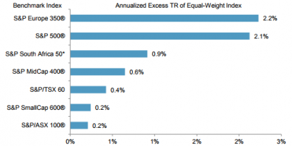
Our recent paper explores the characteristics and applications of equal-weight indices from various standpoints. Since a number of equal-weight indices have outperformed their corresponding cap-weighted parents over the past 15 years, one of the most interesting perspectives asks if factors can help to explain the excess returns of equal weight. Which factors are most relevant? And just how important are they in explaining the returns to equal-weight indices?
Exhibit 1: Annual Outperformance of Equal-Weight Indices
Source: Outperformance in Equal-Weight Indices. Past performance is no guarantee of future results. Chart is provided for illustrative purposes.
Small Size matters, and so does (anti-) Momentum
The most obvious candidate for explaining the performance of equal weight is size. In comparison to cap-weighted indices, equal-weight indices are much less concentrated in the largest constituents and have much greater exposure to smaller stocks. Exhibit 2 shows that whereas the largest 10% of stocks (by market cap) accounted for nearly 50% of the total weight in the S&P 500®, the same stocks accounted for only 10% of the weight in the S&P 500 Equal Weight Index. Conversely, the smallest 40% of stocks accounted for just one tenth of the total weight in the S&P 500, compared to 40% in its equal-weight counterpart.
Exhibit 2: Comparing Constituent Sizes and Cumulative Weights.
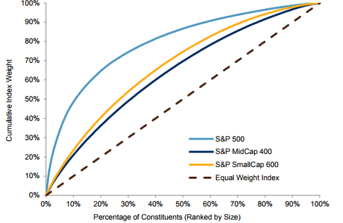
Source: Outperformance in Equal-Weight Indices. Past performance is no guarantee of future results. Chart is provided for illustrative purposes.
Another clear choice is momentum. An equal-weight index rebalances by selling relative winners and purchasing relative losers. This is opposite to what a momentum strategy does, and so it is unsurprising that equal-weight indices have generally performed relatively better when their corresponding momentum index has fared relatively poorly, and vice-versa.
Regression Analysis
In order to see how much of the variation in equal-weight indices’ excess returns is accounted for by these two factors, it is possible to run a simple linear regression. Focusing on the S&P 500 Equal Weight Index, we calculated 12-month excess returns each month between September 1995 and December 2017. Doing the same for the S&P 400 MidCap® and the S&P 500 Momentum Index gives the excess returns of our proxies for the size and momentum factors, respectively.
Exhibit 3 summarizes a regression of excess returns to the equal-weight index on the excess returns to the factor proxies. We can clearly see that the signs of the size and momentum coefficients match what we would expect; there is a positive size loading and a negative momentum loading.
Exhibit 3: Regression statistics
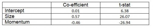
Source: S&P Dow Jones Indices. Data from Sep. 1995 to Dec. 2017. Past performance is no guarantee of future results. Table is provided for illustrative purposes.
Using these regression coefficients to derive a predicted 12-month excess returns in the equal-weight index, Exhibit 4 shows that the size and anti-momentum effects captured the majority of the observed variation in S&P 500 Equal Weight performance; there is an R-squared of 0.88.
Exhibit 4: Comparing relative performances of the S&P 500 Equal Weight Index
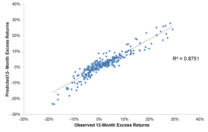
Source: S&P Dow Jones Indices. Data from Sep. 1995 to Dec. 2017. Past performance is no guarantee of future results. Table is provided for illustrative purposes.
Of course, this factor analysis is not the only way to explain the characteristics and applications of equal-weight indices – as our paper shows, sector and constituent level approaches are also useful. However, market participants would be well-served to account for size and momentum when assessing the performance of equal-weight indices. Such analysis helps to explain why the S&P 500 Equal Weight Index underperformed the S&P 500 in 2017, when momentum was the best-performing S&P 500 factor strategy, and smaller size exposure proved a hindrance.
The posts on this blog are opinions, not advice. Please read our Disclaimers.