Get Indexology® Blog updates via email.

In This List

Fixed Income in Stressful Times

Coronavirus Hits Commodities Markets in February

Profiling the "Personality" of 2 Dividend Strategies – A Factor Look: Part 2

U.S. Equities: Staying the Course

The Most Dangerous Words

Fixed Income in Stressful Times

Contributor Image
Brian Luke

Senior Director, Head of Commodities, Real & Digital Assets

S&P Dow Jones Indices

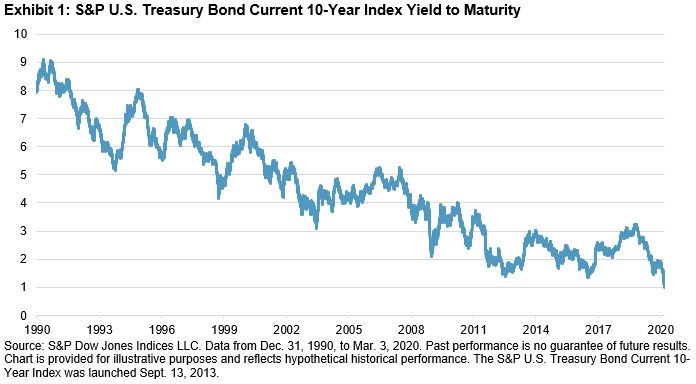
For those wondering what role fixed income would have in their portfolio at record-low yields, they had to wait just one week. On Friday, Feb. 21, 2020, we hit a record-low yield for the 30-year Treasury, as the S&P U.S. Treasury Bond Current 30-Year Index yield fell to 1.92%. The next week, the Dow Jones Industrial Average proceeded to shed over 3,500 points and Treasuries maintained their safe haven status. Following an emergency 50 bps rate cut by the Fed, the 10-year set an all-time low, falling below 1% for the first time. The double digit returns in bonds YTD continue to buffer losses in investors’ portfolios.

The continual downward march in yields has created large shifts in the fixed income market structure, affecting investors who benchmark their portfolios to indices. Borrowers, for the most part, have taken advantage of lower rates to issue debt at lower levels, which lowers the potential return for investors. The coupon rates for fixed income indices have fallen 1%-2% over the past decade (see Exhibit 2). Ten years ago, investment-grade issuers were paying an average coupon of around 6%, while that is closer to what high-yield issuers pay today. While coupons have fallen, the interest rate risk has risen, as measured by modified duration. Borrowers have issued longer dated debt, increasing the index average by nearly 30% and 40% for investment grade and Treasury indices, respectively (see Exhibit 3). While interest rate risk has gone up, credit risk, as measured by the average credit rating of investment-grade issuers, has also increased (see Exhibit 4). BBB-rated securities account for 54% of the investment-grade market, up from 21% in 2000.

Futures markets seem to point to higher potential volatility in 2020 as we near the November 2020 general election. VIX® futures price a premium leading into the November 2020 election and current delegate counts show a stark contrast in political policy to challenge the incumbent. With stocks coming off record highs and markets pricing for increased volatility around Election Day, there still appears to be a place for bonds in your portfolio.

Market participants today are living in a stressful environment, which includes rising interest rate risk, credit risk, and volatility risk. The potential diversification benefit of bonds in a portfolio context should be considered.

The posts on this blog are opinions, not advice. Please read our Disclaimers.

Coronavirus Hits Commodities Markets in February

Contributor Image
Fiona Boal

Managing Director, Global Head of Equities

S&P Dow Jones Indices

The S&P GSCI, a widely recognized measure of broad commodities market beta, fell 8.4% in February. The global spread of coronavirus represents a simultaneous demand and supply shock, a situation that is close to unprecedented in global commodities markets. Across these markets, losses in February were driven by the petroleum complex and livestock, while even precious metals was not accretive to headline performance.

The S&P GSCI Petroleum was down 12.5% in February. The spread of coronavirus had a measurable impact on demand for petroleum products, and particularly so in China, where factories and transportation infrastructure in the worst-affected regions have been shut down for weeks. Oil prices tend to reflect current physical supply and demand conditions, which means that they are often the first to respond to slowdowns in global economic activity, particularly if they are caused by a demand shock. The International Energy Agency (IEA) cut its 2020 global oil demand estimates in mid-February. The IEA is now forecasting a 435,000 barrel per day drop in global oil demand year over year for Q1 2020; this would be the first quarterly drop in demand in more than 10 years. On the supply side, OPEC+ has yet to react to the virus-related slump in demand by making additional production cuts. After only two months, the S&P GSCI Brent Crude Oil was down 24% year to date.

Gold remains one of the only bright spots in the commodities complex, but even it came under some pressure at the end of February, with the S&P GSCI Gold falling 1.2% in February. Gold’s popularity among investors has risen over the past 12 months in response to heightened global geopolitical tensions and falling global interest rates. This popularity was buoyed even further by the spread of coronavirus, which has added a new layer of uncertainty and complexity to global financial markets. Gold can benefit during periods of financial ambiguity and when investors’ appetite for risk is tempered, because it is viewed as an excellent store of value and in many cases can be held outside of the traditional financial market ecosystem.

Relative to other commodities, the S&P GSCI Industrial Metals exhibited a muted decline of 1.2% for the month. Looking beneath the surface, there was more disparity. Most metals declined, but the S&P GSCI Zinc was down the most, declining 8.4% and catching up with the underperformance seen in January from the rest of the base metals. Zinc inventory levels hit a 20+ year low at the London Metal Exchange on Feb. 4, 2020, but supply then shot higher by over 50% a few days later, helping to exacerbate the move lower in price. On a positive note and after a double-digit down month in January, the S&P GSCI Copper showed some signs of life, up 1.4% in February.

The S&P GSCI Agriculture fell 2.9% in February. Losses were spread evenly across the grains and softs markets, with only coffee bucking the trend. The S&P GSCI Coffee ended the month up 6.4%, enjoying somewhat of a bounce that was driven by tighter supplies of washed, quality coffee and speculators starting to liquidate short positions.

Live cattle prices plunged in February, leaving the S&P GSCI Livestock down 6.1% for the month. The potential spread of coronavirus in the U.S. has especially negative implications for beef demand given that beef is the most important meat protein in the foodservice sector and is also the most expensive animal protein source.

The posts on this blog are opinions, not advice. Please read our Disclaimers.

Profiling the "Personality" of 2 Dividend Strategies – A Factor Look: Part 2

Contributor Image
John Naas

Investment Advisor

TD Wealth

What story is Optimal Asset Management’s Factor Allocator’s analysis trying to tell us?  First, it is important to note each strategy has a factor fit quality reading above 80% (the S&P 500 High Dividend Index – 83.72% and the S&P 500 Dividend Aristocrats – 87.62%) which means the analysis of factor exposures appears useful in the explanation of the variation in returns of each strategy.  So, considering the historical performance of each of the factors explained above as well as how they each tend to behave during different market regimes, the S&P 500 High Dividend Index’s larger exposure to Value and Low Momentum coupled with its lack of Quality exposure may lead you to believe that S&P 500 High Dividend Index would have offered more volatility and lower returns when compared to the S&P 500 Dividend Aristocrats.

What about performance?  How has the historical performance of these two indices reflected their underlying factor exposures?  The table below is the performance since January 1995 for each strategy compared to the S&P 500 as of November 29, 2019 according to the Factor Allocator tool.

Interestingly both strategies performed well versus the S&P 500 with excess returns.  However, as suspected the S&P 500 High Dividend Index provided this return by experiencing more volatility.  Alternatively, the S&P 500 Dividend Aristocrats provided higher returns while providing a lower volatility experience.

So, while the Factor Allocator indicates each dividend index had a healthy exposure to the Low Volatility factor that would lead you to believe there would be some similarity in returns between the two, it was their differences that told the rest of the story.

What lesson can we learn from this analysis?  Factors can provide you a personality profile of the index portfolio to give you some indication of what you might expect.

The information contained herein has been provided by Andrew Neatt, Portfolio Manager and Investment Advisor with TD Wealth Private Investment Advice and is for information purposes only. The information has been drawn from sources believed to be reliable. Graphs and charts are used for illustrative purposes only and do not reflect future values or future performance of any investment. The information does not provide financial, legal, tax or investment advice. Particular investment, tax, or trading strategies should be evaluated relative to each individual’s objectives and risk tolerance.
Index returns are shown for comparative purposes only. Indexes are unmanaged and their returns do not include any sales charges or fees as such costs would lower performance. It is not possible to invest directly in an index.
TD Wealth Private Investment Advice is a division of TD Waterhouse Canada Inc., a subsidiary of The Toronto-Dominion Bank.
All trademarks are the property of their respective owners.
® The TD logo and other trade-marks are the property of The Toronto-Dominion Bank.

The posts on this blog are opinions, not advice. Please read our Disclaimers.

U.S. Equities: Staying the Course

Contributor Image
Hamish Preston

Head of U.S. Equities

S&P Dow Jones Indices

The last few days have been turbulent for financial markets as coronavirus contagion fears took hold.  Global equities fell; the S&P 500®’s 6.6% price return plunge since the end of last week wiped off its year-to-date gains; recent U.S. sector and industry declines mean that nearly all S&P Composite 1500® industries are down month-to-date; and safe havens rallied – the 10-year U.S. Treasury yield hit an all-time low on Tuesday.  Unsurprisingly, perhaps, VIX® spiked earlier this week, closing above 25 for the first time in over a year on Monday.

Amid the recent turbulence, people may be tempted to turn their back on equities in favor of so-called safe havens.  But while this strategy may help to mitigate losses in the short-term, it is worth remembering that rotating out of equities has risks, too: the difficulty in timing the market means there is a danger of missing out on upside participation.  This is especially relevant given the current dispersion-correlation environment suggests it is unlikely that we’re on the cusp of a sustained bear market.

Exhibit 2 shows the average 1-month, 1-quarter, 6-month, and 1-year S&P 500 price return following various daily price returns for the U.S. large-cap equity benchmark, based on data over the last 50 years.  The daily price returns (x-axis) were chosen such that 5% of daily moves fell into each “bucket”.  Quite clearly, the S&P 500 typically rose, with stronger price returns usually following larger market declines.  For example, the subsequent returns for the leftmost bucket ranked as the first, second, second, and third highest across 1-month, 1-quarter, 6-month, and 1-year horizons, respectively.

Given the inherent difficulty in correctly anticipating market movements – for example, not many people predicted the S&P 500’s record-setting start to 2019 following the turbulent Q4 2018 – using sectors to express views may provide a useful way to maintain asset allocations while dialing risk up or down within equities: sector rotation can be just as powerful in allowing market participants to express views.

And for those considering turning to active management under the belief that active managers are better able to navigate periods of market volatility, our Risk-Adjusted SPIVA Scorecard offers pause for thought.  Most U.S. equity active managers underperformed their index benchmarks on a risk-adjusted basis over 5-, 10-, and 15-year horizons.  In other words, there is little evidence to suggest that active managers are better at managing risks than their index benchmarks.

In conclusion, even though we will have to wait and see how the market works through coronavirus fears, market participants may wish to consider staying the course by maintaining exposure to equities via an indexed-based approach.


The posts on this blog are opinions, not advice. Please read our Disclaimers.

The Most Dangerous Words

Contributor Image
Craig Lazzara

Former Managing Director, Index Investment Strategy

S&P Dow Jones Indices

The four most dangerous words in investing are “This time it’s different.”  –  Sir John Templeton

As investors ponder the ultimate extent of the coronavirus epidemic, this week’s equity market declines are of natural concern to every asset owner.  The obvious question, after near-record point drops in major indices yesterday and today, is how much worse the damage might get.

To relieve your suspense immediately, I confess that I don’t know.  Furthermore I don’t know anyone who does know, and I am cynical enough to suggest that anyone who claims to know should be presumed to have a tenuous (and possibly mendacious) grasp of reality.  It’s not just the compliance department that keeps us from giving investment advice.

What we can do, however, is to offer some insights from our study of index dynamics.  In 2016, we introduced the dispersion-correlation map to provide perspective on both good and bad markets, as shown in Exhibit 1.

Exhibit 1.  Dispersion-Correlation Map for S&P 500

Source: S&P Dow Jones Indices. Graph is provided for illustrative purposes. Past performance is no guarantee of future results.

Each point in the exhibit represents the average dispersion and correlation for the S&P 500 in the indicated calendar year; the numbers in parentheses are the year’s total return.   The exhibit shows that truly bad markets —  the deflation of the technology bubble, or the global financial crisis — have only occurred in the presence of very high dispersion.  The converse is not true — some high dispersion years have seen strong positive returns.  But it’s fair to observe, based on data back to 1991, that high dispersion seems to be a necessary though not sufficient condition for a bear market.

Comparing the month ended February 24th with these historical data suggests that we are not on the verge of a prolonged market decline.  This conclusion is reinforced when we look at monthly data for two notably bad years.

Exhibit 2.  Dispersion and Correlation by Month, 2001 and 2008

Source: S&P Dow Jones Indices. Graph is provided for illustrative purposes. Past performance is no guarantee of future results.

The data in Exhibit 2 show dispersion and correlation for individual months, as opposed to the annual averages of Exhibit 1.  It’s  clear that current dispersion levels are far below those prevailing in 2001 or 2008.  This can change, of course — in 21 more days we’ll have a completely new set of observations.  And it’s certainly possible that the pattern we’ve observed for the past 30 years can admit of an exception.  But unless such an exception occurs, or unless dispersion increases dramatically from its current level, it seems unlikely that we’re on the cusp of a sustained bear market.

The posts on this blog are opinions, not advice. Please read our Disclaimers.