Get Indexology® Blog updates via email.

In This List

Smart Beta in India

Positive Commodity Years Typically Don't Show Up Alone

Remarkably Unremarkable

Visualizing Factor Exposures

Rieger Report: Municipal bonds in 2017?

Smart Beta in India

Contributor Image
Akash Jain

Director, Global Research & Design

S&P BSE Indices

2016 has been an unpredictable year on many fronts, whether it was Leicester City FC winning the Premier League, the Brexit, or the U.S. election results.  In India, “demonetization” and the Goods and Services Tax (GST) are fundamentally altering fund managers’ target portfolios.  Active institutional fund managers have the benefit of professionally run research teams.  The question is, therefore, how do individual market participants churn their portfolios in times of such volatility?

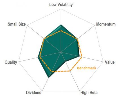
Many active portfolio managers have been adopting risk factors to achieve portfolio diversification and deliver excess returns.  These common risk factors include size, dividend, volatility, momentum, quality, and value.  In recent years, an increasing number of passive investment products have been designed to capture the potential benefits of factor-based investing (also referred to as “smart beta”) as well as the transparency and cost effectiveness of passive investing.

We recently published a report called Factor Risk Premia in the Indian Market, which studies the risk/return characteristics of common risk factors in the Indian equity market.  The research analyzed four common equity risk factors—low volatility, risk-adjusted momentum, quality, and value—based on the S&P BSE LargeMidCap universe back-tested from Sept. 30, 2005, to April 30, 2016.  Using the monthly return of the S&P BSE LargeMidCap to define up and down markets, we summarized the performance of different factors under these two market conditions.

The low volatility portfolio delivered significant excess return in the overall period, and the excess return was more pronounced during down markets.  The quality portfolio, which was constructed using a combined score on return on equity (ROE), the balance sheet accruals ratio, and the financial leverage ratio, demonstrated similar defensive characteristics as the low volatility portfolio.  In contrast, the value portfolio, constructed using book-to-price, earnings-to-price, and sales-to-price ratios, tended to outperform during up markets but significantly underperforms in down markets.  The risk-adjusted momentum portfolio did not deliver significant excess returns in the overall period, despite significantly outperforming the benchmark during down markets.

The analysis shows that different risk factors in the Indian equity market have distinct characteristics and, therefore, they can be used for the implementation of active investment views.  Moreover, blending risk factors with low return correlation may also provide portfolio diversification to mitigate risk.

smart-beta-blog-2016


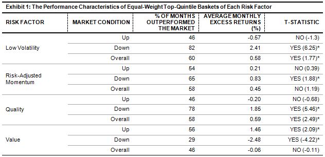
Above risk factor portfolios are hypothetical equal-weight portfolios.

Source: S&P Dow Jones Indices LLC.  Performance data is based on total return in INR.  Data from Sept. 30, 2005, to April 30, 2016.  Past performance is no guarantee of future results.  Table is provided for illustrative purposes and reflects hypothetical historical performance.  Please see the Performance Disclosure available in the research paper for more information regarding the inherent limitations associated with back-tested performance.  Up months are those months when the float-market-cap-weighted S&P BSE LargeMidCap had positive returns.  Down months are those months when the float-market-cap-weighted S&P BSE LargeMidCap had negative returns.  Percentage of months that outperformed the market and average monthly excess returns were calculated using the float-cap-weighted S&P BSE LargeMidCap as the benchmark.

*Implies significance at a 5% level.

The posts on this blog are opinions, not advice. Please read our Disclaimers.

Positive Commodity Years Typically Don't Show Up Alone

Contributor Image
Jodie Gunzberg

Former Managing Director, Head of U.S. Equities

S&P Dow Jones Indices

Commodities ended 2016 by posting the first positive returns in 4 years. The S&P GSCI Total Return gained 11.4% and the DJCI (Dow Jones Commodity Index) gained 13.3%.  Energy was the best performing sector gaining 18.1% in the S&P GSCI, and livestock performed worst, losing 7.3%. Agriculture, industrial metals and precious metals returned -4.2%, 17.6%, and 8.4%, respectively. It was the energy sector’s best year since 2007, when it gained 41.9%. It was also the industrial metal’s best year since 2009, when it gained 82.4%. The comeback in these two sectors together is meaningful since they are the most economically sensitive. The last time these two sectors were up this much together after two consecutive negative years was in 1999, that led commodities to return roughly 360% through 2007.  Through history since 1970, the average number of consecutive positive years is 3.5 years with rarely a single positive year.

Source: S&P Dow Jones Indices

In 2016, there were 17 positive commodities of 24 total, that is the most since 2010 when 21 were positive. It is also the greatest comeback (from only 2 positive commodities last year, namely cocoa and cotton) since the 2009 improvement when 18 were positive after only 2 gained in 2008 – cocoa and gold.  This year, cocoa was the worst performing commodity, losing 33.0%, while zinc performed best, gaining 57.4%. For cocoa, 2016 was the 3rd worst on record but it was the 3rd best year for zinc.  Despite some relatively high and low rankings, the overall index performance rank fell exactly in the middle of its historical performance ranking both its 24th best and 24th worst year.  Also, although many commodities of energy and industrial metals did well, the sectors’ returns only ranked as their 14th (energy) and 12th (industrial metals) best years.

Source: S&P Dow Jones Indices

One potential concern is there were only six commodities (cocoa, cotton, feeder cattle, natural gas, sugar and wheat) in backwardation in December which is just below the average number of 6.8 for this time of year, which means there still needs to be more inventory drawn down before there are persistent shortages.

However, while the S&P 500 beat the S&P GSCI in 2016, by 59 basis points, extending the commodity consecutive annual under-performance to a new record of nine years, the gap is closing that could indicate a turning point in the cycle for commodities.

The three most powerful influences on commodities in 2017 are OPEC’s ability to manage oil production in the face of US competition, Trump’s impact on inflation and growth, and a potential weakening dollar. 

OPEC

  • OPEC’s decision gave energy a huge bump up in the last month, its biggest gain since April, but the upside can be capped depending on three things: 1. Whether all the participants follow through on the agreement.
  •  How the US producers respond  – since US inventories need to be low for OPEC’s decision to matter.
  •  Whether China might slow buying as prices rise – or even worse, start exporting their stockpiles which are somewhat unknown. (China could also put a stop on the metals rally from exporting stockpiles – like it did on the nickel rally in 2014).

Trump and Inflation

  • Historically Republican presidencies are favorable for grains and gas which are key to rising inflation. Moreover, copper, lead and nickel have had their best performance with Republicans. That in itself does not promise growth since rising inflation from commodity prices can cause stagflation – BUT stagflation is less likely if Trump builds infrastructure and jobs growth which may propel GDP and help the metals.
    • Industrials have outperformed as much as 15% annualized on average of industrial metals during Republican (over Democratic) rule.
    • Also,  industrial metals outperformed precious metals last month by the most in 26 years. This is considered extremely bullish. The bullish sentiment is also showing itself in the falling correlation between the metals, meaning investors are specifically seeking growth in industrial metals instead of hiding in the safe haven of gold.

Weakening Dollar?

  • Although the dollar theoretically should rally from rising rates, that relationship hasn’t held. So, even if rates rise more, there is a chance the dollar will revert after continually hitting new recent highs – that can lift commodities substantially. In fact, every single one of the 24 commodities we track rises from a falling dollar, especially industrial metals which can rise as much as 7% for every 1% the dollar falls.


The posts on this blog are opinions, not advice. Please read our Disclaimers.

Remarkably Unremarkable

Contributor Image
Fei Mei Chan

Former Director, Core Product Management

S&P Dow Jones Indices

In geopolitical terms 2016 was a tumultuous year. From the outcome of the Brexit referendum to the surprising conclusion of the U.S. presidential election, 2016 was a year of political surprises. The markets, braced or not, reacted differently in each case. We saw heightened correlation in the aftermath of Brexit and observed higher dispersion immediately after the U.S. presidential election.  Heightened dispersion and/or correlation levels can accompany market weakness, but in both of these cases, the markets rallied and dispersion and correlation readings returned to average levels in fairly short order.

Despite being buffeted by remarkable political events, 2016 looks unremarkable in terms of our dispersion-correlation map. For the U.S., November’s spike in dispersion after the election was resolved by the end of December. Dispersion returned to below-average levels and, for all of 2016, dispersion and correlation essentially plot at the midpoint for the last 26 years. One would be hard-pressed to find a more nondescript point. It’s a very similar story in Europe, even though the U.K.’s exit from the European Union is a work in progress. In Asia, dispersion is lower than average while correlation is right around average.  Market dynamics can certainly change quickly, but dispersion levels suggest that adding value by active management will continue to be challenging.

Dispersion-Correlation Maps

remarkably-unremarkable1 remarkably-unremarkable2 remarkably-unremarkable3

The posts on this blog are opinions, not advice. Please read our Disclaimers.

Visualizing Factor Exposures

Contributor Image
Craig Lazzara

Former Managing Director, Index Investment Strategy

S&P Dow Jones Indices

Measuring the away-from-benchmark exposures of active portfolios (or “smart beta” indices) is not inherently complicated.  To what degree, for example, is a portfolio cheaper than its benchmark, or more tilted toward high quality stocks?  Practitioners typically approach the question in one of several ways:

  • Calculating weighted average differences – e.g., the yield on my portfolio is 3.0% vs. my benchmark’s yield of 2.1%.
  • Calculating standardized (Z) scores – e.g., my portfolio is 0.4 standard deviations cheaper than my benchmark.
  • Performing a regression analysis – e.g., 20% of historical return is attributable to my portfolio’s exposure to the momentum factor.

Each of these methods (especially the first) has some intuitive appeal, but none of them tells us how difficult or easy it might be to achieve a given level of factor exposure.  If I want to target 0.4 standard deviations of cheapness, in other words, or 90 basis points of incremental yield, how easy is it to get there?

Here’s a simple and intuitive approach:

  • List every stock in the benchmark in factor order, noting also each stock’s benchmark weight.  If quality is a factor of interest, e.g., rank each benchmark stock by its quality score, and keep track of its benchmark weight.
  • Form portfolios.  Portfolio 1 owns 1% of index cap — the 1% with the lowest quality score.  (Depending on the interaction of quality and index cap, Portfolio 1 might hold only one stock.)  Portfolio 2 is the lowest quality 2% of the index, Portfolio 3 is the lowest quality 3%, etc.
  • Portfolio 100, in this construction, is the benchmark itself.  The weighted average factor exposure of Portfolio 100 tells us our benchmark’s factor exposure.
  • We can keep going: Portfolio 101 excludes the lowest quality 1%, Portfolio 102 excludes the lowest quality 2%, and so on.  In this way we proceed to Portfolio 199, which includes only the highest quality 1% of the benchmark.  (Alternatively, portfolio 199 excludes the lowest quality 99% of the benchmark.)
  • We now have a series of portfolios from 1 to 199, with decreasing exposure to the factor in question.  We can compare any other index (or active portfolio) to these portfolios by calculating its weighted average factor score.

Defining portfolios in this way provides a useful link to the concept of active share .  The active share of portfolio 100 is 0%.  The active share of portfolios 99 and 101 is 1%, the active share of portfolios 98 and 102 is 2% – and so on until we reach portfolios 199 and 1, both with active share of 99%.  Since active share is an indicator of portfolio aggressiveness, it gives us a way to answer the question we asked earlier — if I want to target 0.4 standard deviations of cheapness or 90 basis points of incremental yield, how easy is it to get there?  If 90 basis points of incremental yield requires an active share of 40%, say, it’s not a big deal.  If it requires an active share of 80%, it’s much tougher to do.

For every factor in which we’re interested, we can create a series of 199 portfolios with steadily increasing factor exposure.   We can then position any portfolio of interest on a scale derived from these 199 factor portfolios (in fact, 7 times 199 such portfolios, one set of portfolios for each factor).  For example:

sample-factor-index

The dotted orange line represents the S&P 500 benchmark, with an active share of 0%.  The origin, and the outer rim of the chart, both reflect an active share of 100%.  The origin represents tilts away from the factor, while the outer rim reflects tilts towards the factor.   This means that, although low volatility and value, say, are scaled differently, on our graph they achieve an analogous and logical representation.

The posts on this blog are opinions, not advice. Please read our Disclaimers.

Rieger Report: Municipal bonds in 2017?

Contributor Image
J.R. Rieger

Former Head of Fixed Income Indices

S&P Dow Jones Indices

A look back may be a telling way to view municipal bonds in 2017. The modest total return of the S&P Municipal Bond Index (0.77%) in 2016 masked an atypical year of volatility for the normally staid market place.  During the year, municipal bonds enjoyed being one of the ‘risk off’ asset classes and as low and negative yields permeated the global bond markets municipal bonds became a source for incremental yield over other options.  Countering all the positives was the worst performing month for municipal bonds since 2008 as November (the index was down over 4.8%) reflected the tax uncertainty the future holds for tax-exempt bonds post the U.S. presidential election.

Table 1: Select bond indices, their yields and returns as of December 30, 2016:

1) Yield represented is Yield to Worst as of December 30, 2016 2) Taxable Equivalent Yield assumes a 39.6% tax rate. Source: S&P Dow Jones Indices, LLC. Data as of December 30, 2016. Table is provided for illustrative purposes. It is not possible to invest directly in an index. Past performance is no guarantee of future results.

How does this impact 2017?

  • The devastation of municipal bond prices following the U.S. presidential election has created opportunities as the yields of non-callable, investment grade, tax-exempt municipal bonds have risen to a point where they cannot be ignored. Two examples are:
    • The five year range tracked in the S&P AMT-Free Municipal Series Dec 2022  and the ten year range tracked in the S&P AMT-Free Municipal Series Dec 2026 had year-ending yields higher than their U.S. Treasury bond equivalents and when viewed from the perspective of Taxable Equivalent Yield the yields of municipal bonds ended incrementally higher in yield than similar U.S. corporate bonds.
  • Factors impacting municipal bonds in 2017 could include:
    • Clarity on potential tax law changes. Potential tax rate cuts along with other changes could impact the value of tax-exempt municipal bonds negatively.
    • New issue supply.
    • Inflation expectations.
    • Sourcing of funding for U.S. infrastructure improvements.  Infrastructure has typically been funded via the municipal bond markets.  Alternative bond like financing could have an impact on supply.
    • Continued and elevated global uncertainty driving ‘risk off’ investing behavior. (Russia, Syria, China et al)
    • Continued and sustained global low and negative yield environments fueling the drive for yield.
    • Retail investor sentiment as measured by fund inflows and outflows continues to play an important role in the direction of bond prices and hence returns in the municipal bond market.

A deeper dive into 2016 performance:

  • The S&P Municipal Bond Investment Grade Index ended in positive territory but underperformed relative to its corporate bond peer substantially due to the tax uncertainty illustrated in November 2016. The result is that yields have risen to become attractive verses taxable bonds.
  • The S&P Municipal Bond High Yield Index was impacted by the rebound in Puerto Rico but also underperformed verses corporate bonds. This complex and less liquid market has historically demanded a ‘yield premium’ which currently is illustrated in both its nominal yield and Taxable Equivalent Yield.
  • The S&P Municipal Bond Puerto Rico Index saw a rebound of over 11% in 2016 as the future of the revenue bonds became a bit clearer.  However, there is much more work to be done in Puerto Rico.
  • Long duration ‘tobacco settlement bonds tracked in the S&P Municipal Bond Tobacco Index also saw another year of positive returns. Down over 6.7% for the last three months of the year, the index still reflected a positive 4.79% in total return for 2016. Advance refundings of higher cost debt also contributed to these returns and a slower pace of advance refundings may be seen in 2017 particularly if rates continue to rise. An important negative is the long duration nature of these bonds.
  • Long duration high grade municipal bonds tracked in the S&P Municipal Bond 20 Year High Grade Index ended the year down over 2% after suffering through a tough last quarter down over 9%.  Another long duration segment that could suffer more as rates rise.
  • The high debt per capita of the Virgin Islands has finally caught up with the ‘Puerto Rico syndrome’ as this small sliver of the municipal bond market was down over 13%.  A 2017 recovery while not impossible would be surprising.

Table 2: Select bond indices tracking the five year maturity range, their yields and returns as of December 30, 2016:

1) Yield represented is Yield to Worst as of December 30, 2016 2) Taxable Equivalent Yield assumes a 39.6% tax rate. Source: S&P Dow Jones Indices, LLC. Data as of December 30, 2016. Table is provided for illustrative purposes. It is not possible to invest directly in an index. Past performance is no guarantee of future results.

Table 3: Select bond indices tracking the ten year maturity range, their yields and returns as of December 30, 2016:

1) Yield represented is Yield to Worst as of December 30, 2016 2) Taxable Equivalent Yield assumes a 39.6% tax rate. Source: S&P Dow Jones Indices, LLC. Data as of December 30, 2016. Table is provided for illustrative purposes. It is not possible to invest directly in an index. Past performance is no guarantee of future results.


The posts on this blog are opinions, not advice. Please read our Disclaimers.