Get Indexology® Blog updates via email.

In This List

Market Myopia

SPIVA U.S Scorecard: Measuring the Effectiveness of Passive Equity Investing in the US

Five-Year Itch in the Condo Market?

Beware The Bear: Turning Points Indicated By Mean Reversion

Sorry, Wrong Number

Market Myopia

Contributor Image
Tim Edwards

Managing Director, Index Investment Strategy

S&P Dow Jones Indices

As investors, we necessarily rely on history.  How we analyse that history is particular to each investor – some will look for technical patterns, some at fundamental data, still others will build quantitative models.  But all of us need data, and history is our only source.

We may have to rely on history; we don’t have to fall prey to what the behavioural economists would call “recency bias.”  Indeed, taking a longer-term view can provide invaluable perspective.  Two popular views of the current environment provide a specific example:

  • Unprecedented levels of low volatility driven by central bank stimulus in the past two years have caused the market to become complacent; valuations are proof positive of a stock market bubble.
  • Moreover, when the bubble “pops”, the modern market of leveraged derivatives, high frequency trading and globalized capital has engendered a greater risk of systemic volatility and, when things get interesting they are going to get very interesting, very fast.

A running thread in both theories is the “risk on/risk off” dynamic.  We are now either in utter turmoil or dulcet calm, each exaggerated by the rapid and capricious response of a highly mobile and sophisticated investment community.

An examination of recent history would appear to support these claims.  It certainly looks like a new, more volatile dynamic since the beginning of the financial crisis.  And as we all know, volatility has registered remarkably low levels more recently.  Are we set to continue in a bar-belled digital age of all volatility, or none?

Pic1

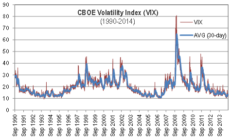
Now, there is a good reason why the chart above begins in 1990.  The VIX data begin then; we don’t know what the VIX would have been during the “black Monday” crash of 1987 (although there are clues, they suggest the answer is higher than at any point subsequently).  Nor do we have any idea of the appropriate level of implied volatility during the “Knickerbocker Crisis” of 1907.

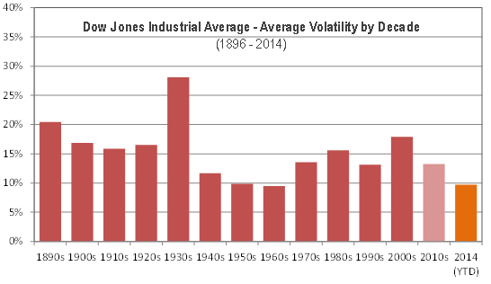
However, what we do have – in the Dow Jones Industrial Average – is a market bellwether with a remarkably comprehensive history.  Here is 118 years of realized monthly volatility in the DJIA:

Pic 2

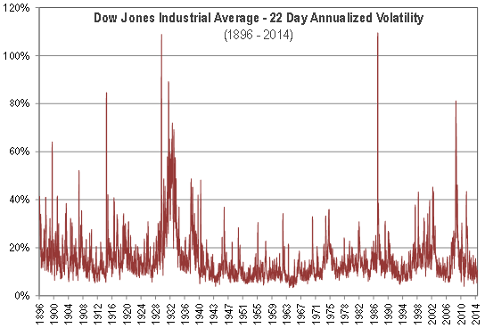
Clearly, long periods of low volatility are not unusual.  Whatever else may have been occurring in the 1960’s – and despite a war and an assassinated president – there wasn’t much turmoil in U.S. blue chips.  Extended periods of both high and low volatility have been a part of the market since it was invented.

Moreover, viewed in this longer perspective, the past decade appears thoroughly ordinary.  A bit less volatile than average recently, a bit more volatile than average during the 2000s.  But, in the grand scheme of things, it is business as usual. 

Pic 3

The phrase “it’s different this time”, uttered by a financial professional, typically provides grounds for mockery.  Sometimes it’s true.  But if you don’t take the long view, it’s hard to see whether this time is actually different at all. 

The posts on this blog are opinions, not advice. Please read our Disclaimers.

SPIVA U.S Scorecard: Measuring the Effectiveness of Passive Equity Investing in the US

Contributor Image
Aye Soe

Former Managing Director, Global Head of Core and Multi-Asset Product Management

S&P Dow Jones Indices

The SPIVA U.S Scorecard, published twice a year, is a de facto scorekeeper of the active versus passive debate. It measures the performance of the actively managed domestic equity funds across the various market capitalizations and styles. The results for the 2014 mid-year Scorecard are in and reveal very few surprises. Here are some of the key findings:

  1. The past 12 months have been quite a bullish ride for the domestic equity markets. The S&P 500®, S&P MidCap 400® and S&P SmallCap 600® returned 24.61%, 25.24% and 25.54%, respectively. During the same period, 59.78% of large-cap managers, 57.84% of mid-cap managers and 72.79% of small-cap managers underperformed the above-mentioned benchmarks.
  2. The past five years have been marked by the rare combination of a remarkable rebound in domestic equity markets and a low-volatility equity environment. Against that backdrop, over 75% of them across all capitalization and style categories failed to deliver returns higher than their respective benchmarks.
  3. On the international front, approximately 70% of global equity funds, 75% of international equity funds, 81% of international small-cap funds and 65% of emerging market funds underperformed their benchmarks over the past one year.
  4. For the first time since adding the International Equity category to the Scorecard, the report witnessed the majority of the international small cap managers underperforming the benchmark. The outcome was slightly more favorable when viewed over three- and five-year horizons, as over 50% of managers outperformed the benchmark.

The results unequivocally show the effectiveness of indexing in the U.S equity market. Together with the Persistence Scorecard, the results highlight that not only it is extremely difficult for active funds to outperform the benchmarks, it is near impossible to find that skillful manager who can effectively do so consistently year after year.

The posts on this blog are opinions, not advice. Please read our Disclaimers.

Five-Year Itch in the Condo Market?

Contributor Image
Marya Alsati

Former Product Manager, Commodities, Home Prices, and Real Assets

S&P Dow Jones Indices

In a prior post, we analyzed the holding period of single-family homes using the S&P/Case-Shiller Home Price Index Series. We quantified the holding period with the rolling return for each period in question—10-, 7-, 5- and 3-year holding periods. In this post, we use the same holding period concept to look into whether the condo market behaves differently than the single-family homes market and assess whether the same pattern holds across the different cities. The cities investigated are Boston, Chicago, Los Angeles, New York and San Francisco. We found that the five-year holding period was the worst-performing holding period across the five cities.

In the single family market, the longer 10-year holding period fared better than the shorter duration periods, and we found that of the shorter duration periods, the three-year period performed better than the five-year period. In the condo market in all five cities, the five-year period experienced the largest decline. To rule out that the cause of the five-year decline was the trough in 2012, we looked at the holding period’s behavior prior to 2012, and we found that the time period that experienced the largest decline was indeed the five-year period.

So what is the cause of this five-year itch? On average, American home owners sell and move every five-to-seven years according to the Census, for reasons ranging from the house being too small to a job transfer. Many variables that drive single-family homes drive the condo market: upgrade, change in demographic, the need to move to a single family home, neighborhood changes, cash in equity, etc. Property owners are less likely to base their decision to buy or sell on the state of the market, and they are more likely to make the decision for personal reasons, because it’s where they live and the place most likely to affect their quality of life.

We did find that while the five-year period was the one that fared the worst, the range of returns—gains and losses—varied across the five cities. The following charts show the different holding periods for Chicago and Los Angeles.

Capture

Capture

In the 10-year holding period, Chicago faired worst having the smallest gain of 93% and the largest decline of 20%. Los Angeles had the maximum gain of 300%. New York didn’t enter into negative territory in the ten year holding period with the smallest gain being 37%. Overall, home owners could benefit from longer holding periods in the condo market, albeit differently depending on their geographic location, but they may need to watch out for that five-year itch.

The posts on this blog are opinions, not advice. Please read our Disclaimers.

Beware The Bear: Turning Points Indicated By Mean Reversion

Contributor Image
Jodie Gunzberg

Former Managing Director, Head of U.S. Equities

S&P Dow Jones Indices

What a difference a summer makes. While many of us enjoy perfect weather, it is a nightmare for a long-only investor in agricultural commodities. Further, the drop in energy from easing supply disruptions in the middle east and slowing demand from China and the Eurozone have caused the Dow Jones Commodity Index (DJCI) to lose 7.3% in the third quarter and the S&P GSCI to lose 8.5%. This is a stark contrast from the first half of the year where the DJCI gained 5.4% and the S&P GSCI gained 7.7%. From the peaks on June 19, the indices are down 9.9% and 8.5% for DJCI and S&P GSCI, respectively.

Source: S&P Dow Jones Indices. Data from Jan 2, 2014 to Sep 5, 2014. Past performance is not an indication of future results.

The DJCI is halfway to the bear market, but this may not be the worst news for investors. As mentioned in the comments of a prior post, I have discussed in two book chapters, Absolute Returns in Commodity (Natural Resource) Futures Investments in Hedge Fund & Investment Management (Edited by Izzy Nelken) and also in The Long and Short of Commodity Futures Index Investing in Intelligent Commodity Investing (Edited by Hilary Till and Joseph Eagleye,) there are two major opportunities to capture returns in commodities, which are cyclical opportunities and systematic opportunities. Trend following systems can capture cyclical opportunities in commodities because only price can respond to balance supply and demand. This is since commodities in the short-run cannot be drilled, mined and grown causing relatively slow cycles of inventory building, which in-turn drives patterns of commodity prices to trend up and down. So, when there is a supply/usage imbalance in a commodity market, its price trend may be persistent, which may be captured by trend-following programs.

Trend following is strong historically in times of persistent shortages (backwardation) since the replenishing of inventories of commodities in shortage may be time consuming. Trend following may also work in times of persistent excess (contango) However, the run of contango commodities experienced from 2005-2012, seems to have ended and commodities are currently hovering at the line near equilibrium where short term disruptions swing the pendulum quickly.

It is debatable whether the shortages that appeared in 2013 and the first half of 2014 are gone for good. The inventory buildup may be temporary based on weather and geopolitics. However, one must keep focus on longer term factors like the strength of the dollar (which is historically inverse to commodity prices), rising inflation, rising interest rates and demand forces coming from China and other parts of the world.

Please join us along with +2,200 investment professionals for our S&P Dow Jones 8th Annual Commodity Seminar featuring Rob Arnott, Bob Greer and Kevin Norrish to find out answers to the following questions:

  • Why do you think investors are continuing to withdraw money from commodity index investments despite recent improvements in the performance of the asset class?
  • What is the likelihood of another sustained period of above average commodity index returns anytime soon?
  • To what extent is the withdrawal of investment money, itself responsible for poor return performance of commodity indices?
  • What commodity investment strategies are likely to perform best over the next year or so?
  • Are we ever likely to see a return to the huge commodity investment inflows of the mid-2000s or was that a one-off?
  • How large of an allocation to commodities, if any, belongs in the typical policy portfolio?
  • During the financial crisis commodities suffered big losses. Shouldn’t they provide diversification?
  • Some investors argue that deflation is a bigger threat than inflation right now. Should we still be worried about inflation?
  • If investors don’t actually buy commodities, how can they hedge against inflation?
  • If futures markets are efficient, is there an inherent return to commodity indexes?
  • In your description of “supra asset classes”, where does gold fit?


The posts on this blog are opinions, not advice. Please read our Disclaimers.

Sorry, Wrong Number

Contributor Image
Craig Lazzara

Former Managing Director, Index Investment Strategy

S&P Dow Jones Indices

Last week brought yet another indication that 2014 is proving to be a very difficult environment for active stock selection strategies.  With the majority of large cap U.S. equity managers underperforming the S&P 500, “only performances in 2006, 2010 and 2011 have been as bad or worse than the current year’s pace.”

Well, in any series with variation, some years will be better than average and some will be worse, and to readers of our SPIVA reports it’s hardly a secret that most active managers fail most of the time.  But what seems particularly troubling to some commentators in 2014 is that the underperformance of active managers has occurred in the face of below-average correlations in most equity markets.  Indeed, earlier this year a number of market analysts opined that 2014 would witness the long-awaited “stock-picker’s market,” providing respite to fundamental managers whose performance had been beleaguered by years of indiscriminately-high correlations.

The prediction that correlations would decline was correct.  But if you’re interested in gauging the potential success of active stock selection strategies, correlation is the wrong number to predict.  Here’s a simple illustration of why:

A and B part 2

C and D

Where would active stock picking be more profitable: in choosing between A and B, or between C and D?  Each pair averaged a return of 6.85%, but the graphs make obvious that the correct choice between C and D was worth a lot, despite their perfect correlation.  And the difference between A and B was de minimis, despite their negative correlation:

ABCD summary

Late last year we introduced the concept of dispersion as a measure of market opportunity.  Our simple example illustrates, as we’ve argued before, that dispersion is a better measure of stock selection opportunity than is correlation.  And, unfortunately for the advocates of active management, dispersion remains at historically low levels.  Regardless of how correlations change, the opportunities for active stock pickers will languish until dispersion rises.

The posts on this blog are opinions, not advice. Please read our Disclaimers.