Get Indexology® Blog updates via email.

In This List

Dispersion and Correlation: Which is "Better?"

A NICKEL For Your Thoughts?

Nat Gas Is HOTTEST In 4 Years

Low Dispersion Implies Low Value Added

A Tough Day for the Dow

Dispersion and Correlation: Which is "Better?"

Contributor Image
Craig Lazzara

Former Managing Director, Index Investment Strategy

S&P Dow Jones Indices

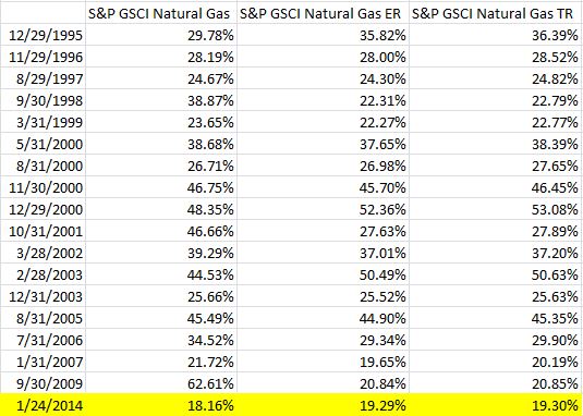
We recently introduced the concept of dispersion, which measures the average difference between the return of an index and the return of each of the index’s components.  In times of high dispersion, the gap between the best performers and the worst performers is relatively wide; when dispersion is low, the performance gap narrows.  Today’s dispersion levels are quite low by historical standards, which implies that:

  • The degree to which the average skillful (or lucky) manager should be expected to exceed index returns is below average, and
  • The degree to which the average unskilled (or unlucky) manager should be expected to lag index returns is also below average.

One consequence of low dispersion, in other words, is that the gap between the best and the worst performers is smaller than it would be if dispersion were higher.  If that’s the case, then the current environment is not especially good for demonstrating stock selection skill.

On the other hand, it’s frequently been argued in recent weeks that since the correlation of stocks within the U.S. equity market is falling, 2014 is poised to be a “stock-picker’s market.”  Correlations have indeed been declining — which means that correlation and dispersion seem to be delivering inconsistent messages.  Is one “right” and the other “wrong?”

The reason for this apparent contradiction is that correlation and dispersion measure two different things.  Consider a simple example, examining the behavior of two stocks over a 20-day holding period:

A and B
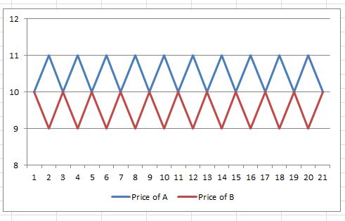
The correlation between A and B is -1.00.  The two stocks are ideal diversifiers, since  moves in one completely offset moves in the other.  The return of both stocks, however, is the same 0%.  Regardless of which one the investor bought, his return would be the same.  (The only reward available for selection strategies is in fact a penalty, since holding either stock entails more volatility than holding both.)  That doesn’t sound like a good environment for stock picking.

Now consider stocks C and D:

C and D
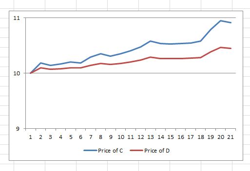
The correlation between C and D is 1.00, which is to say that both stocks always move in the same direction.  Holding both has the same volatility as holding either stock individually.  Does that mean that stock selection is irrelevant?  Hardly, since C’s return (9.2% as shown) is more than double D’s return (4.5%).

Correlation is primarily a measure of timing.  High correlations mean that things go up and down at the same time; negative correlations mean that they offset.  C and D always move in the same direction (hence the 1.00 correlation), while A and B always move in opposite directions (hence their -1.00 correlation).   But low correlation does not necessarily mean that the environment is favorable for skillful stock pickers.

Dispersion is a measure of magnitude.  It tells us by how much the return of the average stock differed from the market average.  In our hypothetical exercise, there’s no dispersion at all between A and B, and a considerable dispersion between C and D.  High dispersion gives skillful stock pickers a better chance to showcase their abilities.

Correlation is an essential tool in understanding portfolio diversification.  But as a measure of the magnitude of opportunity available to selection strategies – dispersion is the better metric.

The posts on this blog are opinions, not advice. Please read our Disclaimers.

A NICKEL For Your Thoughts?

Contributor Image
Jodie Gunzberg

Former Managing Director, Head of U.S. Equities

S&P Dow Jones Indices

Industrial Metals are historically the most economically sensitive sector besides energy. While Chinese oil demand growth is set at 3.6% in 2014 and HSBC’s Chinese Manufacturing Purchasing Managers’ Index (PMI) edged down to 50.8 in November, barely above the key 50-threshold delineating expansion from contraction, according to IEA’s OMR Report, nickel is the only commodity in petroleum and industrial metals to have positive performance in 2014, although it is up just 0.7% YTD (as of Jan 29 after losing 1.1% for the day.) 

Many who are unfamiliar with nickel may wonder what it is used for, besides to strengthen the silver of the Stanley Cup. According to the Nickel Institute:

“Nickel-containing materials play a major role in our everyday lives – food preparation equipment, mobile phones, medical equipment, transport, buildings, power generation – the list is almost endless. They are selected because – compared with other materials – they offer better corrosion resistance, better toughness, better strength at high and low temperatures, and a range of special magnetic and electronic properties.”

Although  the manufacturing numbers aren’t great, the reason nickel is the only commodity between energy and industrial metals that is performing well is because of its unique supply and demand model despite general macro factors.

According to Reuters, there is a ban on exports of key mineral ores from Indonesia unless they are processed in the country.  However, weaker economic conditions have caused the ban to be lifted to allow shipments of copper, zinc, lead, manganese and iron ore concentrate, leaving nickel and bauxite – key ingredients in making steel and aluminium – the main targets.

Further, as FT.com points out, unlike copper, iron ore, lead and zinc, where miners were given a few years to phase out exports, shipments of nickel ore were cut altogether as of January 12th.

As you can see in the chart below, nickel has had a lackluster history post the financial crisis despite its gain of 188.0% from March 2009 to Feb 2011.  Since Feb 2011, the S&P GSCI Nickel has given back more than half that gain, losing 53.5%.

Source: S&P Dow Jones Indices. Data from Jan 1993 to Jan 2014. Past performance is not an indication of future results. This chart reflects hypothetical historical performance. Please see the Performance Disclosure at the end of this document for more information regarding the inherent limitations associated with backtested performance.

Also since Feb 2011, there have only been 13 of 35 months where the returns were positive and on average the positive monthly return was only 5.3%. This is compared to the negative 8.3% on average in the down months, which has hindered nickel from bigger profits. See below for the table of positive months since Feb 2011:

Source: S&P Dow Jones Indices. Data from Jan 1993 to Jan 2014. Past performance is not an indication of future results. This chart reflects hypothetical historical performance. Please see the Performance Disclosure at the end of this document for more information regarding the inherent limitations associated with backtested performance.

Source: S&P Dow Jones Indices. Data from Jan 1993 to Jan 2014. Past performance is not an indication of future results. This chart reflects hypothetical historical performance. Please see the Performance Disclosure at the end of this document for more information regarding the inherent limitations associated with backtested performance.

Despite the relatively weak economic industrial growth data from China that showed only 6% yoy in Dec 2013 versus 9.6% yoy in Nov 2013, demand for industrial metals like nickel may be on the rise. This is since they are linked with emerging technologies and electronic devices, including health care and biotech devices. For instance, some industry estimates show that demand for smart devices will increase 7–8% in developed markets, and 17% in emerging markets between 2012 and 2017. This may impact the demand, which may drive a comeback in prices.

However, as consumers deplete the inventories from 2011, the balance may depend on how fast the producers can bring supply to the market and how the governments treat trading bans. The chart below depicts the cycle of inventories reflected by backwardation and contango as measure by the index. Notice there has not been a shortage since Dec 2011, and even then, it was small – adding only 3 bps. The question remains whether now could be the time of another cycle switch for a sustained period of shortage or backwardation in nickel, where front month investors may benefit.

Source: S&P Dow Jones Indices. Data from Jan 1993 to Jan 2014. Past performance is not an indication of future results. This chart reflects hypothetical historical performance. Please see the Performance Disclosure at the end of this document for more information regarding the inherent limitations associated with backtested performance.


The posts on this blog are opinions, not advice. Please read our Disclaimers.

Nat Gas Is HOTTEST In 4 Years

Contributor Image
Jodie Gunzberg

Former Managing Director, Head of U.S. Equities

S&P Dow Jones Indices

Every conversation I’ve had today with people from Nashville to Toronto has started with how cold it is outside.  After the shock of the cold and when the heating bills come due, the conversation may turn to how expensive heat was in January.  That, of course, is at least for those who don’t invest in commodities to offset price spikes.

After natural gas posted the biggest one-day gain of 9.2% on Jan 24, 2014 since June 14, 2012, the S&P GSCI Natural Gas has gained 19.3% this year.  It has gained 25.9% in just 10 days since Jan. 9, 2014 and is also up 44.6% since it’s low for the prior year on Nov. 4, 2013.

In the history of the index since Jan 8, 1994, it has been calculated on 5,053 days and only 39 of 5,053 days have had a higher gain than the 9.2% seen on Friday  – that is only 0.77% of days. That puts Friday’s gain in the top 1% of big daily gains for the natural gas index.  See the table below for days gaining more than 9.2%:

Source: S&P Dow Jones Indices. Data from Jan 1994 to Jan 2014. Past performance is not an indication of future results. This chart reflects hypothetical historical performance. Please see the Performance Disclosure at the end of this document for more information regarding the inherent limitations associated with backtested performance.

Also, January 2014 MTD has posted the biggest monthly gain since September 2009.  Only 17 months of the 240 in the history of the index have seen bigger gains than 19.3%.  Although natural gas can be considered in a bull market from the bottom, many will watch to see if natural gas will earn the bull market stamp in January by breaking break the mark of a 20% gain for the month. Please see below for the table of natural gas bull market months:

Source: S&P Dow Jones Indices. Data from Jan 1994 to Jan 2014. Past performance is not an indication of future results. This chart reflects hypothetical historical performance. Please see the Performance Disclosure at the end of this document for more information regarding the inherent limitations associated with backtested performance.

Last, below is a chart of the index, where you can see the level is highest since Jan. 29, 2010.

Source: S&P Dow Jones Indices. Data from Jan 1994 to Jan 2014. Past performance is not an indication of future results. This chart reflects hypothetical historical performance. Please see the Performance Disclosure at the end of this document for more information regarding the inherent limitations associated with backtested performance.


The posts on this blog are opinions, not advice. Please read our Disclaimers.

Low Dispersion Implies Low Value Added

Contributor Image
Craig Lazzara

Former Managing Director, Index Investment Strategy

S&P Dow Jones Indices

Understanding a market’s dispersion provides important insights into its internal dynamics and the opportunities and pitfalls that might await both active and passive investors.  Dispersion measures the average difference between the return of an index and the return of each of the index’s components.  In times of high dispersion, the gap between the best performers and the worst performers is relatively wide; when dispersion is low, the performance gap narrows.

We recently updated our volatility and dispersion dashboard to reflect full calendar year 2013 results.  Dispersion is at or near its all-time low in every market we surveyed.  This has important implications for an investor who owns anything other than a broad market capitalization-weighted index fund.  Dispersion doesn’t tell us anything about what the market’s overall performance will be, nor does it tell us what strategies are likely to outperform or underperform.  What it can do, however, is to help us estimate how much over- or under-performance we are likely to experience.

For example, consider the historical performance of the S&P 500 Dividend Aristocrats index.  Since 1991, when the market has been in its least-disperse quartile, the average monthly deviation of the Aristocrats index relative to its parent S&P 500 has been 0.71%.  In the next least-disperse quartile, the average deviation rose to 0.95%, then to 1.36%, and finally, in the market’s  most-disperse quartile, to 3.31%.  Its average monthly deviation was 4.6 times larger in the most disperse quartile than in the least.

What is true for the Dividend Aristocrats is equally true for other strategy indices and emphatically also true for active managers.  When dispersion is low, there is less opportunity either to succeed or to fail.  With dispersion at its current levels, strategies that deviate from market cap weighting — whether active or indicized — should expect relatively low incremental returns.

The posts on this blog are opinions, not advice. Please read our Disclaimers.

A Tough Day for the Dow

Contributor Image
Jamie Farmer

Former Chief Commercial Officer

S&P Dow Jones Indices

Friday, January 24 was a rough day for the US equity markets with the Dow Jones Industrial Average shedding 318.24 points or 1.96%.  Driven by increasingly wide spread expectations of a market correction and slowing manufacturing in China, the Dow experienced its worst single day point drop since June 20th of last year.  On that day, the markets gave back over 353 points after comments from former Fed Chairman Ben Bernanke fueled fears of an imminent stimulus taper.

Lowlights from today’s tape:

  • Today’s drop leaves the DJIA down nearly 700 points or 4.21% on the year.  It’s a pretty arbitrary measurement, but that’s the worst 16 day start since 2009 when the DJIA lost over 7.50% over those early days.
  • Visa (V), responsible for the loss of nearly 45 points, was the worst performer.  Boeing (BA) was responsible for taking off nearly 30 points and 3M (MMM) nearly 29.  Procter & Gamble (G), adding just over 6 points, was the best performer and one of only 3 Dow stocks up on the day.
  • As a group, Financials were the worst performer today (-97.42 points) and year to date (-174.36).  None of the 9 industries represented in the DJIA were up today, nor are any up on the year.

The posts on this blog are opinions, not advice. Please read our Disclaimers.