The S&P BSE SENSEX Series comprises three indices, namely the S&P BSE SENSEX, the S&P BSE SENSEX 50, and the S&P BSE SENSEX Next 50. The S&P BSE SENSEX is the oldest and the most-tracked index in India and comprises 30 large, well-established, and financially sound companies within the S&P BSE 100. The S&P BSE SENSEX 50 is designed to measure 50 of the largest and most liquid companies within the S&P BSE 100. The S&P BSE SENSEX Next 50 is designed to measure 50 of the largest and most liquid companies within the S&P BSE 100 that are not members of the S&P BSE SENSEX 50.
Let us now compare the returns of the S&P BSE SENSEX, the S&P BSE SENSEX 50, and the S&P BSE SENSEX Next 50 for this calendar year, as of Dec. 31, 2017.
| Exhibit 1: Index Absolute Returns | |||
| INDEX | INDEX VALUE ON DEC. 31, 2016 | INDEX VALUE ON DEC. 31, 2017 | ABSOLUTE RETURN (%) |
| S&P BSE SENSEX (TR) | 37,472 | 48,550 | 29.56 |
| S&P BSE SENSEX 50 (TR) | 9,805 | 12,939 | 31.96 |
| S&P BSE SENSEX Next 50 (TR) | 31,246 | 44,027 | 40.90 |
Source: S&P Dow Jones Indices LLC. Data from Dec. 31, 2016, to Dec. 31, 2017. Past performance is no guarantee of future results. Table is provided for illustrative purposes and reflects hypothetical historical performance. The S&P BSE SENSEX Next 50 was launched on Feb. 27, 2017.
In Exhibit 1, we see that in the 12-month period ending Dec. 31, 2017, the absolute returns of the S&P BSE SENSEX, S&P BSE SENSEX 50, and S&P BSE SENSEX Next 50 were 29.56%, 31.96%, and 40.90%, respectively.
Exhibit 2: Index Total Returns
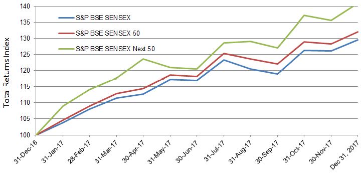
Source: S&P Dow Jones Indices LLC. Data from Dec. 31, 2016, to Dec. 31, 2017. Past performance is no guarantee of future results. Chart is provided for illustrative purposes and reflects hypothetical historical performance. The S&P BSE SENSEX Next 50 was launched on Feb. 27, 2017.
In Exhibit 2, we see the total return index level chart for the S&P BSE SENSEX, the S&P BSE SENSEX 50, and the S&P BSE SENSEX Next 50. The S&P BSE SENSEX Next 50 consistently outperformed the S&P BSE SENSEX and S&P BSE SENSEX 50 during the 12-month period ending Dec. 31, 2017.
Exhibit 3: Sector Breakdown of the S&P BSE SENSEX, S&P BSE SENSEX 50, and S&P BSE SENSEX Next 50 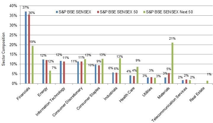
Source: S&P Dow Jones Indices LLC. Data as on Dec. 31, 2017. Chart is provided for illustrative purposes.
From Exhibit 3, we can see that as of Dec. 31, 2017, the financial sector had the highest weight in the S&P BSE SENSEX Series, while the real estate sector had the lowest weight.
For the year ending Dec. 31, 2017, we can state that the S&P BSE SENSEX Series has shown promising returns. The S&P BSE SENSEX added over 14 lakh crores of market cap during this period. We can conclude by saying that 2017 has been a great year for the S&P BSE SENSEX Series, as the indices have given outstanding returns.
The posts on this blog are opinions, not advice. Please read our Disclaimers.