Get Indexology® Blog updates via email.

In This List

Does active management work in Europe?

Why So Many Worry About Inflation

Three Reasons to Consider Index Funds

Fed Up With High Prices? July Opened A Window of Opportunity

July 31st: More Sellers than Buyers

Does active management work in Europe?

Contributor Image
Tim Edwards

Managing Director, Index Investment Strategy

S&P Dow Jones Indices

Academic arguments may well have “proven” the theoretical advantages of passive investing.  But theory is nothing without experiment; a comprehensive and impartial assessment of where and when active managers have delivered the promised “alpha” – or not – is a necessary and critical component of the debate.

Our S&P Index Versus Active scorecard and associated Persistence reports have – for twelve years – quantitatively examined the performance of active mutual funds in the U.S. versus their relevant benchmarks. Yet many questions regarding the global picture have so far been left unanswered, and the publication last week of the first SPIVA® scorecard dedicated to the performance of the European fund industry is accordingly of great interest.1

The overall conclusion for Europe is entirely familiar: broadly speaking, the majority of funds fail to beat their benchmarks.  However, the conclusion is more nuanced at the more granular level of country and currency fund categories; and there are certainly a few surprises:

SPIVA Europe highlights

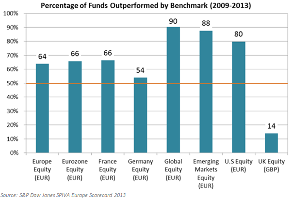
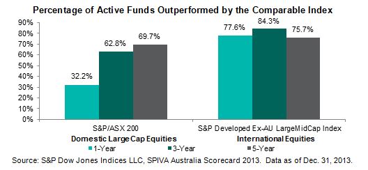
Throughout the report –which contains analysis for multiple further categories and time periods, as well as statistics on fund survival rates – interesting themes emerge above and beyond the headline numbers.  Two conclusions of particular note are evidenced in the chart above:

  • There are pockets (time periods and markets) where active managers as a group have conclusively delivered excess returns.  In this case – nearly 7 out of 8 managers providing sterling-denominated exposure to U.K equities outperformed.
  • Such pockets may be found in surprising places.  Who amongst us would have anticipated such praise-worthy performance within the highly liquid, well-studied and notoriously efficient U.K. markets?  It is particularly remarkable in contrast to the lamentable performance of emerging market equity managers, operating in the more volatile and idiosyncratic waters that supposedly mark the domains of active preeminence.

Of course, it is tempting to speculate as to what drivers might be accountable for the curious performance of active managers in the U.K. (indeed, we’re not immune to that temptation).  However, what shouldn’t be lost is the critical observation that, at a fine enough degree of granularity and across enough time periods, one will almost certainly find places and times where active management delivered.

Moreover, such anomalies raise important further questions, which include:

This is an area of ongoing research for us, and one that we consider to be deeply important. As such, we hope you join us in welcoming the Europe SPIVA report to an increasingly lively and global debate.


1)      With the issuance of the most recent European report, there are now five regions covered including the U.S., Europe, Canada, India and Australia. The reports can be found here.


The posts on this blog are opinions, not advice. Please read our Disclaimers.

Why So Many Worry About Inflation

Contributor Image
David Blitzer

Former Managing Director and Chairman of the Index Committee

S&P Dow Jones Indices

Inflation fears are everywhere except in the data.  While the Fed keeps reminding us that the inflation rate is below their 2% target, analysts keep arguing that the Fed will be miss signs of inflation.  Any hint of rising prices anywhere – from the CPI to oil to the money supply – is highlighted while reports of little change are ignored.  Is there actually less threat of inflation than most perceive? Why do so many investors expect inflation to appear any moment?

The numbers: The latest figures for the CPI and the Core (excluding food & energy) CPI are 2.1% and 1.9% in the 12 months ended in June. The Fed uses the personal consumption expenditure (PCE) and Core PCE deflators which show slightly lower 12 month numbers of 1.6% and 1.5%, also as of June.  The chart shows all four series over the last five years, there isn’t much of a trend either up or down. Whatever the numbers show, some will point out that we’re looking at the past and what matters is the future. True, but the key factors that drive inflation don’t give any reason for worry. Wages, salaries and benefit costs are one inflation factor – if employment costs rise, businesses will try to recover their costs in price increases.  However, the government’s Employment Cost Index for total compensation doesn’t give any hints of impending inflation. Since 2010 it has averaged 1.9%, the last figure was 2.1%, the same pace reported in third quarter of 2010 and the second quarter of 2011.  The price of oil is another key determinant of inflation. While oil prices are volatile, they don’t show massive inflation dangers. Prices recently at a bit below $100 per barrel for WTI have ranged between $95 and $113 since August 2010.

Some see inflation as something of a self-fulfilling prospect – if everyone expects higher inflation then business will raise prices and consumers will rush to buy before prices go up and the result will be inflation.  The University of Michigan Consumer Sentiment survey asks people what they expect for inflation. From the beginning of 2010 to June of this year, the average is 3.2%. Even though consumers expect slightly higher inflation than we’ve experienced, the expectation isn’t raising the inflation rate. However, the difference between peoples’ expectation and the actual numbers confirms that a lot of us do believe prices are about to rise more quickly in the future.

The continuing belief that rising inflation is around the corner stems from either economic theories or personal experience.  It can be difficult to confirm or deny economic theories with data because the economy is continually changing. So, while theory should be judged by how well it explains the data, it is often accepted if it seems plausible or can be understood.  The simplest theory of inflation is “too much money chasing too few goods causes inflation.”  Combine this with the Fed’s quantitative easing that boosted the money supply and you will expect more inflation.  But the inflation didn’t happen. The theory missed that the Fed began to pay interest on bank reserves and banks responded by keeping large deposits at the Fed rather than lending them out and creating more money. There wasn’t too much money where it would have mattered.

Most people don’t attempt to forecast inflation with economic theory. Their expectations of the future economy, or tomorrow’s markets, are based on their own past experiences.  One large group which came of age in an age of inflation are probably still concerned about prices. The baby boom, born between 1946 and 1964, turned 18 years old in 1964 through 1982, a period characterized by rising prices, two oil crises and sky-high interest rates which ended when the Fed attacked double digit inflation with a deep recession.  Today the baby boomers range from 50 to 68 years old and some are probably still worried that rising prices will outrun their savings.

Should we forget about inflation? Not completely. However, before we buy, sell or hold anything based on a belief of higher inflation, looking at the numbers would be a good idea. The numbers suggest that inflation is reasonably well anchored near but a bit below the Fed’s 2% target.  For the last few years the Fed responded to unemployment that was too high and inflation that is too low, with very easy money. At some point in the next year or so, the Fed may face inflation and unemployment both close to their targets of 2% inflation and about 5.5% unemployment. Then Fed policy is likely to change and the markets will react.

The posts on this blog are opinions, not advice. Please read our Disclaimers.

Three Reasons to Consider Index Funds

Contributor Image
Priscilla Luk

Managing Director, Global Research & Design, APAC

S&P Dow Jones Indices

Indexing is an investment approach which simply tracks an index to provide exposure to a market or segment of a market. For the three reasons listed below, it may be a viable complement or substitute to actively managed investments.

Firstly, indices outperform the majority of actively managed funds. The SPIVA Australia Scorecard, which is published twice a year, tracks the number of actively managed Australian mutual funds that were outperformed by their comparable benchmarks over different timeframes. The year end 2013 SPIVA Australia Scorecard showed that benchmark indices outperformed the majority of their comparable actively managed funds over three- and five-year horizons. Similar findings are also observed in the U.S., Canada and Europe SPIVA Scorecards.

Percentage of Active Funds Outperformed by the Comparable Index

Secondly, winning streaks don’t often last. We observed that only very few Australian actively managed funds were consistent top performers. Out of 95 top-quartile-performing Australian Equity Large-Cap funds as of December 2009, only 3.2% managed to remain in the top quartile by the end of December 2013. In the US, less than 1% of domestic equity funds that began as top-quartile performers in March 2010 ended up in the top quartile almost four years later, as shown in the Persistence Scorecard published in June 2014.

Performance Persistence of Australian Active Funds Over Five Consecutive 12-Month Periods

Lastly, indexing generally offers lower costs, greater transparency and portfolio diversification. Index-linked products generally have lower management and administration fees and no commissions. There is also less turnover in ETFs than in most actively managed funds, resulting in lower trading costs and fewer taxable events, such as capital gains distributions. All of these reasons contribute to the cost of investing in an ETF being less expensive than the cost of investing in actively managed funds.

Compared to active funds, ETFs are typically more transparent as most ETF providers update ETF performance and constituent lists every trading day on their websites, whereas most actively managed funds only publish a selection of their holdings on a monthly basis. Indexing also provides more portfolio diversification as each index can track hundreds–even thousands–of securities, which reduces a portfolio’s dependence on single investments.

The posts on this blog are opinions, not advice. Please read our Disclaimers.

Fed Up With High Prices? July Opened A Window of Opportunity

Contributor Image
Jodie Gunzberg

Former Managing Director, Head of U.S. Equities

S&P Dow Jones Indices

After much economic activity this week, the Fed announced inflation moved “somewhat closer” to the objective and is showing signs of firming after running below its 2% target for the past two years.  In the last June report from the United States Department of Labor, food prices continued to increase although at a slower pace and unleaded gasoline prices had the biggest increase since March 2013. 

The Commerce Department reported earlier Wednesday the economy grew at a 4% annual rate in the second quarter, bouncing back after a 2.1% first quarter contraction driven by bad weather.  The combination of a growing economy and bad weather was great news for commodities in the first half of the year as evidenced by the 5.7% increase in the S&P GSCI through June. That all changed in July.

July 2014 was the worst month for commodities since May 2012. The S&P GSCI lost 5.3%, giving up almost its entire gain for the year, now positive only 11 basis points YTD. The DJCI also had a big loss of 4.9% that pushed it into negative territory for the year, down 39 basis points.

While this is not good news for commodity investors, this might be the relief consumers need to keep their wallets from shrinking. Energy and Agriculture were the two worst performing sectors in July, down 5.8% and 8.7%, respectively in the S&P GSCI. Energy was down even more, losing 6.7%, in the DJCI from its heavier weight in natural gas that lost 13.7%, the most since March 2012. However, agriculture fared slightly better in the DJCI than in the S&P GSCI losing 7.2% from its bigger weight in soybeans, which lost 6.5%, less than wheat and corn – plus coffee was up another 11.4%, bringing its YTD total up to 68.9%.

Although not the biggest loser in the index or the most heavily weighted, one of the most important commodities that we all care about is unleaded gasoline. Prices at the pump have been brutal, as I mentioned above that the government reported the biggest price increase since March 2013. If the S&P GSCI or DJCI Unleaded Gasoline is any indication of prices we may see, the -8.1% spot return was the 5th worst July on record since 1988 and may provide some indication of price relief at the pump. It is also the worst July since July 2008, when after the index drop, the CPI data showed a drop in price increase from 4.090 in July 2008 to 1.689 by Dec 2008.

Further we have been discussing the impact of climate change (and potentially el nino) on food prices, where food processors have been running out of choices (substitution and buying ahead) to keep food prices down for everyday consumers like you and me.  The result has been higher prices at the grocery store. This happened from the destruction of the agriculture and livestock chain from the freezing weather in Q1. Now after the decline in July from perfect weather that brought down the grains, the agriculture is priced the lowest since July of 2010.

Fed up with high prices
Source: S&P Dow Jones Indices. Data from July 2009 to July 2014. Past performance is not an indication of future results.

This may open a window of opportunity for food processors to purchase cheap ingredients ahead of further price spikes that may happen from an el nino and climate change. Then, we may see lower prices again at the grocery store.


The posts on this blog are opinions, not advice. Please read our Disclaimers.

July 31st: More Sellers than Buyers

Contributor Image
David Blitzer

Former Managing Director and Chairman of the Index Committee

S&P Dow Jones Indices

Stocks closed down today with the S&P 500 and the Dow Jones Industrials both down 1.8% despite yesterday’s stronger-than-expected GDP report, numerous earnings reports which beat Street expectations and no hints of early interest rate moves from the Fed.  Bearish or negative news stories weren’t much different from the day or week before – unrest in the Middle East, sanctions on Russia in response to fighting in the Ukraine and an on-going argument between Argentina and a hedge fund over debt.  There was no single event to send the market down for the worst loss in years.

Fear, greed, anxiety and the madness of crowds really do drive markets.  While it is often possible to cite shifts in the economy, corporate earnings or political events for market moves that extend over months or years; short term day-to-day shifts are driven as much or more by emotion than by reason and news. Robert Shiller, the author of Irrational Exuberance, describes surveys of investors down in the days following the 1987 market crash.  Clearly today’s dip is nothing like the 1987 event when the S&P 500 dropped over 20% in a day, but then investors couldn’t point to a news story or major event that sent the market plunging.  The most common news stories cited by investors were about falling stock prices, not some external change in fundamentals or the economy.

Was today’s drop driven by emotion or anxiety with little news or analysis of fundamentals?  The market has drifted in the last few days and closed flat on the best economic news in the last few years. The chart shows a rise in the frequency of searches for the phrase “stock market bubble” on Google Trends and the biggest news story seems to be a lack of action in the Congress.  It will take several weeks or months to see if today’s drop was caused by more worried people selling than confident people buying.  Unless news and the fundamentals turn much worse the best explanation may be simply worried investors.

Period Shown 11/2013 to 7/2014

Google Trends shows the relative frequency of searches for specific terms.  The letter A indicates the publication of an article in Forbes on Where to Invest When the Market Bubble Bursts.

The posts on this blog are opinions, not advice. Please read our Disclaimers.