Get Indexology® Blog updates via email.

In This List

Big Week for Economic Numbers and the Fed

Weighing In: On Diversification

Back to the Future for Small-caps

Don’t Doubt the Economy

Mid-July Muni Minutes

Big Week for Economic Numbers and the Fed

Contributor Image
David Blitzer

Former Managing Director and Chairman of the Index Committee

S&P Dow Jones Indices

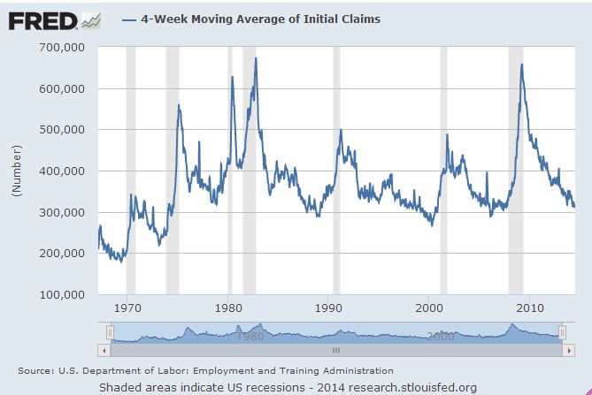
By lunch time next Friday (August 1st) we will have many more numbers about the economy, maybe we will know more about the economy.   The week starts slow with pending home sales on Monday, likely to show that sales of existing home are okay. Tuesday brings the S&P/Case-Shiller Home Price Indices; recent months revealed that the pace of price increases is slowing.  After warming up with two days of data, Wednesday brings second quarter GDP and the Fed’s announcement following its two day FOMC meeting.  Betting on GDP is for a solidly positive report of up 2.9%, reversing the first quarter plunge.  Thursday is a momentary relief from the data deluge with only the weekly initial unemployment claims. This series has been sending very bullish economic signals lately.  Lest any number crunchers be tempted to rest on Friday the chatter begins at 8:30 AM with the July Employment Report, followed by auto sales and the ISM Manufacturing report.  If that’s not enough, two consumer sentiment reports and June personal income numbers are due during the week.

The most interesting item will be the Fed’s statement following the FOMC meeting.  Attention is rapidly shifting to the question of when will the central bank begin raising interest rates and how it will do so. The economy is looking stronger and this week’s numbers are likely to make it look even better: second quarter GDP growth, another month of job gains comfortably over 200,000 in July, auto sales holding steady and the ISM numbers slightly higher.  While most of these will be reported after the FOMC meeting and Fed summary, everyone will be looking for some hints about the long-awaited move on interest rates.  Moreover, the Fed has taken both quantitative easing and inflation fears off the table. The minutes of the last meeting, released a few weeks ago, confirmed that bond buying and quantitative easing will end in October.  Contrary to some commentators worried about inflation, the Fed does not see signs that price rises will accelerate over the next few quarters.  Further, even if a slight rise in its preferred inflation gauge, the PCE deflator, appears in the June personal income and outlay numbers on Friday the Fed is not likely to react.

The Fed won’t offer a clear signal or a date for a rise in interest rates. However, its comments, combined with remarks from some FOMC members in recent weeks, will lead analysts to expect the move to be sooner rather than later. The second half of 2015 seems too far away unless the economy suddenly sours; a better bet is Spring 2015 when the unemployment rate is likely to be between 5.5% and 6% and the economy will have a string of four quarters of respectable growth.   Since the Fed’s balance sheet will still be above $4 trillion then and since excess bank reserves will still be massive, the Fed action is likely to consist of an increase in the interest rate paid on excess reserves combined with reverse repos to boost the short term interest rate floor.  Given that inflation will still be modest and that some time is needed for everyone to fully understand the new operating procedures, the Fed will probably move gradually – no 50 or 75 basis point jumps. However, the first Fed rate hike after a long period of monetary ease usually spooks the market.


The posts on this blog are opinions, not advice. Please read our Disclaimers.

Weighing In: On Diversification

Contributor Image
Jodie Gunzberg

Former Managing Director, Head of U.S. Equities

S&P Dow Jones Indices

Diversification is one of the main reasons investors use commodities in their portfolios. Despite the fact that in only 4 years since 1970 did commodities and equities drop in the same year (1981, 2001, 2008, 2011), investors lost confidence in commodities as a diversifier as the correlation spiked with equities after the crisis. That confidence is starting to return as investors watch the correlation fall into negative territory, even lower than the historical averages of 0.20 for the DJCI and 0.17 for the S&P GSCI when measured with S&P 500.

Source: S&P Dow Jones Indices. Data from Jan 20, 1999 to July 24, 2014. Past performance is not an indication of future results.

To help understand the diversification benefits from each the DJCI and S&P GSCI, we will continue our series called “Weighing In:” As you can see from the chart above, the answer to the question of “which commodity index to pick?” from correlation as a measure of diversification is not definitive.  Looking at a correlation matrix like the one below based on monthly data going back to Jan 1999, the S&P GSCI fares slightly better than the DJCI with correlation of 0.30 versus 0.42.

Source: S&P Dow Jones Indices. Data from Jan 1999 to Dec  2013. Past performance is not an indication of future results.
Source: S&P Dow Jones Indices. Data from Jan 1999 to Dec 2013. Past performance is not an indication of future results.

Another way some investors might describe diversification is by preservation of capital, perhaps through protection against losses from equities. When evaluating returns on an annual basis, again going back to 1999 (starting in Jan,) on average when the S&P 500 lost, it lost 17.01%. Commodities have had better performance in those years where on average the DJCI lost only 2.43% and the S&P GSCI actually showed gains, although small, of 0.44%.

Source: S&P Dow Jones Indices. Data from Jan 1999 to Dec  2013. Past performance is not an indication of future results.
Source: S&P Dow Jones Indices. Data from Jan 1999 to Dec 2013. Past performance is not an indication of future results.

With all of these measures, the S&P GSCI is showing a slightly stronger diversification benefit than the DJCI.  Although, when we look at what may be the holy grail of diversification, measured by the risk adjusted return of a portfolio when commodities are added to stocks and bonds, the DJCI comes out slightly ahead.

Source: S&P Dow Jones Indices. Data from Jan 1999 to Dec  2013. Past performance is not an indication of future results.
Source: S&P Dow Jones Indices. Data from Jan 1999 to Dec 2013. Past performance is not an indication of future results.

It seems, whether you pick DJCI or S&P GSCI, there is a diversification benefit, though in the time period, the higher risk adjusted return of the DJCI outweighs the lower correlation of S&P GSCI by a small amount, adding an addition 20 basis points annually with 16 basis points less of risk, measured by standard deviation. Notice with the addition of commodities, the portfolio cumulative return consistently stays above a 50/50 stock/bond mix and far above equities alone.

If you have other ways to think about diversification, let us know so we can continue the analysis.


The posts on this blog are opinions, not advice. Please read our Disclaimers.

Back to the Future for Small-caps

Contributor Image
Philip Murphy

Former Managing Director, Global Head of Index Governance

S&P Dow Jones Indices

Suppose you were a financial advisor during the height of the financial crisis in the first quarter of 2009, and you presciently theorized that the market was bottoming as Federal Reserve policies and emergency U.S. Treasury rescue programs took hold to reestablish confidence in capital markets. Your theory was to favor small-cap stocks because you believed massive monetary stimulus would result in strong fundamental growth and multiple expansions for this group. The challenging question you would have next faced is how to implement your investment thesis for clients. One significant issue is whether you would have invested client capital in actively managed or passively managed funds.

Inspired by the S&P Persistence Scorecard, I simulated this scenario in preparation for a recent S&P Dow Jones webinar, “For the Love of U.S. Small-Caps”, and I analyzed what the results would have been for the clients of such a financial advisor.

Crucially, our financial advisor from early 2009 – with the extremely timely and rare insight to seek small-cap exposure at that particular point in time – could have easily fallen victim to the all-too common misconception that it pays to seek active managers in “less efficient” segments like small-cap. As shown in the chart below, he or she might have cost their clients significant wealth in the form of lost opportunity – particularly since their investment thesis turned out to be so prescient.

On the other hand, had he or she resisted the “sophisticated” idea that relatively inefficient markets make fertile ground for alpha generation and stuck with a low cost index fund, they would have captured the handsome small-cap returns we have seen over the last few years. Only one further distinction would have created additional value for his or her clients – the selection of the small-cap benchmark used to capture the market return. Had an index fund tracking the S&P SmallCap 600 instead of the Russell 2000 been selected, clients would have been about 23% richer.


Capture

Disclaimer

Here is an outline of my experiment and its results:

  • On the active side, I exclusively considered top-quartile mutual fund share classes in the Morningstar database as of the first quarter of 2009.
  • I screened the database for small blend share classes (some funds have multiple share classes) that were ranked in the top performance quartile for 2008. This resulted in 152 share classes.
  • 9 of these share classes merged before the performance period ended and were not counted in the analysis.
  • 4 of these share classes were liquidated before the performance period ended and were not counted in the analysis.
  • The evaluation period is the 1st quarter of 2009 and the performance period is five years from April 2009 to March 2014.
  • Of the 139 remaining share classes with a full 5-year history through March 2014, only 9 beat the S&P SmallCap 600 benchmark (5.9% of the starting set).

This analysis differs from the Scorecard in two ways:

  1. It compares top quartile funds to an appropriate benchmark rather than counting how many funds remain in the top quartile from period to period.
  2. It shows the magnitude of under-performance and out-performance, as well as the frequency of each.

The posts on this blog are opinions, not advice. Please read our Disclaimers.

Don’t Doubt the Economy

Contributor Image
David Blitzer

Former Managing Director and Chairman of the Index Committee

S&P Dow Jones Indices

Amidst the worries over some future Fed tightening, misplaced angst about inflation and chatter about the S&P 500 touching 2000, investors seem to be ignoring a few reliable economic indicators.  One of the more consistent signs is the weekly initial unemployment claims report – people applying for unemployment insurance.  The news is good and the economy is strong.

The chart shows a four week moving average to smooth out a few bumps and some noise. The pattern is clear all the way back to the late 1960s: anything over 400,000 is cause for concern and probably a recession; anything under 300,000 is a strong economy. The weekly numbers are headed in the right direction: today’s (July 24th) was 284,000. The four week moving average was 302,000.

Eventually the Fed will raise interest rates, inflation won’t be stuck at 2% forever and the market will, sooner or later, correct.  Rather than spending the whole time wondering when all this will happen, remember the economy is looking good right now.

The posts on this blog are opinions, not advice. Please read our Disclaimers.

Mid-July Muni Minutes

Contributor Image
Tyler Cling

Senior Manager, Fixed Income Indices

S&P Dow Jones Indices

Detroit: The anniversary of the city of Detroit essentially declaring bankruptcy by cancelling payments on $40 million of debt obligations last summer is not dragging down the state of Michigan. As observed by the S&P Municipal Bond Michigan General Obligation Index, the state’s debt is trading on par with the rest of the U.S. municipal bond universe.   Both Michigan G.O. bonds and the S&P Municipal Bond Index have annual returns between 6-7% with yields struggling to eclipse 3%. The federal ruling last week that entitles Detroit to $15 million a month in casino revenue certainly helps the city’s ability to make their debt payments.

Puerto Rico: Puerto Rico had investors demanding higher yields last week after the island passed a law in late June allowing PREPA, the Puerto Rico Electric Power Authority, to restructure their debt. The edict was not received warmly by the holders of $73 billion dollars in Puerto Rico related debt, especially since the unincorporated territory doesn’t have the benefit of bankruptcy Chapter 9. Investors are demanding higher yields to hold the recent downgrade to junk status debt. This is demonstrated in the graph below with the S&P Municipal Bond Puerto Rico Index. Yields have risen from 7.35% to 7.95% or 60bps since the beginning of the month. The index has a negative 1-year return of (15.58%).

SP Municipal Bond Puerto Rico Index

Tobacco: July hasn’t been good to tobacco bond holders either. Following the Tobacco Master Settlement Agreement of 1998, tobacco companies have to essentially pay a sin tax for the negative effect their product has on American health. Percentages of revenue from the likes of Philip Morris & R.J. Reynolds have been ruled to contribute towards smoking related medical costs and awareness campaigns. The agreement, which has a minimum cash flow floor of $206 billion over the 25-year span since the enactment, is being used as the source of funds on the municipal tobacco debt.

Tobacco debt as an asset class has been a rockstar so far into 2014, the S&P Municipal Bond Tobacco Index has returned 10.31%YTD. The party could be over, however, as the weighted average price of bonds in the index has dropped (7.6%) in July as seen below. The picture is not all doom and gloom for tobacco debt as the total return of the index is only down (1.4%) for the month. Remember that the revenue used to repay this debt only comes from American tobacco use, so an increase in trends like SE Asia smoking habits or U.S. E-cigarettes does not generate extra cash flow for the tobacco settlement bonds.

SP Municipal Bond Tobacco Index

For a broader insight into the world of fixed income and a look into the upcoming events signaling the pace of our economic recovery, please refer to a recent post by my colleague, Kevin Horan.


The posts on this blog are opinions, not advice. Please read our Disclaimers.