Get Indexology® Blog updates via email.

In This List

Food Drives March

March On

What's In Their Wallet?

Inside the S&P 500: Multiple Share Classes

2013: A year in SPIVA Perspective (Part I)

Food Drives March

Contributor Image
Jodie Gunzberg

Former Managing Director, Head of U.S. Equities

S&P Dow Jones Indices

Commodities continue their comeback as supply shocks prevail over demand growth concerns from China. The backwardation (indicative of shortage), measured by roll yield or the excess return minus the spot return, has not only persisted from February into March but increased.  March’s roll yield of 26 basis points more than doubled February’s roll yield of 10 basis points, bringing a MTD gain of 14 basis points to increase the S&P GSCI YTD return to 2.9%.  While we have seen some backwardation in the past few summers, we have not seen it this early in the year since 2004 – the last year of low inventories until now.  In 2004, the S&P GSCI returned 17.3%.

Source: S&P Dow Jones Indices. Data from Jan 1970 to March 2014. Past performance is not an indication of future results. This chart reflects hypothetical historical performance. Please note that any information prior to the launch of the index is considered hypothetical historical performance (backtesting).  Backtested performance is not actual performance and there are a number of inherent limitations associated with backtested performance, including the fact that backtested calculations are generally prepared with the benefit of hindsight.
Source: S&P Dow Jones Indices. Data from Jan 1970 to March 2014. Past performance is not an indication of future results. This chart reflects hypothetical historical performance. Please note that any information prior to the launch of the index is considered hypothetical historical performance (backtesting). Backtested performance is not actual performance and there are a number of inherent limitations associated with backtested performance, including the fact that backtested calculations are generally prepared with the benefit of hindsight.

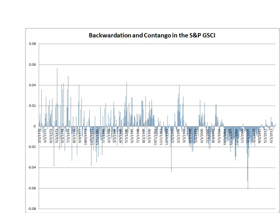
Don’t let the term structure fool you, though.  There is a misperception that the term structure determines the total return.  While the roll yield is a highly significant attribute to the total return, it is not the only driver.  Price return and collateral yield are also included so that sometimes a positive return is realized despite contango.  Although on average in this chart, there are no negative average monthly returns with backwardation, it does happen.

Return Roll

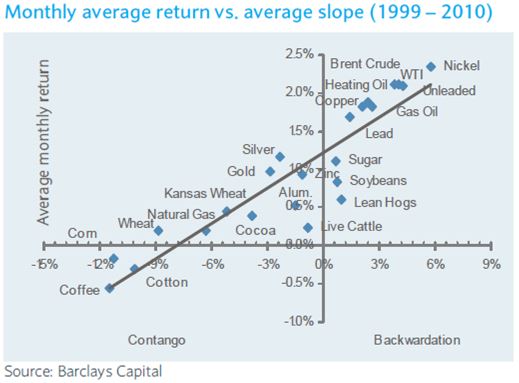
Currently we are experiencing shifts in the curves that are not big enough to overcome price changes.  For example, the S&P GSCI Energy is in backwardation but is has a negative total return for the month of -1.2%.  Also the S&P GSCI Copper is in backwardation for the 5th month straight but its March total return was -5.3%.  It is hard to be a big copper bear with persistent backwardation like that unless a big supply comes to market.  On the flip side, the S&P GSCI Agriculture & Livestock is up 6.4% in March but is still showing slight contango.  The lean hogs, up 19.0% in March, had the fattest gain for the month, but is in contango (reflecting abundance and high storage costs), giving up 7.8% for a total return of 11.2%.

Earlier in the month, someone asked me if I had a food fetish after I had posted about coffee, cocoa, pork, cattle and corn.  Given the S&P GSCI has 24 commodities and 10 are food related (if you don’t count edible gold leaf confections), I answered maybe a half of a food fetish, but that the weather is causing all sorts of problems in the supply chain for food commodities, spiking prices across the S&P GSCI Agriculture & Livestock. The weather is also putting some of these commodities into backwardation earlier than normal, which might be even more profitable for an index investor.  


The posts on this blog are opinions, not advice. Please read our Disclaimers.

March On

Contributor Image
Howard Silverblatt

Senior Index Analyst, Product Management

S&P Dow Jones Indices

TAKEAWAYS & FYIs (commentary):

  • U.S.-Russian relations continued to decline, but markets didn’t see it as major issue; European markets have been more concerned about oil and gas sales from Russia, as Russia needs the currency and Europe needs the products
  • The Fed moved the conversation from stimulus ending to increasing interest rates, but after an initial negative impact the market accepted this (rate increases are at least a year away), just as it accepted the end of QE4-ever
  • Interest rates declined for Q1, as the 10-year fell to 2.72% from 3.03% (1.76% at the end of 2012)
  • Buybacks were flat for Q4 with fewer shares repurchased, but companies issued less, resulting in lower share counts and higher EPS
  • Activists continued on, as boards reacted: If you have people knocking on the board room door, you have to answer it or reinforce the door
  • Biotechnology declined, underperforming healthcare YTD: correction opportunity vs. bubble debate

Thought items:

  • It’s nice to have (new) paper money, as Facebook uses it for another $2B purchase, after last month’s $19B buy
  • It’s also a nice time to do an IPO – at least if you have profits (health care)
  • Starbucks will expand its evening wine and beer sales – a new twist on speak-easy (what would Maynard G Krebs buy?)

Key stats:

  • Cash set its sixth consecutive quarterly record for the S&P 500 Industrials (Old) at $1.3 trillion; 94 weeks of net income sitting on the books was making very little but attracting outsiders
  • Traders market: the index was up 1.30%, but 90 issues were up at least 10%, with 36 down at least 10% YTD (25.2% of the issues)

Key concept:

  • Q1 feeling (on the Street) is that the weather is an okay excuse for less than expected results, which increases the stakes on company guidance for Q2

The posts on this blog are opinions, not advice. Please read our Disclaimers.

What's In Their Wallet?

Contributor Image
Howard Silverblatt

Senior Index Analyst, Product Management

S&P Dow Jones Indices

S&P 500 Industrials have easily set a sixth consecutive quarterly record for cash and equivalent on hand (under current assets, mark-to-market), sitting on what amounts to 94 weeks of net earnings (latest 12 months). The $1.3 trillion is not making much as it sits in short-term investments or banks, regardless of its U.S. or foreign domain. The cash is however getting a lot of attention, especially from activist investors, who see the pot of gold at the end of a short rainbow.
The How is easy, the Why is not.
For 2013, earnings (with a supporting hand from higher margins) and cash-flow both set a new record. However, it’s not always what you make, but what you spend. And while dividends and capital expenditures also posted new record highs, and buybacks increased 30%, income was stronger. Dividends, while at record levels, are only 36% of income (historically they are 52%), and Capital Expenditures appear (my review is not complete yet) to be more about maintenance and production increases than new plants and expansion. So cash keeps going up, as does the actions by those attracted to it.
The Why is ‘why aren’t companies spending more’, which is not as quantifiable. Sales, which only increased 2% in the S&P 500 last year, remain the main concern, and to some degree is the main reason. No company is going to produce 110 widgets when they only think they can sell 100 (regardless of tax credits or incentives; there are 60 credit items on the Senate table in April), with the key word here (in my opinion) being ‘think’. Confidence in the economy has grown, as the economy has demonstrated its ability to ride through tough times (recession, budgets, deficits, sequester, government shut-downs and the weather) and still produce growth. However, growth in leadership still (to me) appears to be a bit lacking. There are some signs that spending is increasing, and along with it some corporate commitment. However, ‘some’ will be slow, and while slow and steady has worked for the stock market for the last year-and-half, I’m not as certain about the steady when it comes to the economy.
Regardless, cash is enormous, with enough money for companies to do whatever they want. And when they start spending it – that is where you want to be.
cash_20140326

The posts on this blog are opinions, not advice. Please read our Disclaimers.

Inside the S&P 500: Multiple Share Classes

Contributor Image
David Blitzer

Former Managing Director and Chairman of the Index Committee

S&P Dow Jones Indices

Later this week when Google’s class C shares begin trading there will be 500 companies but 501 different ticker symbols and stocks in the S&P 500.  And beginning September 15, 2015, companies in the 500 which have multiple share classes will have all their liquid classes included.  The weight of each company will represent the total float available to shareholders, just as it does today.

Multiple share classes are becoming more common in the US, especially among technology companies.  The usual reason is either super-voting stock (shares with more than one vote) or non-voting stock to insulate management from takeovers or activist investors.  S&P Dow Jones Indices has included multiple share classes in some foreign indices covering markets where they are common. The increasing use in the US, as highlighted by Google’s new class C shares which begin trading this week, led to a review of the index methodology for the S&P 500 and our other US indices.  Under the current methodology, S&P DJI identifies the most liquid class and then increases its share count to account for all classes.  This approach works well when the less liquid class is small so the increase to the share count of the liquid class is also small. However, when the excluded class is as large as the included class – as is the case with Google classes A or C – the increase in the share count can be large enough to raise concerns about liquidity.  Likewise, in sector or strategy indices with fewer stocks and larger weights on each stock, increasing share counts to adjust for less liquid classes could affect liquidity.

While the shift for Google’s new class C is being done now, the shift to multiple share classes for other companies in the S&P 500 (and the S&P 100, S&P 400, and S&P 600) will be done in September 2015. (yes – 2015).  This will involve several stocks and both advance planning and advance notice to market is important.

Starting on April 3rd, the S&P 500 will still have 500 companies, but there will be 501 stocks.  The “extra” stock will be Google class C with no votes and Google’s current ticker symbol GOOG. Google class A with one vote will get a new ticker, GOOGL.  The tickers are set by NASDAQ and Google.  Google class B shares which have 10 votes per share are closely held by management and don’t trade. Since the class B doesn’t trade, it is not in the S&P 500.

The posts on this blog are opinions, not advice. Please read our Disclaimers.

2013: A year in SPIVA Perspective (Part I)

Contributor Image
Aye Soe

Former Managing Director, Global Head of Core and Multi-Asset Product Management

S&P Dow Jones Indices

2013 was the blockbuster year for equity as the domestic equity markets posted double-digits returns.  In a year marked by record breaking gains, it is particularly important to measure the relative performance of active funds versus the indices as bull markets often present challenging conditions for active managers to overcome. The 2013 year-end SPIVA report findings confirm that while active managers may do very well on an absolute basis, the majority of them can end up underperforming on a relative basis, at times by narrow margins.

Looking at the large cap space, the S&P 500 returned 32.39% for the year while the median quartile breakpoint for the large cap core category is 31.92%.  This slim spread of 47 basis point difference in returns is reflected in the underperformance of large cap core funds against the benchmark by a narrow majority (57.74%).

Small cap space, however, tells a different story.  The S&P SmallCap 600 had its best year since the launch in 1994, posting 41.31%.  The first quartile breakpoint of 40.85% for small cap core active funds indicates that a quarter of the funds were able to outperform the benchmark on a relative basis, albeit by a narrow margin of 0.46%.

Mid cap space is the only category in which the active managers fared well against the benchmark in 2013.  The S&P MidCap 400 Index gained 33.5% for the year.  The median mid cap core manager posted 34.91%, highlighting that the majority of the active mid cap managers were able to beat the benchmark by a good margin.

Over a longer-term investment horizon, even an underperformance or outperformance by a small return margin in one year can translate into a meaningful difference as compounding kicks in.  When viewed over the five-year horizon, active managers across all market cap segments and style underperformed their respective benchmarks.

Exhibit 1:  The Percentage of U.S Equity Active Managers Outperformed by Benchmarks

Source:  S&P Dow Jones Indices, CRSP.  Data as of 12/31/2013.

Exhibit 2:  One and Five-Year Quartile Breakpoints of U.S Equity Funds

Source:  S&P Dow Jones Indices, CRSP.  Data as of 12/31/2013.

The posts on this blog are opinions, not advice. Please read our Disclaimers.