Get Indexology® Blog updates via email.

In This List

Paying Too Much at the Pump?!

That Was Easy

Shorter Municipal Bonds Hang In There While Long Municipal Bonds Suffer

Despite strong double-digit gains in the equity markets last year, S&P 500 issues posted record pension and OPEB underfunding in 2012

Inside the S&P 500: Float adjustment

Paying Too Much at the Pump?!

Contributor Image
Jodie Gunzberg

Former Managing Director, Head of U.S. Equities

S&P Dow Jones Indices

Why are gas prices so high? I know I’m not alone as “a commodity lady” wondering this as I pull out my credit card to pay at the pump. (Which is not often since I ride my bicycle to work most days)

US Gas Prices

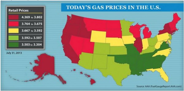
Gasoline prices typically rise in the summer because more people travel to take vacations. However, this July, the S&P GSCI Unleaded Gasoline  gained 12.0%, which was the 4th highest increase in July in the history of the index (since 1988,) and the biggest rise in July since 2005 when the index increased 13.6%. The other years with big July increases were 1990, up 19.0%, and 2004, up 14.7%. While the index fell 11.1% in Aug 2004, it rose 17.6% in Sept that year. However, August 1990 and August 2005 subsequently jumped significantly, up 49.5% and 36.6%, respectively.  It will be interesting to see where gas price go this August.

Why has this summer’s gas price increased so much? Finding and producing crude oil, the input to unleaded gasoline is difficult and expensive. Today, American oil reserves tend to lie in shale formations or in deposits under the ocean floor.

Finding Crude Oil

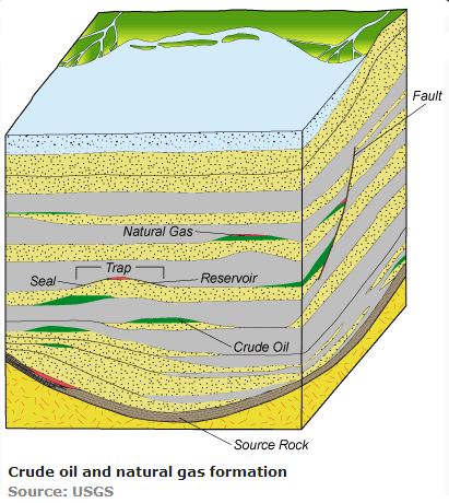
Since many easy-to-access oil reserves have already been tapped, more expensive technology is required to reach new reserves. The higher production costs drive higher gasoline prices as crude oil is the main substance in gasoline, which powers our transportation.

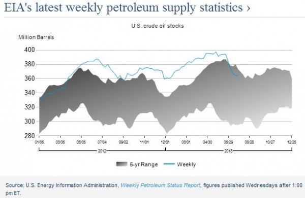
The S&P GSCI Crude Oil has a gained a total of 17.5% since May which is the most since Oct 2011. It gained 9.2% in July, the biggest monthly increase since Aug 2012 when it was also up 9.2%. This increase is from new infrastructure that has helped drain supplies and inventories from the U.S. benchmark supply point at Cushing, Oklahoma. The U.S. government data showed oil inventories at the Cushing, Oklahoma, delivery point fell for a fifth straight week to the lowest since April 2012. See the chart below from the U.S. EIA (Energy Information Administration)

Crude Oil Stocks

Also BP Plc’s new 250,000 barrel per day crude distillation unit at its Whiting, Indiana, refinery started up at the end of June, increasing demand.  This in conjunction with the U.S. Federal Reserve announcing plans to continue its $85 billion a month purchases of mortgage and Treasury securities to back the economy has supported oil prices. If the Fed eases up on the stimulus program, generally that might slow the economy and potentially drive down oil prices, then prices at the pump may come back down.

The posts on this blog are opinions, not advice. Please read our Disclaimers.

That Was Easy

Contributor Image
Craig Lazzara

Former Managing Director, Index Investment Strategy

S&P Dow Jones Indices

If every month were like July, equity investors would have an easy life.  The most striking thing about July’s U.S. equity market performance was how consistently good it turned out to be.  The S&P 500 was up +5.09%, with the Mid Cap 400 ahead of that pace (+6.20%) and the Small Cap 600 further ahead yet (+6.84%).  All 10 S&P 500 sectors rose, and all but one were up by +4% or more.  Value was marginally ahead of growth, yield-tilted strategies were ahead of vanilla, and (unsurprisingly for a +5% month), High Beta beat Low Volatility. Volatility itself declined sharply, as it typically does in good markets, although our Dynamic VEQTOR Index turned in a positive (+2.31%) result.

The international equity markets were also up strongly, with the S&P Europe 350 gaining +7.42% to pace the field.  Emerging markets (+0.83%) were much weaker than their developed counterparts, with Latin America (-1.64%) proving a drag on performance.  Even commodities had a good month, led by their energy components — the Dow Jones-UBS Commodity Index rose by +1.36%, and the more energy-laden S&P GSCI gained +4.91%.

Of course, there’s a dark lining in every silver cloud, and this month, as in May and June, long-term interest rates rose.  The S&P/BGCantor 20+ Year U.S. Treasury Index fell -1.61%, with its 7-10 year counterpart off -0.43%  Shorter duration indices dodged the bullet; the S&P/LSTA U.S. Leveraged Loan 100 Index gained +1.22% in July.

The posts on this blog are opinions, not advice. Please read our Disclaimers.

Shorter Municipal Bonds Hang In There While Long Municipal Bonds Suffer

Contributor Image
J.R. Rieger

Former Head of Fixed Income Indices

S&P Dow Jones Indices

Fund outflows in the municipal bond asset class, in part driven by the Detroit bankruptcy, pushed municipal bond performance down in July according to the S&P National AMT-Free Municipal Bond Index.


Other Sectors and Asset classes:

July 2013

 YTD
S&P Municipal Bond California Index

-0.95%

-3.64%
S&P Municipal Bond Illinois Index

-1.23%

-3.70%
S&P Municipal Bond Michigan Index

-1.28%

-3.87%
S&P Municipal Bond New York Index

-0.81%

-3.45%
S&P Municipal Bond Puerto Rico

-4.18%

-6.61%
S&P Municipal Bond High Yield

-2.12%

-3.58%
Investment Grade Corporate Bonds
S&P U.S. Issued Inv Grade Corp Bond Index

+0.68%

-2.47%
High Yield Corporate Bonds
S&P U.S. Issued High Yield Corp Bond Index

+1.70%

+2.88%


The posts on this blog are opinions, not advice. Please read our Disclaimers.

Despite strong double-digit gains in the equity markets last year, S&P 500 issues posted record pension and OPEB underfunding in 2012

Contributor Image
Howard Silverblatt

Senior Index Analyst, Product Management

S&P Dow Jones Indices

Despite strong double-digit gains in the equity markets last year, S&P 500 issues posted record pension and OPEB underfunding in 2012. The double-digit equity gains of 2012 were no match for the artificially low interest rates which vaulted pension liabilities into record underfunding territory. Companies have only 77 cents for each dollar they owe in pensions and only 22 cents for each dollar of OPEB obligations. Overall, pensions and OPEB remain a manageable expense, currently within income and assets levels. Pensions funding should improve since interest rates have risen -> the higher the interest rate used the lower the discounted liabilities.

The full report, “S&P 500 2012 Pensions and Other Post Employment Benefits (OPEB): The Final Frontier”, can be accessed at www.spdji.com/sp500.

Defined pensions underfunding set a new record at $451.7B in 2012, up $97B billion from $354.7B in 2011 (up $206.7B from $245B in 2010). The S&P 500 rose 13.41% and the S&P Global BMI ex-U.S. added 14.05%, but it’s what you owe more than what you have. Pension funding rate decreased to 77.3% from 78.8% in 2011 (83.9% in 2010). Pension return rates declined for the 12th consecutive year, to 7.31% from 7.60% in 2011 (7.73% in 2010). Discount rates declined for the fourth year in a row, falling 78 bps to 3.93% from 4.71% in 2011 (5.31% in 2010), significantly increasing projected obligations.

Funds maintained 2011 allocations in 2012 in an attempt to manage forward risk from markets. Equity allocations ticked up to 48.6% from 48.4%. Fixed income allocations ticked down to 40.4% from 40.9%.

OPEB underfunded increased to $234.9B from $223.4B in 2011 ($210.1B in 2010). Funding rate increased to 22.3% from 21.8%. OPEB remains a target for cuts. Medical coverage is now a political as well as social issue.

Combined, S&P 500 companies have set aside $1.60 trillion in pensions & OPEB funds to cover $2.29 trillion in obligations,  with the resulting underfunding equating to $686.6B, or a 70.0% overall funding rate.

Companies continue to shift retirement risk to the individual. The good news for current retirees is that most S&P 500 large-cap issues have enough cash and resources available to cover the expense. The bad news is for future retirees, whose benefits have been reduced or cut and will need to find a way to supplement, or postpone their retirement. The American dream of a golden retirement for baby boomers has dissipated for most.

Legacy pension and OPEB programs will mostly work their way out of the last bastions of the U.S. labor market over the next several decades. For baby-boomers it is already too late to safely build-up assets, outside of working longer or living more frugally in retirement. For younger workers, there is a need to start early, permitting time to compound their returns for their retirement. For individuals, the personal wealth depletion, via lower housing and equity positions, combined with lower pension and OPEB benefits (as longevity and the cost of staying healthy continue to escalate), has left potential retirees with little ability to retire. The current economic reality of strained government programs, the need for additional revenue (taxes), reduced spending (entitlement programs), and higher social costs have heralded a return to the retirement of prior generations: you work for most of your longer life and spend your remaining years in retirement in a reduced lifestyle.  The result is that the American dream of a golden retirement for upcoming baby boomers is quickly dissipating. The current situation leaves few options for a comfortable retirement, and few years for baby boomers to significantly add to their retirement resources, outside of working longer.

Personal:

Let me put it this way, my teenage kids worked last summer (and this one) and I ‘talked’ them into opening up a Roth IRA, even though they won’t get the money for almost fifty years (I matched their contributions  – think I did good, considering I could have gotten stuck with the entire amount).  It will be difficult for my generation, where many of us are split between our old IRAs, pensions (most being frozen), 401k and savings.  But for the next generation, its looks like it’s all on them.  So they need to start early, and let time compound their early contributions (amazing, I used to worry about their college fund, now I’m trying to help start them off for their retirement – and I’m still working; middle-class is strange, just glad I can do it).

The posts on this blog are opinions, not advice. Please read our Disclaimers.

Inside the S&P 500: Float adjustment

Contributor Image
David Blitzer

Former Managing Director and Chairman of the Index Committee

S&P Dow Jones Indices

Most stock indices where the weight of each stock depends on its market value are “float adjusted” meaning that the index only counts those shares that are available to investors and excludes closely held shares or shares held by governments or other companies.

The S&P 500 moved to float adjustment in in 2004-2005.  Initially many investors expected substantial changes would result.  By most estimates, between 10% and 15% of the stock of each company in the index is held by ETFs or indexed money managed for pensions, endowments or mutual funds.  With a block that large held by index trackers, it would seem that counting only the stock that is readily available to investors and index trackers would matter.  There were two counter arguments raised by some analysts. First, the stocks in the S&P 500 are all liquid. Currently a stock should exhibit at least 100% share turnover in a year when it joins the index; most companies in the index surpass this by a wide margin.  Second, the index has a long-standing requirement that at least 50% of a company’s outstanding stock be part of the public float when it entered the index so low-float companies were excluded.

Looking back to September 2005, when the index became float adjusted, we can see the results of float adjustment.  The chart shows the official or float adjusted S&P 500 and the same index without float adjustment. (S&P Dow Jones Indices calculates both versions.)  In terms of price performance, the difference is very small – barely visible on the chart.  The difference in index levels on July 26, 2013 – almost eight years since the introduction of float adjustment– is 13 index points or 77 basis points.  The weight of the ten largest stocks in the float adjusted S&P 500 as of July 26th close is 18.09%, slightly less than the ten largest stocks in the non-adjusted index which were 18.14%.  One of the ten largest stocks in the non float-adjusted index, Wal-Mart, does not make it to the top ten in the float adjusted index because closely held shares are excluded.

Does all this mean that float adjustment was unnecessary? No. Rather the average float factor – the percentage of shares in public float – across all 500 stocks in the index today is over 97%. In the U.S. large cap market segment that the S&P 500 tracks, the vast majority of stock is not closely held.  Compare the 97% to the same statistic for the S&P Small Cap 600, 91% or the S&P Europe 350 at 82%.

Float Chart

Details on float adjustment are available on the S&P Dow Jones Indices web site,

The posts on this blog are opinions, not advice. Please read our Disclaimers.