Get Indexology® Blog updates via email.

In This List

Why is the VIX so high?

FII Net Flow - Tell it to Sweeney!

Backwardation Bonanza!

The Mind of the Fed

Practical Considerations for Implementing Alternate Beta Strategies

Why is the VIX so high?

Contributor Image
Tim Edwards

Managing Director, Index Investment Strategy

S&P Dow Jones Indices

No, our crack proofreading team didn’t muff the headline.  After several weeks of seemingly unanimous commentary about how investor complacency has resulted in VIX® levels that are “too low,” we want to ask the contrarian question.  Rather than being too low, why is the VIX so high?

The question is germane because there has been hardly any volatility in the S&P 500®. Realized volatility has been running at roughly 6%-7% annualized. And although the VIX is a measure of implied, or anticipated, rather than actual, volatility – it still ought somehow to be anchored in realized volatility data.

The VIX is currently much, much higher than realized volatility – at around 11.5 as we write.  One interpretation of this is that the market “expects” next month’s volatility to be nearly double what we’ve seen recently. Moreover, the futures market is pricing in an expected gain in the VIX to around 17 by March 2015 — nearly triple the current level of realized volatility.  Two questions naturally emerge:

  1. Does the market really expect a doubling or tripling of volatility?  Otherwise said, is the VIX “worried” about something that the equity market hasn’t noticed yet?
  2. Can I make money from this?

The first question relates to the information that the VIX ultimately conveys. To simplify, suppose two types of events can affect the equity markets: i) day to day economic or company-specific news driving the cut-and-thrust of market flows and ii) extraordinary events – sometimes called tail risks – which might (or might not) be financial in nature (a major earthquake, for example).

Total risk is of course a combination of events of type i) and type ii) and everything in between.  It happens to be the case that recent data comprise a steady trickle of the former and none of the latter. But lower risk of the first type does not necessarily imply lower risk of the second type. To use a geological analogy: there were no earthquakes in California last month (i.e. no short-term volatility), but the probability of a major temblor along the San Andreas fault (i.e. a tail event) has not gone down. This is somewhat intuitive: the average institutional investor may be reassured by Yellen’s so-far steady chairmanship or the overall macroeconomic outlook, but the tail risk gods are supremely indifferent.

As a consequence, a high proportion of the risk in equity markets currently is accounted for by the possibility of tail events (a phenomenon manifest in so-called “skew”).  In other words, a VIX several points higher than realized volatility is consistent with a market expectation of continuing similar volatility unless something surprising happens. The mere possibility of tail events – invisible in current equity valuations – provides the VIX with a different perspective, evoking Michel de Montaigne:

 “My life has been full of terrible misfortunes most of which never happened.”

Turning to opportunity for profit: the key judgement relates to whether the likelihood of an extreme event is overpriced.  Selling S&P 500 put and/or call options can realize a profit if volatility proves less than expected, as can taking short positions in either VIX futures or in related exchange-traded products. Indeed, such strategies are popular ways to capture any “premium” to the VIX systematically. However, the risks of such strategies are far from symmetric: if the VIX were to remain roughly where it is for the next month, a short position in the July 2014 VIX future stands to make a 6% return. On the other hand, the occurrence of a tail event could quite conceivably send the VIX towards the top of its historical range. The losses on a short position during such a scenario would then be several multiples of the notional amount invested.

Even when profit is possible, or highly likely, dramatic risks remain.  Selling volatility remains a strategy exclusive to the courageous.  Perhaps that is one reason why the VIX is so high.

The posts on this blog are opinions, not advice. Please read our Disclaimers.

FII Net Flow - Tell it to Sweeney!

Contributor Image
Utkarsh Agrawal

Associate Director, Global Research & Design

S&P Dow Jones Indices

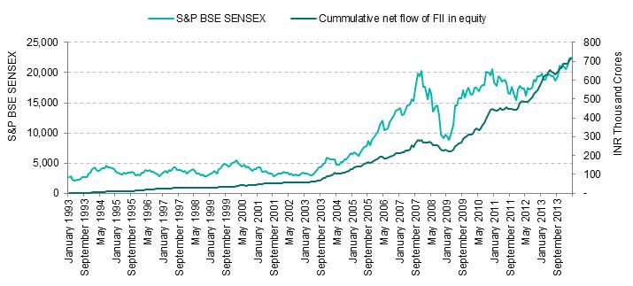
The Indian Stock Market has continued to be volatile recently. The Lok Sabha election and the formation of the new Indian government boosted the stock market to an all-time high. The S&P BSE SENSEX Price Return Index surged and went beyond the threshold of 25,000 points. FII activity also increased with the positive sentiment and outlook of the stock market.

Looking at Exhibit 1, it is noticable that the cumulative net investment of FII in equity has been increasing, except in 2008 at the time of global recession.  From Dec. 31, 2007, to April 30, 2009, the percentage decrease of the cumulative net investment of FII in equity was approximately 19%, while in the case of the S&P BSE SENSEX it was approximately 44%.  The percentage decrease in the S&P BSE SENSEX was much greater than in the cumulative net investment of FII in equity.  The question then arises: the stock market is affected by FII activity, but does it play a dominating role?

Exhibit 1: S&P BSE SENSEX and Cumulative Net Flow of FII in Equity

FII 1

Source: AIPL and SEBI. Data as of last trading day in April 2014. Charts and graphs are provided for illustrative purposes.  Past performance is no guarantee of future results.  This chart may reflect hypothetical historical performance.  Please see the Performance Disclosures for more information regarding the inherent limitations associated with back-tested performance. 

Let’s examine the affect of FII activity by testing if the volatility of the return of the S&P BSE Indices is greater than the volatility of the percentage change in the cumulative net flow of FII in equity. We also examine what the correlation is between them.

Let the null hypothesis be that the variance of the return of the S&P BSE Indices is less than or equal to the variance of the percentage change in the cumulative net flow of FII in equity.  The alternate hypothesis will be that the variance of the return of the S&P BSE Indices is greater than the variance of the percentage change in the cumulative net flow of FII in equity.  The alternate hypothesis is what we are most interested in.

Assuming that the returns of the indices and the percentage change in cumulative net flow of FII in equity are normally distributed, the appropriate test statistic will be the F-Test.  Let’s perform the test at 1% level of significance.  If the test statistic is greater than the critical value, we reject the null hypothesis and accept the alternate hypothesis.  Exhibit 2 displays the variances and Exhibit 3 displays the critical values at a 1% significance level and the computed test statistics.

Exhibit 2: Sample Variance of Monthly Returns of the S&P BSE Indices and the Percent Change in Cumulative Net Flow of FII in Equity
Period FII Net Flow* (%) S&P BSE SENSEX (%) S&P BSE 100 (%) S&P BSE 200 (%) S&P BSE 500 (%) S&P BSE MID CAP (%) S&P BSE SMALL CAP (%)
3 Year 0.0351 0.2256 0.2630 0.2656 0.2670 0.3726 0.4580
5 Year 0.0599 0.3807 0.4212 0.4310 0.4412 0.6569 0.9015
10 Year 0.0842 0.5324 0.5920 0.6095 0.6282 0.8477 1.1348
15 Year 0.0844 0.5283 0.6530 0.6492 0.6699
20 Year 0.0958 0.5344 0.6192 0.6191

Source: AIPL and SEBI.  Data as of last trading day in April 2014.  FII Net Flow* is the monthly percentage change in the cumulative net flow of FII in equity.  Charts and graphs are provided for illustrative purposes. Past performance is no guarantee of future results.  This chart may reflect hypothetical historical performance.  Please see the Performance Disclosures for information regarding the inherent limitations associated with back-tested performance. 

Exhibit 3: F-Test Statistic of Monthly Returns of the S&P BSE Indices and the Percent Change in Cumulative Net Flow of FII in Equity
Period S&P BSE SENSEX S&P BSE 100 S&P BSE 200 S&P BSE 500 S&P BSE MID CAP S&P BSE SMALL CAP F Critical*
3 Year 6.4341 7.5028 7.5750 7.6157 10.6273 13.0634 2.2309
5 Year 6.3500 7.0256 7.1892 7.3602 10.9578 15.0381 1.8459
10 Year 6.3228 7.0304 7.2387 7.4601 10.0674 13.4760 1.5358
15 Year 6.2564 7.7327 7.6888 7.9333 1.4178
20 Year 5.5784 6.4631 6.4625 1.3523

Source: AIPL and SEBI.  Data as of last trading day in April 2014.  F Critical* is at 1% level of significance.  The F-Test statistic is calculated by dividing the sample variance of the monthly returns of the index by the sample variance of the monthly percentage change in the cumulative net flow of FII in equity.  Charts and graphs are provided for illustrative purposes.  Past performance is no guarantee of future results.  This chart may reflect hypothetical historical performance. Please see the Performance Disclosures for information regarding the inherent limitations associated with back-tested performance. 

The results in Exhibit 3 lead us to reject the null hypothesis for all periods and for all indices, as the test statistics computed are greater than the corresponding critical value.  Therefore, we conclude that the volatility of the returns of the S&P BSE Indices is greater than the volatility of the percentage change in the cumulative net flow of FII in equity.

Exhibit 4: Correlation Between Monthly Returns of the S&P BSE Indices and the Percent Change in Cumulative Net Flow of FII in Equity
Period S&P BSE SENSEX (%) S&P BSE 100 (%) S&P BSE 200 (%) S&P BSE 500 (%) S&P BSE MID CAP (%) S&P BSE SMALL CAP (%)
3 Year 43.70 46.97 48.78 49.40 55.17 46.09
5 Year 58.70 59.40 60.55 61.00 63.25 59.27
10 Year 64.56 64.66 65.15 65.40 64.73 59.91
15 Year 56.19 52.26 52.18 51.94
20 Year 46.85 43.98 43.57

Source: AIPL and SEBI.  Data as of last trading day in April 2014.  Charts and graphs are provided for illustrative purposes.  Past performance is no guarantee of future results.  This chart may reflect hypothetical historical performance.  Please see the Performance Disclosures for information regarding the inherent limitations associated with back-tested performance. 

From Exhibit 4, we can observe that the correlation between the return of the S&P BSE Indices and the percentage change in the cumulative net flow of FII in equity is also less than 70%, thus failing to be statistically strong.

These results lead us to conclude that FII activity affects the stock market, but it has not played a dominating role.


The posts on this blog are opinions, not advice. Please read our Disclaimers.

Backwardation Bonanza!

Contributor Image
Jodie Gunzberg

Former Managing Director, Head of U.S. Equities

S&P Dow Jones Indices

If you experience your most expensive 4th of July ever, it may be from the unprecedented shortages of commodities in June.  Since 1970, as far back as the S&P GSCI has data, there has never been a June with as many commodities in backwardation as in June 2014.

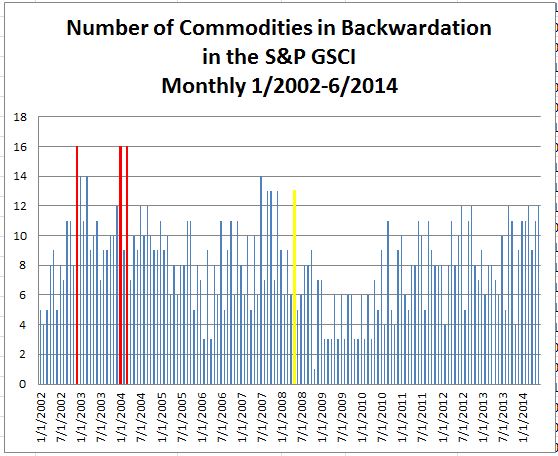
Of 24 commodities in the S&P GSCI, 23 of which are in the DJCI, 12 are in backwardation (as defined by the monthly excess return less the monthly spot return): Brent Crude, CocoaCopperCorn, Cotton, WTI Crude Oil, Feeder Cattle, GoldLive CattleNatural Gas, Soybeans and Unleaded Gasoline.  16 commodities are the most that were ever in backwardation together during any month in history. That happened 3 times: in March 2004, Jan 2004, and Dec 2002.  Also, the last time there were more than 12 commodities in backwardation was before the global financial crisis, back in May 2008, when there were 13 commodities in backwardation.

Source: S&P Dow Jones Indices. Data from Jan 2002 to Jun 2014. Past performance is not an indication of future results.

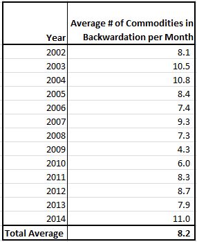
The average number of commodities in backwardation per month since 2002 when all 24 commodities were included in the index is 8. In 2014 through June, it has been 11 per month on average. We have not seen this since 2004 when the average was also 11 per month – the total return that year was 17.3%.

Source: S&P Dow Jones Indices. Data from Jan 2002 to Jun 2014. Past performance is not an indication of future results.

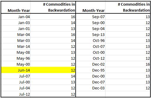
Last, notice in the chart below that going all the way back to 1970, there are some months that never saw 12 or more commodities in backwardation.  Never has a Feb, Apr, Aug or Nov seen a count this high, and in 2014, June makes it’s first appearance in the list.

Source: S&P Dow Jones Indices. Data from Jan 2002 to Jun 2014. Past performance is not an indication of future results.


The posts on this blog are opinions, not advice. Please read our Disclaimers.

The Mind of the Fed

Contributor Image
David Blitzer

Former Managing Director and Chairman of the Index Committee

S&P Dow Jones Indices

The saying goes, “if the only tool you have is a hammer, everything looks like a nail.”  That is the difficulty Fed chair Janet Yellen sees in monetary policy: if the only tool is raising or lowering interest rates, then everything – bubbles, inflation, unemployment, excessive risks, yield hunting or systemically important financial institutions – looks like nails.  In a lecture at the IMF earlier this week (here), Mrs. Yellen answered questions about future bubbles and rate increases by explaining that the Fed has much more than the hammer of interest rates.

Macroprudential policy may not get through most spell checkers, but it is the chosen approach to frothy financial markets and incipient bubbles.  Macroprudential policies are not new, but most were not aggressively used in the run-up to the financial crisis. Examples include regulatory limits on leverage, restrictions on short term funding and stronger underwriting standards for loans and mortgages. When the challenges in the financial markets are rapidly rising home prices or excessive and misunderstood risks, the response should be tighter credit standards for mortgages or restrictions on leverage.  If the Fed were to raise interest rates to burst a housing bubble, the bubble might persist while higher interest rates boosted unemployment or lowered economic growth.  Restrictions on loan-to-value and income-to-loan ratios would be a better choice.  Interest rate policy should be reserved for controlling inflation and unemployment.

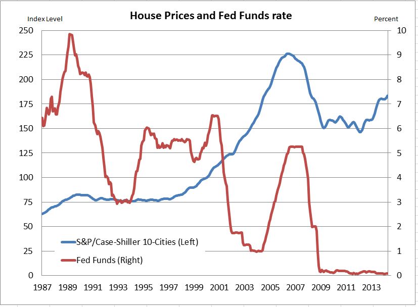
The chart shows the monthly pattern of home prices (as measured by the S&P/Case-Shiller 10 City Composite Index) and the fed funds rate since 1987.   While whether the fed funds rate aggravated the housing bubble is debatable, there is a need for better ways to address bubbles,

Source: S&P Dow Jones Indices, US Federal Reserve Board

The combined use of interest rate and macroprudential policies has some implications for investors: First, worries about a renewed housing bubble are not likely to push the Fed to raise interest rates. Those who want to argue that the rate increase will come sooner than the consensus target of the summer of 2015 need to argue about inflation and unemployment. Second, macroprudential policies are likely to reduce risks and profits in the financial sector. Less leverage should reduce the risk of another Lehman Brothers scale bank failure; it will also lower bank profits.

Some may wonder why macroprudential policy rules are needed – shouldn’t market discipline keep leverage in line and maintain credit standards?  Hyman Minsky, a sometimes forgotten economist, noted that when good times persist people forget the risks and ignore the rules until the bubbles grow, leverage expands and banks and businesses fail.  Macroprudential policy is partially an effort to control human nature.

The posts on this blog are opinions, not advice. Please read our Disclaimers.
Practical Considerations for Implementing Alternate Beta Strategies

Contributor Image
Daniel Ung

Former Director

Global Research & Design

Recent financial crises have exposed the shortcomings of the traditional approach to asset allocation and have led an emerging shift, especially among institutional investors, towards dynamic asset allocation, hinged on the diversification across risk factors. While there are numerous research papers that explore this topic, they tend to be theoretical and it is for this reason we have written a research paper which has a stronger focus on the practical aspects of implementation. (Click here to access the paper)

Key Stages of Decision Making and Implementation

 alt_beta_strategies_ung

Necessary Considerations prior to adopting alternate beta strategies in asset allocation

  • The adoption of alternate beta strategies is often related to the investment philosophy of an organization and whether it subscribes to the belief that long term risk premia can be harvested to achieve long-term returns.
  • Investors may adopt alternate beta strategies because of their investment objectives and constraints.
  • Are there the commitment and the expertise inside the company to ensure successful implementation?

How to ensure successful implementation?

  • Choose the right mix of factors, in order to achieve investment objectives and meet constraints.
  • Evaluate the diverse offering in the marketplace and choose appropriate strategies and a skilful manager
  • Understand  the secondary exposures of alternate beta strategies
  • Assess the costs of implementation (direct costs, such as commissions, and indirect costs, such as implementation shortfall and portfolio turnover)
  • Measure and monitor performance on an ongoing basis.

The posts on this blog are opinions, not advice. Please read our Disclaimers.