Get Indexology® Blog updates via email.

In This List

Sectors: A tale of American Culture

Long and Short of It: Munis Outshine Equities in 2014 as Demand Holds

Investing is Simple…Really?

Is Climate Change Impacting Your Grocery Bill?

The Fed Views a Stronger Economy, Preferred and Investment Grade Corporate Bond Indices Going Strong

Sectors: A tale of American Culture

Contributor Image
Howard Silverblatt

Senior Index Analyst, Product Management

S&P Dow Jones Indices

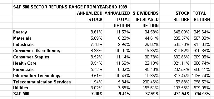
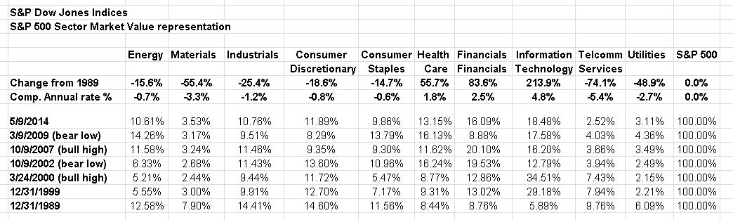
The makeup of the S&P 500 reflects the U.S. overall big-cap public market, and while it’s relevance to investing is well known, it is also a reflection on the changes in U.S. culture. Last December Facebook was added to the S&P 500, signaling the importance of social media. The prior month J.C. Penney was removed, signaling the end of traditional ‘mail order’ houses (Sears, Montgomery Ward, Woolworth), as the new ‘mail order’ houses, such as Amazon.com and to some degree negotiated mail order issue eBay took their business place. In 2012, Apple started to pay a dividend, propelling Information Technology to become the largest dividend payer (who would have tunk it), just as Apple’s price move had helped the sector maintained its position as the largest sector in the index. And in December 2010, The New York Times was removed from the S&P 500, in what many saw as signaling that print products no longer needed representation in the big caps – as the issue was added to the S&P MidCap 400; Eastman Kodak – one of the original S&P 500 and nifty-50 issues was also moved to the S&P MidCap. On a higher level, from the end of 1989, the shift has been to Health Care, as Americans live longer, and spend more to do so; the Finance sector saw financial institutions grow and try to become ‘one-shop’ centers, as retirement responsibility was shifted to individuals from institutions (as health care is now doing), and investing, insurance, and ‘planning’ has grown; and of course Information Technology, to which the capabilities of my smart phone overpowers rooms of computers from when I used key-punch cards in college (I still have some in the office, along with a few 5” floppies, and an epcdic 6250 tape). Down over the period, partially because of the faster pace of the growth of the former three, is materials, which is partially due to the shift in global operations (this is a U.S. index, even though foreign sales for the S&P 500 are approaching 50%). Consumer groups have declined, partially due lower market values, inspired by lower margins and profits (again, global shifts in production play a key issue). However, the largest decline is in the Industrial sector, where the share of ‘made in the U.S.A.’ and ‘look for the union label’ has declined – which is a commentary in and of itself. Not seen in the sectors is Transportation, which declined so much it was moved from a major group (there were four originally: industrials, transportation, financials, and utilities) to a sub-group within Industrials. And while I’m on sectors, let me note that most investors don’t realize how small energy is – at 10.6% of the index it ranks 6th in market value of the 10 sectors. That wasn’t always the situation. Energy, for a very brief period in July 2008 was the largest sector under GICS (then Information Technology and Financials). And if I go back to my Stock Guide days (where I started), and construct proforma groups, the 1980 representation for Energy is 28.7%, with financials and the equivalent of Information Technology being a lot smaller.

pic12

As for those die-hard capitalists who denounce sentimental retrospectives (although there is always money in sentimental retrospectives – just ask the movie industry), here are the hard, cold prices. News reports typically focus on short-term gains, sometimes the big winner for the day, then at month-end, quarter-end and year-end. The news follows the ‘glory’ of the win, quick money, and playing the long-shot. However, many investors are long-term and not home-run hitter, and they measure their numbers over years and decades. Long-term investing has different characteristics. For that time period dividends count significantly, since they pay every year – in good markets and bad (cash-flow is up there in importance), and when compounded can change the return (and therefore the rick-reward trade-off) significantly. To illustrate, utilities are generally considered slower, but steadier growth investments, paying dividends as they go; they typically (and there are lots of non-typicals out there) attracts income seekers and those wishing lower risk and lower volatility. Since 1989 utilities have returned 3.03% compounded annually, but with dividends added back in, they have returned 7.85% – lower than the S&P 500’s 7.10% stock return, but closer to the 9.41% with dividends (which is a risk-reward trade-off). Information Technology, a sector known for higher risk, has returned 9.51% in stock, and slightly higher with their lower dividends – 10.49%. The difference in breakdown is significant, but so is the risk, with each investor deciding their own trade-off. Sector investor is also popular for long-term trends, where investors believe certain groups will need to survive and prosper over time. Health Care, which is up 11.66% with dividends (the best of any sector) and energy, which is up 11.59% are examples.

pic13

The posts on this blog are opinions, not advice. Please read our Disclaimers.

Long and Short of It: Munis Outshine Equities in 2014 as Demand Holds

Contributor Image
J.R. Rieger

Former Head of Fixed Income Indices

S&P Dow Jones Indices

Demand for munis continues to outpace supply and the result is the muni market is reflecting strength from the five year maturity range on out.  On the shorter end of the curve, five year non-callable municipal bonds tracked in the S&P AMT-Free Municipal Series 2019 Index have returned 2.19% just about where the S&P 500 TR is.  In the intermediate part of the curve, seven year non-callable municipal bonds tracked in the S&P AMT-Free Municipal Series 2021 Index have outpaced the equity market by returning 4.41% with yields dropping by 33bps this year.  Slightly longer bonds in the nine year range maturing in 2023 have returned over 6.2% year to date with yields of the bonds tracked in the S&P AMT-Free Municipal Bond 2023 Index dropping by 79bps.

The long end of the bond market continues to enjoy double digit returns.  The S&P Municipal Bond 20 Year High Grade Index has returned just under 12% year to date with yields dropping by 70bps on the year.

In the high yield arena, the S&P Municipal Bond High Yield Index has returned 8.16% year to date more than double the return of its corporate counterpart, the S&P U.S. Issued High Yield Corporate Bond index, which has returned 3.99% year to date.

Keeping an eye on bonds from Puerto Rico, the S&P Municipal Bond Puerto Rico General Obligation Index has returned 12.26% year to date helping to offset a 2013 decline of over 20%.

Source: S&P Dow Jones Indices LLC.  Data as of May 8, 2014.
Source: S&P Dow Jones Indices LLC. Data as of May 8, 2014.
Source: S&P Dow Jones Indices LLC.  Data as of May 8, 2014.
Source: S&P Dow Jones Indices LLC. Data as of May 8, 2014.

The posts on this blog are opinions, not advice. Please read our Disclaimers.

Investing is Simple…Really?

Contributor Image
Koel Ghosh

Former Head of South Asia

S&P Dow Jones Indices

Investing, for some can be a pretty cumbersome task. Surprisingly, many professionals may also confess to being lazy in the “investing” department. Very often investment houses enthuse the dormant investors with a rendition of a very popular slogan, “You are working hard for money, but is your money working hard for you?” It’s the same old story that we hear over and over with excuses founded on busy schedules, daily routines of hectic work and simply put, no time. Many of us are comfortable just knowing that our monthly paycheck sits safely, resting in a bank savings account. Currently, the average savings accounts interest rate(s) are between 4% and 6% but are we really earning that interest? The Inflation Rate (Consumer Price Index) in India has been close to reaching double-digits since 2009. If we were to actually understand the ultimate net return on our savings, we would realize that it’s actually negative!

Source: International Monetary Fund, World Economic Outlook Database, April 2014

In India, there are two popular avenues of investment, bank deposits and gold. The annual bank fixed deposit rates for the past year have ranged between of 8% and 10%. Realizing that inflation is in fact eroding the returns does give cause to look for viable investment options. As per the latest World Gold Council report, India, for the first time lost its tag of the world’s largest gold consumer to China, who was reported to have 1,065.8 tons in 2013. The Indian government in order to reduce the large current account deficit, introduced a number of measures last year.  These measures are intended to curb the demand for gold, which is one of the country’s biggest imports.  However, it seems that this was only an initial check as the demand for gold is expected to be back on the rise this year. While a few see gold as an investment, many consumers merely hoard this commodity, thereby widening the deficit even further. As shared by my colleague, Jodie in an earlier post on Indexology, in 2013 gold lost 28.3%, the most in a single year since 1981, when gold lost 32.8%. Following this event, a recovery period for gold started, which lasted 25 years. If history it set to repeat itself as we have all come to believe it does in some form or fashion, there may be a long recovery period for gold to follow. However, much of this depends on the fundamentals of investing for today and the availability of investment options today which are supposed to make investing effortless and simple. Olympic Metals: Going For The GOLD?!

Source: Thomson Reuters GFMS, World Gold Council


The posts on this blog are opinions, not advice. Please read our Disclaimers.

Is Climate Change Impacting Your Grocery Bill?

Contributor Image
Jodie Gunzberg

Former Managing Director, Head of U.S. Equities

S&P Dow Jones Indices

It doesn’t take a weatherman to point out the crazy weather we have experienced in the recent past. There are more severe droughts, storms, freezes and heat that many blame on climate change. The National Climate Assessment, that will drive Barack Obama’s environmental agenda, notes that average temperature in the US has increased by about 1.5F (0.8C) since 1895, with more than 80% of that rise since 1980. The last decade was the hottest on record in the US.

The last five decades have seen a progressive rise in the Earth’s average surface temperature. Bars show the difference between each decade’s average temperature and the overall average for 1901-2000. (Figure source: NOAA NCDC).

What impact does this spike in temperature have on agriculture and the price of food we consume?

It depends on a number of factors and the answer may be different than you think. Production, a factor some think is an obvious driver, is often not closely related to price, which can be observed somewhat through the relationship of roll yield and price returns. Although in 1973, when a large percentage shortfall from expected production occurred, there was a large price spike, sometimes the impact has been far less severe. Other shortfalls happened in 1983, 1988, 1993 and in 2012 but the prices barely moved. The chart shows that a significant production shortfall is neither necessary nor sufficient to cause a price spike.

Source: S&P Dow Jones Indices and Bloomberg. Data from Jan 1970 to Apr 2014. Past performance is not an indication of future results. This chart reflects hypothetical historical performance. Please note that any information prior to the launch of the index is considered hypothetical historical performance (backtesting).  Backtested performance is not actual performance and there are a number of inherent limitations associated with backtested performance, including the fact that backtested calculations are generally prepared with the benefit of hindsight.
Source: S&P Dow Jones Indices and Bloomberg. Data from Jan 1970 to Apr 2014. Past performance is not an indication of future results. This chart reflects hypothetical historical performance. Please note that any information prior to the launch of the index is considered hypothetical historical performance (backtesting). Backtested performance is not actual performance and there are a number of inherent limitations associated with backtested performance, including the fact that backtested calculations are generally prepared with the benefit of hindsight.

Looking at seasonal data that is broken by quarter from 1970-2014, the S&P GSCI Agriculture returns are generally stable with a decrease in returns during the summer quarters (Q3) mainly from the huge spike in the mid 70’s.

Source: S&P Dow Jones Indices and Bloomberg. Data from Jan 1970 to Apr 2014. Past performance is not an indication of future results. This chart reflects hypothetical historical performance. Please note that any information prior to the launch of the index is considered hypothetical historical performance (backtesting).  Backtested performance is not actual performance and there are a number of inherent limitations associated with backtested performance, including the fact that backtested calculations are generally prepared with the benefit of hindsight.
Source: S&P Dow Jones Indices and Bloomberg. Data from Jan 1970 to Apr 2014. Past performance is not an indication of future results. This chart reflects hypothetical historical performance. Please note that any information prior to the launch of the index is considered hypothetical historical performance (backtesting). Backtested performance is not actual performance and there are a number of inherent limitations associated with backtested performance, including the fact that backtested calculations are generally prepared with the benefit of hindsight.

However, more than 80% of the temperature rise has occurred since 1980, and with that has come some prices increases, even with the financial crisis and huge demand drop of 2008-9. When we cut the shortfall of the 70’s out, the picture changes with an increase of roughly 16 basis points per summer quarter (Q3), which could be due to the climate change.

Source: S&P Dow Jones Indices and Bloomberg. Data from Jan 1980 to Apr 2014. Past performance is not an indication of future results. This chart reflects hypothetical historical performance. Please note that any information prior to the launch of the index is considered hypothetical historical performance (backtesting).  Backtested performance is not actual performance and there are a number of inherent limitations associated with backtested performance, including the fact that backtested calculations are generally prepared with the benefit of hindsight.
Source: S&P Dow Jones Indices and Bloomberg. Data from Jan 1980 to Apr 2014. Past performance is not an indication of future results. This chart reflects hypothetical historical performance. Please note that any information prior to the launch of the index is considered hypothetical historical performance (backtesting). Backtested performance is not actual performance and there are a number of inherent limitations associated with backtested performance, including the fact that backtested calculations are generally prepared with the benefit of hindsight.

What is more interesting is the rise in premiums when premiums were commanded. Notice Q1 of 2014 is the best performing first quarter in the history of the index.  Seasonally in Q3, when the dog days of summer occur, is when the prices spike most.  Q3 of 2010 was the best performing summer in history, up 33.4%, besides in 1973 when prices spiked 44.0%. Return premiums are rising through time, except in the second quarter, and on average have been 6.0% (Q1), 8.6% (Q2), 10.0% (Q3) and 9.2% (Q4) with average quarterly rises of 0.16% (Q1), -0.39% (Q2), 0.30% (Q3) and 0.17% (Q4) .

Source: S&P Dow Jones Indices and Bloomberg. Data from Jan 1980 to Apr 2014. Past performance is not an indication of future results. This chart reflects hypothetical historical performance. Please note that any information prior to the launch of the index is considered hypothetical historical performance (backtesting).  Backtested performance is not actual performance and there are a number of inherent limitations associated with backtested performance, including the fact that backtested calculations are generally prepared with the benefit of hindsight.
Source: S&P Dow Jones Indices and Bloomberg. Data from Jan 1980 to Apr 2014. Past performance is not an indication of future results. This chart reflects hypothetical historical performance. Please note that any information prior to the launch of the index is considered hypothetical historical performance (backtesting). Backtested performance is not actual performance and there are a number of inherent limitations associated with backtested performance, including the fact that backtested calculations are generally prepared with the benefit of hindsight.

Then can rising prices be attributed to hotter summers?

There are still more factors at play such as inventories that incorporate supply, demand and storage.  Remember when inventories are critically low, like they were in the 70’s and may be now, prices are much more sensitive to shocks like weather.  According to Agricultural Market Information System (AMIS), “The discussion of the commodity market model shows that stocks moderate the price-increasing effects of negative shocks to available supply. Price spikes occur after stocks have been depleted. These observations have two implications: a. Price spikes tend to come after price has already increased to a threshold price region, consistent with low aggregate supply. b. Price spikes generally come only after stocks have been depleted to a low “critical” region.”

PriceSensitivit

Also, the amount of risk investors are willing to take to supply the insurance to the producers may be lower depending on the time frame, such as after the financial crisis. When this happens, producers have less incentive to produce and store, causing volatility to spike as described by Lutz Killian.  See the chart below for spikes in volatility that correlate to production shortfalls.

Source: S&P Dow Jones Indices and Bloomberg. Data from Jan 1970 to Apr 2014. Past performance is not an indication of future results. This chart reflects hypothetical historical performance. Please note that any information prior to the launch of the index is considered hypothetical historical performance (backtesting).  Backtested performance is not actual performance and there are a number of inherent limitations associated with backtested performance, including the fact that backtested calculations are generally prepared with the benefit of hindsight.
Source: S&P Dow Jones Indices and Bloomberg. Data from Jan 1970 to Apr 2014. Past performance is not an indication of future results. This chart reflects hypothetical historical performance. Please note that any information prior to the launch of the index is considered hypothetical historical performance (backtesting). Backtested performance is not actual performance and there are a number of inherent limitations associated with backtested performance, including the fact that backtested calculations are generally prepared with the benefit of hindsight.

Still all of these factors taken together, do not necessarily mean you will be spending more at the grocery store, especially if the commercial consumer like a cereal maker uses a substitute. According to Hicks’ theory of congenital weakness, it is easier for consumers to choose alternatives so they are less vulnerable to price increases than producers are to price drops. This means you may be eating wheat rather than corn, or soybean oil rather than palm oil, so that the price you pay at the grocery store is not higher. 

Population growth and wealth are also key factors in driving the prices of agriculture. In major consuming countries such as China and India, parts of the population consume both wheat and rice, and, as rice consumers become wealthier, they tend to substitute some wheat products for rice. (The countries are also stockpiling the grains, taking more supply off the market, possibly driving prices even higher.)

Whether the substitution is from the commercial consumer or by choice from the retail consumer, sometimes unfortunately substitution is not possible such as in 1975. The poor corn harvest in the United States occurred when global wheat and rice supplies were also low, so the usual substitutes could not fill the global yield gap in corn.

Various prices are reported by consumers in different regions, especially those far from developed futures exchanges. Also, sometimes consumer prices reflect other factors like taxes or trade bans. So, it is possible index levels recorded in the agriculture sector do not accurately represent the marginal value to global consumers.  However, global prices as measured by indices are often by far the best available measures of the state of the world’s agriculture markets.

That said, the the prices you see at the grocery store may very well be increasing from global warming. Though you don’t need to be poorer by shopping for food and may offset this inflation with a basket of commodities.


The posts on this blog are opinions, not advice. Please read our Disclaimers.

The Fed Views a Stronger Economy, Preferred and Investment Grade Corporate Bond Indices Going Strong

Contributor Image
Kevin Horan

Former Director, Fixed Income Indices

S&P Dow Jones Indices

Yields on the 10-year Treasury continued lower last week as measured by the S&P/BGCantor Current 10 Year U.S. Treasury Index.  Friday’s 2.59% is one basis point off from this year’s low of 2.58% of February 3rd.  The index recorded a 2.59% in spite of the fact that the April U.S. Unemployment rate reached a low of 6.3%, a level not seen since 2008.  The Ukraine crisis and the Fed’s near zero interest rate policy continued to keep yields low.  Wednesday’s conclusion of the FOMC meeting resulted in continued stimulus reduction and stating growth in economic activity has picked up recently after being effected by the harsh winter conditions.

Domestic economic news will be quieter than weeks past as the calendar is light.  Today’s Markit U.S. Services PMI was slightly higher at 55 (54.5 expected).  Treasuries sold off on the news after having been higher from news of weakness in China’s manufacturing sector.  March’s Trade Balance is scheduled for tomorrow while MBA Mortgage Applications (-5.9% prior) is due on Wednesday.  Initial Jobless Claims (325k expected) and March’s Wholesale Inventories (0.5% expected) will close out the week.

So far 2014 is off to a good start for investment grade corporates.  The S&P U.S. Issued Investment Grade Corporate Bond Index has not had a down month yet and has returned 0.45% for May.  Year-to-date this index has returned 4.54%, 80 basis points more than high yield.  All industry sectors except for catalog retail are contributing positively to the index with the top performing sectors being electric utilities, diversified banks and integrated telecommunications.

The S&P U.S. Issued High Yield Corporate Bond Index has returned 0.08% so far for May after having returned only 0.67% for the month of April.  To date, the best performing month has been the 1.92% in February.  Year-to-date high yield has returned 3.74%.

The tone in the market improved over the past week as the S&P/LSTA U.S. Leveraged Loan 100 Index has returned 0.19% month-to-date and 1.33% year-to-date.  Last week the long-anticipated bankruptcy filing of Energy Future Holdings (formerly known as TXU) occurred.  The S&P/LSTA U.S. Leveraged Loan 100 Index holds two loans which accounted for a 0.03% weight within the index.  The loans will remain in the index though not contribute to its yield measures.


The S&P U.S. Preferred Stock Index [TR] so far has returned 0.21% for May and year-to-date has returned 9.15%.  Like investment grade corporates, this index has not had a losing month this year.  January and February were well above 2% while March and April both returned 1.8%.  Longer duration issues in positively performing names such as Royal Bank of Scotland, American Homes and General Electric have increased the returns of this index.

Source: S&P Dow Jones Indices, Data as of 5/2/2014, Leveraged Loan data as of 5/4/2014.


The posts on this blog are opinions, not advice. Please read our Disclaimers.