Get Indexology® Blog updates via email.

In This List

Australian Small Caps Advance amid Higher Gold Prices

Diversification across Durations

Why Does Index Liquidity Matter?

Looking at Trends in the S&P UBS Leveraged Loan Index

Navigating Market Cycles: The Complementary Roles of Quality and Momentum Indices

Australian Small Caps Advance amid Higher Gold Prices

Contributor Image
Sean Freer

Director, Global Exchange Indices

S&P Dow Jones Indices

The third quarter of 2025 was notable for a number of market milestones. There were 12 days when the S&P/ASX 200 reached a new all-time high at market close. The movements of the flagship market index and new highs were widely reported; however, lesser known is the outperformance of the S&P/ASX Small Ordinaries compared to the S&P/ASX 200.

The S&P/ASX Small Ordinaries was up 15.3% in Q3 2025, outperforming the S&P/ASX 200 by more than 10%. That is the largest quarterly outperformance of the S&P/ASX Small Ordinaries versus the S&P/ASX 200 since Q2 2009, when the markets were recovering from the 2008 Global Financial Crisis.

The quarter’s small-cap outperformance is also the third-largest three-month outperformance of the S&P/ASX Small Ordinaries over the S&P/ASX 200 since the inception of the index.

The Materials sector accounted for more than half of the S&P/ASX Small Ordinaries return for the quarter, with gold mining companies among the top contributors, benefitting from a strong gold price.

What Is the S&P/ASX Small Ordinaries?

The S&P/ASX Small Ordinaries was launched April 3, 2000, and is designed to measure the performance of smaller companies listed on the ASX. The index includes all the companies in the S&P/ASX 300, while excluding the S&P/ASX 100, which comprises the 100 largest ASX-listed companies by rank of three-month average market capitalization.

Typically, the S&P/ASX Small Ordinaries has had less representation of Financials than the S&P/ASX 200 and more diversified weights in other sectors such as Materials, Consumer Discretionary, Real Estate and Industrials.

Small Caps Offered More Diversification

The higher the weight of a constituent in an index, the larger the contribution to the index performance, based on the company’s share price movements. Fewer companies can meaningfully affect performance in a more concentrated stock market index.

As of Sept. 30, 2025, the top 10 companies in the S&P/ASX 200 comprised more than 47% of the index weight, with the “big four” banks making up 24%.1 The S&P/ASX Small Ordinaries was more diversified at the constituent level, with the top 10 companies comprising just under 15% at the same point in time. Cumulatively, the top 50 securities in the S&P/ASX 200 comprised nearly 80% of the index weight, while for the S&P/ASX Small Ordinaries, the top 50 companies represented less than 50% of the index weight.

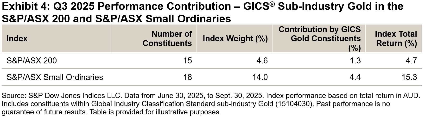
Therefore, more companies within the S&P/ASX Small Ordinaries could have a meaningful contribution to index performance when compared to the S&P/ASX 200. Exhibit 4 further breaks down performance contribution to show a comparison of gold producers in each index.

S&P/ASX Small Ordinaries Edged ahead over Three-Year Period

With its strong performance in Q3 2025, the S&P/ASX Small Ordinaries gained 21.50% over the one-year period, doubling the gains of the S&P/ASX 200 while also edging ahead of the S&P/ASX 200 over the three-year period ending Sept. 30, 2025.

In terms of diversifying away from large-cap-heavy broad market indices, other S&P/ASX mid- and small- cap indices have also performed well. The S&P/ASX 200 Ex-S&P/ASX 100 Index (the bottom 100 companies in the S&P/ASX 200 by market cap) outperformed over the one- and three-year periods, while the S&P/ASX Midcap 50 was the top performer over the 5- and 10-year periods ending Sept. 30, 2025.

Conclusion

S&P/ASX mid- and small-cap indices have significantly outperformed in the short term and showed greater diversification at both the sector and security level compared to broad market indices, which have been increasingly concentrated in large-cap Financials and Materials.

1 Big 4 banks are made up of: Commonwealth Bank of Australia, National Australia Bank, Australia and New Zealand Banking Group and Westpac.

The posts on this blog are opinions, not advice. Please read our Disclaimers.

Diversification across Durations

Contributor Image
Anu Ganti

Head of U.S. Index Investment Strategy

S&P Dow Jones Indices

The S&P 500® surged to a third all-time closing high on Oct. 28, 2025, up 18% YTD. But the ride for U.S. equity investors has not always been a smooth one, with the index recouping sharp losses from earlier in the month on renewed tariff-related concerns and regional bank losses, coupled with AI bubble1 jitters looming in the background.

Turning to the fixed income markets, the closely watched 10-year U.S. Treasury yield has declined so far this year, falling below the 4% handle, thanks to optimism surrounding potential upcoming Fed rate cuts and expectations of an end to quantitative tightening, better-than-expected inflation results and increased safe-haven demand amid corporate credit concerns and a government shutdown.

So how can market participants think about diversification and risk reduction in this shifting market environment? We began by analyzing the interaction of equities versus bonds, calculating the historical six-month correlations of the returns of the S&P 500 versus the S&P U.S. Treasury Bond Current 10-Year Index. After having witnessed negative correlations since the early April market tumult, when equities plummeted and market participants sought the refuge of Treasuries, correlations briefly turned positive but recently reversed again into negative territory, showing diversification potential across the two asset classes. 

However, for a more nuanced perspective of the relationship between equities and fixed income, analyzing bonds across various durations or interest rate sensitivities may be helpful. Next, we calculated correlations of S&P 500 performance across the entire Treasuries curve, from 1-3 year to 15+ year maturities, using our suite of iBoxx $ Treasuries indices.

We observed that from April to September, there was a wide divergence across correlations, with longer-term Treasuries providing less diversification compared to short-term Treasuries, which had consistently lower correlations versus equities. Although these correlations have since converged, the diversification benefits of equities versus bonds can vary depending on which part of the curve Treasuries are situated in. 

Another example of when correlations between equities and bonds varied across the Treasuries curve was from August 2011 to May 2013, characterized by momentous events like the European debt crisis, when market participants sought safe havens like Treasuries, and the Fed’s “Operation Twist,” which involved selling shorter-dated Treasury debt and buying longer-dated debt. During this period, however, shorter-dated Treasuries provided acted as less of a diversifier, with higher relative correlations to equities compared to longer-duration bonds.

For an even more granular perspective across equities, we can compare the correlations of Treasuries across durations versus individual sectors. Sampling classically cyclical Information Technology and traditionally defensive Utilities, Exhibit 5 displays the historical six-month correlations of the excess returns of S&P 500 Information Technology and S&P 500 Utilities versus the iBoxx $ Treasuries 1-3 Year and iBoxx $ Treasuries 15 Years+. Unsurprisingly, Utilities generally exhibited a stronger correlation with short and longer-duration bonds compared to Information Technology, which, given the tech-heavy nature of the large-cap equity market, may indicate that the diversification ballast offered by bonds may be particularly germane in the current market regime.

Understanding equity movements versus bonds, both across the duration spectrum and across sectors, may be especially relevant as we anticipate the Fed’s upcoming rate decision and Big Tech earnings this week, and as the beginning of Q4 approaches.

1 https://www.wsj.com/finance/stocks/why-bubbles-can-keep-inflating-in-plain-sight-a4af6aef?mod=finance_lead_pos2

The posts on this blog are opinions, not advice. Please read our Disclaimers.

Why Does Index Liquidity Matter?

Explore how the equity and fixed income trading ecosystems are evolving in response to the continued growth of assettracking indices and what it could mean for investors with S&P DJI’s Tim Edwards and Anu Ganti. 

The posts on this blog are opinions, not advice. Please read our Disclaimers.

Looking at Trends in the S&P UBS Leveraged Loan Index

Contributor Image
Eric Pettinelli

Fixed Income Specialist, Index Investment Strategy

S&P Dow Jones Indices

Leveraged loans are playing an increasingly prominent role within the high yield landscape, with data from S&P Dow Jones Indices showing that the U.S. leveraged loan market has grown from nearly USD 400 million to USD 1.5 trillion over the last decade.1 The expansion of the broader loan ecosystem has naturally increased the importance and relevance of indices measuring performance and serving as category benchmarks, creating the potential for index-linked products and derivatives based on the S&P UBS Leveraged Loan Index Series.

Offering a broad benchmark for the U.S. loan market, the S&P UBS Leveraged Loan Index tracks USD-denominated leveraged loans with a credit rating below investment grade or, for unrated loans, with a spread of 125 bps above their reference rate.2 The index rebalances at the end of every month to account for new loans, continually reflecting changes in underlying credit risk and interest rate spreads. When it comes to credit risk, as shown in Exhibit 1, there has been a shift of over 10% from BB rated loans to B rated loans over the last decade.

The index also reflects how interest spreads (above the reference rate) have drifted downward over time as the leveraged loan market has grown. The index-weighted average spread of the S&P UBS Leveraged Loan Index declined (or compressed) over the period shown in Exhibit 1—both at the overall level and within each credit bucket—as shown in Exhibit 2.

External forces also play a role in shaping the S&P UBS Leveraged Loan Index. Exhibit 3 shows the evolution of the index-weighted average three-year discount margin over the current year.3 The impact of the April 2025 tariff announcements and the accompanying economic and market uncertainty had the effect of sharply increasing the discount margin in April, but this was followed by a reversal and more, bringing the discount margin to new YTD lows over the summer.

The S&P UBS Leveraged Loan Indices have been an important measure of the evolving U.S. and European loan markets since the 1990s, enhancing transparency for market observers and participants. The indices will continue to support the market through loan benchmarking, performance measurement and the development of index-linked products. With the growing demand for indexing solutions in the leveraged finance sector, the S&P UBS Leveraged Loan Indices are poised to play an increasingly significant role in shaping market understanding.

1 See the S&P UBS Leveraged Loan Index Factsheet. Data as of Sept. 30, 2025.

2 The yield on each loan is composed of a reference rate plus a predetermined spread. The reference rate for each loan is typically a published money market interest rate that evolves over the period of the loan. Presently, the U.S. dollar SOFR (Secured Overnight Funding Rate) is typically used for new loans, but other reference rates may be used—especially historically.

3 The three-year discount rate for each loan, based on its current price, is the excess annualized yield (over the reference rate) that would result if that loan realized all future cash flow over an assumed three-year life. Accordingly, if the loan is currently trading at a price equal to its notional, the discount margin will equal the spread exactly. A lower price will result in a higher discount margin; a higher price results in a lower discount margin.

The posts on this blog are opinions, not advice. Please read our Disclaimers.

Navigating Market Cycles: The Complementary Roles of Quality and Momentum Indices

Contributor Image
Wenli Bill Hao

Director, Factors and Dividends Indices, Product Management and Development

S&P Dow Jones Indices

Over the long term, both the S&P 500® Quality Index and S&P 500 Momentum Index have outperformed the broader market (as measured by the S&P 500) in terms of absolute and risk-adjusted returns. The quality factor emphasizes financially strong and stable companies, while momentum tracks stocks with sustained price trends. When combined, these strategies create a complementary pairing that can enhance diversification across various market environments. In this blog, we will explore their methodologies, key characteristics and performance.

Methodology Overview

High quality is typically associated with a company’s strong profitability, high earnings quality and robust financial strength. To reflect these quality characteristics, the S&P Quality Indices1 utilize three key metrics: return on equity (ROE) to assess profitability, balance sheet accruals ratio (BSA)2 to evaluate earnings quality and financial leverage ratio (FLR) to measure debt-to-equity level (see Exhibit 2).

Momentum indices focus on securities that have recently demonstrated strong relative performance, positioning for their continued outperformance. The S&P Momentum Indices generally use 12-month risk-adjusted price momentum to select stocks ranked in the top quintile.3 To account for short-term reversal effects, the most recent month is skipped when calculating price momentum.4 The use of risk-adjusted momentum, instead of raw price momentum, may help to mitigate the negative effects of idiosyncratic risk associated with raw momentum and reduce downside risks.5

Quality and Momentum: Mutual Diversifiers

These factors can be complementary as they highlight distinct yet synergistic drivers of performance. Momentum focuses on market dynamics and investor sentiment, whereas quality is rooted in intrinsic financial strength. By combining these two factors, the resulting blend could strike a balance between performance potential and downside protection. Momentum tends to enhance performance in strong, trending markets, while quality offers stability during downturns.

These characteristics are evident in their performances across various economic regimes6 (see Exhibit 3). The S&P 500 Quality Index has historically outperformed in Falling Growth regimes, while the S&P 500 Momentum Index has historically performed better in Rising Growth regimes. With a historically low excess return correlation of -0.07,7 the S&P 500 Quality Index and the S&P 500 Momentum Index tend to act as effective diversifiers for each other.

Combining Quality and Momentum: Potential for More Persistent Performance

To illustrate the historical advantages of combining the S&P 500 Quality Index and the S&P 500 Momentum Index, we have created a hypothetical index of indices with equal weights of 50% assigned to each (referred to as the “50/50” index). This index is rebalanced semiannually at the end of June and December. As shown in Exhibit 4, the 50/50 has a few striking features.

More Persistent Historical Returns

The 50/50 index outperformed the broader S&P 500 on a more consistent basis, in both absolute and risk-adjusted terms across various short- and long-term horizons.

More Favorable Capture Ratios

Furthermore, the 50/50 index has exhibited more favorable capture ratios, achieving one-to-one returns during up markets8 while experiencing significantly smaller declines during down markets.

Outperformance across Historical Economic Regimes

Finally, the 50/50 index generated positive excess return across all economic regimes, while the S&P 500 Quality Index experienced negative excess returns in Rising Growth environments and the S&P 500 Momentum Index had negative excess return in the Falling Growth and Rising Inflation economic regime.

1 Please refer to the S&P Quality Indices Methodology for more details.

2 Richardson, Scott A., et al., “Accrual Reliability, Earnings Persistence and Stock Prices,” Journal of Accounting & Economics, Vol. 39, No. 3, September 2005.

3 Please refer to the S&P Momentum Indices Methodology for more details.

4 Jegadeesh, Narasimhan and Sheridan Titman, “Returns to Buying Winners and Selling Losers: Implications for Stock Market Efficiency,” The Journal of Finance, Vol. 48, No. 1, March 1993.

5 Fan, Minyou, et al., “Momentum and the Cross-section of Stock Volatility,” Journal of Economic Dynamics and Control, Volume 144, November 2022.

6 Hao, W. and Rupert Watts, “A Historical Perspective on Factor Index Performance across Macroeconomic Cycles”, S&P Dow Jones Indices, November 2024.

7 Correlation is calculated using monthly excess returns of the S&P 500 Quality Index and the S&P 500 Momentum Index versus the S&P 500, respectively, from Dec. 31, 1994, to Aug. 31, 2025.

8 The market is defined as the monthly performance of the underlying benchmarks from Dec. 31, 1994, to Aug. 31, 2025.

The posts on this blog are opinions, not advice. Please read our Disclaimers.