Get Indexology® Blog updates via email.

In This List

Hedging Debt Ceiling Drama with the S&P GSCI SOFR and S&P GSCI Gold

Cutting Carbon without Changing Course: Net Zero Fixed Income Indices

A Quick Look at Key USD Indices and Fixed Income ETF Flows This Year

Persistently Disappointing

Disentangling Diversification

Hedging Debt Ceiling Drama with the S&P GSCI SOFR and S&P GSCI Gold

Contributor Image
Brian Luke

Senior Director, Head of Commodities, Real & Digital Assets

S&P Dow Jones Indices

The debt ceiling debate in Washington appears to be nearing an end. According to the U.S. Treasury, Congress has “always acted when called upon” and markets will look for them to do so for the 79th time this month. By index rule, all commodities in the S&P GSCI are traded in U.S. dollars, so the importance and reverence to the “world’s reserve currency” rings true every time a futures contract on the S&P GSCI is settled.

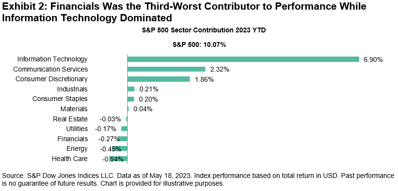
The S&P GSCI SOFR launched in May and leverages the same index construction and calculation principles as the S&P GSCI, but applies the Secured Overnight Financing Rate (SOFR) into the calculation instead of Treasury Bills. Using SOFR in lieu of Treasury Bills allows for performance tracking with alternative cash management strategies. Including rates that are collateralized by Treasury securities, there is still exposure to the faith and credit of the U.S. government. However, it excludes certain transactions that are deemed to be trading “special,” or at a rate outside the general market activity. The SOFR is published daily by the U.S. Federal Reserve and can be found on its website. As SOFR volumes rise, the ability to have a complementary index allows for potentially improved cash management capabilities through cash and derivative instruments.

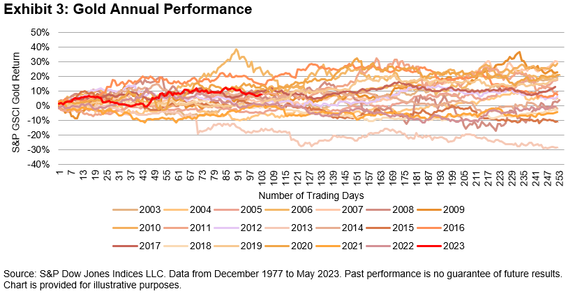
Gold has long served as the alternative to fiat currency when there is concern in the market regarding the political outlook. With this year’s debate, the S&P GSCI Gold has traded near its all-time high and has outperformed broad commodities by over 18%. While fiat money can, and likely will, continue to be printed, the global production of gold is relatively flat at just 1%-2% of total supply. Central banks have purchased gold at rates not seen since the U.S. government broke its gold standard in 1971. Steady supply creates a relatively fixed base for the metal, while demand is largely driven by some of the largest holders of U.S. government debt: global central banks.

Largest Central Bank Purchases in 50 Years

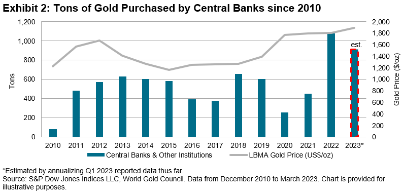
Since hitting a YTD high of 12%, the S&P GSCI Gold has turned in solid, if not spectacular, results. Popularity has risen due to the recent debt ceiling debates, and despite politicians coming to a solution that would avoid default, central bankers appear to be stocking up.

The posts on this blog are opinions, not advice. Please read our Disclaimers.

Cutting Carbon without Changing Course: Net Zero Fixed Income Indices

Contributor Image
Maya Beyhan

Senior Director, ESG Specialist, Index Investment Strategy

S&P Dow Jones Indices

S&P DJI recently expanded its range of S&P PACT™ Indices (S&P Paris-Aligned & Climate Transition Indices) to go beyond equity to now cover fixed income. Within these indices, the differences between the two asset classes in terms of the balance between cost (tracking error) and reward (sustainability profile) are material and highly thought-provoking.

As shown in S&P DJI’s Climate & ESG Index Dashboard, the equity S&P PACT Indices typically have an annualized tracking error ranging from 1.8% to 2.7% versus their market-cap-weighted benchmarks as of March 31, 2023. These levels of tracking error may be challenging for investors who are highly sensitive to any deviations in performance from a standard, market-cap-weighted benchmark.

Following on the path drawn by equity indices, the suite of S&P PACT Indices expanded into fixed income with the launch of the iBoxx EUR Corporates Net Zero 2050 Paris-Aligned ESG. This index uses the broad iBoxx € Corporates as its underlying benchmark and adopts similarly ambitious sustainability and climate targets as its equity counterpart—in particular, meeting the definition of a Paris-Aligned benchmark.

What is particularly remarkable about this fixed income S&P PACT Index is that it has had a (back-tested) annual tracking error of only 0.2% versus its underlying index; specifically, it has achieved a material benchmark-relative reduction in carbon exposure of 59.1% as of March 31, 2023. Exhibits 1 and 2 summarize the carbon exposure improvement and performance characteristics as compared to iBoxx Corporates, using the same analytical engine driving S&P DJI’s Climate & ESG Index Dashboard.

Overall, these exhibits show that the fixed income S&P PACT Index maintained near benchmark-like performance while achieving a substantial improvement in carbon exposure.

The key to this result is that, while integrating sustainability and climate goals, the fixed income methodology for the S&P PACT Indices also includes steps to approximate the duration and credit quality of the benchmark. With a similar rating and maturity profile, even ambitious sustainability and climate goals can potentially be incorporated without generating materially distinct index performance. For this reason, the fixed income S&P PACT Index may be useful to those who are highly sensitive to tracking error, aligning with climate and sustainability goals at a marginal cost.

Key performance and sustainability metrics for the S&P PACT Index suite can be monitored in S&P DJI’s Quarterly Climate & ESG Index Dashboard.


1 https://www.spglobal.com/spdji/en/education/article/faq-esg-back-testing-backward-data-assumption-overview/

The posts on this blog are opinions, not advice. Please read our Disclaimers.

A Quick Look at Key USD Indices and Fixed Income ETF Flows This Year

Contributor Image
Kangwei Yang

Director, Fixed Income Indices

S&P Dow Jones Indices

2022 marked a full year of rate hikes, unprecedented since the Global Financial Crisis, which propelled short-term yields upward and in turn ultimately caused the 10-2 spread1 to fall below zero in the second half of 2022, where it has since stayed. Recent market expectations suggest that the end of rate rises is perhaps in sight as we start to see its impact on a few U.S. regional banks as well as the forced takeover of one of Europe’s largest banks—Credit Suisse—earlier this year. While the latest U.S. inflation numbers have eased, employment data continues to suggest a strong labor market. It’s anyone’s guess whether the Fed will move rates in June.

Index Performance

Let us take a look at the performance of key USD indices in 2022, and 2023 YTD. Thereafter, we will explore how the index performance may have impacted ETFs flows in their respective categories so far this year.

As can be seen in the chart above, 2022 was a pretty dismal year for USD fixed income, with the multiple rate hikes depressing the value of bonds, especially the longer tenors. The only index that was not adversely affected by the interest rate movements was the short-dated iBoxx $ Treasury Bills, which measures the performance of U.S. government bills with maturities of one year or less.

The worst-performing segment was high quality corporate bonds, as represented by the iBoxx USD Liquid Investment Grade. The index was down 17.9% in 2022.

It has been a completely different story since the start of 2023; all of these featured indices are back in the black, led by the iBoxx USD Liquid Investment Grade with a YTD return of 5.2% (as of April 30, 2023), outperforming short-term treasury bills and other U.S. government securities.

The positive performance coincided with market sentiment that we may be nearing the end of the rate hikes, which may have prompted investors to start moving away from short-term bonds into longer-tenure bonds with an emphasis on credit quality.

ETF Flows

As depicted in Exhibit 3, investors have seemingly begun to move away from inflation and money market products this year, with the majority of the flows moving into U.S. government bonds. Even though corporate investment grade bonds performed better than U.S. Treasuries (as seen in Exhibit 2), investors may still be cautious of the overall economic outlook and thus prefer the safe haven of a relatively risk-free asset over corporate investment grade bonds.

As of April 30, 2023, U.S. Treasuries—as represented by the iBoxx $ Treasuries—offered a yield of 3.73% with an annual modified duration of 6.35 years, while U.S. investment grade bonds—as represented by the iBoxx $ Liquid Investment Grade—offered a yield of 5.17% with an annual modified duration of 8.36 years.

It is perhaps of no surprise that the majority of the AUM flows were directed into U.S. fixed income ETFs, given their dominance and market share in the overall ETF market. There has also been a small outflow from APAC ETFs so far this year, perhaps due to the preference for high quality bonds and higher yields in offshore markets compared to lower local currency yields in certain APAC markets.

Short- or Longer-Term Investments Today?

In a hypothetical scenario, if one were to invest in a longer-term bond fund today and rates retreat over the next couple of years, the return on investment may be higher than the “offered yield” today due to capital appreciation of the bonds. This is due to the inverse relationship between bond prices and yields (as yields go down, bond prices go up).

As we may be approaching the end of the rate hikes, will we see a sustained shift toward medium-to-long dated bonds in the near future?

1 Source: Federal Reserve Bank of St. Louis

The posts on this blog are opinions, not advice. Please read our Disclaimers.

Persistently Disappointing

Contributor Image
Craig Lazzara

Former Managing Director, Index Investment Strategy

S&P Dow Jones Indices

If you’ve ever read a prospectus (or, for that matter, an S&P DJI research report), you know that “past performance is no guarantee of future results.” At one level, if you understand that, you understand the most important thing about S&P DJI’s Persistence Scorecards. For the U.S., Europe, Latin America, and Canada (with Australia coming soon!) our recently released Persistence Scorecards are unanimous in showing that historical outperformance is not a predictor of future outperformance.

At a deeper level, why do we care? We know from SPIVA® and other data that most active managers underperform most of the time. But even in the most challenging years, there is a range of active performance results; some managers will always do better than others, regardless of how many outperform passive benchmarks like the S&P 500®. Do the top performers get there because of genuine skill or merely because of good luck?

There is, after all, no theology that precludes the existence of a (presumably small) subset of genuinely skillful active managers. If such a group existed, how would their abilities be evidenced in performance data? As a thought experiment, we can consider a hypothetical set of managers who achieve above-median performance in a particular period, and ask how they perform in subsequent periods.

If every above-median manager in period one got there simply by being lucky, we would expect half of them to be above median again in period two. If the repeat-success rate were substantially above 50%, we might begin to suspect that the above-median managers were genuinely skillful. But if fewer than 50% of the period one successes were above median in period two, that would support the view that their period one success was due to luck. If we understand something about persistence, we may be able to make inferences about manager skill.

And that is exactly what the Persistence Scorecards let us do. Exhibit 1 illustrates, using 10 years of U.S. equity data and asking to what degree above-median performance in the first 5 years predicted above-median performance in the second 5 years. The answer is: not at all. In every fund category, the winners in years 1-5 were unlikely to repeat their success in years 6-10.

There are, of course, other ways to test for persistence. We could examine performance relative to a benchmark rather than to a peer group, with different lookback periods (one year or three years rather than five years), with different cutoffs (quartiles rather than halves), and for different asset classes (bonds as well as stocks). Our Persistence Scorecards do all of these things and, mutatis mutandis, the results are the same.

Results produced by genuine skill are likely to continue, while those due to luck are likely to prove ephemeral. The data suggest that good active performance often owes more to luck than to skill.

The posts on this blog are opinions, not advice. Please read our Disclaimers.

Disentangling Diversification

Contributor Image
Anu Ganti

U.S. Head of Index Investment Strategy

S&P Dow Jones Indices

We frequently hear that “it’s a stock picker’s market.” The recent market environment could equally well be characterized as a sector picker’s market.

To measure the importance of sectors, we decompose total market dispersion into within-sector and cross-sector effects. Exhibit 1 shows that the contribution of cross-sector effects to total S&P 500® dispersion has trended upward this year, implying that the rewards for skillful sector selection have increased. 

The recent travails of the banking industry have weakened the Financials sector, with the S&P 500 Financials down 4% YTD as of May 18, 2023. Meanwhile, the overall market has marched to a different drumbeat, with the S&P 500 up 10%. As Exhibit 2 illustrates, the Financials sector was the third-biggest detractor from S&P 500 performance, while Information Technology was the dominant contributor YTD.

As a result, investors who overweighted Information Technology or underweighted Financials would have been well rewarded, with the S&P 500 Ex-Financials up 12% YTD. However, it is worth noting that the outperformance of IT has been much greater than the underperformance of Financials, with the S&P 500 Information Technology up 28% YTD.

As sectors evolve over time, so does their diversification potential. As we previously explored for Energy and Information Technology, in Exhibit 3, we calculate the spread in trailing 12-month volatility between the S&P 500 and the S&P 500 Ex-Financials. When this spread is positive, the inclusion of Financials increases volatility in the benchmark; when negative, the sector acts as a diversifier. Note the negative spread for Financials so far this year.

The Financials sector has become a volatility diversifier because its correlation with the rest of the market has recently declined, as shown in Exhibit 4.

While the Financials sector has recently reduced volatility, this hasn’t always been the case. For example, during the depths of the 2008 Global Financial Crisis, the Financials sector was a major source of volatility. Despite the sector’s faltering relative performance so far this year, its current risk positioning might potentially prove auspicious for judicious sector allocators. 

The posts on this blog are opinions, not advice. Please read our Disclaimers.