Get Indexology® Blog updates via email.

In This List

The S&P MidCap 400: An Overlooked Gem

Index-Based Tools for Tracking the Future

Food and Energy Inflation Concerns Drive Commodities Higher in May

29 Years of VIX

Insurance General Accounts See Increased Fixed Income ETF Adoption in 2021

The S&P MidCap 400: An Overlooked Gem

Contributor Image
Fei Wang

Senior Analyst, U.S. Equity Indices

S&P Dow Jones Indices

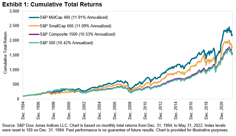
The S&P MidCap 400® is an often-overlooked member of the S&P Composite 1500® series, despite outperforming the S&P 500® and S&P SmallCap 600® since 1994 (see Exhibit 1).1 The mid-cap U.S. equity index also weathered the market volatility slightly better during the first five months of 2022 by falling less than 11%, compared to a near 13% decline for the S&P 500 and more than 11% for the S&P SmallCap 600.

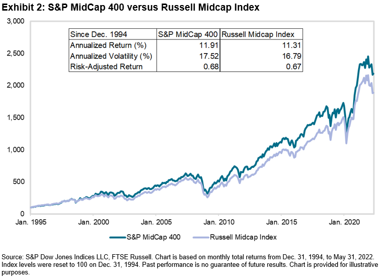
The S&P MidCap 400 is not the only index designed to represent the performance of mid-cap U.S. equities; the Russell Midcap Index also tracks this segment. Exhibit 2 shows that the S&P 400® has outperformed the Russell Midcap Index since 1994. Such outperformance has also been observed so far this year, with the S&P 400 beating the Russell Midcap Index by 1.9% through the end of May 2022. So, what helps to explain this difference?

As we have pointed out before, the S&P Composite 1500 series is constructed differently than the Russell 3000. One of the major differences is that the S&P Composite 1500 uses an earnings screen, which impacts the selection of companies in the indices. Exhibit 3 shows the results from a 2-Factor Brinson Attribution analysis by GICS® sectors between the S&P MidCap 400 and Russell Midcap Index from Dec. 31, 2021, to May 31, 2022.

The results show that the choice of constituents (selection effect) drove the S&P 400’s outperformance during the first five months of 2022, particularly in the Information Technology, Financials and Health Care sectors. Differences in sector weights (allocation effect) slightly detracted from relative returns. The S&P 400’s lower weight in Energy helped to explain this result.

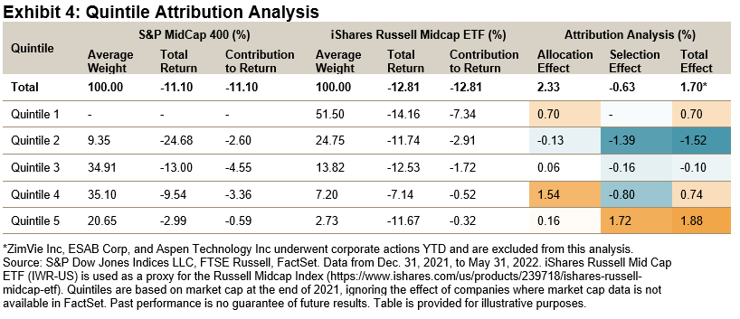
Another important difference between the two indices is they have different size exposures. For example, Exhibit 4 shows that more than 50% of iShares Russell Midcap ETF’s weight fell in the largest size quintile at the end of 2021. The S&P 400 had no exposure to these companies, which helped its relative performance in the first five months of 2022. The S&P 400 also benefited from its greater exposure to the smallest size quintile.

Overall, the S&P 400’s recent returns highlight the potential benefit of mid-cap U.S. equities—the index outperformed the S&P 500 and S&P SmallCap 600 since 1994, and YTD in 2022. The S&P 400’s outperformance compared to the Russell Midcap also demonstrates the importance of index construction and the potential impact on stock selection and size exposure.


1 For more information, see Bellucci Louis, Hamish Preston and Aye M. Soe. “The S&P MidCap 400: Outperformance and Potential Applications.” S&P Dow Jones Indices. June 2019.

The posts on this blog are opinions, not advice. Please read our Disclaimers.

Index-Based Tools for Tracking the Future

Get to know the S&P Kensho New Economy Indices, a comprehensive, rules-based, thematic index framework powered by AI and designed to help investors better understand and precisely measure the long-term transformative trends and exponential innovation and growth of the sectors and industries driving the Fourth Industrial Revolution.

Learn more: New Economies – Investment Themes | S&P Dow Jones Indices (spglobal.com)

The posts on this blog are opinions, not advice. Please read our Disclaimers.

Food and Energy Inflation Concerns Drive Commodities Higher in May

Contributor Image
Fiona Boal

Managing Director, Global Head of Equities

S&P Dow Jones Indices

Record inflation prints, export embargos and import bans helped the S&P GSCI, the broad commodities benchmark, to post another monthly gain in May, ending the month up 5.1% and bringing its YTD performance to 47.0%. The ongoing disruptions to the flow of energy and agricultural commodities out of Ukraine and Russia pushed energy and grain markets higher, while the metals markets continued to be weighed down by the prospect of higher interest rates and fears of global economic slowdown.

Energy prices extended their bull run into the end of May after the EU agreed to a partial ban on Russian oil and China decided to lift some coronavirus restrictions. EU leaders agreed in principle to cut 90% of oil imports from Russia by the end of 2022, equivalent to around 1.5 million barrels per day. Russian crude oil exports that have traditionally been destined for the EU will not necessarily be lost to the global market, but even if it can find willing buyers, it will be a challenge to transport the oil to new markets and prices will be discounted. The S&P GSCI Petroleum ended the month 9.8% higher. Targeting Russian natural gas supplies may be the EU’s next diplomatic battleground in the economic war, and U.S. natural gas prices are increasingly pricing in this scenario. The S&P GSCI Natural Gas rallied 11.3% in May and 129.3% YTD.

Industrial metals prices fell again in May. The S&P GSCI Nickel took the biggest hit, down 10.7%. Despite tight nickel supply around the world, recent pandemic hits to demand out of China have pushed prices lower, as the market continues to recalibrate from the unprecedented price spike and associated disruptions in March. Nornickel, the world’s largest refined nickel producer, announced during the month that it expects a mild surplus this year after deficits in prior years.

Gold and silver’s lackluster year continued with both precious metals falling in May. The U.S. dollar reached another 20-year high, pressuring precious metals. After some strength earlier in the year, the S&P GSCI Precious Metals ended May flat YTD.

A growing concern among central bankers and others regarding food security serves to highlight the importance of agricultural commodities to the global economy from both a societal and environmental perspective. The war in Ukraine has disrupted global food supplies to an unprecedented degree. A prime example is the tightening global wheat supply picture. Ukraine is considered Europe’s breadbasket and roughly one-third of global exports of wheat come from Ukraine and Russia. Severe restrictions on wheat exports from this region combined with worsening harvest prospects in China, parts of Europe and the U.S., as well as an export ban by major producer India, have tightened stocks and exacerbated global food supply concerns. As a result, global wheat prices have skyrocketed; the S&P GSCI Wheat was up 3.1% in May and 39.2% YTD.

In contrast to the agriculture commodity sector, the livestock markets were benign in May, with the S&P GSCI Livestock ending the month down 1.7%.

The posts on this blog are opinions, not advice. Please read our Disclaimers.

29 Years of VIX

Contributor Image
Berlinda Liu

Former Director, Multi-Asset Indices

S&P Dow Jones Indices

In 1993, the Chicago Board Options Exchange (Cboe) announced the launch of the Cboe Market Volatility Index or VIX®, which provides market participants with a barometer to measure market sentiment. Since then, the index has become one of the most followed benchmarks. In commemoration for its 29th anniversary, we take a look at the evolution of the index.

The VIX concept arises from the research of Menachem Brenner and Dan Galai in 1989. They believed that the so-called Sigma index “would play the same role as the market index plays for options and futures on the index.”1 Professor Robert E. Whaley then designed the first version of VIX based on the Black-Scholes model, using at-the-money S&P 100 options.2

In 2003, Cboe revised the VIX methodology with the help of Goldman Sachs.3 The revised VIX now uses a more robust model that captures options of all strikes and the most liquid index option in the market, S&P 500® options. The index name became the Cboe Volatility Index, or VIX.

With nearly three decades of history, VIX exhibits a few time-honored characteristics. In the long run, VIX has shown a clear mean-reverting trend. For most of the time, it ranges between 13 (~20th percentile) and 25 (~80th percentile), with a mean of ~19.5 and a median of ~17.5. In the first four months of 2022, we’ve seen VIX hovering above 25 or even 30 (~90th percentile), indicating the elevated risk and anxiety in the financial market.

In the short term, however, VIX tends to move fast, usually in the opposite direction of the S&P 500. The correlation between VIX and the broad U.S. equity market is ~-75% on average and has gone as high as -90% during volatile market environments. For example, during all the weeks since 1990 when the S&P 500 dropped at least 5%, VIX showed a positive return. In the week ending Feb. 28, 2022, the S&P 500 declined 11.49% and VIX jumped 134.84%, its highest weekly return since 1990. This is why VIX is sometimes referred to as Wall Street’s “fear gauge.”

The strong negative correlation between VIX and the U.S. equity market makes VIX derivatives attractive hedging tools for market participants. VIX options are now the second most liquid index options on Cboe. Increased demand from market participants led Cboe to extend VIX futures trading hours and list mini VIX futures in recent years. In the first four months of 2022, the average daily value of VIX futures and options increased by 7% and 9%, respectively, compared with 2021.

In January 2009, the first suite of tradable VIX futures indices were launched in response to increasing demand for effective hedging tools for broad equity market risk. The S&P 500 VIX Short-Term Futures Index has since grown into one of the most actively followed indices for equity and volatility traders.

VIX and VIX futures indices are still new compared with other broad market measures such as the S&P 500 and the Dow Jones Industrial Average®. However, their negative correlation with the U.S. equities market and hedging capabilities indicate that their popularity among investors could continue for decades to come.

1 Brenner, Menachem; Galai, Dan (1989). “New Financial Instruments for Hedging Changes in Volatility.” Financial Analysts Journal. 45 (4): 61–65. ISSN 0015-198X.

2 Bob Pisani (March 29, 2020). “Father of Wall Street’s ‘fear gauge’ sees wild volatility continuing until coronavirus cases peak.”

3 vixwhite.pdf (cboe.com)

The posts on this blog are opinions, not advice. Please read our Disclaimers.

Insurance General Accounts See Increased Fixed Income ETF Adoption in 2021

Contributor Image
Raghu Ramachandran

Head of Insurance Asset Channel

S&P Dow Jones Indices

As of year-end 2021, insurance companies held USD 45.4 billion in ETFs in their general accounts—a 15% increase over 2020. We recently published a research piece on the use of ETFs by insurance companies. In this blog post, we explore the increased use of fixed income ETFs in these portfolios.

Fixed income securities comprise the majority of insurance portfolios. However, equity ETFs continue to constitute the majority of insurance companies’ ETF usage, largely due to regulatory constraints. Even as regulation has changed and made it easier for insurance companies to invest in ETFs, fixed income ETF adoption was slow. Recently, that has begun to change, and insurance companies’ fixed income ETF usage has nearly doubled in the past two years (see Exhibit 1).

Again, as to be expected, investment grade funds dominated insurance companies’ fixed income ETF usage, but there has been an increase in their use of high yield ETFs (see Exhibit 2). Over the past 1-, 3-, 5- and 10-year periods, the growth rate of high yield ETFs has exceeded the growth of investment grade ETFs within insurance general accounts. In 2021, high yield ETF AUM increased by 80%, and the proportion of ETFs invested in high yield by insurance companies exceeded the proportion of high yield ETFs in the overall U.S. ETF market.

Life insurance companies have driven the growth of fixed income ETF usage. In 2015, life companies had only USD 617 million invested in fixed income ETFs. By 2021, this had grown 13 times to reach USD 7.8 billion (see Exhibit 3). Indeed, as a proportion of the usage, life companies have a majority of their ETF investments in fixed income, whereas P&C companies still continue to invest mostly in equity ETFs. Health companies also invest heavily in fixed income ETFs, but their pool of assets is much smaller than that of life and P&C companies.

Even though insurance companies tended to hold fewer fixed income ETFs, they traded them more frequently. Trade volume for fixed income ETFs exceeded the trade volume for equity ETFs in 2019, and fixed income ETFs continued to dominate insurance trading through 2021 (see Exhibit 4). If we consider the trade ratio (the amount traded in a year divided by the assets held at the beginning of the year), we see that insurance companies used fixed income ETFs much more actively than equity ETFs (see Exhibit 5).

Given the size of the insurance fixed income pool, we continue to monitor this activity for future growth.

The posts on this blog are opinions, not advice. Please read our Disclaimers.