Get Indexology® Blog updates via email.

In This List

The S&P Composite 1500®: An Efficient Measure of the U.S. Market

How Are Insurance Investors Using ETFs?

Big Sector Shifts in Low Volatility Composition

Symbiotic Sentiments

Sector Spotlight: Healthcare in India

The S&P Composite 1500®: An Efficient Measure of the U.S. Market

Contributor Image
Hamish Preston

Head of U.S. Equities

S&P Dow Jones Indices

The S&P 1500 serves as both a benchmark indicator for U.S. equity market performance and as a basis for passively replicating investment products that aim to deliver a “market” return.  Our new paper examines the index from both these perspectives, and compares the S&P 1500 with other U.S. equity market indices.  Here are a few takeaways.

The S&P 1500 offers a more holistic assessment of the U.S. market.

Many investors look to the S&P 500 to gauge U.S. market performance, with more than USD 9 trillion being indexed or benchmarked to the index as of the end of 2018. However, by looking beyond the S&P 500, the S&P 1500 offers perspectives on a broader range of market narratives. Indeed, S&P MidCap 400 and S&P SmallCap 600 constituents are typically more sensitive to the U.S. economy, and differences in sector allocations can help to diversify large-cap sector exposures.

The S&P 1500 benefitted from its exposure to smaller companies.

Students of financial theory will be well-versed in the “small size” premium: the observation that smaller companies have typically outperformed their larger counterparts.  This premium can be seen when looking at historical returns: the S&P 400 and the S&P 600 outperformed over longer horizons, which in turn helped to explain why the S&P 1500 beat the S&P 500 over the same horizons.

Combined with the fact that most active managers have typically found it difficult to outperform these indices – on an absolute or risk-adjusted basis – the S&P 1500 may be an appealing option for those looking to access the U.S. equity market.

The S&P 1500 Avoids Less Liquid, Lower Priced, and Lower Quality Stocks That Are Specific to the Russell 3000

Market participants can choose from several indices to track the performance of U.S. equities.  For example, the Russell 3000 index measures the performance of the 3,000 largest U.S. companies, subject to certain criteria.  Although sizeable overlaps in mega-cap names meant that the S&P 1500 and Russell 3000 posted similar risk/return profiles, it is important to remember that the two indices are constructed differently.

For example, the S&P U.S. equity indices incorporate an earnings screen whereas their Russell counterparts do not.  One way to see the impact of this earnings screen is to compare the characteristics of S&P 1500 stocks with “Extra 1500” stocks.  The latter group consists of the largest 1,500 U.S. stocks that were not members of the S&P 1500, with around 85% being iShares Russell 3000 ETF constituents at the end of April.

Exhibit 3 suggests that investors may find it more difficult to trade stocks that are specific to the Russell 3000 and may be more likely to encounter capacity constraints: the “Extra 1500” stocks are less liquid, lower priced, and of lower quality.

Taken together, the S&P 1500 is a more representative benchmark for those wishing to seek the returns of the U.S. equity universe but wanting to avoid additional trading and implementation costs coming from the additional 1500 securities.

The posts on this blog are opinions, not advice. Please read our Disclaimers.

How Are Insurance Investors Using ETFs?

Contributor Image
Kelsey Stokes

Director, Multi-Asset Index Sales

S&P Dow Jones Indices

S&P Dow Jones Indices recently published its fifth annual analysis of exchange-traded fund (ETF) usage by U.S. insurers in their general accounts. Regulatory filing data, which details the individual securities that insurers hold, showed that in 2019, ETF AUM in insurance general accounts grew to USD 31 billion—a 16% increase over 2018. While this headline figure shows the continued growth of ETFs in insurers’ portfolios, the trends that underlie this data are perhaps more interesting.

Insurers Sold ETFs That Weren’t Equity or Fixed Income

The number of ETF shares insurers held declined in 2019 to 398 million from 400 million in 2018, indicating that while AUM grew, insurers were net sellers of ETFs in 2019. If we break down the data in terms of asset class, however, we see that insurers bought equity and fixed income ETFs and sold ETFs classified as “other,” a category that includes currency, commodity, multi-asset, etc. Insurers’ holdings of non-equity and non-fixed income ETFs saw a 38% year-over-year decrease in AUM and a 45% decrease in shares. Exhibit 1 shows how each asset class contributed to the change in insurers’ ETF shares from 2018 to 2019.

Life Insurers, in Particular, Sold ETFs

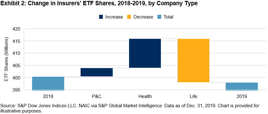
If we look at what drove the decline in insurers’ ETF shares now in terms of company type versus asset class, we see that while Property and Casualty (P&C) and Health companies were net buyers of ETFs in 2019, Life companies were net sellers (see Exhibit 2).

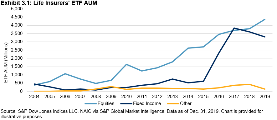
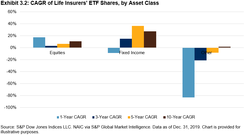
Life insurers sold fixed income ETFs last year, a reversal in the significant buying that took place between 2015 and 2017 (see Exhibits 3.1 and 3.2).

Most of Insurers’ Fixed Income ETF AUM Was in IG, but High Yield (HY) Gained Traction

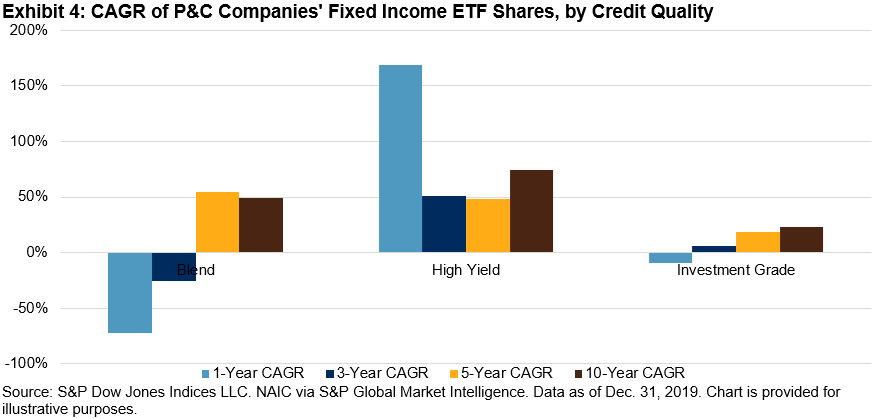
Fixed income ETF usage within insurance general accounts overall, however, continues to grow, with AUM up 13% year-over-year and shares up 11% year-over-year. While nearly 80% of insurers’ fixed income ETF AUM was in investment-grade bond ETFs, HY bond ETFs are gaining traction, particularly with P&C insurers, which increased their buying of HY bond ETFs by 169% in 2019 (see Exhibit 4).

HY bond ETFs comprised 38% of P&C insurers’ fixed income ETF holdings—more than four times the percentage of the broader insurance market’s HY bond ETF holdings.

We offer these insights with the caveat that much has changed this year in the financial markets, and as a result, insurers’ ETF holdings may look quite different today than they did at the end of 2019. We’ll be taking a closer look at the quarterly data and publishing a companion to this report to better understand how COVID-19 may have affected insurers’ holdings.


The posts on this blog are opinions, not advice. Please read our Disclaimers.

Big Sector Shifts in Low Volatility Composition

Contributor Image
Fei Mei Chan

Former Director, Core Product Management

S&P Dow Jones Indices

In March, COVID-19 inspired volatility roiled markets across the globe. Similarly, the volatility of the S&P/TSX Composite also jumped. The increase, however, was not balanced across all sectors. We see this manifested in the most recent rebalance for the S&P/TSX Composite Low Volatility Index.

Effective after the close of trading April 24, 2020, Exhibit 1 reflects the sector allocation of the low volatility index. Thirty of the 50 names were replaced in the index, for a weight change of 56%. (For context, median annual turnover for the index is 60%.) Needless, to say this reflects a quarter of major commotion.

Notably, we saw a significant scaling back of Real Estate (-16%), Utilities (-12%), and Financials (-11%). In their place, Industrials (+19%) and Consumer Staples (+10%) rose as the two highest allocations of the index.

S&P DJI’s low volatility methodology does not apply constraints around sector allocations.  Though the low volatility index searches for the lowest volatility at the stock level, sector allocations (as shown in Exhibit 2) can sometimes offer context around where things are relatively more stable. Not surprisingly, Energy, Utilities, and Financials experienced the biggest spikes in volatility, and all are on the higher end of the volatility spectrum while Consumer Staples and Industrials are relatively less volatile.

The posts on this blog are opinions, not advice. Please read our Disclaimers.

Symbiotic Sentiments

Contributor Image
Anu Ganti

U.S. Head of Index Investment Strategy

S&P Dow Jones Indices

Sectors and factors are different ways of viewing the world, but they are not mutually exclusive.  We find an example of such a close, symbiotic relationship between the technology sector and the quality factor.  Exhibit 1 shows that the S&P 500 Information Technology index has a strong tilt towards quality, while the biggest overweight in the S&P 500 Quality Index is towards information technology.

Source: S&P Dow Jones Indices LLC and FactSet. Data as of April 2020. Chart is provided for illustrative purposes.

Both technology and quality have outperformed during both calendar 2020 and the 12 months ending April 30.   This raises an obvious question: Has technology done well because of its exposure to quality, or has quality done well because of its exposure to technology?

We begin our inquiries by calculating quality scores for all the constituents of the S&P 500, based on the following metrics: return on equity, financial leverage and accruals ratio.  We then rank the constituents by their quality score, and slice the S&P 500 into quality quintiles.  Finally, we analyze how much of S&P 500 Info Tech’s weight is in each of these quintiles.

Exhibit 2 illustrates that an astonishing 70% of S&P 500 Info Tech’s weight is in the top quality quintile.

Source: S&P Dow Jones Indices LLC and FactSet. Data as of April 2020. Chart is provided for illustrative purposes.

Quality is clearly important to the technology sector, but how important is technology to the quality factor? To answer, we turn the tables and look at technology’s weight in the S&P 500’s top quality quintile.

We observe in Exhibit 3 that 53% of the capitalization of the top quality quintile in the S&P 500 is in technology, dominating the other sectors.  But an even greater share – 70% – of large-cap technology comes from the top quality quintile. Therefore, we can conclude that quality’s influence on technology is greater than technology’s influence on quality.

Source: S&P Dow Jones Indices LLC and FactSet. Data as of April 2020. Chart is provided for illustrative purposes.

Both S&P 500 Info Tech and the top quality quintile of the S&P 500 are highly concentrated, as we see in Exhibit 4. While the five largest names in Info Tech are all in the top quality quintile, only three out of the five largest names in the top quality quintile are in Technology, further confirming our conclusion that quality’s influence on technology outweighs technology’s influence on quality.

Source: S&P Dow Jones Indices LLC and FactSet. Data as of April 2020. Chart is provided for illustrative purposes.

While we cannot fully disentangle the overlap between the technology sector and the quality factor, the data argue that quality has greater significance to technology than the other way around. Understanding both perspectives is not only helpful, but also important to recognizing the intertwined relationship between sectors and factors.


The posts on this blog are opinions, not advice. Please read our Disclaimers.

Sector Spotlight: Healthcare in India

Is Healthcare providing a potential opportunity for Indian investors? Explore recent sector performance with S&P DJI’s Koel Ghosh and see how India’s Healthcare sector stacks up to broader markets.

Read more here: https://www.indexologyblog.com/2020/05/11/covid-19-revelations-health-care-is-wealth/

The posts on this blog are opinions, not advice. Please read our Disclaimers.