Get Indexology® Blog updates via email.

In This List

Futures Prices for Europe’s Fear Gauge Jump. U.S. Investors say, “Le Pen? Le Who?”

Commodity February Facts, Bears to Bulls, & Interest Rate Winners

Multi-Factor Indexes: More Bang for Your Buck

Valuations Are High but Dispersion Is Low

High Yield Bonds in a Rising Rate Environment

Futures Prices for Europe’s Fear Gauge Jump. U.S. Investors say, “Le Pen? Le Who?”

Contributor Image
Reid Steadman

Former Managing Director, Global Head of ESG & Innovation

S&P Dow Jones Indices

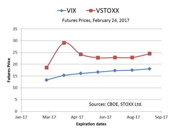
Futures tied to VSTOXX, the Eurozone’s version of VIX, are signaling risk ahead. The French elections, which take place April 23 (first round) and May 7 (run-off election) and the possibility of Marine Le Pen leading France’s exit from the Eurozone appear to have spooked European options investors. They are now paying higher premiums for put options expiring near the election. As a result, the term structure for VSTOXX futures has assumed an unusual shape.

VSTOXX is usually higher than VIX (on average by 10.6 points over the past five years) but the two benchmarks tend to move in near lockstep.

Should U.S Investors Care?
Here’s a quick quiz for you. What percentage of S&P 500 company sales come from Europe? According to a report issued by S&P Dow Jones Indices last year, 7.8% of S&P 500 sales revenue in 2015 came from Europe.  If France were to leave the Eurozone, this could affect the U.S. in ways beyond those captured in direct sales figures. Still, 7.8% is a good statistic to keep in mind. Leading U.S. companies are less tied to the European economy than many investors would expect.

A Look Back at the Brexit Vote
Traders, policy experts, and journalists are comparing the French elections to the Brexit vote. It’s worth looking back to see how VSTOXX and VIX moved when British voters chose “Leave.”

VSTOXX and VIX are notoriously noisy signals – the “vol of vol” is high – but we can note the following:

  • Though most economists predicted “Remain” would win, VSTOXX traded at elevated levels before the election, indicating greater uncertainty in financial markets about the outcome.
  • When “Leave” prevailed, both VSTOXX and VIX jumped, but U.S. options investors were more surprised. One day after the Brexit vote, the VSTOXX closed only 8.7% higher than the day before (36.4 to 39.6). In comparison, VIX increased 49.3% between closings.
  • Options investors in both markets quickly focused forward and VSTOXX and VIX declined to normal levels in the course of a week.

The French election and Brexit are of course different, but VSTOXX and VIX look like they did leading up to the Brexit vote: VSTOXX is elevated and VIX is low. On April 23 and May 7, we will learn whether U.S. investors have been too complacent.


The posts on this blog are opinions, not advice. Please read our Disclaimers.

Commodity February Facts, Bears to Bulls, & Interest Rate Winners

Contributor Image
Jodie Gunzberg

Former Managing Director, Head of U.S. Equities

S&P Dow Jones Indices

It was a flattish February for commodities with the S&P GSCI Total Return up 23 basis points for a year-to-date return of -1.2%, and the Dow Jones Commodity Index up 11 basis points bringing its year-to-date return to 78 basis points.  Overall  in the S&P GSCI TR, 3 of 5 sectors were positive and 14 of 24 commodities were positive. The S&P GSCI Precious Metals TR was the best performing sector, gaining 3.7%, and the S&P GSCI Nickel TR was the best performing single commodity up 10.2%.  The worst performing sector was the S&P GSCI Energy TR with a loss of 26 basis points, led by the biggest single commodity drop of 13.1% from the S&P GSCI Natural Gas TR.

Before discussing what a difference one year makes and interest rate impacts on commodities, a few stats from inside the S&P GSCI TR are interesting from this forgettable February:

  • Aluminum had its biggest consecutive 2-month gain of 13.5%, in 5 years when it returned 13.9% in Jan.-Feb. 2012.
  • Cocoa lost for the 6th consecutive month, its longest losing streak since the 9 months ending in May 1999. Only four times in history since 1984 has cocoa been down this long.  Also it is cocoa’s 2nd biggest drop in history, down 34.2% since Sep. 2016.  Cocoa lost most, -48.2%, in Sep. 98 – May 99. Its other big losses occurred from  Jan. – Jun. 1986 (-25.4%) and Dec. 92 – Jun. 93 (-17.9%.)
  • Gold posted its first consecutive 2-month gain, 8.7% since Jun.-Jul. 2016, when it gained 10.9%.
  • Kansas Wheat and Wheat posted the first positive consecutive 3-months ending April 2014 for Kansas Wheat and Dec. 2014 for Wheat.  For the 3 months ending Feb., Kansas Wheat gained 10.0% and Wheat gained 7.3%.
  • Natural gas lost 27% in Jan.-Feb. 2017. its worst 2-month loss since Jan. – Feb. 2016 when it fell 29.2%.
  • Nickel had it best month, up 10.2%, since July 2016 when it gained 12.4%.
  • Unleaded gas is down 10.5% in Jan. – Feb. 2016, the most since Jun. – July 2016 when it lost 19.3%.

While energy has struggled to start the year, losing 4.9%, all other sectors are up, reflected in the year-to-date performance of the S&P GSCI Non-Energy Total Return of 5.1%.  As a reminder of how far commodities have come from this time last year, there were 10 commodities in a bear market that caused both the S&P GSCI TR and energy sector to be down more than 20% for the 12 months ending in Feb. 2016, and every single commodity and sector were negative except lead and gold.  Now for the 12 months ending in Feb. 2017, every one of those bears are positive except for Kansas wheat.   Further, there are 11 bulls plus the sectors of energy and industrial metals are each up over 20% and only cocoa is in a bear market.

Source: S&P Dow Jones Indices. 12-month performance ending Feb. 2016 and Feb. 2017 of S&P GSCI Total Return, singles and sectors within.

If commodities performance going forward depends on interest rates, there may be more of the bulls charging.  Historically rising interest rates are positive for commodities.  On average in rising rate periods, the S&P GSCI TR has gained 43.5%, more than the spot index that has gained on average 31.3%, showing that rising rates may drive carrying costs higher and making it less beneficial to hold inventory.

Source: S&P Dow Jones Indices. https://fred.stlouisfed.org (Mar. 1, 2017)

Which commodities benefit most from the rising rates? Energy and metals. Only cocoa and feeder cattle lose in rising interest rate environments.  Additionally, for natural gas and wheat that are both difficult to store, the total return that includes the storage costs declines with rising rates.

Source: S&P Dow Jones Indices.

The posts on this blog are opinions, not advice. Please read our Disclaimers.

Multi-Factor Indexes: More Bang for Your Buck

Contributor Image
Adam Butler

CEO

ReSolve Asset Management

Many advisors are unsure whether introducing factor-tilt ‘smart beta’ strategies into portfolios will improve client outcomes. In fact, some factor tilt portfolios appear to provide the equivalent of levered exposures to a diverse set of alternative risk premia. This is because factor tilt portfolios may contain much greater than 100% exposure to several risk factors in aggregate.

Consider the iShares S&P 600 Small-Cap Value Index ETF which is constructed to hold small-cap companies with high book-to-market, earnings-to-price, and sales-to-price ratios. Via simple back-tested regression on the underlying index back to inception in 1997, we find that it offers the following factor exposures, which are all significant at the 0.1% level:

It is useful to think about the factor betas in Table 1 as weights in a synthetic portfolio. Given historical data from Ken French (MKT, SMB, HML and UMD) and AQR (QMJ), and using monthly return data, we calculate the following premia and weighted excess return:

The expected total excess arithmetic return from all factor exposures would be the weighted sum of the factor exposures and the premia, plus the intercept:

1.1*7.6%+0.82*2.7%+.53*4.5%+.26*8.3%+.43*4.2%-4.2% = 12.7%.

Given that the index implies over 300% exposure to risk factors, one might expect the portfolio to exhibit much higher volatility than a market capitalization weighted index. If the factors were all highly correlated, the portfolio would have a volatility approximately equal to the weighted average volatility of all exposures:

1.1*18%+.82*11%+.53*14%+.26*16%+.43*8% = 43.8%.

This would have meaningful implications in terms of compound return, as the implied compound annual return of the portfolio would be the arithmetic mean of 12.7% minus a volatility decay factor equal to half the portfolio variance: 0.127 – 0.5 * 0.438^2 = 3.1%. Compare this to the implied compound return of the market factor alone: 7.6% – 0.5 * 0.18^2 = 6%.

However, the factors are not highly correlated. In fact, the average off-diagonal pairwise correlations of the five factors in Table 1. is just -0.14. As such, we would expect the volatility of the portfolio to be less than the weighted average volatility of the factors. In fact, we can estimate expected volatility of the portfolio (sigma_p) from the following formula:

sigma_p = sqrt(w^T Sigma w),

where w= the factor exposures from Table 1. and Sigma is the covariance matrix of the factors:

Thus, the implied expected portfolio volatility would be about 25%. The compound excess return would be 12.7% – 0.5*.25^2 = 9.6, which now compares quite favorably to the capitalization weighted market factor. Moreover, the Sharpe ratio of the factor-tilted Index is 12.7%/25%=0.51, compared with the market’s Sharpe ratio of .42.

The posts on this blog are opinions, not advice. Please read our Disclaimers.

Valuations Are High but Dispersion Is Low

Contributor Image
Fei Mei Chan

Former Director, Core Product Management

S&P Dow Jones Indices

Stocks Have Froth but No Bubble,” in today’s Wall Street Journal argues that while stocks are sitting at the highest valuations seen in many years, the market is not in a bubble.  Despite similarities to early 2000 by some measures, other distinguishing features of trading bubbles (such as high trading volume and high leverage) are subdued.

Another way to see this is by looking at the dispersion-correlation map. You don’t have to have high dispersion to have a crisis. But, as the chart below shows, times of calamity are often accompanied by higher dispersion as, for example, in 2000 and 2008. S&P 500 dispersion did rise late last year, but after a temporary spike at the end of November 2016, dispersion has fallen back to historically low levels. It is also significantly lower compared to this time last year. Dispersion can change, sometimes quickly, but until it does indications are that there’s no need to worry as of yet.

The posts on this blog are opinions, not advice. Please read our Disclaimers.

High Yield Bonds in a Rising Rate Environment

Contributor Image
Hong Xie

Former Senior Director, Global Research & Design

S&P Dow Jones Indices

Since the “taper tantrum” back in 2013, the prospect of the Fed easing monetary policy has been one of the top concerns for global market participants.  The Fed has increased rates twice since then: once in December 2015 and again in 2016.  With more rate hikes expected and U.S. inflation firming up, long-term interest rates have risen from their low of July 2016 and the market is watchful for more potential increases.

In a rising rate environment, interest rate risk comes to the forefront, and this is particularly true for fixed income products because of their sensitivity to interest rates, as measured by the concept of duration.  In this blog, we show that among various sectors of U.S. fixed income, the high yield bond market not only has less duration, but also historically has exhibited less correlation with interest rates due to movement of credit spreads.

Exhibit 1 shows the duration comparison of U.S. fixed income sectors.  As of January 2017, the investment grade corporate bond index bears the highest duration of 6.9, while the two high yield indices have much shorter durations of approximately 4.2.

Duration measures bonds’ direct exposure to interest rates.  For spread products such as corporate bonds, their total return is also sensitive to changes in credit spread.  Empirically, corporate bonds’ total returns tend to be less sensitive to interest rates compared with what is indicated by their duration measure, due to the negative correlation between interest rate and credit spread changes.

In a rising rate environment, credit spreads tend to tighten, reflecting improved credit fundamentals in a growing economy.  The positive return due to credit spread tightening could cancel out part or all of the negative return from rising rates.  This can be seen in the historical correlation of the performance of U.S. fixed income sectors with the change in government bond yields (see Exhibit 2).

Both high yield indices demonstrated a positive correlation with rate changes, meaning that high yield bonds had positive returns when government bond yields rose.  In contrast, investment-grade corporate bonds showed a negative correlation with interest rates.  The positive correlation of high yield bonds was further corroborated by the negative correlation of credit spreads and interest rate changes, indicating that when government bond yields moved higher, credit spreads tightened.

While it is understandable that market participants are concerned about interest rate risk in a rising rate environment, it is interesting to note that the high yield bond sector stands out within the fixed income market with less rate sensitivity.  Historical data show that its return profile exhibited positive correlation with interest rate movement.

The posts on this blog are opinions, not advice. Please read our Disclaimers.